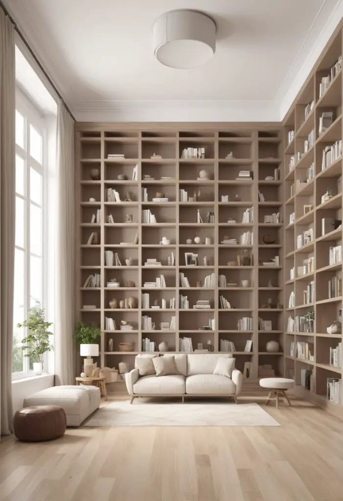
In the realm of interior design, the choice of paint color plays a pivotal role in shaping the ambiance and character of a space. With 2024’s trending color, Balanced Beige, modern libraries can elevate their aesthetic appeal while fostering an environment conducive to focus and relaxation. This warm, versatile hue strikes a delicate balance between sophistication and comfort, making it an ideal choice for libraries seeking to merge contemporary style with timeless elegance.
5 Tips to Match Color:
- Consider Natural Light: Before painting, assess the library’s natural light sources. Balanced Beige complements both ample sunlight and artificial lighting, but adjusting the tone may be necessary based on the room’s brightness.
- Sample Testing: Always test paint samples on the walls to observe how Balanced Beige interacts with the library’s furnishings, flooring, and decor. This step ensures the chosen hue harmonizes seamlessly with the existing elements.
- Layer Textures: Introduce varied textures such as plush rugs, sleek metal accents, and wood furnishings to enhance Balanced Beige’s depth and visual interest. Textural diversity adds dimension to the space, creating a dynamic and inviting atmosphere.
- Accent Colors: Explore accent colors that complement Balanced Beige, such as soft blues, muted greens, or warm neutrals. These accents can be incorporated through upholstery, artwork, or accessories, adding pops of color without overwhelming the serene ambiance.
- Regular Maintenance: Maintain the pristine appearance of Balanced Beige by periodically cleaning the walls with a gentle solution to remove dust and dirt. Routine maintenance ensures the library retains its inviting allure for years to come.
5 Hue Matching Options:
- Soft White: Pairing Balanced Beige with soft white accents creates a timeless and airy aesthetic. Consider white shelving units, trim, or molding to accentuate the warmth of Balanced Beige while amplifying the sense of spaciousness within the library.
- Earthy Green: For a nature-inspired palette, incorporate earthy green hues such as sage or olive. These subtle greens complement Balanced Beige’s organic warmth, evoking a sense of tranquility and connection to the outdoors.
- Rich Navy: Introduce sophistication and depth by pairing Balanced Beige with rich navy accents. Navy upholstery, curtains, or accent walls create a striking contrast that adds drama and modern flair to the library’s design scheme.
- Warm Gray: Enhance Balanced Beige’s versatility by incorporating warm gray tones. Gray accents in varying shades complement the neutrality of Balanced Beige while adding sophistication and depth to the overall color palette.
- Blush Pink: Infuse the library with a touch of femininity and warmth by incorporating blush pink accents. From throw pillows to artwork, blush pink adds a subtle yet impactful layer of color that softens the ambiance and fosters a cozy atmosphere.
5 Alternative Colors from Sherwin Williams and Benjamin Moore:
- Sherwin Williams: Accessible Beige: This soft, warm neutral from Sherwin Williams complements Balanced Beige beautifully, offering a slightly lighter alternative that exudes understated elegance.
- Sherwin Williams: Alabaster: For a crisp and clean aesthetic, consider pairing Balanced Beige with Sherwin Williams’ Alabaster. This fresh white hue enhances the warmth of Balanced Beige while creating a timeless backdrop for the library’s design elements.
- Benjamin Moore: Revere Pewter: Benjamin Moore’s Revere Pewter is a versatile greige that pairs effortlessly with Balanced Beige. Its subtle undertones of gray and beige add depth and sophistication to the color palette, creating a harmonious balance of warmth and neutrality.
- Benjamin Moore: Edgecomb Gray: With its soft, warm undertones, Benjamin Moore’s Edgecomb Gray complements Balanced Beige beautifully. This subtle gray hue adds depth and dimension to the space while maintaining a cohesive and inviting ambiance.
- Benjamin Moore: Pale Oak: For a lighter alternative to Balanced Beige, consider Benjamin Moore’s Pale Oak. This soft, warm neutral enhances the luminosity of the space while offering a timeless backdrop for the library’s design elements.
Other Rooms to Use Color:
Living Room: Balanced Beige creates a serene backdrop for the living room, promoting relaxation and comfort. Pair with plush sofas, cozy throws, and natural accents for a cozy yet sophisticated ambiance.
Bedroom: In the bedroom, Balanced Beige fosters a tranquil atmosphere conducive to rest and rejuvenation. Layer with soft bedding, ambient lighting, and tactile textures for a luxurious retreat.
Home Office: Transform your home office into a productive sanctuary with Balanced Beige. This warm, neutral hue promotes focus and concentration while providing a calming backdrop for work-related tasks.
Dining Room: Infuse the dining room with understated elegance by painting the walls in Balanced Beige. This versatile hue sets the stage for intimate gatherings and festive occasions, allowing your culinary creations to take center stage.
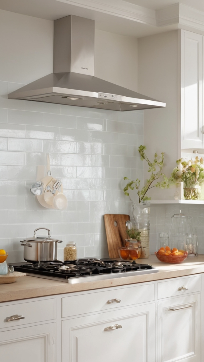
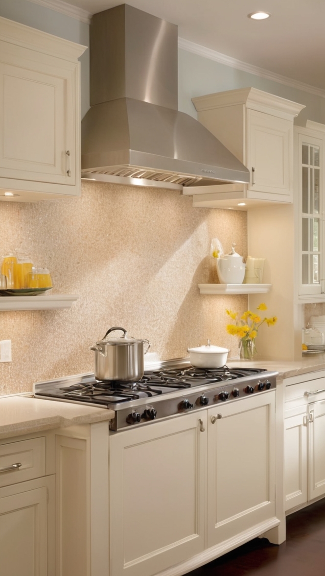
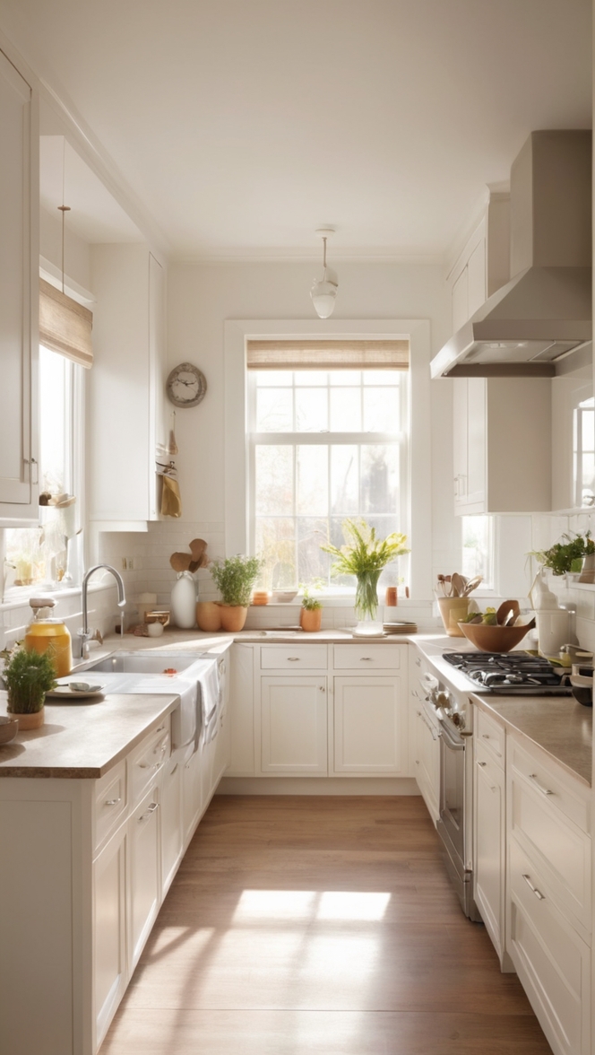
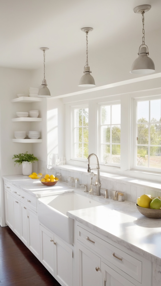
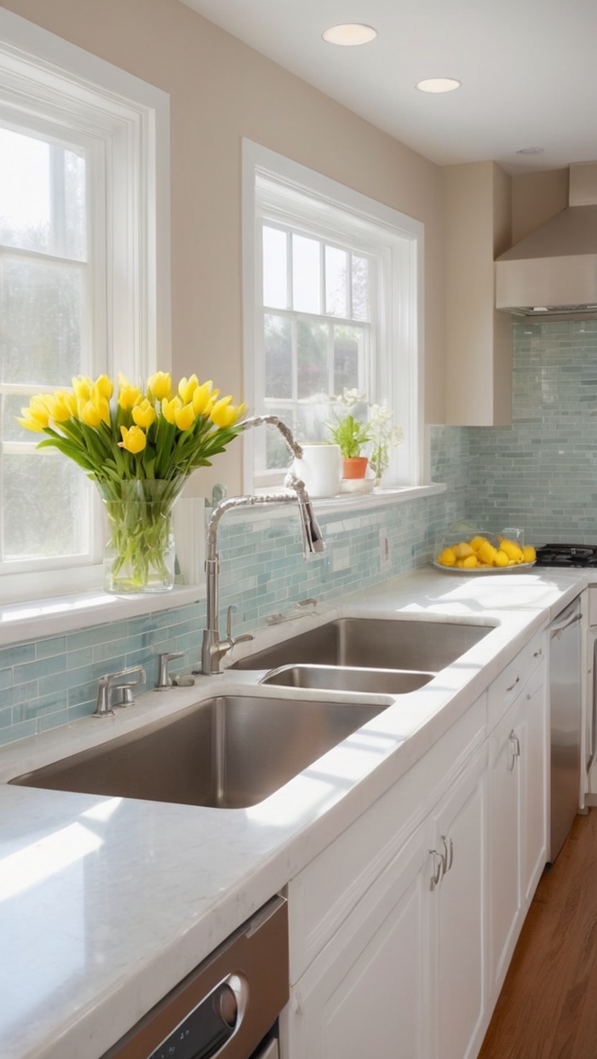
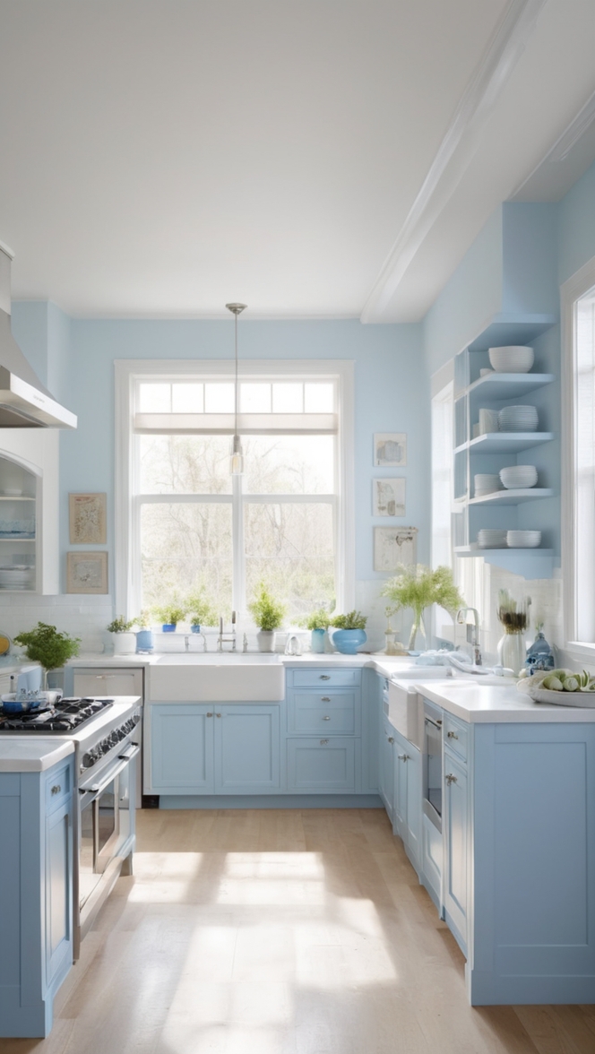
Kitchen: In the kitchen, Balanced Beige adds warmth and sophistication without overpowering the space. Pair with crisp white cabinetry, natural stone countertops, and metallic accents for a timeless yet contemporary aesthetic.
Conclusion:
Incorporating Balanced Beige into modern libraries elevates their aesthetic appeal while fostering a serene and inviting atmosphere. By following these tips for color matching and exploring complementary hues and alternative options, you can create a sophisticated and timeless space that promotes focus, relaxation, and creativity. Whether used in libraries or other rooms throughout the home, Balanced Beige proves to be a versatile and enduring choice for interior design enthusiasts seeking to strike the perfect balance between style and comfort.

