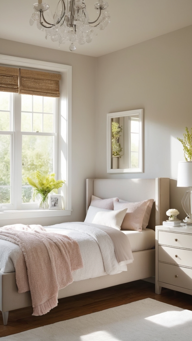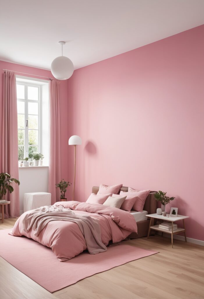
Creating a bedroom that exudes warmth, comfort, and a touch of elegance starts with the right color choice. One hue that perfectly encapsulates these qualities is a delightful shade of pink, specifically the “In the Pink” paint. This charming and versatile color can breathe new life into your personal sanctuary, making it a haven of tranquility and style. In this article, we will explore why “In the Pink” is an excellent choice for your bedroom, provide tips on matching it with other colors, suggest alternative hues from Sherwin-Williams and Benjamin Moore, and highlight other rooms where this color can shine.
Why Choose In the Pink for Your Bedroom?
“In the Pink” is more than just a color; it’s a mood-enhancer. This shade of pink is soft, calming, and sophisticated, offering a perfect balance that is neither too bold nor too subdued. Here are some reasons why this color is ideal for your bedroom:
- Promotes Relaxation: The gentle hue of “In the Pink” creates a serene atmosphere, helping you unwind and relax after a long day. Its calming effect can improve sleep quality and overall well-being.
- Adds Warmth: Unlike cooler tones, pink adds warmth to a space, making it feel cozy and inviting. This is particularly beneficial in a bedroom, where comfort is paramount.
- Versatile: “In the Pink” is incredibly versatile and can be paired with various colors and styles, from modern to traditional. It adapts well to different design elements and furnishings.
- Enhances Natural Light: This light pink shade reflects natural light beautifully, brightening up the room and creating an airy feel.
- Aesthetic Appeal: The subtle elegance of “In the Pink” adds a touch of sophistication to any bedroom. It’s a timeless color that never goes out of style.
5 Tips to Match In the Pink Color:
Successfully incorporating “In the Pink” into your bedroom involves more than just painting the walls. Here are five tips to help you match this color effectively:
1. Pair with Neutral Tones
Neutrals like white, beige, and gray complement “In the Pink” perfectly. These colors provide a balanced backdrop, allowing the pink hue to stand out without overwhelming the space.
2. Incorporate Metallic Accents
Gold, rose gold, or copper accents can add a touch of glamour to a pink-themed bedroom. Consider metallic light fixtures, picture frames, or decorative pieces to enhance the overall look.
3. Use Complementary Colors
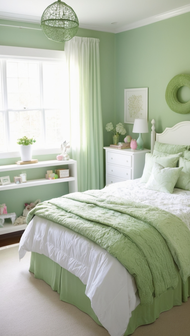
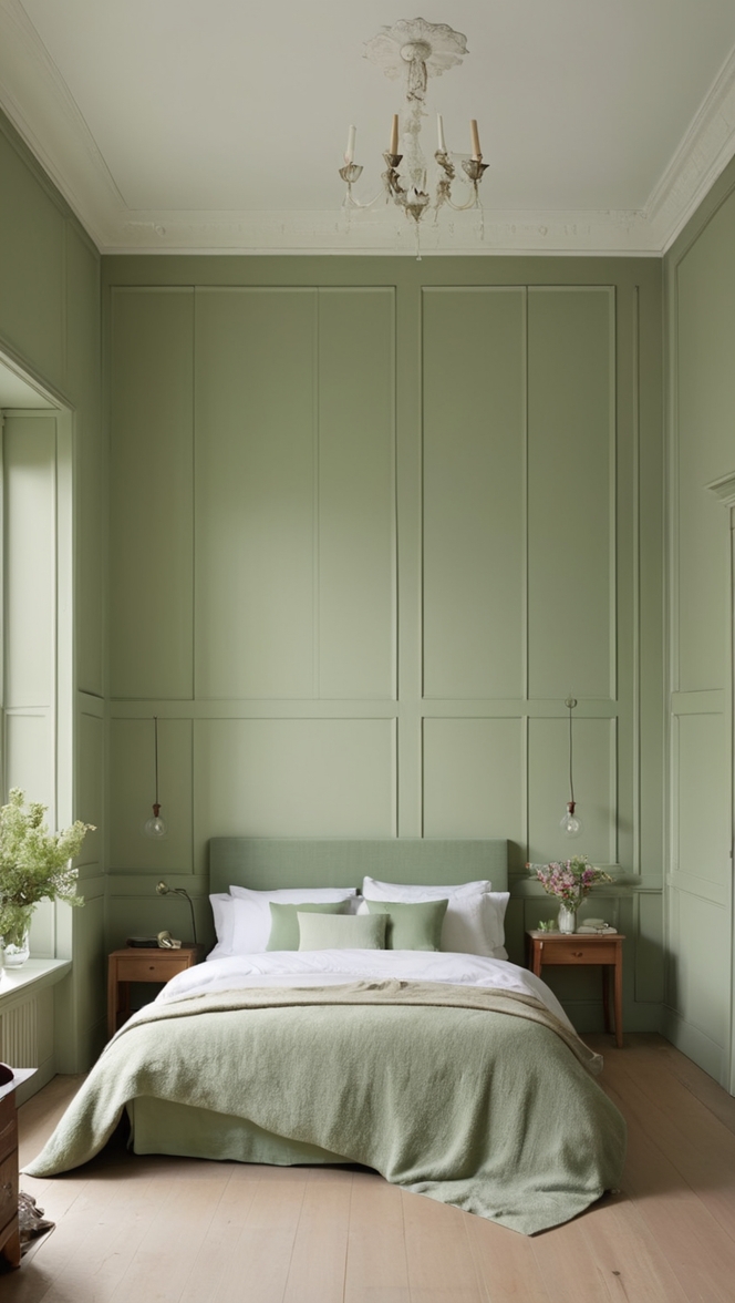
Colors such as mint green, navy blue, and lavender work well with “In the Pink.” These complementary shades can be used in bedding, curtains, or accent pillows to create a cohesive and harmonious design.
4. Add Textures
Introduce various textures to add depth and interest to your bedroom. Think velvet cushions, woolen throws, or silk drapes in shades that match or contrast with the pink walls.
5. Choose the Right Furniture
Opt for furniture in natural wood tones or painted in soft whites and grays to complement the pink walls. This choice ensures a balanced look that is both stylish and comfortable.
5 Hue Matching Ideas:
Creating a beautiful bedroom with “In the Pink” paint involves finding the right hues that complement and enhance its beauty. Here are five hue matching ideas:
1. Soft Pastels
Pair “In the Pink” with other pastel shades like baby blue, soft lavender, and pale yellow. These hues create a dreamy and tranquil environment perfect for a bedroom.
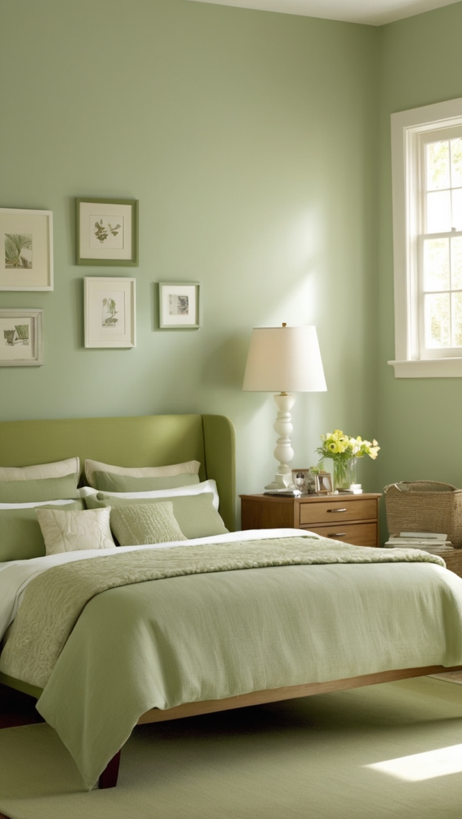
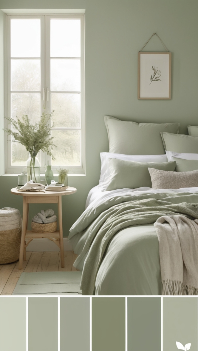
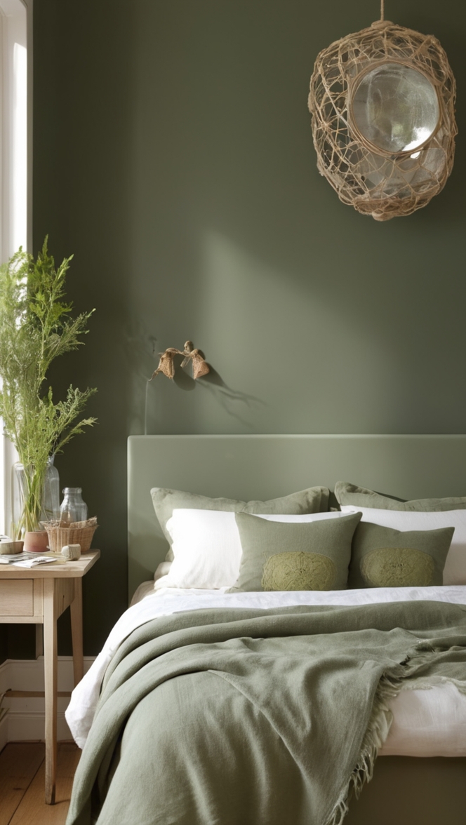
2. Earthy Tones
Incorporate earthy tones such as terracotta, olive green, and taupe. These colors add a grounding effect and bring a natural element into your bedroom design.
3. Bold Contrasts
For a more dynamic look, combine “In the Pink” with bold colors like deep navy, emerald green, or rich plum. These contrasts can make your space more vibrant and visually interesting.
4. Monochromatic Scheme
Create a sophisticated and cohesive look by using different shades of pink. Combine “In the Pink” with lighter or darker pinks for a monochromatic scheme that is both stylish and elegant.
5. Warm Whites
Warm whites with a hint of cream or beige complement “In the Pink” beautifully. These hues create a soft, inviting space that feels clean and fresh.
5 Alternative Colors from Sherwin-Williams and Benjamin Moore:
If “In the Pink” isn’t quite what you’re looking for, here are five alternative colors from Sherwin-Williams and Benjamin Moore that offer similar charm and appeal:
1. Sherwin-Williams “Intimate White” (SW 6322)
A delicate, barely-there pink that adds a subtle hint of color while maintaining a light and airy feel.
2. Sherwin-Williams “Blushing” (SW 6617)
A soft, romantic pink that is perfect for creating a cozy and inviting bedroom atmosphere.
3. Benjamin Moore “First Light” (2102-70)
A fresh and airy pink that brings a sense of calm and tranquility to any space, making it ideal for bedrooms.
4. Benjamin Moore “Pink Bliss” (2093-70)
A gentle, serene pink that works well in both modern and traditional settings, offering a timeless appeal.
5. Benjamin Moore “Pale Petal” (2086-70)
A soft and delicate pink that provides a touch of elegance and warmth, perfect for a restful bedroom environment.
Other Rooms to Use In the Pink:
Living Room
“In the Pink” can create a warm and welcoming atmosphere in your living room. Pair it with neutral furnishings and metallic accents for a sophisticated look.
Nursery
This gentle pink shade is perfect for a nursery, providing a soothing and calming environment for your baby. Complement it with pastel tones and soft textures.
Home Office
Incorporate “In the Pink” in your home office to create a space that is both inspiring and calming. Pair it with white or gray furniture for a balanced look.
Bathroom
Add a touch of luxury to your bathroom with “In the Pink.” This shade pairs well with marble finishes and gold fixtures for a chic, spa-like feel.
Dining Room
Use “In the Pink” in your dining room to create an elegant and inviting space. Complement it with rich wood tones and stylish lighting for a sophisticated ambiance.
Conclusion:
Choosing “In the Pink” paint for your bedroom is a fantastic way to create a serene, stylish, and inviting space. This versatile color promotes relaxation, adds warmth, and enhances natural light, making it perfect for your personal sanctuary. By following the tips for matching colors and exploring alternative hues from Sherwin-Williams and Benjamin Moore, you can find the perfect shade to suit your taste. Additionally, “In the Pink” isn’t limited to bedrooms—it can beautifully transform other rooms in your home as well. Embrace the charm and elegance of this delightful pink shade and wake up happy in your newly transformed space.