Looking to create the illusion of a larger kitchen space? Discover the power of color in transforming your kitchen’s ambiance.
How do you use color to make your kitchen feel more spacious?
As a routine with an interior designer, selecting the right colors for your kitchen can significantly impact how spacious it feels. Light and neutral colors like whites, creams, or soft pastels can make a space appear larger and brighter. To add depth, consider using one accent wall in a darker hue. Color matching painting to create a cohesive look will enhance the feeling of openness. Careful planning and organization of the color scheme alongside the furniture and decor will help create a seamless and spacious kitchen design.
To create a sense of space in your kitchen using lighter colors, several key strategies can be implemented. Lighter colors tend to reflect light, making a space feel more open and airy. Here are some important considerations for using lighter colors in your kitchen:
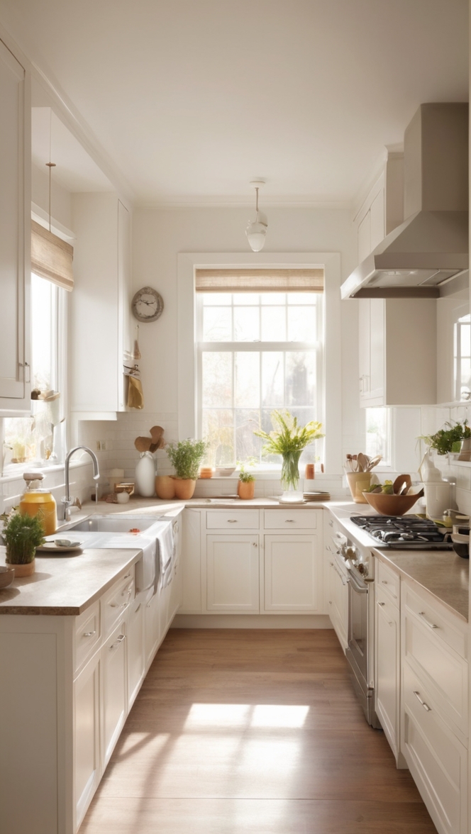
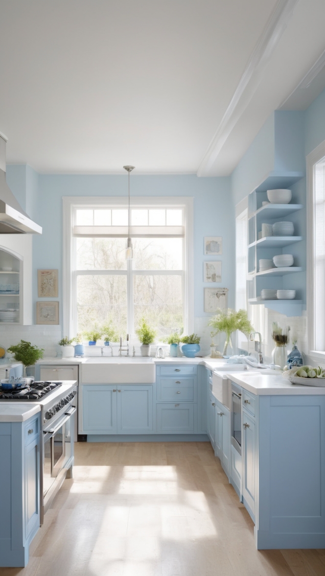
– **Utilize Lighter Paint Colors:** Paint your kitchen walls in light shades such as soft whites, pale yellows, or light blues. These colors can visually expand the space and create a brighter atmosphere.
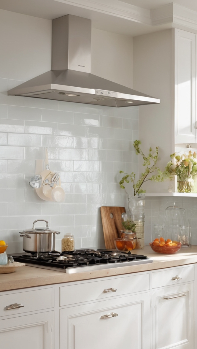
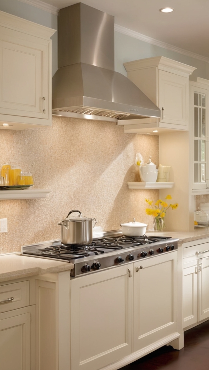
– **Choose Light-Toned Cabinetry:** Opt for kitchen cabinets in light wood finishes or white variations to enhance the feeling of spaciousness. Light-colored cabinets can prevent the kitchen from feeling cramped and visually heavy.
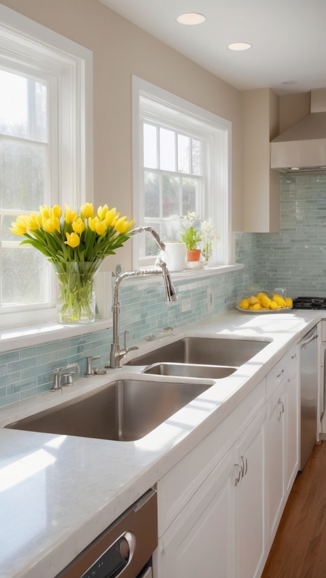
– **Use Light-Colored Flooring:** Light-colored flooring, such as light wood or pale tiles, can help the kitchen feel more expansive. Consider a neutral or light-colored flooring option to complement the overall color scheme.
– **Maximize Natural Light:** Allow natural light to flow into the kitchen by keeping windows uncovered or using sheer curtains. Natural light enhances the effect of lighter colors and contributes to a more open and inviting space.
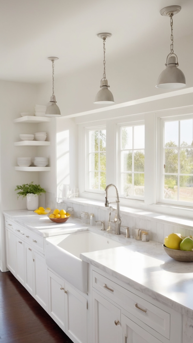
– **Select Light-Toned Countertops:** Choose countertops in light colors like white or pale gray to maintain a cohesive look in the kitchen. Light countertops create a seamless visual flow and amplify the sense of spaciousness.
– **Incorporate Light Accents:** Add light accents through decor elements such as light-colored upholstery, curtains, or kitchen accessories. These accents can further enhance the overall brightness and openness of the kitchen.
– **Enhance with Reflective Surfaces:** Incorporate reflective surfaces like mirrors or glass elements to bounce light around the space. Reflective surfaces can contribute to the illusion of a larger kitchen by maximizing light dispersion.
Using specific colors can significantly impact the perception of space in your kitchen. Here are some color recommendations to make your kitchen feel more spacious:
– **White:** White is a timeless color choice that can visually expand a room. It reflects light effectively, making the kitchen feel open and airy. Consider using white for walls, cabinets, and larger elements to maximize the spacious feel.
– **Soft Pastels:** Soft pastel colors like light blues, subtle greens, or pale yellows can create a serene and spacious ambiance in the kitchen. These gentle hues add warmth without overwhelming the space, ideal for enhancing the feeling of openness.
– **Neutral Tones:** Neutral colors such as beige, light gray, or taupe can provide a versatile backdrop for a spacious kitchen. Neutrals blend seamlessly with various decor styles and allow other elements to shine, contributing to a visually larger space.
– **Light Gray:** Light gray hues offer a modern and sophisticated touch to the kitchen while maintaining an expansive feel. Gray tones can complement both lighter and darker accents, adding depth to the space while preserving a sense of openness.
By using different shades of the same color in your kitchen, you can create a cohesive and harmonious look while amplifying the perceived spaciousness. Gradations of a single color can visually connect different elements in the kitchen and establish a sense of continuity. For example, varying shades of blue can be used on walls, cabinets, and accessories to achieve a cohesive color scheme that visually expands the space. In contrast, opt for different tones of white or beige to create a serene and unified environment. Mixing light and dark hues within the same color family can add depth and dimension to the kitchen without compromising the overall feeling of spaciousness.
The perception of space in your kitchen is greatly influenced by the choice of colors. Color selection can impact the visual perception of dimensions, light distribution, and overall atmosphere. Here are some ways in which color choice can affect the sensation of space in your kitchen:
– **Light vs. Dark Colors:** Light colors like white, pastels, and neutrals tend to reflect light and create an illusion of openness. Dark colors can absorb light and make a space feel more intimate but potentially smaller. Choosing light colors can enhance the perceived spaciousness of your kitchen.
– **Color Contrast:** Contrast between elements in the kitchen can influence the sense of space. High contrast between walls, cabinets, and countertops can visually divide the space and make it feel smaller. Opt for a harmonious color palette with subtle variations to maintain a cohesive and expansive look.
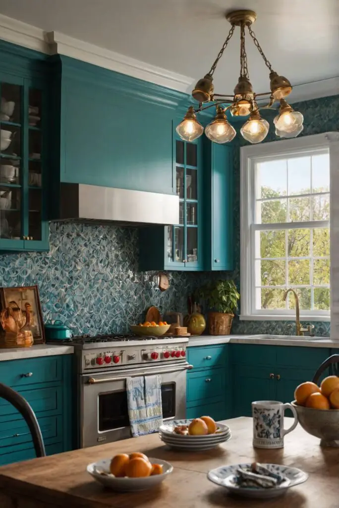
– **Warm vs. Cool Colors:** Warm colors like yellows, oranges, and reds can add coziness but may visually advance towards the observer, potentially diminishing the perception of space. Cool colors such as blues, greens, and purples recede visually, creating a sense of depth and openness. Consider cool tones to promote a larger feeling in your kitchen.
– **Monochromatic Schemes:** Monochromatic color schemes utilize variations of a single color and can create a visually cohesive and expansive look in the kitchen. By sticking to one color family with different shades, tints, and tones, you can unify the space and make it appear larger than it actually is.
When aiming to make your kitchen appear larger, consider alternative paint options beyond traditional wall paint. Experimenting with different finishes, textures, and techniques can help achieve a spacious look while adding visual interest. Here are some paint alternatives to enhance the perceived size of your kitchen:
– **Textured Paint:** Textured paints, such as faux finishes or plaster effects, can introduce depth and dimension to your kitchen walls. Textured surfaces can create visual intrigue and distract from the limited space, making the kitchen feel larger.
– **Chalkboard Paint:** Chalkboard paint is a versatile option that can add functionality and charm to your kitchen. By painting a wall or cabinet surface with chalkboard paint, you can create a focal point that enhances the perception of space while offering a creative element to the room.
– **Two-Tone Walls:** Painting two-tone walls, where the lower half is a darker color and the upper half is a lighter shade, can visually expand the height of the kitchen. This technique draws the eye upward, creating a sense of vertical spaciousness and architectural interest.
– **High-Gloss Paint:** High-gloss paint finishes reflect light effectively, creating a luminous and reflective surface. Applying high-gloss paint to cabinets or an accent wall can amplify the perception of space by maximizing light reflection and brightness in the kitchen.
– **Color Wash Technique:** The color wash technique involves diluting paint with water to create a translucent, layered effect on walls. This artistic approach adds depth and movement to the walls, contributing to an airy and spacious ambiance. Use soft colors for a subtle color wash effect that enhances the openness of the kitchen.
Combining colors strategically is essential to maximize the feeling of spaciousness in your kitchen. By harmonizing different hues and tones, you can create a balanced and visually expansive environment. Here are some tips on how to effectively combine colors to optimize the sense of space in your kitchen:
– **Create a Unified Color Scheme:** Select a cohesive color palette that incorporates light shades, pastels, or neutrals to establish a sense of continuity in the kitchen. Choose colors that complement each other to create a harmonious and spacious look throughout the space.
– **Use Color Blocking:** Divide the kitchen into color zones by strategically painting different areas or elements in contrasting colors. Color blocking can visually segment the space while maintaining an overall cohesive design. Opt for lighter hues to enhance the perception of openness and flow.
– **Accent with Bright Colors:** Introduce bright accent colors sparingly to add pops of energy and vibrancy to the kitchen. Use bold colors in small doses through accessories, art pieces, or decor items to create focal points and visual interest. Bright accents can enliven the space without overwhelming the spacious feel.
– **Consider a Neutral Base:** Start with a neutral base color for larger surfaces like walls, cabinets, and countertops. Neutrals provide a versatile backdrop for incorporating different colors and textures while allowing the space to feel open and airy. Build upon the neutral base with subtle variations in color for depth and dimension.
– **Play with Light and Dark Contrasts:** Balance light and dark hues within your color scheme to add depth and visual intrigue. Contrasting light walls with darker cabinetry or countertops can create a dynamic interplay of colors that enhances the perceived spaciousness of the kitchen. Experiment with different combinations to find the right balance.
When aiming to create a spacious and open feel in your kitchen through color choices, certain decor elements should be avoided to prevent the space from feeling crowded or visually overwhelming. Here are specific decor elements to steer clear of in order to maintain a sense of spaciousness:
– **Heavy or Dark Curtains:** Avoid heavy or dark-colored curtains that can block natural light and weigh down the room. Opt for sheer or light-colored curtains that allow light to pass through, contributing to a brighter and more expansive ambiance.
– **Excessive Clutter:** Minimize clutter on countertops, shelves, and surfaces to prevent a cramped look in the kitchen. Clutter can disrupt the flow of the space and make it feel smaller. Keep decor items and accessories to a minimum to maintain an open and airy feel.
– **Overly Busy Patterns:** Steer clear of overly busy patterns on walls, tiles, or textiles that can visually overwhelm the kitchen. Intricate designs or bold patterns can create a sense of visual clutter and detract from the perceived spaciousness of the room. Opt for subtle or minimalist patterns to maintain a clean and serene look.
– **Dark or Bulky Furniture:** Avoid dark or bulky furniture pieces that can dominate the space and make it feel cramped. Opt for streamlined and light-colored furniture that blends seamlessly with the overall color scheme. Choose furniture with legs or open bases to create a sense of lightness and openness.
– **Intrusive Lighting Fixtures:** Be cautious with lighting fixtures that are too large or visually imposing. Overly bulky or ornate lighting fixtures can detract from the sense of space in the kitchen. Opt for sleek and minimalistic lighting designs that complement the overall aesthetic while providing adequate illumination.
– **Limited Access to Natural Light:** Ensure that natural light sources are unobstructed to maximize the feeling of openness in the kitchen. Avoid placing large furniture pieces or heavy drapes near windows that could hinder the flow of natural light. Enhance the presence of natural light to create a bright and airy atmosphere.
In summary, the use of lighter colors, specific color choices, variations of the same color, and strategic color combinations all play a crucial role in making your kitchen feel more spacious. By incorporating light tones, pastel hues, and neutrals, you can create an open and airy environment that enhances the perception of space. Avoiding clutter, dark elements, and heavy decor can further contribute to a visually expansive kitchen that feels inviting and spacious.
**Key Takeaways:**
1. Lighter colors such as whites, pastels, and neutrals can reflect light and create a sense of spaciousness in your kitchen.
2. By utilizing specific colors like white, soft pastels, and light gray, you can enhance the perceived size of the space.
3. Gradations of the same color can promote cohesion and continuity while visually expanding the kitchen.
4. Color choice influences the perception of space through light reflection, contrast, warmth, and color psychology.
5. Experimenting with textured paint, chalkboard paint, two-tone walls, high-gloss finishes, and color wash techniques can enhance the spacious feel.
6. Strategic color combinations, including unified color schemes, color blocking, and accent colors, can optimize the sense of space.
7. Avoid heavy curtains, clutter, busy patterns, dark furniture, intrusive lighting fixtures, and limited access to natural light to maintain a spacious atmosphere in the kitchen.