Discover surprising kitchen color combinations that are a feast for the eyes. Uncover the top 10 unexpected pairings for a stunning kitchen transformation.
10 Unexpected Kitchen Color Pairings That Work Beautifully Together
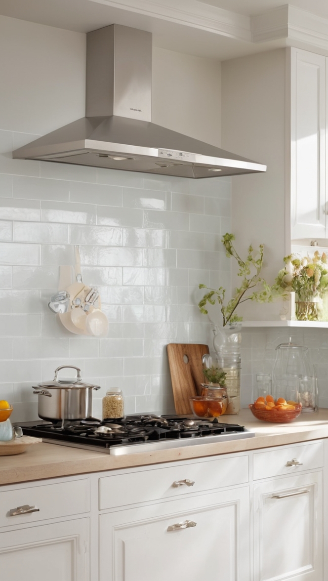
As a daily routine with an interior designer, it is essential to keep in mind the importance of color selection in creating a visually appealing kitchen. When choosing colors for the kitchen, consider unexpected pairings that can work beautifully together. For example, try combining navy blue with blush pink for a modern and elegant look. Incorporating a deep green with mustard yellow can bring warmth and sophistication to the space. Additionally, experimenting with bold colors like teal and coral can add a vibrant touch to the kitchen. Remember to balance the colors by incorporating neutral tones as well. By carefully selecting and pairing colors, you can create a unique and stylish kitchen design that reflects your personal style and enhances the overall aesthetics of the space.
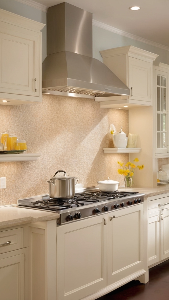
Home decorating and interior design involve not only selecting furniture and decor but also paying attention to the color scheme. Utilizing color theory and understanding how different hues interact can help you achieve a cohesive and harmonious look in your kitchen. When planning the color palette for your kitchen, consider the size of the space and the amount of natural light it receives. Lighter colors can make a small kitchen feel more open and airy, while darker tones can add coziness and depth to a larger space. Experimenting with color swatches and conducting paint tests can help you visualize the final result and make informed decisions. Investing in high-quality primer paint for walls is crucial to ensure a smooth and lasting finish for your chosen colors.
When it comes to color matching in painting, be mindful of undertones and finishes to ensure a seamless blend. Pairing complementary colors or using analogous hues can create a harmonious and balanced aesthetic in your kitchen. Mixing cool and warm tones can add dimension and interest to the space, while monochromatic schemes can create a sophisticated and timeless look. Consider the mood you want to evoke in your kitchen and select colors that resonate with that vision. Whether you opt for bold statements or subtle accents, coordinating the wall paint with other elements like cabinetry, countertops, and flooring is key to a cohesive design. Remember that the right color choices can transform your kitchen into a inviting and stylish living space for you and your family to enjoy.
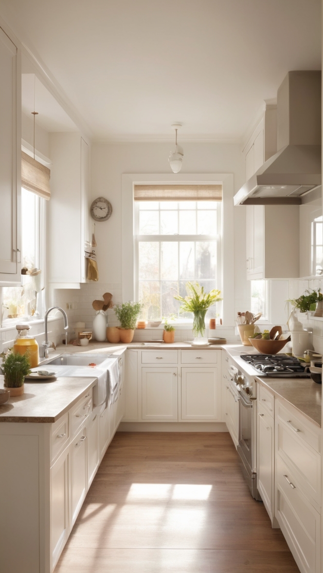
Space planning in interior design plays a crucial role in optimizing the functionality and flow of your kitchen. Properly organizing the layout of cabinets, appliances, and work zones can enhance the efficiency and usability of the space. Consider the triangle rule for kitchen design, which involves positioning the sink, stove, and refrigerator in a triangular formation to create a practical and ergonomic workspace. Maximizing storage solutions and incorporating multifunctional elements can help you make the most of the available space while maintaining a clutter-free environment. Consult with designers specializing in kitchen designs to explore innovative solutions and tailor-made options that suit your lifestyle and design preferences. By combining thoughtful color pairings with effective space planning, you can create a kitchen that is not only visually stunning but also a joy to cook and entertain in.
How do I choose unexpected kitchen color pairings for a cohesive look?
To choose unexpected kitchen color pairings for a cohesive look, consider the following tips:
– **Contrast**: Pair colors that have a strong contrast, such as navy blue and mustard yellow, to create visual interest.
– **Undertones**: Ensure that the undertones of the colors work well together. For example, if you choose a warm color like terracotta, pair it with a cool color like seafoam green.
– **Balance**: Create a balanced look by choosing one dominant color and using the other colors as accents. This will prevent the space from looking overwhelming.
– **Experiment**: Don’t be afraid to experiment with different color combinations. You can use color swatches or online tools to visualize how different colors will look together.
– **Natural Elements**: Incorporate natural elements like wood or stone to tie together unexpected color pairings and add warmth to the space.
– **Accessories**: Use accessories like rugs, curtains, or wall art in complementary colors to tie the room together and create a cohesive look.
– **Lighting**: Consider how lighting will affect the colors in your kitchen. Natural light can make colors appear different, so test your color pairings in different lighting conditions.
What is the best way to incorporate bold colors into a kitchen design?
To incorporate bold colors into your kitchen design effectively:
– **Accent Wall**: Paint one wall in a bold color to create a focal point in the kitchen without overwhelming the space.
– **Cabinetry**: Use bold colors on kitchen cabinets or island to add a pop of color while keeping the rest of the kitchen neutral.
– **Backsplash**: Choose a bold tile or backsplash in a vibrant color to add personality to the kitchen.
– **Appliances**: Opt for bold-colored appliances like refrigerators or stoves to make a statement in an otherwise neutral kitchen.
– **Accessories**: Use accessories like colorful bar stools, light fixtures, or kitchen tools to introduce bold colors in a subtle way.
– **Balance**: Pair bold colors with neutral tones like white, gray, or beige to create a balanced look that doesn’t feel overwhelming.
– **Texture**: Mix different textures like matte and glossy finishes to add depth and interest to the kitchen design.
Can I mix warm and cool tones in my kitchen color scheme?
Mixing warm and cool tones in your kitchen color scheme can create a sophisticated and dynamic look. However, it’s essential to ensure that the tones are balanced to avoid clashing. Here are some tips:
– **Balance**: Choose one dominant tone (warm or cool) and use the other as an accent to create harmony in the space.
– **Neutrals**: Introduce neutral colors like white, gray, or beige to bridge the warm and cool tones and create a cohesive color palette.
– **Contrast**: Pair warm colors like orange or red with cool colors like blue or green to create a striking contrast that adds visual interest.
– **Texture**: Use textures like wood, metal, or stone to enhance the warmth or coolness of the colors in your kitchen design.
– **Testing**: Experiment with different color combinations by using swatches or creating mood boards to see how warm and cool tones work together in your space.
How can I ensure that my kitchen colors complement each other?
To ensure that your kitchen colors complement each other seamlessly:
– **Color Wheel**: Use a color wheel to identify complementary colors that work well together. Pairing colors that are opposite each other on the color wheel can create a harmonious look.
– **Analogous Colors**: Choose colors that are next to each other on the color wheel (analogous colors) to create a cohesive and serene color scheme.
– **Monochromatic Scheme**: Select different shades of the same color for a monochromatic scheme that is easy to coordinate and looks elegant.
– **Neutral Base**: Start with a neutral base like white or beige and layer on accent colors to add depth and interest to the space.
– **Test Lighting**: Consider how natural and artificial lighting will affect the colors in your kitchen. Test the colors in different lighting conditions before making a final decision.
– **Flow**: Ensure that the colors in your kitchen flow seamlessly into adjoining spaces to create a cohesive look throughout your home.
What are some unconventional color combinations that work well in kitchens?
Some unconventional color combinations that work well in kitchens include:
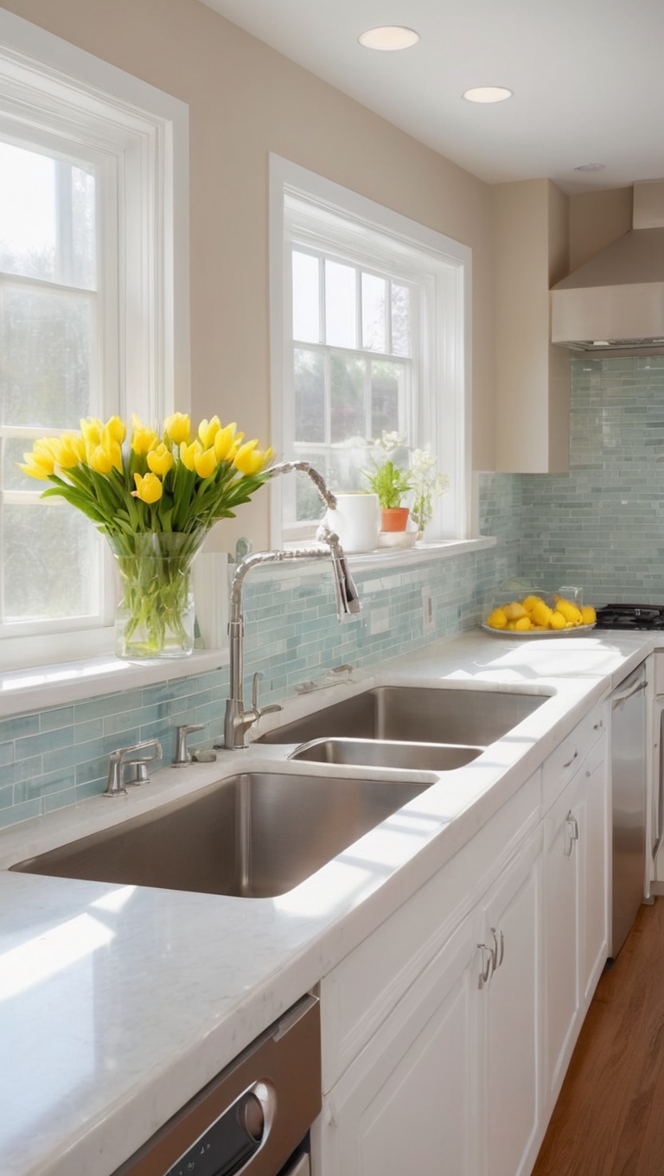
– **Navy Blue and Blush Pink**: This sophisticated pairing adds a touch of elegance and warmth to the kitchen.
– **Emerald Green and Gold**: A luxurious combination that creates a rich and opulent feel in the kitchen.
– **Plum and Mustard**: A bold and unexpected pairing that adds depth and vibrancy to the space.
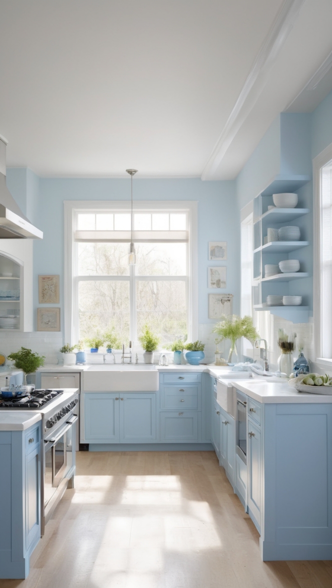
– **Mint Green and Coral**: A fresh and cheerful combination that brings a pop of color to a neutral kitchen.
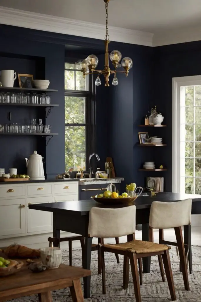
– **Charcoal Gray and Teal**: A modern and sleek pairing that adds drama and sophistication to the kitchen.
– **Terracotta and Sage**: A rustic and earthy combination that creates a warm and inviting atmosphere in the kitchen.
How do I know if the kitchen color pairings will create a harmonious look?
To ensure that your kitchen color pairings create a harmonious look, consider the following factors:
– **Undertones**: Choose colors with similar undertones to create a cohesive and unified color scheme.
– **Balance**: Strive for a balance between light and dark colors, warm and cool tones, and bold and neutral shades in your kitchen design.
– **Testing**: Experiment with samples and swatches to see how the colors look together in your space before making a final decision.
– **Accent Colors**: Use accent colors sparingly to add pops of color without overwhelming the overall design.
– **Consider the Space**: Take into account the size and layout of your kitchen when selecting colors to ensure that they work well in the space.
– **Personal Style**: Choose colors that resonate with your personal style and create a space that feels comfortable and inviting to you.
Why is it important to consider natural light when selecting kitchen colors?
Considering natural light when selecting kitchen colors is crucial because:
– **Lighting Effects**: Natural light can affect how colors appear in your kitchen. Colors may look different depending on the intensity and direction of sunlight.
– **Warmth and Coolness**: Natural light can highlight warm or cool undertones in colors, affecting the overall mood and atmosphere of the space.
– **Reflection**: Light colors reflect more light and can make a small kitchen feel larger and brighter, while dark colors absorb light and create a cozy ambiance.
– **Visibility**: Adequate lighting is essential for food preparation and cooking tasks in the kitchen. Choosing light, reflective colors can enhance visibility and functionality.
– **Time of Day**: Consider how the natural light changes throughout the day in your kitchen. Test your color choices under different lighting conditions to see how they will look in various scenarios.
Key Takeaways:
– **Contrast** and **balance** are key when choosing unexpected kitchen color pairings.
– Incorporating bold colors through **accent walls**, **cabinetry**, or **accessories** can add personality to the kitchen.
– Mixing warm and cool tones can create a **sophisticated look** if done correctly.
– Ensure that your kitchen colors **complement each other** by using the color wheel and testing under different lighting conditions.
– **Unconventional color combinations** like navy blue and blush pink or emerald green and gold can bring depth and sophistication to your kitchen.
– Consider **undertones**, **balance**, and **personal style** when selecting kitchen colors for a harmonious look.
– **Natural light** plays a crucial role in how colors appear in your kitchen, affecting mood, visibility, and ambiance.