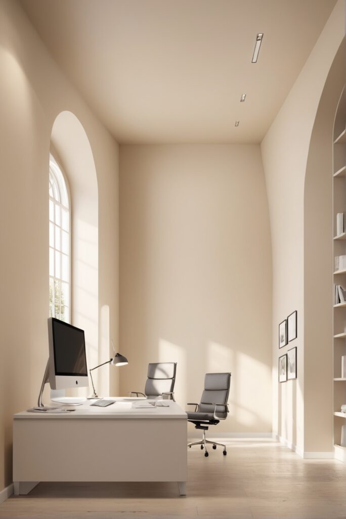
In the fast-paced world of business, the office environment plays a crucial role in shaping productivity, creativity, and overall well-being. As we stride into 2024, the trend of creating aesthetically pleasing workspaces that promote efficiency and inspiration continues to evolve. Among the myriad of options available, one timeless choice stands out: Dollop of Cream paint. Its subtle elegance and versatility make it a top recommendation for revamping your office space this year.
Cream paint exudes a sense of warmth and sophistication that can transform any drab office into a welcoming and professional environment. Here’s why we recommend incorporating this color into your workspace:
- Elevated Aesthetics: Cream paint adds a touch of class and sophistication to your office walls, instantly elevating the overall aesthetics of the space. Its neutral tone serves as an excellent backdrop for showcasing artwork, furniture, and other decorative elements.
- Enhanced Productivity: Studies have shown that colors can significantly impact mood and productivity. Cream, being a soft and soothing hue, creates a calming atmosphere conducive to focused work. Unlike stark white walls, cream tones down harsh lighting, reducing eye strain and fatigue.
- Versatile Pairing Options: Cream paint seamlessly complements a wide range of interior design styles and color schemes. Whether your office features modern minimalist decor or classic furnishings, cream serves as a versatile canvas that ties everything together cohesively.
- Perceived Spaciousness: Light-colored paints, such as cream, have the remarkable ability to visually expand the perceived size of a room. This is especially beneficial for smaller offices or those with limited natural light, as cream paint can make the space feel airier and more open.
- Timeless Appeal: Trends come and go, but cream paint remains a timeless choice for interior design. Unlike bolder color choices that may quickly become outdated, cream exudes a timeless elegance that ensures your office space remains stylish and relevant for years to come.
5 Tips to Match Dollop of Cream Paint with Your
Office Design:
- Consider Lighting: Take into account the natural and artificial lighting in your office space when choosing the shade of cream paint. Cooler creams may work better in brightly lit areas, while warmer creams can add coziness to spaces with limited light.
- Coordinate with Furniture: Ensure that the cream paint complements the existing furniture in your office. If your furniture features predominantly cool tones, opt for a cooler shade of cream to maintain harmony in the space.
- Sample Before Committing: Before painting the entire office, test different shades of cream paint on small sections of the wall to see how they look throughout the day. Lighting conditions can significantly alter the appearance of paint colors.
- Consider Accents: Think about how accent colors will interact with the cream paint. Whether it’s through artwork, textiles, or accessories, select accent hues that enhance the overall aesthetic and create visual interest.
- Balance with Trim and Flooring: Ensure that the cream paint complements the color of the trim and flooring in your office. A harmonious color scheme ties the room together seamlessly, creating a cohesive and polished look.
5 Hue Matching Options for Dollop of Cream Paint:
- Soft Taupe: Pairing cream paint with soft taupe accents adds depth and sophistication to your office space. The subtle contrast between these neutral hues creates a timeless and refined atmosphere.
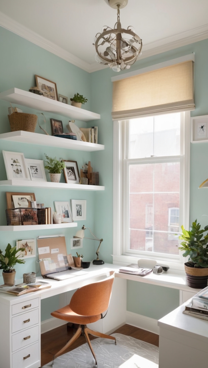
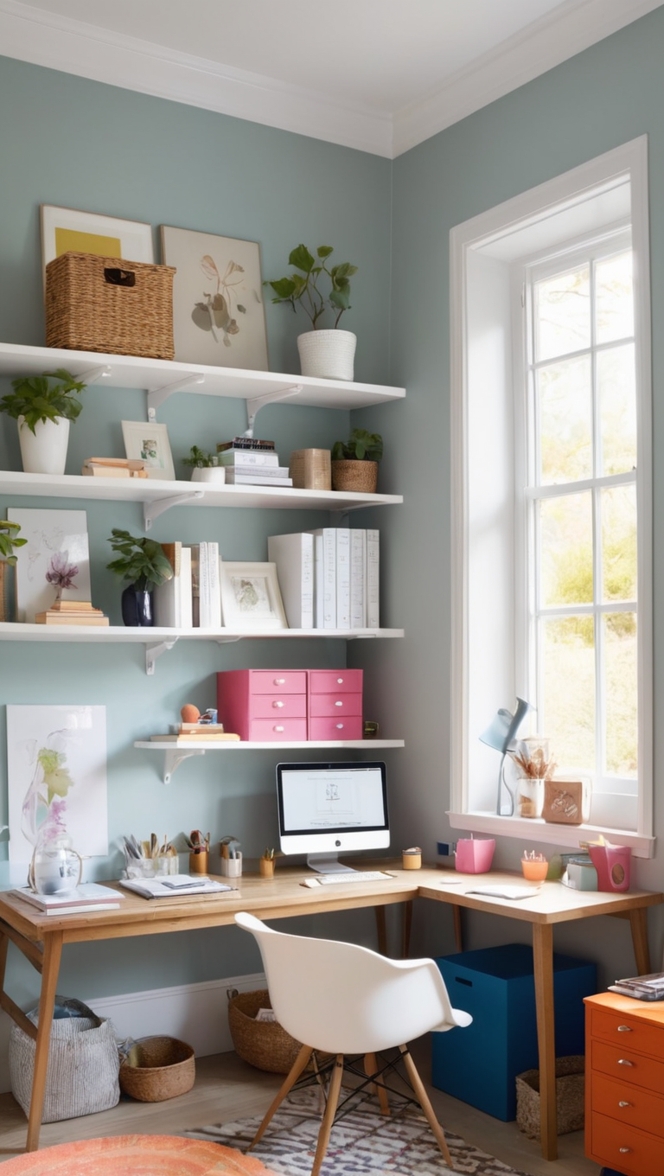
- Pale Blue: For a refreshing and airy vibe, consider incorporating pale blue accents alongside cream paint. This color combination evokes a sense of tranquility and serenity, ideal for promoting focus and productivity.
- Subtle Gray: Incorporating subtle gray tones into your office design scheme adds a modern twist to the classic cream palette. The combination of cream and gray creates a contemporary aesthetic with understated elegance.
- Warm Beige: Pairing cream paint with warm beige accents creates a harmonious and inviting atmosphere. This combination exudes comfort and coziness, making it perfect for fostering creativity and collaboration.
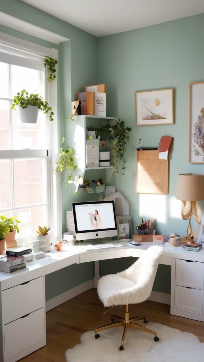
- Soft Green: Infusing touches of soft green alongside cream paint brings a hint of nature indoors, promoting a sense of vitality and rejuvenation. This color pairing is particularly effective in offices aiming to create a biophilic design that connects occupants with the natural world.
5 Alternative Dollop of Cream Paint Colors from
Sherwin Williams and Benjamin Moore:
- Sherwin Williams – “Navajo White”: A timeless off-white hue with warm undertones, Navajo White from Sherwin Williams provides a subtle alternative to traditional cream paint, creating a soft and inviting atmosphere.
- Benjamin Moore – “White Dove”: White Dove by Benjamin Moore is a versatile off-white shade that pairs beautifully with cream tones. Its neutral undertones make it an excellent choice for achieving a classic and timeless look in your office space.
- Sherwin Williams – “Alabaster”: Alabaster from Sherwin Williams is a soft and creamy white paint color that adds warmth and depth to any room. Its subtle undertones make it an elegant alternative to brighter whites.
- Benjamin Moore – “Simply White”: As the name suggests, Simply White by Benjamin Moore is a crisp and clean white paint color with subtle warmth. It complements cream tones effortlessly, creating a cohesive and inviting ambiance.
- Sherwin Williams – “Creamy”: True to its name, Creamy by Sherwin Williams is a soft and inviting cream paint color with a hint of warmth. It’s a versatile option that pairs well with a variety of design styles and color palettes.
Other Rooms to Use Dollop of Cream Paint:
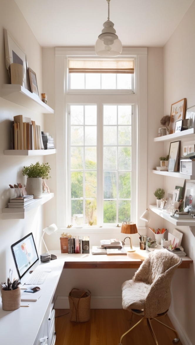
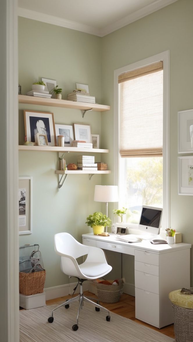
Home Office: Transform your home office into a productive sanctuary by incorporating cream paint on the walls. This soothing hue creates a conducive environment for focused work while maintaining a sense of warmth and comfort.
Living Room: Infuse your living room with an air of sophistication by painting the walls in cream. This versatile color serves as an excellent backdrop for showcasing artwork and furniture, creating a stylish and inviting space for relaxation and entertainment.
Dining Room: Create an elegant dining experience by adorning the walls of your dining room with cream paint. Whether hosting intimate gatherings or formal dinner parties, cream sets the stage for memorable meals and lively conversations.
Kitchen: Brighten up your kitchen with cream-colored walls that reflect natural light and create a welcoming atmosphere. Pair cream paint with crisp white cabinets for a classic look or incorporate warm wood tones for a cozy and inviting feel.
Bedroom: Foster a sense of tranquility and relaxation in your bedroom with cream paint. This soft and soothing hue promotes restful sleep and creates a serene oasis where you can unwind and recharge after a long day.
Conclusion:
In the quest to optimize productivity and foster creativity in the workplace, the choice of paint color plays a pivotal role. Cream paint stands out as a timeless and versatile option that enhances aesthetics, promotes productivity, and creates a welcoming atmosphere. By following the tips for matching cream paint with your office design, exploring hue matching options, and considering alternative cream paint colors from top brands like Sherwin Williams and Benjamin Moore, you can elevate your office space to new heights of style and functionality. Whether you’re revamping a corporate office or creating a cozy home workspace, cream paint offers endless possibilities for transforming your environment and enhancing your overall well-being.