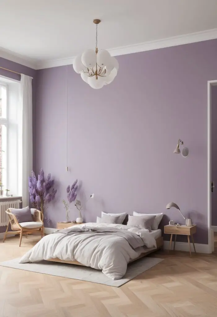
Wisteria, a delicate and enchanting shade of purple, is the trending color for 2024. This captivating hue, inspired by the soft and soothing blossoms of the wisteria vine, is perfect for creating a serene and stylish sanctuary in your home. Whether you’re looking to refresh a single room or your entire home, Wisteria offers a versatile and sophisticated option that can be tailored to suit a variety of design preferences. Here’s why you should consider this trendy color for your next painting project.
Why Choose Wisteria?
Wisteria is more than just a color; it’s a mood. This soft, muted purple brings a sense of calm and tranquility, making it ideal for spaces where relaxation is key. It’s a perfect balance of femininity and elegance, without being overwhelming. Wisteria can transform any room into a peaceful retreat, which is why it’s the perfect choice for 2024.
1. A Calming Effect
Purple is known for its calming properties. Lighter shades like Wisteria can help reduce stress and create a tranquil atmosphere. This makes it an excellent choice for bedrooms, living rooms, and any space where you seek peace and quiet.
2. Versatile and Timeless
Wisteria is a versatile color that can work with various styles, from modern to traditional. Its subtlety ensures it won’t go out of style quickly, making it a timeless addition to your home.
3. Enhances Natural Light
This light purple hue can enhance natural light in a room, making spaces feel brighter and more inviting. It’s particularly effective in rooms with limited natural light, as it can reflect light and give the illusion of a larger, more open space.
4. Pairs Well with Neutrals
Wisteria pairs beautifully with neutral colors like white, beige, and gray. This makes it easy to integrate into your existing decor and ensures a cohesive and harmonious look throughout your home.
5. Adds a Touch of Luxury
The sophisticated undertones of Wisteria add a touch of luxury to any room. It’s a color that suggests elegance and refinement, perfect for creating a high-end look without the high-end cost.
Tips to Match Wisteria Paint:
1. Pair with Soft Whites
Soft whites and off-whites can enhance the delicate beauty of Wisteria. Use these shades for trim, ceilings, or furniture to create a clean and cohesive look.
2. Complement with Metallic Accents
Metallic accents in silver or gold can add a touch of glamour to a Wisteria-painted room. Consider using metallic picture frames, light fixtures, or decorative accessories to elevate the space.
3. Integrate Natural Elements
Natural materials like wood and stone can complement the soft purple of Wisteria beautifully. Use wooden furniture or stone accents to create a harmonious blend of natural textures and colors.
4. Add Greenery
Plants and greenery can add a refreshing contrast to Wisteria walls. The green tones will pop against the purple backdrop, bringing a lively and vibrant feel to the room.
5. Use Soft Fabrics
Soft fabrics in shades of lavender, mauve, or pastel pink can enhance the cozy and inviting feel of a Wisteria room. Consider using throw pillows, curtains, or rugs in these hues for a cohesive and comforting aesthetic.
Hue Matching with Wisteria:
1. Lavender
A lighter shade of purple, lavender pairs beautifully with Wisteria for a monochromatic look. Use lavender accents to add depth and interest without overwhelming the space.
2. Mauve
Mauve, a slightly deeper and warmer purple, can create a rich and sophisticated palette when used with Wisteria. This combination is perfect for adding warmth and depth to your decor.
3. Pastel Pink
For a soft and romantic feel, pair Wisteria with pastel pink. This delicate combination works well in bedrooms or nurseries, creating a serene and dreamy atmosphere.
4. Soft Gray
Soft gray is an excellent neutral to pair with Wisteria. This combination offers a modern and sleek look, perfect for contemporary spaces that need a touch of color without being too bold.
5. Warm Beige
Warm beige can balance the cool undertones of Wisteria, creating a harmonious and inviting space. This pairing is ideal for living rooms or dining areas where you want a cozy and welcoming ambiance.
Alternative Colors from Sherwin-Williams and Benjamin Moore:
1. Sherwin-Williams “Mauve Finery” (SW 6284)
A close alternative to Wisteria, Mauve Finery offers a similar soft purple tone with a bit more depth. It’s perfect if you’re looking for a slightly richer hue.
2. Sherwin-Williams “Lite Lavender” (SW 6554)
Lite Lavender is a lighter, more pastel version of Wisteria. It’s ideal for creating an even softer and more delicate look, perfect for nurseries or bedrooms.
3. Benjamin Moore “Lavender Mist” (2070-60)
Lavender Mist from Benjamin Moore is a great alternative that offers a light and airy feel. It’s slightly more muted, making it a versatile choice for various rooms.
4. Benjamin Moore “Spring Iris” (1402)
Spring Iris is a deeper and more vibrant purple, offering a bold alternative to Wisteria. It’s great for accent walls or to add a pop of color in a neutral space.
5. Benjamin Moore “Wild Lilac” (2070-40)
Wild Lilac is a warmer and more saturated purple. It offers a rich and cozy feel, perfect for creating a more intimate and luxurious atmosphere.
Other Rooms to Use Wisteria:
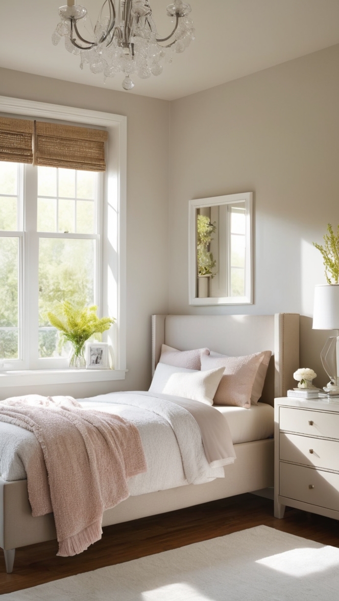
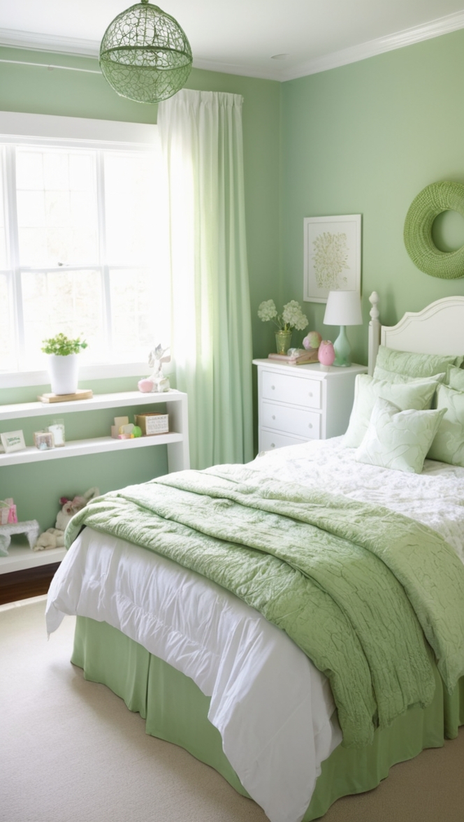
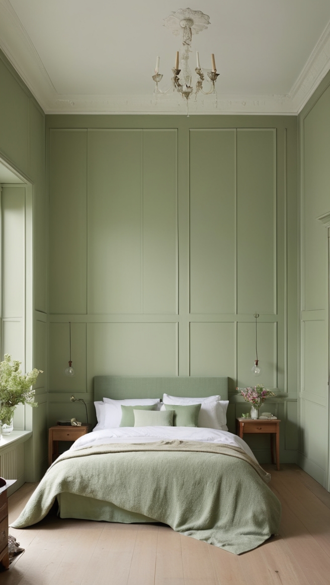
1. Bedroom
The calming properties of Wisteria make it an ideal choice for bedrooms. It creates a serene and relaxing environment, perfect for winding down after a long day.
2. Living Room
In the living room, Wisteria can add a touch of elegance and sophistication. Pair it with neutral furniture and metallic accents for a chic and stylish space.
3. Bathroom
Wisteria can transform a bathroom into a spa-like retreat. Its soothing color can make your daily routine feel more luxurious and relaxing.
4. Home Office
Create a calming and productive home office with Wisteria. This color can help reduce stress and enhance focus, making it easier to get work done.
5. Dining Room
In the dining room, Wisteria can create a warm and inviting atmosphere. Pair it with warm beige or soft gray for a sophisticated and elegant dining experience.
Conclusion:
Choosing the right paint color for your home can make a significant difference in the overall feel and aesthetic of your space. Wisteria, with its calming and versatile qualities, is the perfect choice for 2024. Whether you’re looking to create a peaceful sanctuary, a stylish living room, or a luxurious bathroom, Wisteria offers a timeless and elegant solution. By pairing it with complementary colors, integrating natural elements, and considering alternative shades from trusted brands like Sherwin-Williams and Benjamin Moore, you can transform any room into a beautiful and inviting space. Embrace the trend and let Wisteria bring a touch of tranquility and sophistication to your home.