
In the realm of interior design, colors wield immense power. They have the ability to influence mood, perception, and even productivity. As we delve into the trends of 2024, one shade emerges as a frontrunner for creating a serene and inviting atmosphere: Cosmetic Peach. This soft, warm hue brings a sense of tranquility and sophistication to any space, making it an ideal choice for revamping your reading area.
Why Cosmetic Peach Paint?
Cosmetic Peach paint offers a myriad of benefits that make it an exceptional choice for transforming your reading space. Here are several compelling reasons why you should consider this captivating hue:
- Calming Effect: In today’s fast-paced world, finding moments of peace and relaxation is essential. Cosmetic Peach exudes tranquility, creating a serene environment perfect for unwinding with a good book after a long day.
- Versatility: Cosmetic Peach is a versatile shade that complements a wide range of design styles, from modern to traditional. Its soft, understated tone pairs beautifully with both neutral and bold accents, allowing you to customize your reading nook to suit your personal taste.
- Warmth and Coziness: There’s something inherently cozy about the warm undertones of Cosmetic Peach. This inviting hue envelops your space in a comforting embrace, making it the perfect backdrop for curling up with a blanket and getting lost in a captivating story.
- Enhanced Concentration: Research suggests that certain colors can enhance cognitive function and concentration. The soft, gentle nature of Cosmetic Peach fosters a focused atmosphere, helping you immerse yourself fully in the world of literature without distractions.
- Timeless Elegance: While trends come and go, Cosmetic Peach stands the test of time with its timeless elegance. Unlike bolder, more trend-driven shades, this subtle hue remains effortlessly chic year after year, ensuring that your reading space remains stylish and inviting for years to come.
Tips for Matching Cosmetic Peach Paint:
When incorporating Cosmetic Peach paint into your reading space, it’s essential to consider how to harmonize it with other elements to create a cohesive look. Here are five tips to help you achieve a balanced and stylish aesthetic:
- Neutral Accents: Pair Cosmetic Peach walls with neutral accents such as crisp white furniture, natural wood finishes, and soft gray textiles. These understated tones will complement the warmth of the peach hue without overwhelming the space.
- Metallic Accents: Add a touch of glamour to your reading nook by incorporating metallic accents in gold or brass. Whether it’s a sleek floor lamp, decorative accessories, or a statement mirror, metallic finishes lend a sophisticated flair to the space while complementing the softness of Cosmetic Peach.
- Complementary Colors: Experiment with complementary colors to add visual interest to your reading area. Shades of sage green, dusty blue, and blush pink pair harmoniously with Cosmetic Peach, creating a balanced and inviting color palette that stimulates the senses without overwhelming the space.
- Natural Elements: Bring the outdoors in by incorporating natural elements such as plants, woven textures, and organic materials. Not only do these elements add visual interest and texture to your reading space, but they also complement the warmth and earthiness of Cosmetic Peach, creating a tranquil oasis inspired by nature.
- Layered Textures: Create depth and dimension in your reading nook by layering textures such as plush rugs, velvet cushions, and cozy throws. These tactile elements not only enhance the comfort and coziness of the space but also add visual richness and warmth to complement the softness of Cosmetic Peach.
Hue Matching for Cosmetic Peach Paint:
When selecting complementary hues to pair with Cosmetic Peach, consider the following five options to create a harmonious and visually appealing color palette:
- Soft Sage Green: The muted tones of sage green provide a soothing contrast to the warmth of Cosmetic Peach, creating a balanced and harmonious color palette reminiscent of a tranquil garden oasis.
- Dusty Rose: Embrace romance and sophistication by pairing Cosmetic Peach with dusty rose accents. This subtle yet elegant combination exudes a sense of timeless charm and femininity, perfect for creating a cozy reading nook with a touch of romance.
- Subtle Lavender: Infuse your reading space with a sense of serenity and relaxation by incorporating subtle lavender accents. The gentle purple undertones complement the warmth of Cosmetic Peach, creating a tranquil atmosphere ideal for unwinding with a good book.
- Soft Gray: For a classic and sophisticated look, pair Cosmetic Peach with soft gray accents. The cool, neutral tones of gray provide a subtle contrast to the warmth of peach, creating a modern and elegant color palette that never goes out of style.
- Pale Blue: Create a sense of serenity and tranquility in your reading nook by incorporating pale blue accents. The soft, calming hue of blue complements the warmth of Cosmetic Peach, evoking the peaceful ambiance of a clear sky on a sunny day.
Alternative Colors from Sherwin Williams and Benjamin Moore:
If Cosmetic Peach isn’t quite the right fit for your reading space, consider these alternative colors from Sherwin Williams and Benjamin Moore:
- Sherwin Williams – Alabaster: A timeless off-white hue with warm undertones, Sherwin Williams’ Alabaster creates a soft and inviting backdrop for your reading area, allowing other elements to take center stage.
- Benjamin Moore – Revere Pewter: A classic greige with subtle undertones of gray and beige, Benjamin Moore’s Revere Pewter adds sophistication and warmth to any space, making it an ideal choice for creating a cozy reading nook.
- Sherwin Williams – Sea Salt: A soft and soothing blue-green hue, Sherwin Williams’ Sea Salt brings a sense of tranquility and serenity to your reading space, evoking the calming beauty of the ocean.
- Benjamin Moore – Hale Navy: A rich and dramatic navy blue, Benjamin Moore’s Hale Navy adds depth and contrast to your reading area, creating a bold and sophisticated atmosphere that’s perfect for making a statement.
- Sherwin Williams – Agreeable Gray: A versatile and neutral gray with warm undertones, Sherwin Williams’ Agreeable Gray provides a soft and subtle backdrop for your reading nook, allowing other elements to shine.
Other Rooms to Use Cosmetic Peach:
While Cosmetic Peach is a perfect choice for transforming your reading space, its versatility allows it to shine in other rooms as well. Here are a few additional spaces where Cosmetic Peach can make a statement:
Living Room: Create a cozy and inviting atmosphere in your living room by incorporating Cosmetic Peach accents through throw pillows, curtains, and decorative accessories. Pair with neutral tones and natural textures for a relaxed yet sophisticated look.
Bedroom: Infuse your bedroom with warmth and serenity by painting the walls in Cosmetic Peach. Pair with soft, luxurious bedding and ambient lighting to create a tranquil retreat perfect for rest and relaxation.
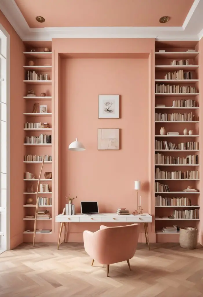
Home Office: Boost productivity and creativity in your home office by incorporating Cosmetic Peach accents through desk accessories, artwork, and storage solutions. Pair with crisp white furniture and natural wood finishes for a clean and organized workspace.
Conclusion:
In the ever-evolving world of interior design, Cosmetic Peach emerges as a timeless and versatile hue that’s perfect for transforming your reading space into a serene oasis of relaxation and inspiration. Whether you’re curling up with a good book or simply unwinding after a long day


