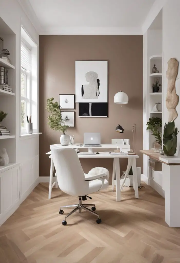
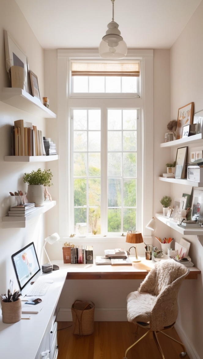
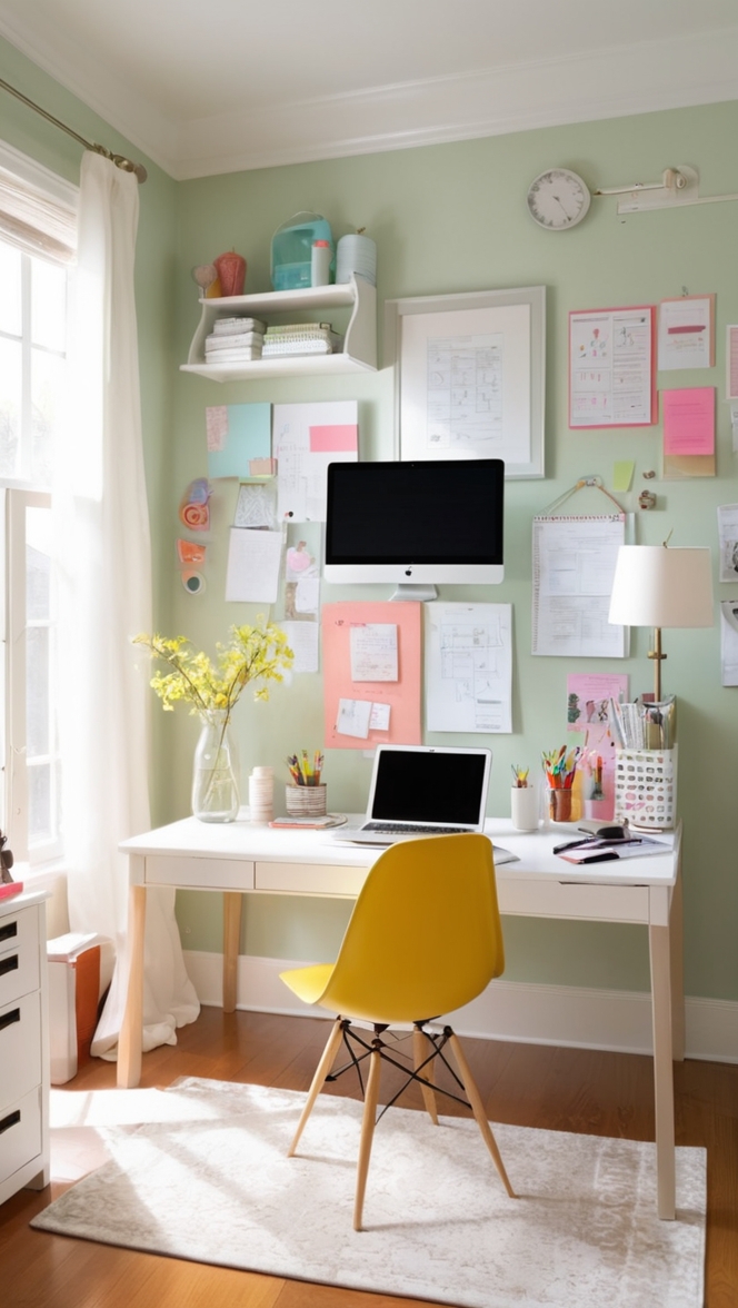
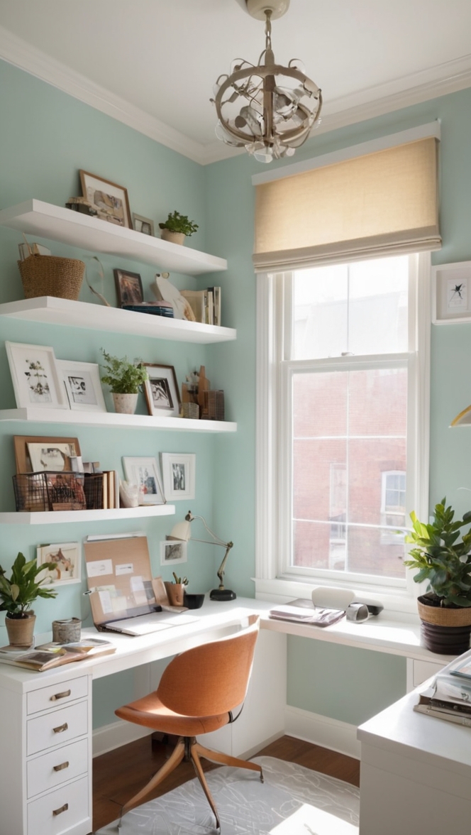
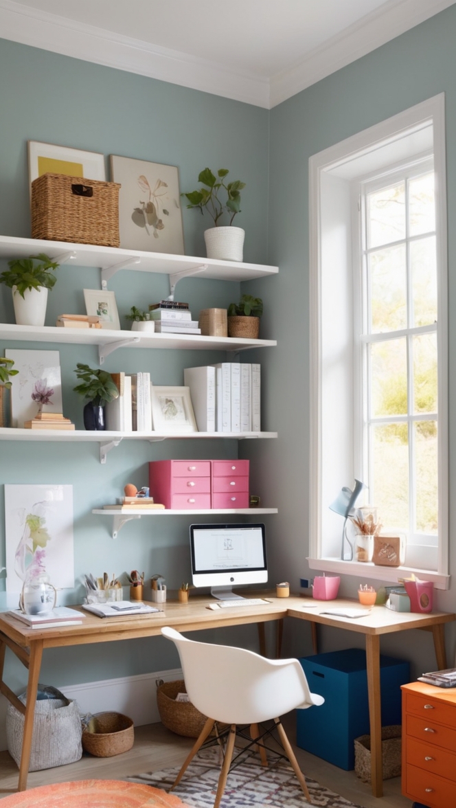
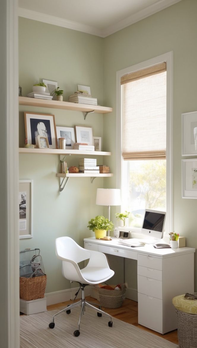
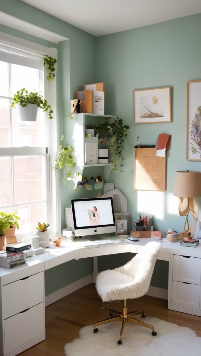
In the world of interior design, color is a powerful tool. It has the ability to influence mood, productivity, and even creativity. As we step into 2024, there’s one hue that’s taking the design world by storm: Nacre paint. This captivating color not only adds a touch of elegance to any space but also brings a sense of tranquility and sophistication. If you’re looking to elevate your office aesthetic, Nacre paint is the way to go.
Why Choose Nacre Paint?
Nacre paint, with its soft, pearlescent sheen, effortlessly blends modern sophistication with timeless elegance. Its subtle undertones of beige and gray make it a versatile choice that complements a wide range of design styles. Whether your office space is contemporary or traditional, Nacre paint adds a touch of warmth and sophistication that is unmatched by other hues.
Here are five reasons why Nacre paint should be your top choice for transforming your office space:
- Versatility: Nacre paint is incredibly versatile, making it suitable for various office environments. Whether you’re aiming for a minimalist look or a more eclectic style, this hue seamlessly integrates with existing decor elements, furniture, and accessories.
- Enhanced Lighting: The pearlescent quality of Nacre paint reflects light beautifully, creating a luminous and airy atmosphere in your office. This not only makes the space feel more spacious but also enhances visibility, making it ideal for workplaces where ample lighting is essential.
- Calming Effect: The soft, neutral tones of Nacre paint have a calming effect, making it conducive to productivity and focus. In a fast-paced work environment, incorporating this soothing hue can help reduce stress levels and promote a sense of tranquility among employees.
- Timeless Elegance: Unlike trendy colors that may quickly become outdated, Nacre paint exudes timeless elegance. Its understated sophistication ensures that your office will maintain a chic and stylish appearance for years to come, without the need for frequent updates.
- Professionalism: Nacre paint strikes the perfect balance between professionalism and warmth, making it an ideal choice for office settings. Whether you’re hosting clients or conducting meetings, the refined ambiance created by this hue leaves a lasting impression of professionalism and sophistication.
Tips to Match Nacre Paint:
- Accessorize with Metallic Accents: Incorporate metallic accents such as gold or silver to complement the pearlescent quality of Nacre paint, adding a touch of glamour to your office decor.
- Layer Textures: Create visual interest by layering different textures such as velvet, linen, and wood against the backdrop of Nacre paint, adding depth and dimension to your office space.
- Introduce Natural Elements: Bring the outdoors in by incorporating natural elements such as plants, stone, or wood furnishings, which harmonize beautifully with the earthy tones of Nacre paint.
- Play with Contrast: Experiment with contrasting colors such as deep navy or rich emerald to create a striking visual impact against the neutral backdrop of Nacre paint, adding depth and drama to your office design.
- Balance with White: Offset the warmth of Nacre paint by pairing it with crisp white accents, such as furniture or trim, for a fresh and modern look that feels both inviting and sophisticated.
Hue Matching with Nacre Paint:
- Soft Blush: Pair Nacre paint with soft blush tones to create a serene and feminine aesthetic that exudes understated elegance and sophistication.
- Sage Green: Combine Nacre paint with sage green accents for a refreshing and tranquil ambiance reminiscent of nature’s tranquility, perfect for fostering creativity and productivity.
- Dusty Blue: Incorporate dusty blue hues to complement Nacre paint, creating a harmonious and soothing environment that promotes relaxation and focus.
- Warm Taupe: Mix Nacre paint with warm taupe tones for a cozy and inviting atmosphere that feels both sophisticated and welcoming, ideal for collaborative workspaces or lounge areas.
- Charcoal Gray: Contrast Nacre paint with charcoal gray accents for a bold and dramatic look that exudes contemporary elegance, perfect for making a statement in reception areas or executive offices.
Alternative Colors from Sherwin Williams and Benjamin Moore:
- Sherwin Williams Alternative: “Accessible Beige” from Sherwin Williams offers a similar neutral tone to Nacre paint, with warm undertones that create a cozy and inviting atmosphere in any office space.
- Benjamin Moore Alternative: “Revere Pewter” by Benjamin Moore is another excellent alternative to Nacre paint, featuring a timeless gray-beige hue that adds sophistication and versatility to your office design scheme.
Other Rooms to Use Nacre Paint:
Reception Area: Create a welcoming first impression by painting the reception area with Nacre paint, setting the tone for professionalism and sophistication from the moment visitors step inside.
Conference Room: Foster a conducive environment for collaboration and creativity by incorporating Nacre paint into the conference room, promoting focus and productivity during meetings and brainstorming sessions.
Executive Office: Elevate the ambiance of executive offices with Nacre paint, exuding a sense of refinement and luxury that reflects the status and professionalism of its occupants.
Conclusion:
Nacre paint is more than just a color; it’s a statement of style and sophistication. With its versatile appeal, calming effect, and timeless elegance, Nacre paint is the perfect choice for transforming your office aesthetic in 2024 and beyond. Whether you’re aiming for a modern, minimalist look or a more traditional, elegant feel, this captivating hue effortlessly elevates any space, leaving a lasting impression of professionalism and refinement. So why wait? Embrace the beauty of Nacre paint and take your office design to new heights today.

