In the world of interior design, colors play a pivotal role in setting the mood, tone, and overall aesthetic of a space. As we stride into 2024, a year marked by innovation and fresh beginnings, it’s time to revitalize your office space with a hue that embodies vitality, creativity, and warmth. Enter Avid Apricot – a captivating shade that promises to breathe new life into your workplace. Here’s why you should consider adorning your office walls with this delightful color.
Why Avid Apricot?
Avid Apricot is more than just a color; it’s a statement. Its vibrant yet sophisticated hue strikes the perfect balance between energy and tranquility, making it ideal for fostering productivity and creativity in the workplace. As the world evolves, so do our work environments. Gone are the days of bland, uninspiring offices. Avid Apricot injects a sense of vitality and optimism into any space, stimulating the mind and uplifting the spirit.
Tips to Match Color:
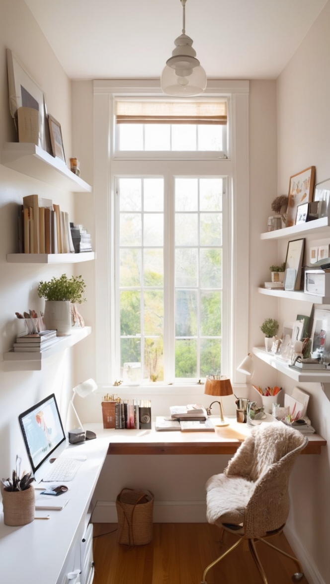
- Neutral Foundations: Pair Avid Apricot with neutral tones like white, beige, or light gray for a harmonious balance. This allows the color to pop without overwhelming the space, creating a serene yet inviting atmosphere.
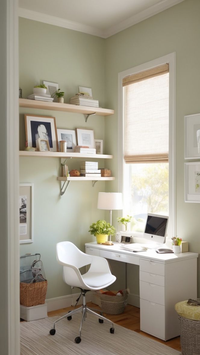
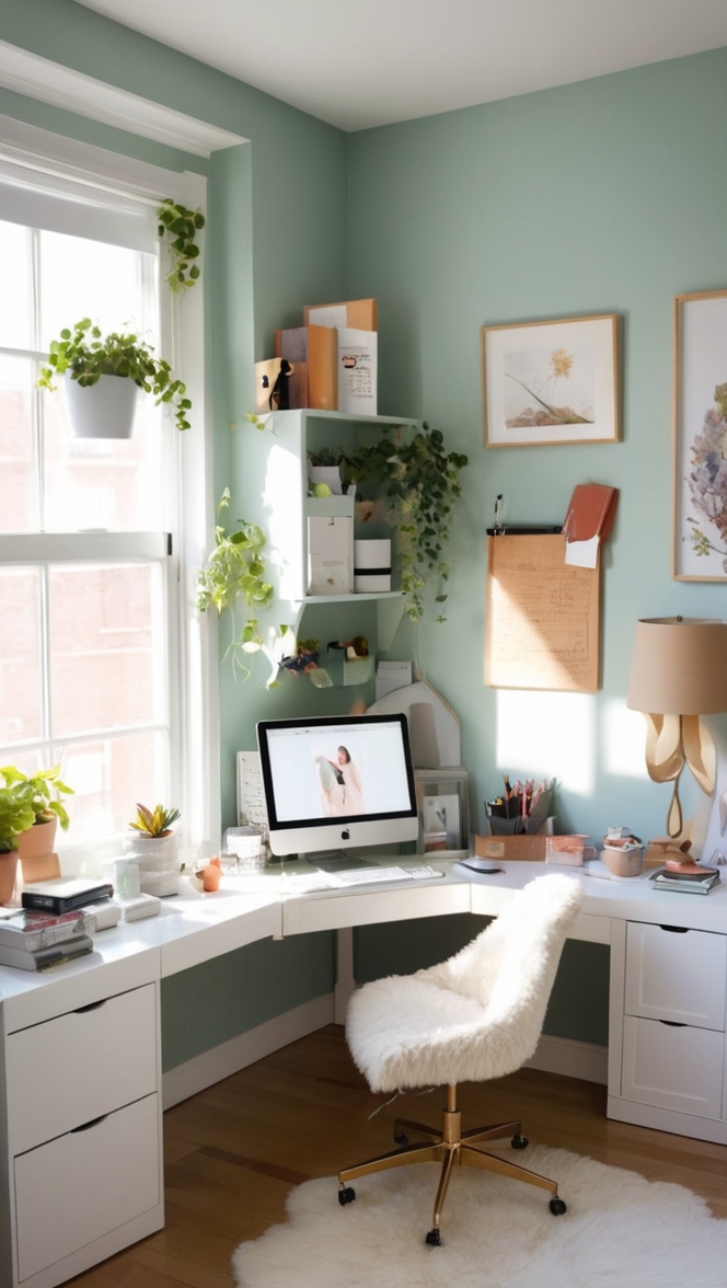
- Natural Accents: Incorporate elements of nature such as wooden furniture, indoor plants, or stone accents to complement Avid Apricot’s warmth. These natural textures add depth and visual interest to the room while enhancing the overall ambiance.
- Contrasting Elements: Experiment with contrasting colors like navy blue, emerald green, or charcoal gray to create a bold and dynamic look. Avid Apricot serves as the perfect backdrop for these rich, jewel-toned hues, adding depth and sophistication to your office space.
- Accent Pieces: Introduce accent pieces in complementary shades such as soft coral, dusty rose, or mustard yellow to enhance Avid Apricot’s vibrancy. Whether it’s throw pillows, artwork, or desk accessories, these pops of color add personality and charm to your workspace.
- Layered Textures: Play with layered textures such as plush rugs, velvet upholstery, or metallic finishes to add dimension to the room. Avid Apricot provides a versatile canvas for these textures to shine, creating a visually stimulating environment that encourages creativity and innovation.
Hue Matching:
- Peach Perfection: If you’re drawn to Avid Apricot’s warm undertones, consider complementary hues such as peach or coral. These shades evoke a sense of coziness and intimacy, perfect for creating a welcoming atmosphere in your office.
- Golden Glow: Embrace Avid Apricot’s sunny disposition by pairing it with shades of gold or amber. These radiant hues add a touch of glamour and luxury to your workspace, elevating the overall aesthetic and inspiring confidence and success.
- Terracotta Tones: For a more earthy and grounded feel, look to terracotta hues like rust or burnt sienna. These natural tones harmonize beautifully with Avid Apricot, creating a serene and nurturing environment that promotes focus and mindfulness.
- Warm Sunset: Channel the warmth and serenity of a summer sunset by combining Avid Apricot with soft shades of lavender or dusty pink. These calming hues evoke a sense of tranquility and relaxation, ideal for reducing stress and fostering a sense of well-being in the workplace.
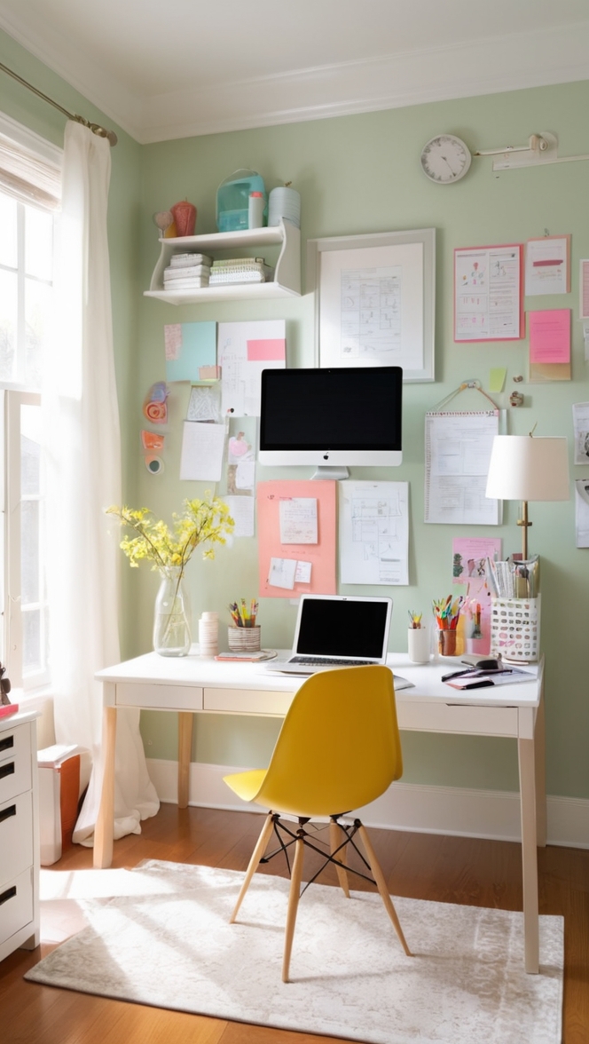
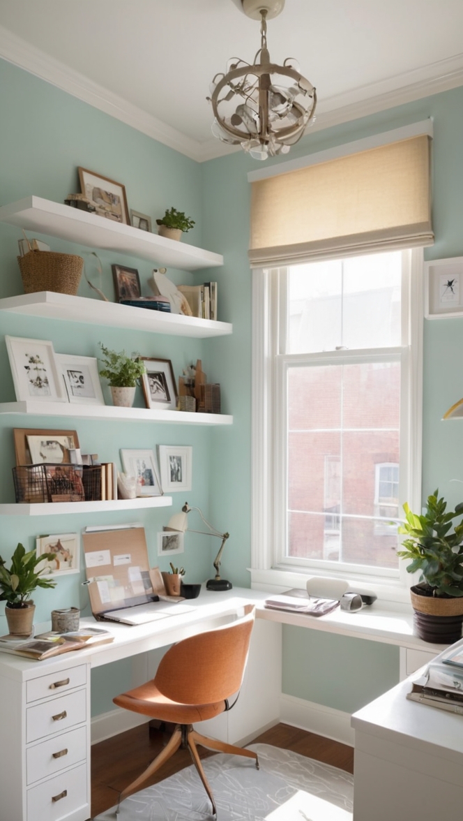
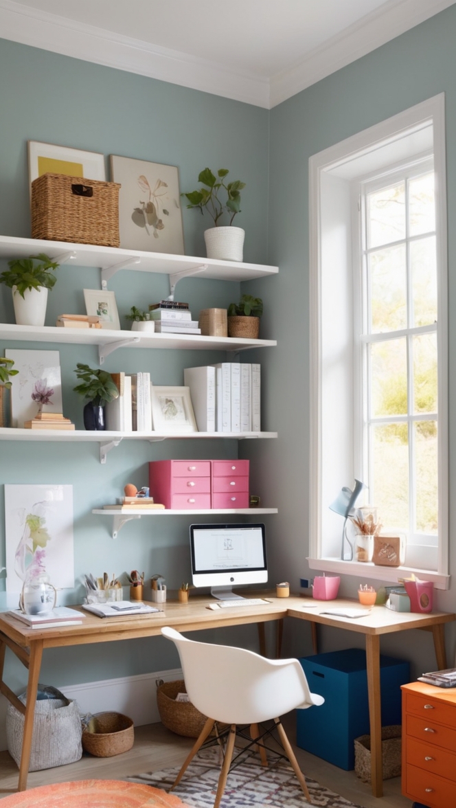
- Cool Contrast: Balance Avid Apricot’s warmth with cool tones such as mint green or sky blue. These refreshing hues create a sense of balance and harmony, injecting a dose of energy and vitality into your office space without overwhelming the senses.
Alternative Colors from Sherwin Williams and Benjamin Moore:
- Sherwin Williams Alternative: Consider “Coral Reef” from Sherwin Williams as an alternative to Avid Apricot. This lively shade infuses your office with energy and vitality, creating a space that inspires creativity and innovation.
- Benjamin Moore Alternative: Explore “Terra Cotta Tile” from Benjamin Moore for a timeless and elegant alternative to Avid Apricot. This rich, earthy hue adds warmth and sophistication to your office, setting the stage for productivity and success.
Other Rooms to Use Color:
Meeting Rooms: Energize your meeting rooms with Avid Apricot to foster collaboration and communication. The warm and inviting atmosphere created by this color encourages open dialogue and creativity, leading to more productive and impactful meetings.
Break Rooms: Transform your break room into a cozy retreat with Avid Apricot. This uplifting hue creates a welcoming environment where employees can unwind, recharge, and connect with their colleagues over a cup of coffee or a quick snack.
Reception Area: Make a lasting first impression on clients and visitors by incorporating Avid Apricot into your reception area. This vibrant and sophisticated color sets the tone for your company’s brand identity, exuding professionalism, warmth, and hospitality.
Conclusion:
In 2024, it’s time to reimagine your office space with Avid Apricot. This captivating hue not only transforms your workspace aesthetically but also enhances productivity, creativity, and well-being. By following these tips and exploring complementary hues, you can create a harmonious and inspiring environment that reflects the spirit of innovation and progress. Whether you’re revamping meeting rooms, break areas, or reception spaces, Avid Apricot is the perfect choice for elevating your office aesthetic to new heights.