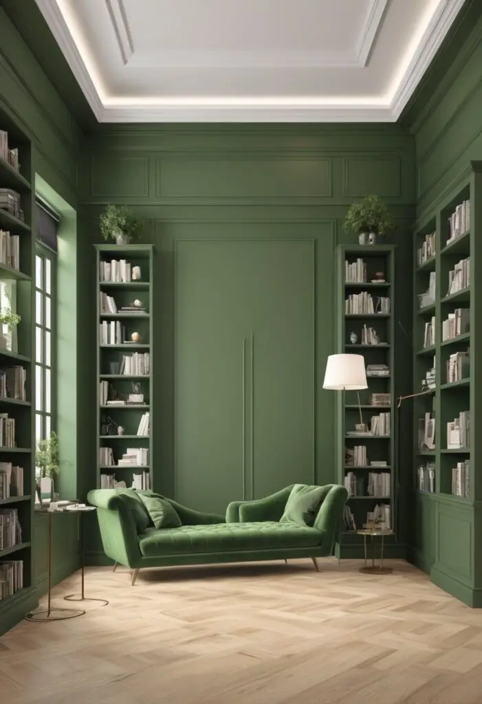
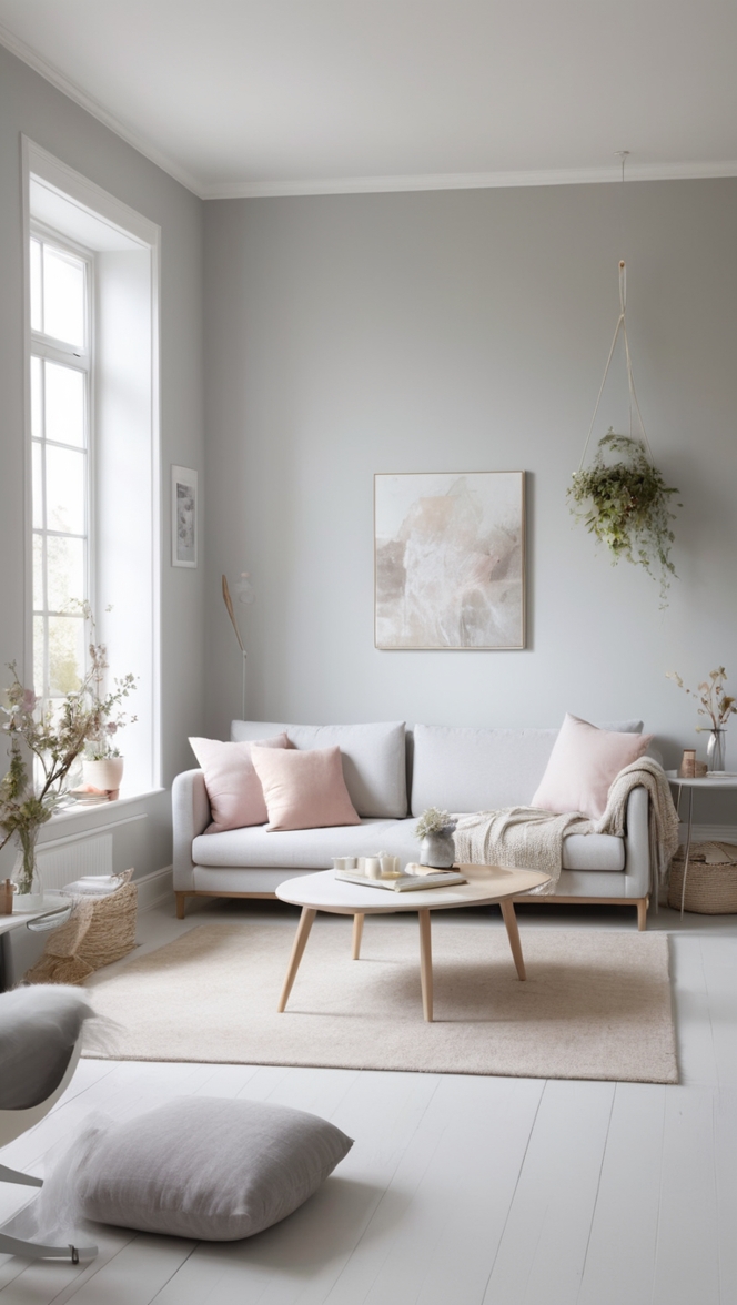
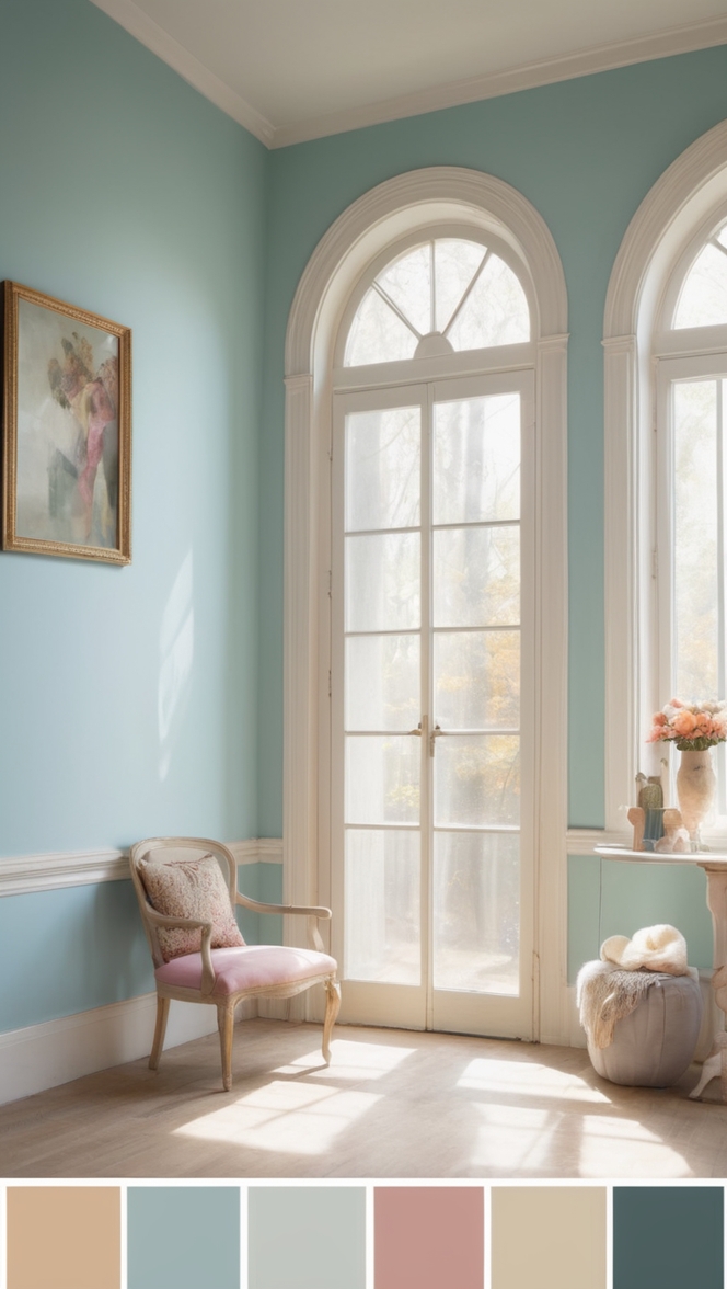
In the realm of interior design, color holds unparalleled power in shaping the ambiance and character of a space. As we usher in the year 2024, there’s a notable trend emerging – a shift towards hues that evoke tranquility and serenity. Among these, Reclining Green stands out as a versatile and soothing choice, ideal for transforming your library into a sanctuary of peace and inspiration.
Why Reclining Green?
Reclining Green, with its subtle yet profound presence, is the epitome of sophistication and calm. This nuanced shade of green infuses spaces with a sense of harmony, making it the perfect backdrop for a library where one seeks solace and intellectual stimulation. Here’s why you should consider this serene hue for your literary haven:
- Elevates Tranquility: In today’s fast-paced world, finding moments of tranquility is paramount. Reclining Green, with its calming undertones, creates an environment conducive to relaxation and focus, essential for unwinding with a good book.
- Enhances Concentration: The soft, muted nature of Reclining Green minimizes distractions, allowing your mind to delve deeply into the realms of literature without external interruptions. It fosters a conducive atmosphere for concentration and contemplation.
- Brings Nature Indoors: Green, often associated with nature, brings the serenity of the outdoors into your home. Reclining Green, in particular, evokes images of lush foliage and tranquil forests, reconnecting you with the natural world even as you immerse yourself in literary adventures.
- Versatile Elegance: Whether your library boasts traditional, contemporary, or eclectic aesthetics, Reclining Green effortlessly complements a variety of design styles. Its understated elegance serves as a sophisticated backdrop for diverse décor choices, from antique bookcases to modern furnishings.
- Timeless Appeal: Unlike fleeting design fads, Reclining Green transcends trends, ensuring that your library remains a timeless sanctuary for years to come. Its enduring charm makes it a wise investment in creating a space that evolves with your tastes and preferences.
Tips to Match Color:
- Natural Accents: Pair Reclining Green with natural materials such as wood and stone to enhance its organic allure. Incorporate wooden bookshelves, stone accents, or rattan furniture to create a harmonious blend of textures.
- Warm Metallics: Introduce warmth and sophistication by accessorizing with metallic accents in gold, brass, or copper. Picture frames, lighting fixtures, or decorative objects in these finishes add a touch of luxury to the serene backdrop of Reclining Green.
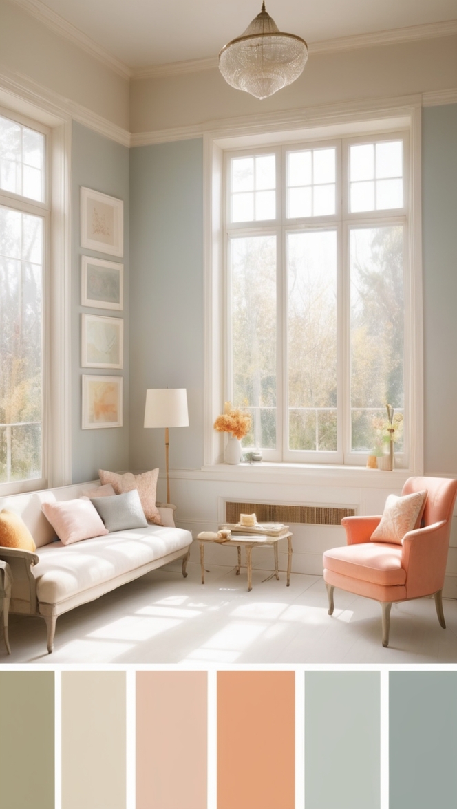
- Neutral Neighbors: Balance the richness of Reclining Green with neutral hues like soft beige, creamy white, or warm taupe. These understated tones create a sense of balance and allow the green to shine without overwhelming the space.
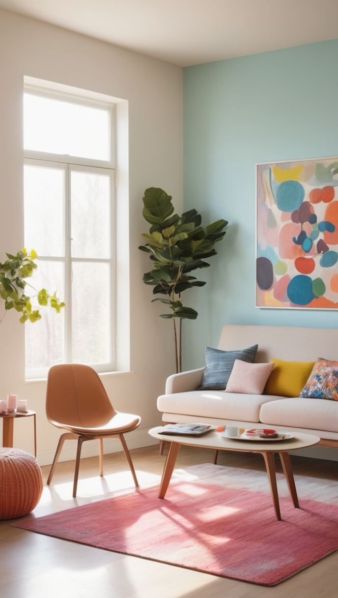
- Pop of Color: Inject personality and visual interest by incorporating pops of complementary colors. Consider accent pillows, throws, or artwork in shades of mustard yellow, deep navy, or terracotta to infuse your library with character while maintaining harmony with Reclining Green.
- Layered Lighting: Illuminate your library with layered lighting to enhance the ambiance and highlight the beauty of Reclining Green. Combine overhead fixtures with table lamps, floor lamps, and sconces to create a multifaceted lighting scheme that adds depth and dimension to the space.
Hue Matching:
- Soft Sage: For a lighter alternative, opt for soft sage green, which shares Reclining Green’s calming qualities while offering a slightly brighter hue that can visually expand smaller spaces.
- Mossy Olive: Embrace a deeper, earthier vibe with mossy olive green. This hue adds richness and depth to your library, creating a cozy atmosphere reminiscent of a secluded forest retreat.
- Subtle Teal: Infuse a hint of blue-green tranquility with subtle teal accents. Pairing Reclining Green with this refreshing hue creates a dynamic yet harmonious color palette that invigorates the senses.
- Pale Celadon: Explore the delicate charm of pale celadon green, a soft and ethereal hue that exudes understated elegance. This light green shade complements Reclining Green beautifully, adding a touch of serenity to your library.
- Forest Fern: Channel the lushness of the forest with forest fern green, a deep and verdant hue that envelops your library in a sense of mystery and enchantment. This bold color choice makes a statement while maintaining a connection to nature.
Alternative Colors from Sherwin Williams and Benjamin Moore:
- Sherwin Williams – Elation (SW 6827): This serene green hue from Sherwin Williams evokes a sense of joy and optimism, making it an excellent alternative to Reclining Green for those seeking a brighter, more uplifting vibe in their library.
- Benjamin Moore – Gray Cashmere (2138-60): For a sophisticated twist on traditional green, consider Gray Cashmere from Benjamin Moore. This subtle gray-green hue adds depth and complexity to your library while maintaining a refined, understated elegance.
Other Rooms to Use Color:
Living Room: Extend the calming influence of Reclining Green to your living room, creating a cohesive flow throughout your home. Use this serene hue on accent walls, upholstery, or decorative accessories to imbue the space with a sense of tranquility.
Bedroom: Foster restful nights and peaceful mornings by incorporating Reclining Green into your bedroom design. Whether as a soothing wall color, plush bedding, or accent pillows, this calming hue sets the stage for relaxation and rejuvenation.
Home Office: Boost productivity and creativity in your home office with the serene backdrop of Reclining Green. This calming hue promotes focus and concentration, creating an inspiring environment for work and study.
Conclusion:
In the quest to create a haven of tranquility and inspiration within your home, the choice of paint color plays a pivotal role. Reclining Green emerges as a timeless and versatile option, imbuing your library with a sense of calm sophistication that transcends fleeting trends. By incorporating this serene hue into your design scheme and following the suggested tips and alternatives, you can transform your library into a sanctuary where literary pursuits thrive amidst serene surroundings.

