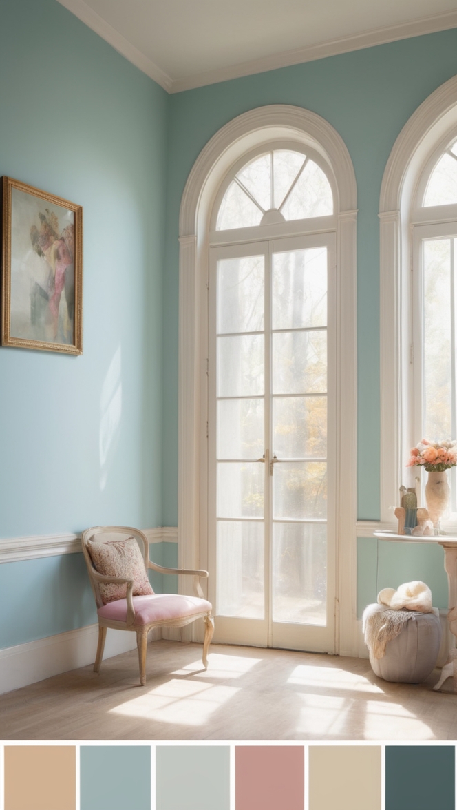
In a world often filled with chaos and noise, finding moments of serenity becomes essential. Your home should be a sanctuary, a place where you can escape the hustle and bustle of everyday life. One way to cultivate tranquility in your living space is through the thoughtful selection of paint colors. For 2024, why not consider the calming allure of Cucumber Paint?
Why Choose Cucumber Paint?
Cucumber Paint embodies the soothing essence of nature. Its soft, muted green tones evoke images of lush, verdant landscapes and tranquil forest groves. This hue effortlessly brings a sense of calm and rejuvenation to any room it graces, making it an ideal choice for your library.
5 Tips to Match Color:
- Natural Elements: Complement the serene vibe of Cucumber Paint by incorporating natural elements into your library decor. Think wooden bookshelves, rattan furniture, and potted plants to create a harmonious blend of indoor and outdoor aesthetics.
- Lighting: Pay attention to lighting when selecting complementary colors and furnishings. Soft, diffused lighting enhances the peaceful ambiance of Cucumber Paint, while harsh or overly bright lights may detract from its calming effect.
- Textiles: Introduce soft, inviting textiles in neutral tones to balance the coolness of Cucumber Paint. Think cozy throws, plush rugs, and linen curtains to add warmth and texture to your library space.
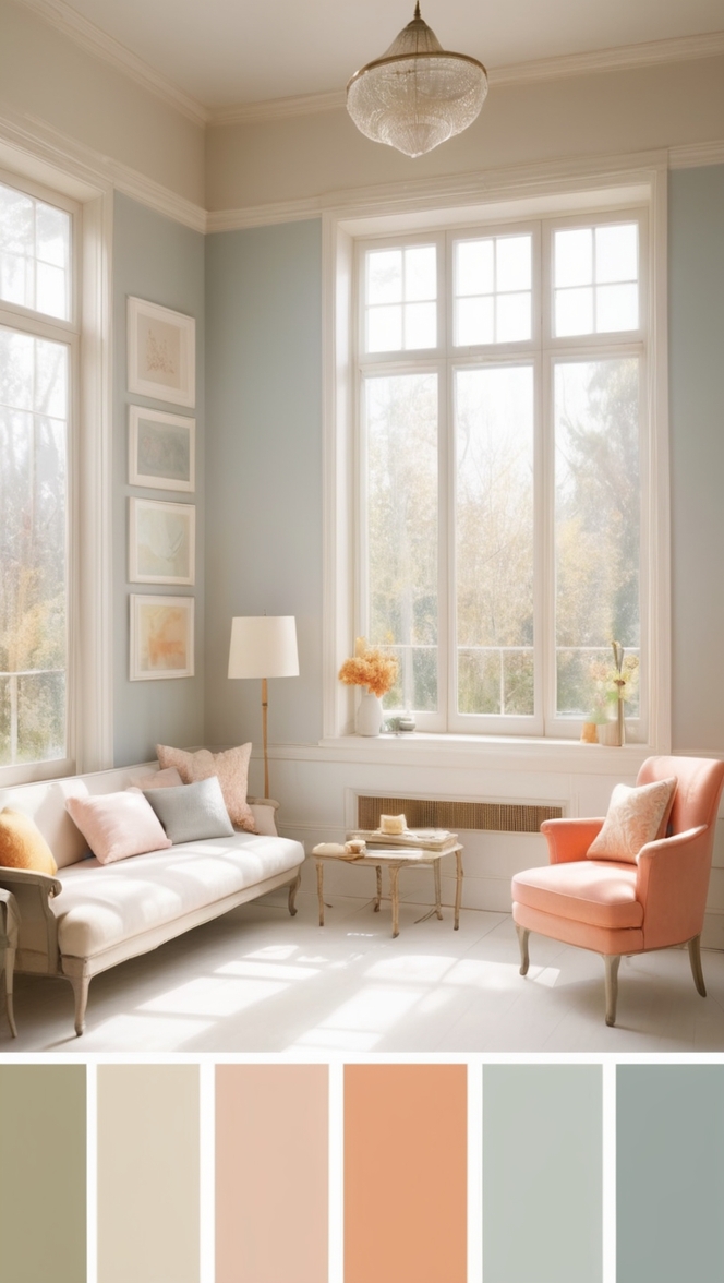
- Accent Pieces: Incorporate accent pieces in complementary colors to add depth and visual interest to your library. Consider incorporating earthy tones like sandy beige or warm taupe to create a cohesive color palette that enhances the tranquility of Cucumber Paint.
- Personal Touches: Infuse your library with personal touches that reflect your unique style and interests. Whether it’s displaying cherished artwork, incorporating family heirlooms, or showcasing travel souvenirs, adding personal elements to your space will make it truly your own.
5 Hue Matching Options:
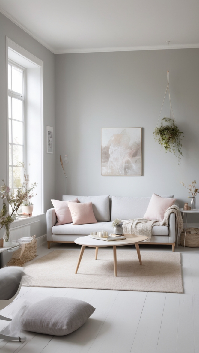
- Soft Gray: Pairing Cucumber Paint with soft gray accents creates a sophisticated yet serene atmosphere in your library. Opt for gray upholstered furniture, throw pillows, or accent walls to complement the cool undertones of Cucumber Paint.
- Powder Blue: For a refreshing twist, consider pairing Cucumber Paint with accents in powder blue. This soft, airy hue harmonizes beautifully with the natural green tones of Cucumber Paint, creating a space reminiscent of a tranquil spring day.
- Creamy White: Embrace understated elegance by combining Cucumber Paint with creamy white accents. White furniture, trim, and accessories add brightness and contrast to your library, while allowing the calming green hue to take center stage.
- Earthy Brown: Ground the soothing ambiance of Cucumber Paint with accents in earthy brown tones. Rich chocolate brown or warm caramel accents add depth and warmth to your library, creating a cozy retreat perfect for curling up with a good book.
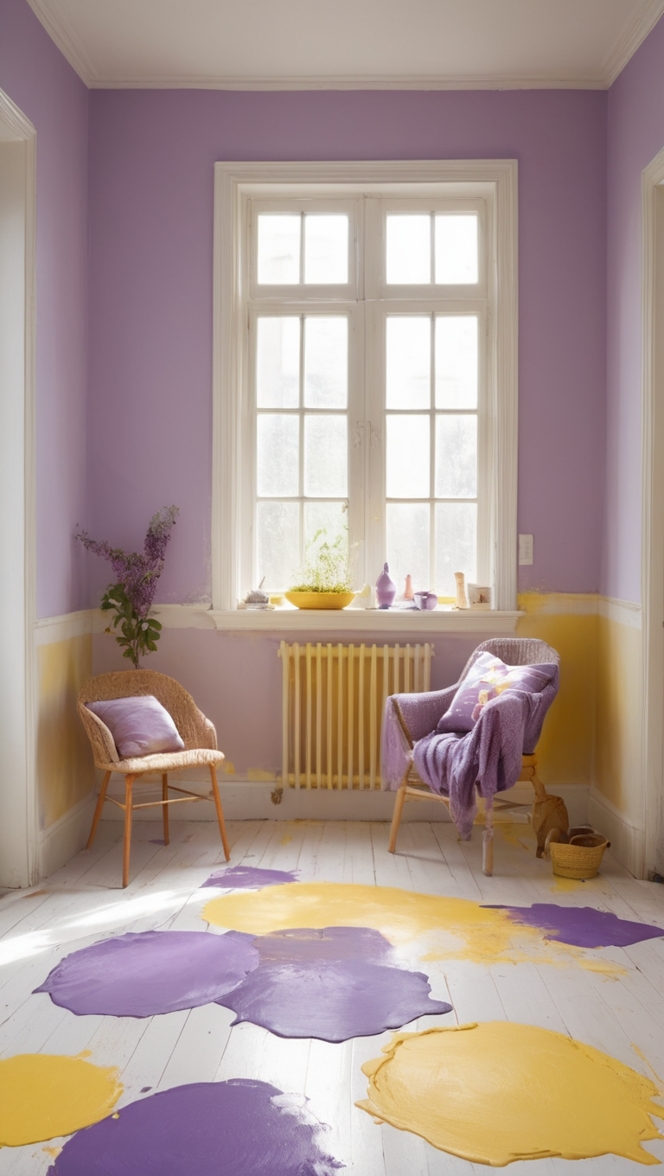
- Soft Lavender: Infuse your library with a hint of romance by pairing Cucumber Paint with accents in soft lavender. This delicate hue adds a touch of whimsy and femininity to your space, while complementing the serene green backdrop.
5 Alternative Colors from Sherwin Williams and Benjamin Moore:
- Sherwin Williams – Rainwashed (SW 6211): This soft, blue-green hue complements Cucumber Paint beautifully, creating a serene and inviting atmosphere in your library.
- Sherwin Williams – Sea Salt (SW 6204): With its subtle gray undertones, Sea Salt adds depth and sophistication to your library, while harmonizing effortlessly with the cool green tones of Cucumber Paint.
- Benjamin Moore – Palladian Blue (HC-144): Palladian Blue infuses your library with a timeless elegance, its soft, muted blue-green hue creating a serene backdrop for relaxation and contemplation.
- Benjamin Moore – Soft Fern (2144-40): Soft Fern pairs perfectly with Cucumber Paint, its muted green tones blending seamlessly to create a cohesive and calming environment in your library.
- Benjamin Moore – Gray Owl (OC-52): For a modern twist, consider pairing Cucumber Paint with Gray Owl. This versatile gray hue complements the cool green tones of Cucumber Paint, adding depth and sophistication to your library space.
Other Rooms to Use Color:
Bedroom: Create a peaceful oasis in your bedroom by painting the walls in Cucumber Paint. Pair with crisp white bedding, soft gray accents, and natural wood furniture for a serene and inviting retreat.
Bathroom: Transform your bathroom into a spa-like sanctuary with Cucumber Paint. Add plush white towels, natural stone accents, and potted plants to create a tranquil escape perfect for unwinding after a long day.
Home Office: Boost productivity and creativity in your home office with Cucumber Paint. Pair with sleek white furniture, pops of vibrant green, and plenty of natural light to create a stimulating yet serene work environment.
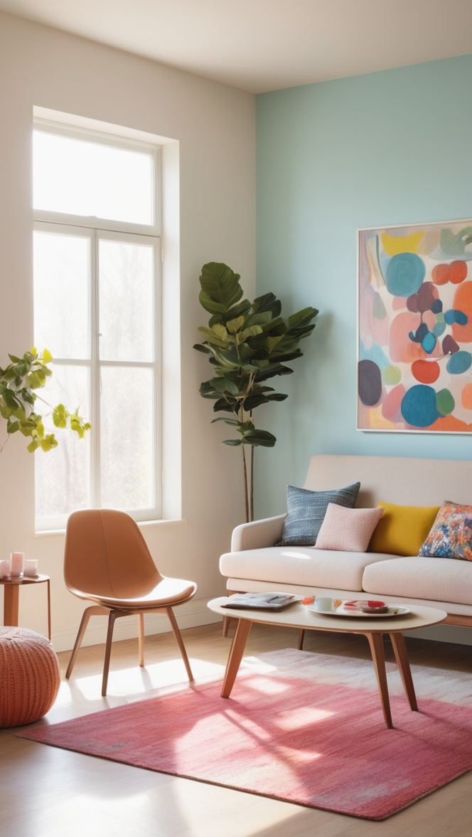
Living Room: Infuse your living room with a sense of tranquility by painting the walls in Cucumber Paint. Add cozy neutral furniture, plush textiles, and pops of earthy green for a welcoming space that invites relaxation and conversation.
Kitchen: Bring a touch of nature into your kitchen with Cucumber Paint. Pair with crisp white cabinets, natural wood accents, and stainless steel appliances for a fresh and inviting space that inspires culinary creativity.
Conclusion:
Incorporating Cucumber Paint into your home decor is a simple yet effective way to create a serene and tranquil environment. Whether you’re transforming your library, bedroom, or home office, this soothing hue brings a sense of calm and rejuvenation to any room it graces. With careful consideration of complementary colors, textures, and accents, you can cultivate a space that not only looks beautiful but also promotes relaxation and well-being. Embrace the serenity of Cucumber Paint and transform your home into a sanctuary where you can escape the stresses of everyday life and find peace amidst the chaos.

