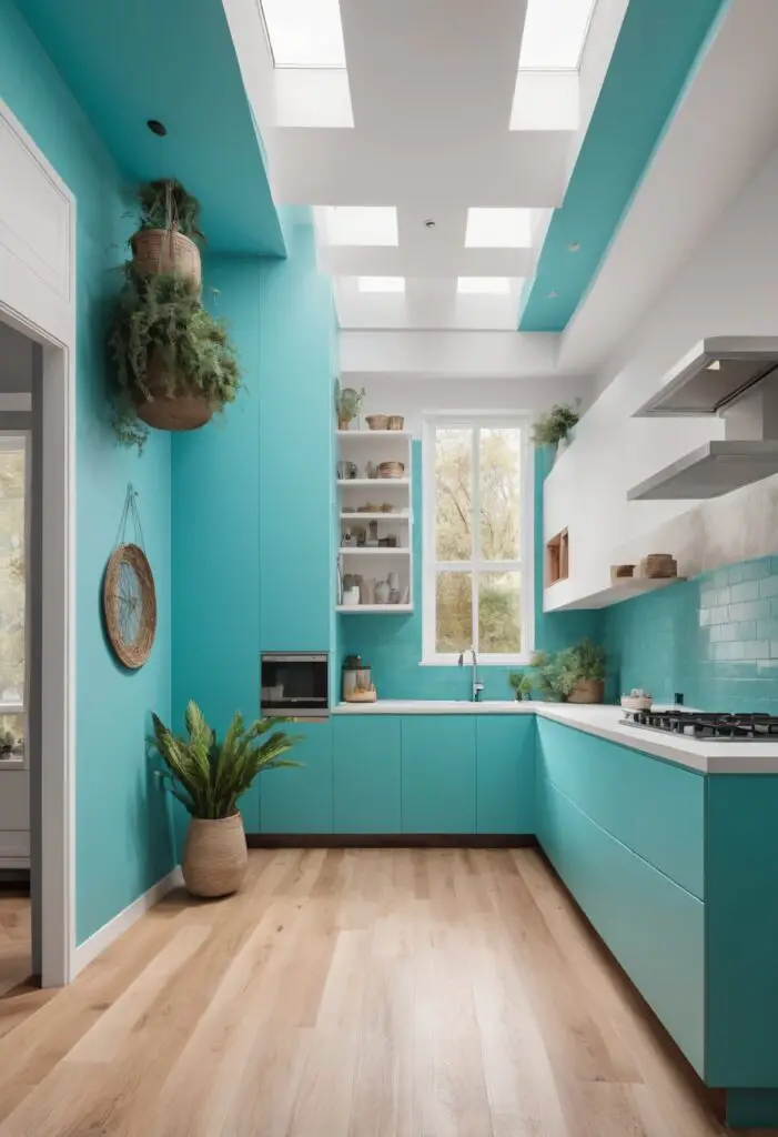
In the world of interior design, color is a powerful tool that can dramatically transform a space. For 2024, one color that stands out is Holiday Turquoise. This vibrant and refreshing shade not only breathes new life into your kitchen but also adds a modern flair that can make your home feel more inviting and stylish. Here’s why Holiday Turquoise is the must-have paint color for your kitchen this year, along with tips on how to match it, complementary hues, alternative colors from Sherwin-Williams and Benjamin Moore, and suggestions for other rooms in your house.
Why Choose Holiday Turquoise for Your Kitchen?
Holiday Turquoise is an invigorating color that exudes a sense of freshness and energy. It is a versatile hue that can brighten up any space, making it feel more open and lively. Here are some reasons why you should consider Holiday Turquoise for your kitchen:
- Modern Appeal: Turquoise is a contemporary color that aligns with modern design trends. It pairs well with minimalist and sleek kitchen designs, providing a pop of color that stands out against neutral backgrounds.
- Emotional Impact: Colors significantly influence our emotions. Turquoise is known for its calming yet uplifting properties. It can make your kitchen a pleasant place to be, reducing stress and promoting a positive atmosphere.
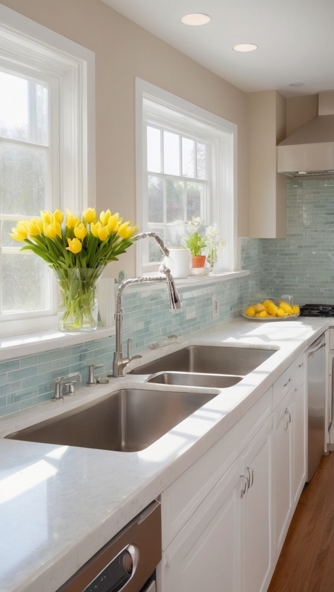
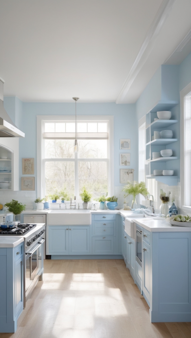
- Versatility: This shade of turquoise works well with a variety of other colors and materials, including wood, metal, and glass. It can complement both warm and cool tones, making it a flexible choice for any kitchen style.
- Reflective Quality: The bright and reflective quality of turquoise can enhance natural light, making your kitchen appear larger and more inviting. It’s particularly effective in smaller kitchens where space and light are limited.
- Timeless Elegance: While it’s a modern color, turquoise also has a timeless appeal. It can fit into various design eras, from mid-century modern to contemporary chic, ensuring that your kitchen remains stylish for years to come.
5 Tips to Match Holiday Turquoise in Your Kitchen:
1. Pair with Neutral Tones
Neutral tones like white, beige, or gray are perfect complements to Holiday Turquoise. These colors provide a clean backdrop that allows the turquoise to stand out without overwhelming the space.
2. Use Metallic Accents
Metallic accents such as stainless steel, brushed nickel, or copper can enhance the modern feel of Holiday Turquoise. These materials add a touch of sophistication and help balance the vibrant color.
3. Incorporate Natural Elements
Wooden elements, such as countertops, cabinetry, or flooring, can soften the boldness of turquoise and create a harmonious balance. Opt for lighter woods like maple or birch to keep the space airy.
4. Add Contrast with Dark Colors
Introduce dark colors like navy blue or charcoal to create contrast. This can be done through accessories, appliances, or even a feature wall. The contrast will add depth and visual interest to your kitchen.
5. Play with Patterns and Textures
Patterns and textures can add another layer of interest to your kitchen. Consider using patterned tiles for a backsplash or textured fabrics for curtains and seat cushions. These elements will complement the turquoise and add a dynamic feel.
5 Hue Matching Ideas for Holiday Turquoise:
1. Soft Pastels
Soft pastels like blush pink, lavender, and mint green can create a gentle and soothing palette when paired with Holiday Turquoise. These colors work well in creating a serene and inviting kitchen space.
2. Bold and Bright
For a more vibrant look, combine Holiday Turquoise with bold colors like coral, fuchsia, or sunny yellow. This combination is energetic and fun, perfect for a lively and dynamic kitchen environment.
3. Earthy Tones
Earthy tones like terracotta, olive green, and mustard yellow can ground the brightness of turquoise and create a warm, welcoming kitchen. These colors bring an organic feel that complements the refreshing quality of turquoise.
4. Monochromatic Schemes
Create a sophisticated look with a monochromatic scheme by using different shades of turquoise and teal. This layered approach adds depth and sophistication while maintaining a cohesive and modern aesthetic.
5. Cool Grays and Whites
Cool grays and whites can enhance the crispness of Holiday Turquoise. These colors keep the kitchen looking clean and modern, while the turquoise adds a splash of personality.
5 Alternative Colors from Sherwin-Williams and Benjamin Moore:
1. Sherwin-Williams “Swimming” (SW 6764)
Swimming is a vibrant and playful turquoise that can bring a similar freshness and modern flair to your kitchen as Holiday Turquoise.
2. Benjamin Moore “Tropicana Cabana” (2048-50)
Tropicana Cabana is a bright turquoise that exudes energy and cheerfulness. It’s perfect for creating a lively and inviting kitchen atmosphere.
3. Sherwin-Williams “Lagoon” (SW 6480)
Lagoon is a deep, rich turquoise that adds a touch of elegance and depth to your kitchen. It pairs well with both modern and traditional design elements.
4. Benjamin Moore “Aruba Blue” (2049-30)
Aruba Blue is a bold, tropical turquoise that can transport you to a beachside retreat. It’s an excellent choice for adding a vacation-like feel to your kitchen.
5. Sherwin-Williams “Aqua-Sphere” (SW 7613)
Aqua-Sphere is a soft, muted turquoise that offers a more subdued and calming effect. It’s ideal for creating a tranquil and relaxing kitchen space.
Other Rooms to Use Holiday Turquoise:
Holiday Turquoise isn’t just limited to the kitchen. Its versatility makes it suitable for various rooms throughout your home:
Living Room
In the living room, Holiday Turquoise can serve as an accent wall or be used for furniture and accessories. It can create a lively and inviting atmosphere, perfect for entertaining guests.
Bathroom
In the bathroom, Holiday Turquoise can evoke a spa-like feel. Use it for tiles, walls, or cabinetry to create a fresh and clean space.
Bedroom
For a bedroom, Holiday Turquoise can add a calming yet uplifting vibe. It pairs well with white or neutral bedding and can be used for an accent wall or decorative elements.
Home Office
In a home office, Holiday Turquoise can stimulate creativity and reduce stress. It’s a great choice for a feature wall or office furniture.
Dining Room
In the dining room, Holiday Turquoise can create an energetic and cheerful environment. Use it for walls, table settings, or decorative accents to make meals more enjoyable.
Conclusion:
Holiday Turquoise is an exceptional color choice for those looking to transform their kitchen and bring a modern flair to their home in 2024. Its vibrant and refreshing qualities make it a standout option that can brighten up any space. By pairing it with complementary colors, incorporating natural and metallic elements, and exploring alternative hues, you can create a stylish and harmonious kitchen that reflects your personal taste. Additionally, Holiday Turquoise’s versatility makes it a fantastic choice for other rooms in your home, ensuring that its lively charm can be enjoyed throughout your living space.Briefly introduce the appeal of Holiday Turquoise and its relevance in 2024.