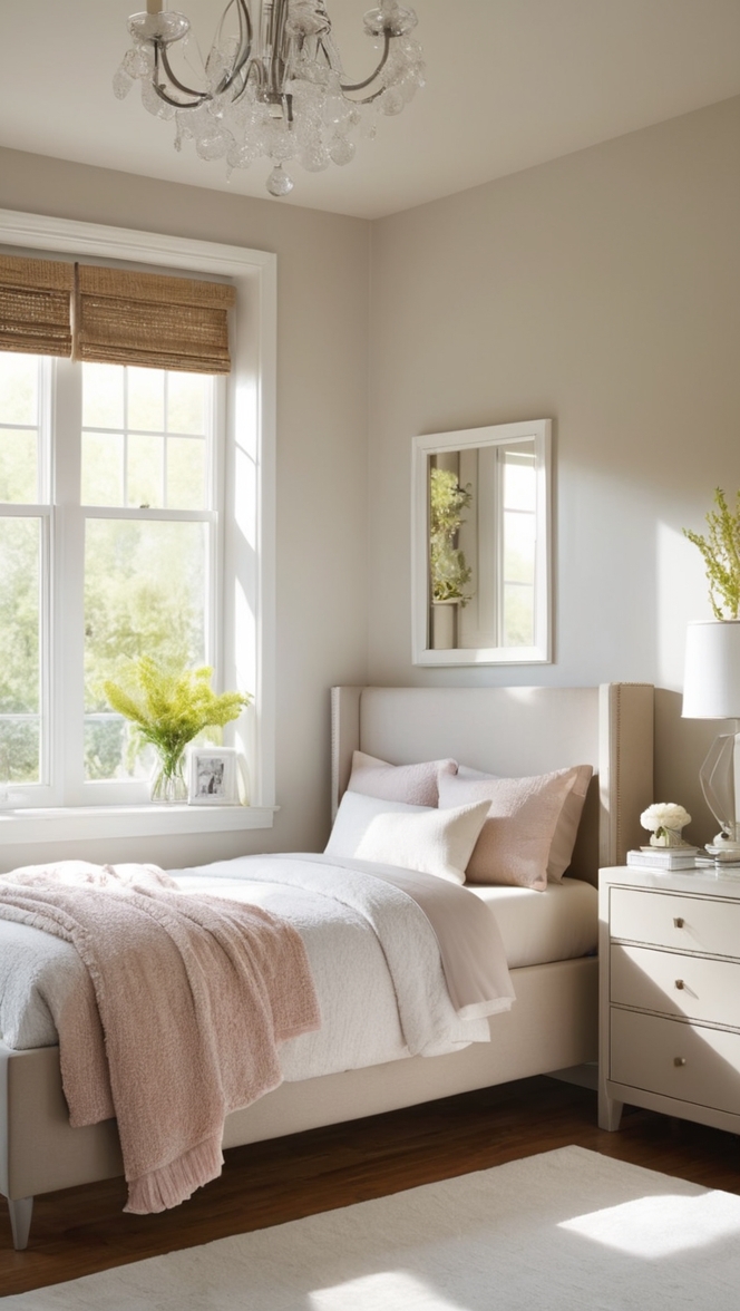
In the world of interior design, the choice of paint color holds immense significance, as it serves as the foundation for the entire aesthetic of a room. Among the myriad of options available, Cream stands out as a timeless and versatile choice, offering a perfect blend of warmth, sophistication, and tranquility. As we step into 2024, Compatible Cream paint emerges as a frontrunner for modern bedroom makeovers, bringing a touch of elegance and contemporary charm. Let’s delve into the reasons why Compatible Cream is the ideal choice and explore tips, hue matching, alternative options, and other rooms where this color can work its magic.
5 Tips to Match Compatible Cream Paint
Successfully :
- Consider Lighting: Before finalizing your paint choice, it’s crucial to evaluate the lighting conditions in your bedroom. Compatible Cream adapts well to both natural and artificial light, providing a consistent and inviting ambiance. However, if your room receives ample natural light, the cream tones may appear slightly warmer, while under artificial light, it takes on a subtle coolness.
- Coordinate with Furniture: To create a cohesive and harmonious look, coordinate the Compatible Cream paint with your bedroom furniture. Darker wood tones, such as walnut or mahogany, complement the warmth of the cream, while lighter furniture, like white or light oak, enhances the overall brightness of the room.
- Accents and Accessories: Infuse pops of color through accessories like throw pillows, bed linens, and artwork. Consider shades like navy blue, sage green, or even a soft blush to add depth and visual interest to the space while maintaining the tranquility of Compatible Cream.
- Test Before Committing: Paint can look different in varying light conditions and against different surfaces. Before committing to Compatible Cream, obtain paint samples and apply them to a small section of your bedroom wall. This allows you to observe how the color interacts with your room’s specific characteristics.
- Pair with Neutral Colors: Create a sophisticated palette by pairing Compatible Cream with other neutral colors. Shades like soft gray, muted taupe, or classic white can complement the cream tones, adding layers and dimension to your bedroom.
5 Hue Matching Options for Compatible Cream Paint
- Subtle Greige Accents: Incorporating subtle greige (a blend of gray and beige) elements into your bedroom can seamlessly enhance the elegance of Compatible Cream. Greige accents, such as a rug, throw blanket, or accent wall, add a touch of modernity while maintaining the overall warm and inviting atmosphere.
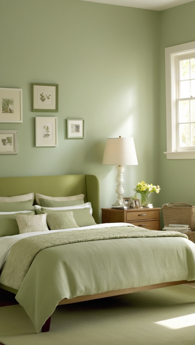
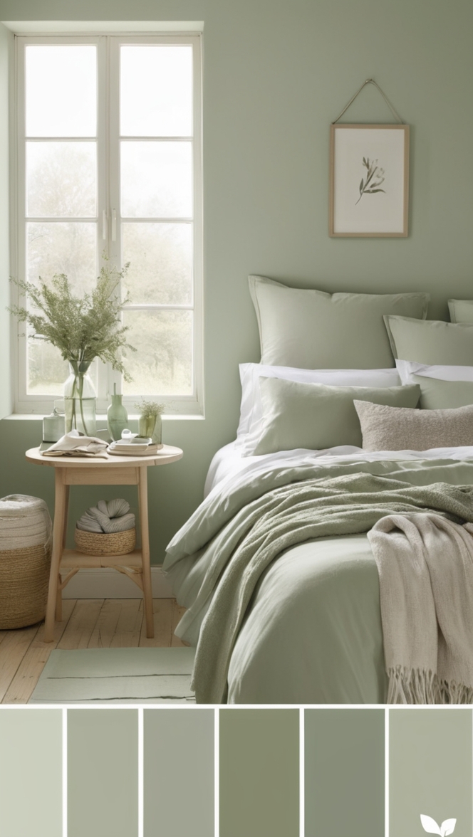
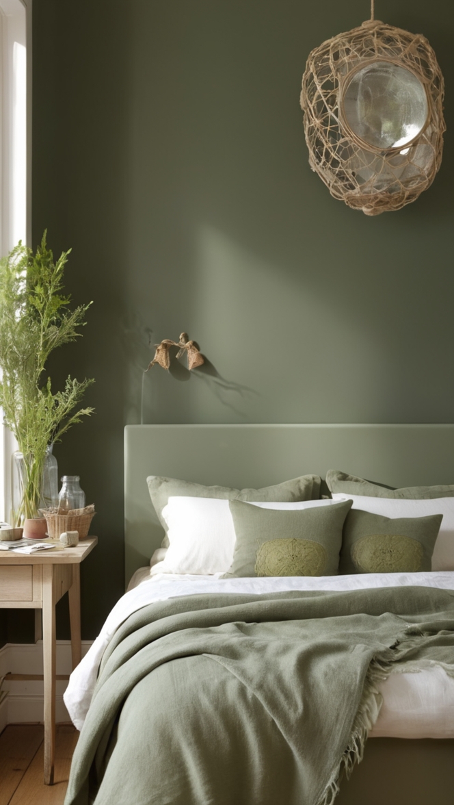
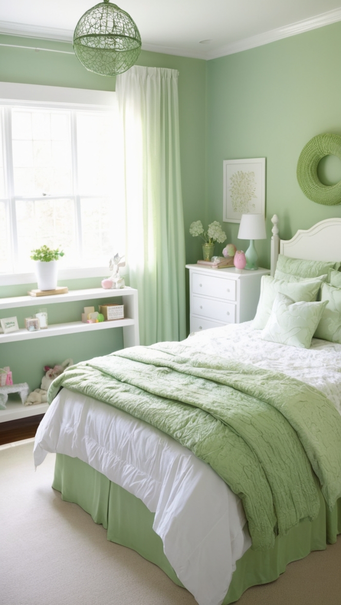
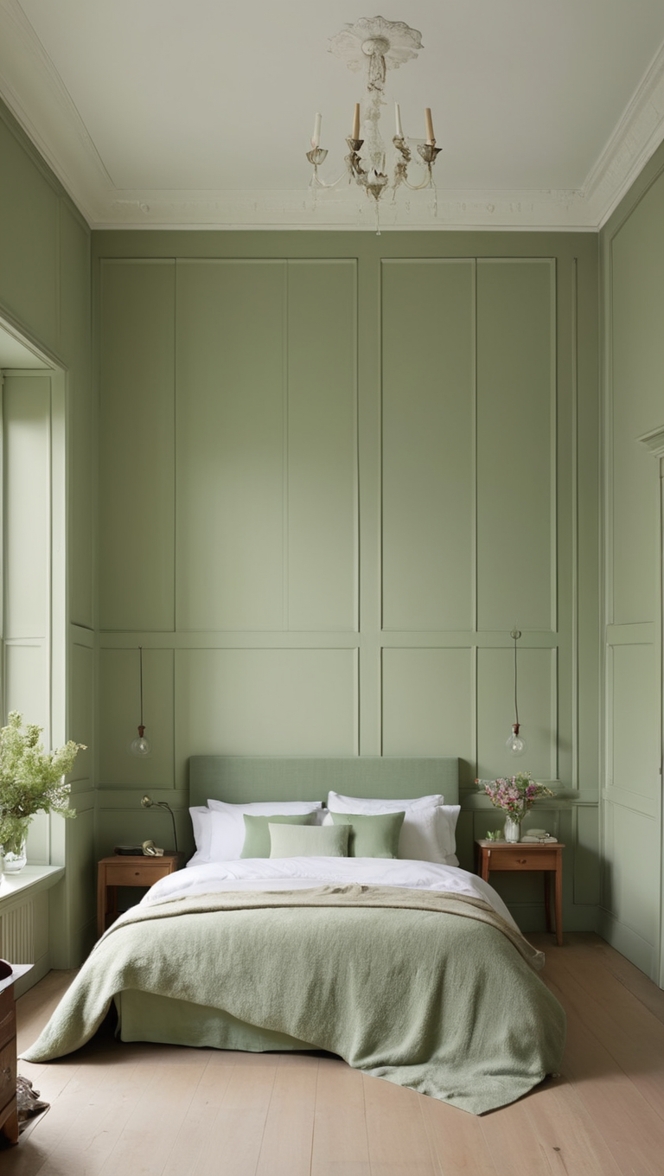
- Soft Sage Green Harmony: For a nature-inspired and calming bedroom, pair Compatible Cream with soft sage green. This combination creates a serene atmosphere, invoking a sense of tranquility and bringing the outdoors inside. Consider using sage green for accent walls, bedding, or decorative elements.
- Navy Blue Sophistication: To infuse a sense of sophistication and depth into your bedroom, opt for navy blue accents with Compatible Cream paint. Navy blue contrasts beautifully with cream, creating a timeless and classic aesthetic. Incorporate navy blue through bed linens, curtains, or statement furniture pieces.
- Blush Pink Elegance: For a touch of romance and subtle femininity, consider pairing Compatible Cream with blush pink accents. Soft and sophisticated, this combination adds a delicate charm to the bedroom. Integrate blush pink through decorative pillows, artwork, or a statement chair.
- Charcoal Gray Contrast: Achieve a modern and edgy look by incorporating charcoal gray into your bedroom design alongside Compatible Cream. Charcoal gray accent walls, furniture, or decor items create a striking contrast, adding depth and visual interest to the overall color scheme.
5 Alternative Colors from Sherwin Williams and
Benjamin Moore :
- Sherwin Williams – Alabaster (SW 7008): A warm and inviting white, Alabaster by Sherwin Williams complements Compatible Cream beautifully. Use Alabaster for trim, molding, or as an accent color to create a cohesive and timeless look.
- Benjamin Moore – Revere Pewter (HC-172): Revere Pewter is a versatile greige that pairs seamlessly with Compatible Cream. This neutral hue adds depth and sophistication, making it an excellent choice for accent walls or furniture pieces.
- Sherwin Williams – Accessible Beige (SW 7036): A soft and neutral beige, Accessible Beige works well in tandem with Compatible Cream. This combination creates a warm and inviting atmosphere, perfect for a cozy bedroom retreat.
- Benjamin Moore – Gray Owl (OC-52): Gray Owl is a light and airy gray that complements the warmth of Compatible Cream. Use Gray Owl for furniture, textiles, or as an accent color to achieve a balanced and contemporary look.
- Sherwin Williams – Sea Salt (SW 6204): For a coastal-inspired bedroom, consider pairing Compatible Cream with Sherwin Williams’ Sea Salt. This soft blue-green hue adds a refreshing and tranquil vibe to the space, creating a serene retreat.
Other Rooms to Use Compatible Cream Paint :
Living Room
Compatible Cream extends its versatility beyond the bedroom, making it an excellent choice for living rooms. Create a welcoming and sophisticated atmosphere by pairing it with plush sofas, wooden furniture, and subtle pops of color through accessories.
Dining Room
Elevate your dining room’s elegance by incorporating Compatible Cream on the walls. This neutral backdrop sets the stage for various dining room styles, from traditional to modern. Enhance the look with a stylish dining table, chairs, and complementary decor.
Home Office
In a home office, Compatible Cream fosters a serene and focused environment. The neutral backdrop allows for a clean and organized workspace, while pops of color in office accessories or artwork can add personality and inspiration.
Conclusion :
In conclusion, Compatible Cream paint emerges as a timeless and versatile choice for modern bedroom makeovers in 2024. Its ability to adapt to various design elements, from furniture to accent colors, makes it a go-to option for creating a harmonious and tranquil atmosphere. The tips provided ensure a successful match with other elements in the room, while the suggested hue pairings and alternative color options from Sherwin Williams and Benjamin Moore offer a comprehensive guide for a cohesive design. Extend the magic of Compatible Cream beyond the bedroom to living rooms, dining rooms, and home offices, where its versatility truly shines. Embrace the allure of Timeless Tranquility with Compatible Cream, transforming your living spaces into havens of modern sophistication and comfort.