
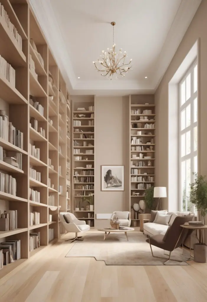
In the ever-evolving landscape of interior design, certain elements endure the test of time. One such element is the timeless elegance of crème paint color. In 2024, as modern libraries continue to redefine themselves as multifunctional spaces, crème emerges as a quintessential choice, blending sophistication with versatility. This hue not only enhances the aesthetic appeal of libraries but also fosters an ambiance conducive to learning, creativity, and relaxation.
Why Choose Crème Paint?
- Versatility: Crème serves as a versatile backdrop, seamlessly complementing a variety of design styles and materials. Whether your library boasts contemporary furnishings or leans towards a more traditional aesthetic, crème paint effortlessly integrates into the space, creating a cohesive and harmonious atmosphere.
- Timeless Appeal: Unlike trendy colors that may quickly become outdated, crème exudes timeless elegance. Its understated sophistication ensures that your library remains stylish and relevant for years to come, transcending fleeting design fads.
- Warmth and Serenity: Crème paint infuses libraries with a sense of warmth and serenity, making them inviting sanctuaries for reading, studying, and contemplation. The soft, neutral tones evoke feelings of tranquility, encouraging visitors to unwind and immerse themselves in the world of literature.
- Enhanced Lighting: Crème paint has the remarkable ability to amplify natural and artificial lighting, thereby brightening up the library space. By reflecting light more effectively than darker hues, crème paint contributes to a well-lit environment conducive to reading and other activities.
- Visual Expansion: In smaller or compact libraries, crème paint can create the illusion of a larger space. Its light, airy quality visually expands the room, making it feel more open and spacious—a particularly advantageous feature for optimizing functionality in modern libraries.
5 Tips to Match Crème Paint Color:
- Consider Existing Décor: When selecting a crème paint color, take into account the existing furniture, flooring, and décor elements in your library. Opt for a shade of crème that harmonizes with the predominant colors and materials in the space, ensuring a cohesive and unified design scheme.
- Test in Different Lighting Conditions: Before committing to a specific crème paint color, test samples in various lighting conditions within your library. Natural light, artificial lighting, and the orientation of windows can significantly influence how the paint color appears, so it’s essential to evaluate its suitability under different lighting scenarios.
- Balance with Accents: To prevent the library from feeling monotonous, incorporate accents in complementary colors to add visual interest and dimension. Accessories such as throw pillows, rugs, artwork, and decorative objects can introduce pops of color while accentuating the timeless elegance of crème paint.
- Consider the Functionality of the Space: Assess the primary functions of your library, whether it’s a quiet reading room, a collaborative study area, or a multifunctional space. Choose a crème paint color that aligns with the intended use of the room while promoting a conducive environment for its occupants.
- Evaluate Long-Term Durability: Select a high-quality paint with excellent durability and washability to ensure the longevity of your library’s aesthetic appeal. Crème paint colors that resist stains, fading, and wear-and-tear will maintain their beauty and elegance over time, minimizing the need for frequent repainting.
5 Hue Matching Options:
- Soft Gray: Pairing crème paint with soft gray accents creates a sophisticated and contemporary color palette. The subtle contrast between crème and gray adds depth to the space while maintaining a cohesive and harmonious ambiance.
- Sage Green: For libraries seeking a calming and nature-inspired aesthetic, combining crème paint with sage green accents can evoke a sense of tranquility and rejuvenation. This harmonious color combination creates a serene environment conducive to focused study and relaxation.
- Navy Blue: To infuse the library with a touch of elegance and depth, consider pairing crème paint with navy blue accents. The juxtaposition of crème’s soft warmth with navy blue’s richness and sophistication adds visual interest and drama to the space, creating a refined and inviting atmosphere.
- Warm Taupe: Combining crème paint with warm taupe accents enhances the library’s cozy and inviting ambiance. The harmonious interplay between crème’s neutrality and taupe’s earthy warmth creates a welcoming environment that encourages comfort and relaxation.
- Blush Pink: For libraries aiming to incorporate subtle femininity and softness into their design, crème paint paired with blush pink accents offers an elegant and sophisticated color palette. This delicate combination exudes warmth and charm, creating a tranquil and inviting space for readers to escape into their favorite books.
5 Alternative Colors from Sherwin Williams and Benjamin Moore:
- Sherwin Williams – Alabaster (SW 7008): This timeless off-white hue from Sherwin Williams serves as an excellent alternative to crème paint, offering a clean and fresh aesthetic that complements a wide range of design styles.
- Sherwin Williams – Agreeable Gray (SW 7029): For libraries desiring a modern and versatile color scheme, Agreeable Gray provides a subtle yet sophisticated backdrop that pairs beautifully with crème accents and furnishings.
- Benjamin Moore – White Dove (OC-17): Benjamin Moore’s White Dove offers a soft, warm white hue that enhances the brightness and airiness of any space, making it an ideal alternative to crème paint for libraries seeking a timeless and elegant look.
- Benjamin Moore – Revere Pewter (HC-172): This timeless greige shade from Benjamin Moore strikes the perfect balance between gray and beige, creating a versatile and sophisticated backdrop for libraries looking to achieve a contemporary yet classic aesthetic.
- Sherwin Williams – Accessible Beige (SW 7036): Accessible Beige offers a warm and inviting neutral tone that complements crème paint beautifully, creating a cohesive and harmonious color palette that exudes timeless elegance and sophistication.
Other Rooms to Use Crème Paint:
Living Room: In the living room, crème paint creates a welcoming and versatile backdrop for entertaining guests or relaxing with family. Pair it with rich textiles, plush furniture, and metallic accents to enhance its elegance and sophistication.
Bedroom: Crème paint fosters a serene and tranquil atmosphere in the bedroom, promoting restful sleep and relaxation. Combine it with soft textiles, warm lighting, and natural elements to create a cozy and inviting retreat.
Dining Room: In the dining room, crème paint sets the stage for elegant dinner parties and intimate gatherings. Enhance its sophistication with luxurious dining furniture, statement lighting, and ornate décor for a timeless and refined aesthetic.
Home Office: Crème paint cultivates a productive and inspiring environment in the home office, fostering creativity and focus. Pair it with sleek, modern furnishings, ample storage solutions, and personalized décor to create a stylish and functional workspace.
Conclusion:
In the ever-evolving landscape of interior design, crème paint emerges as a timeless and versatile choice for modern libraries in 2024. Its understated elegance, warmth, and versatility make it the perfect backdrop for creating inviting and sophisticated library spaces that inspire learning, creativity, and relaxation. By following these tips for color matching and exploring alternative hues from Sherwin Williams and Benjamin Moore, you can.


