In the bustling world of interior design, finding the perfect paint color can feel akin to discovering a rare gem. With the ever-evolving trends and fleeting fads, it’s essential to choose a hue that stands the test of time while exuding sophistication and versatility. Enter Choice Cream—a hue that embodies elegance, warmth, and timelessness. Here’s why you should consider making Choice Cream the star of your office walls in 2024.
Why Choice Cream?
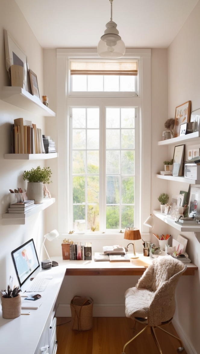
Choice Cream is more than just a color; it’s a statement of refined taste and enduring style. Its soft, creamy undertones create a welcoming ambiance that fosters productivity and creativity within the workspace. Unlike trendy colors that quickly lose their allure, Choice Cream remains a classic choice that complements various design aesthetics, from modern to traditional. Its neutral base serves as the perfect backdrop for accent pieces and artwork, allowing them to shine without overwhelming the space.
5 Tips to Match Choice Cream:
- Embrace Contrasting Tones: Pair Choice Cream with darker hues such as navy blue or charcoal for a sophisticated contrast that adds depth to the room.
- Opt for Natural Elements: Incorporate wooden furniture or accents in warm tones to enhance Choice Cream’s natural warmth and create a harmonious environment.
- Play with Textures: Experiment with textured fabrics like linen or velvet in complementary colors to add visual interest and dimension to the space.
- Balance with White: Use crisp white trim or furnishings to balance Choice Cream’s softness and maintain a fresh, airy feel.
- Consider Lighting: Take into account the natural and artificial lighting in your office space, as it can influence how Choice Cream appears throughout the day. Test samples under different lighting conditions to ensure the perfect match.
5 Hue Matching Options:
- Rich Navy Blue: Create a timeless color scheme by pairing Choice Cream with a rich navy blue. This combination exudes sophistication and adds a sense of depth to the space.
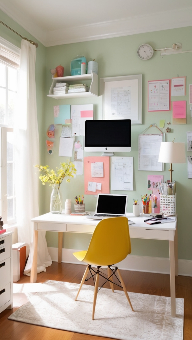
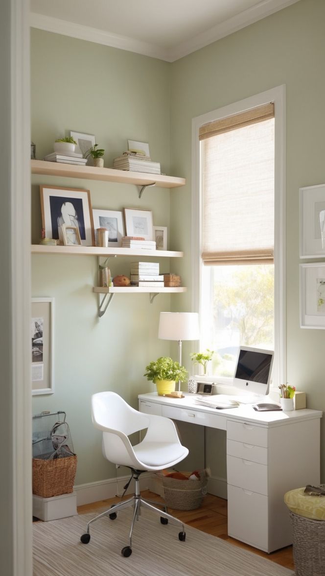
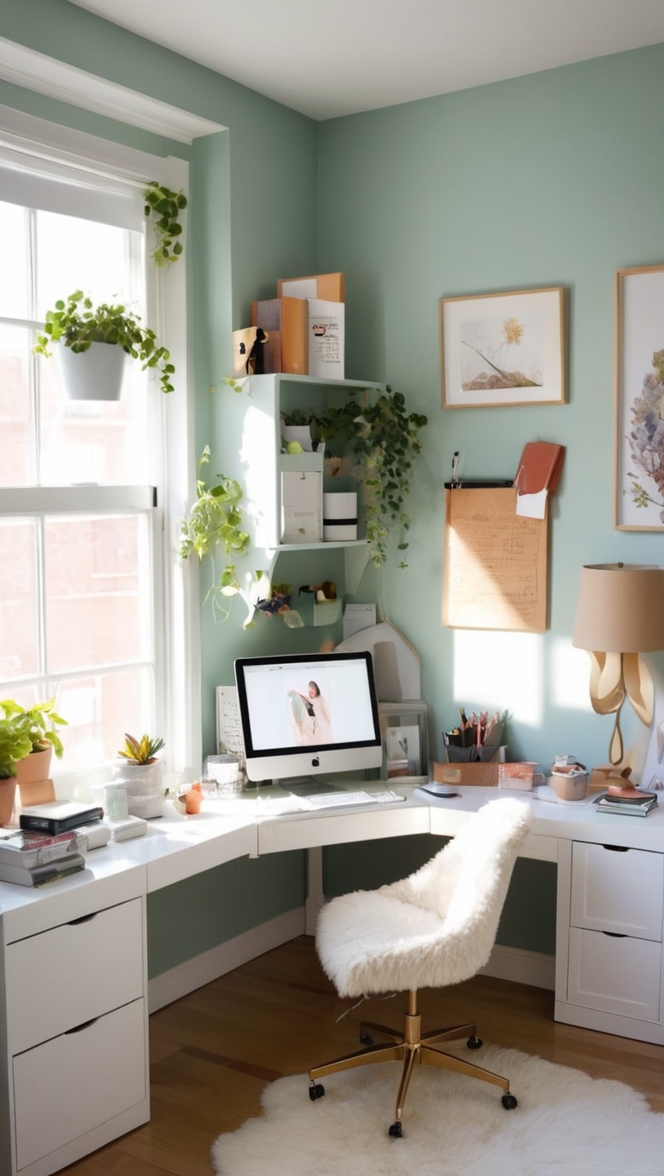
- Soft Sage Green: For a calming and refreshing vibe, pair Choice Cream with soft sage green accents. This combination brings the tranquility of nature indoors while maintaining an elegant aesthetic.
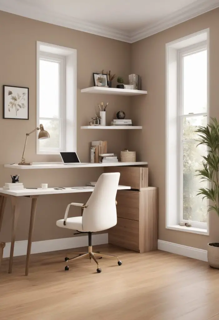
- Warm Taupe: Enhance Choice Cream’s warmth with accents in a warm taupe hue. This pairing creates a cozy and inviting atmosphere, perfect for fostering collaboration and creativity.
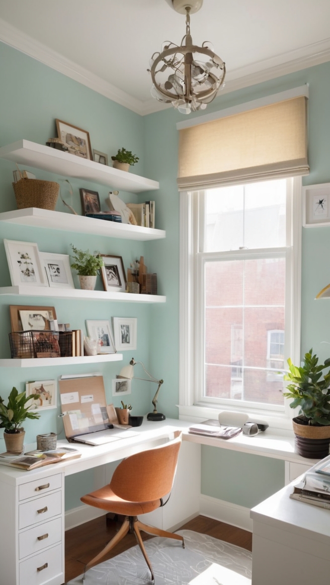
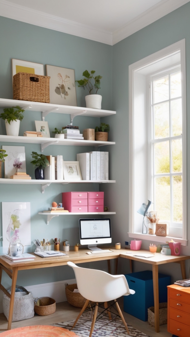
- Subtle Gray: Achieve a contemporary look by combining Choice Cream with subtle gray tones. This pairing is understated yet chic, ideal for modern office spaces seeking a touch of sophistication.
- Earthy Terracotta: Infuse warmth and character into your office with earthy terracotta accents against Choice Cream walls. This pairing adds a pop of color while maintaining a timeless appeal.
5 Alternative Colors from Sherwin Williams and Benjamin Moore:
- Sherwin Williams Alabaster (SW 7008): A classic off-white hue with warm undertones that complements Choice Cream beautifully, creating an elegant and cohesive look.
- Sherwin Williams Agreeable Gray (SW 7029): A versatile greige shade that pairs seamlessly with Choice Cream, offering a contemporary yet timeless color palette.
- Benjamin Moore Revere Pewter (HC-172): A sophisticated greige with a hint of warmth, perfect for creating a modern and inviting office space when combined with Choice Cream.
- Benjamin Moore Edgecomb Gray (HC-173): A soft and understated greige hue that harmonizes effortlessly with Choice Cream, creating a serene and balanced atmosphere.
- Sherwin Williams Accessible Beige (SW 7036): A warm beige tone that complements Choice Cream beautifully, adding warmth and depth to the office environment.
Other Rooms to Use Choice Cream:
Meeting Rooms: Foster a welcoming atmosphere for productive discussions and brainstorming sessions by painting meeting room walls in Choice Cream. Pair with sleek furniture and pops of color for a modern yet inviting space.
Reception Area: Make a lasting first impression on clients and visitors by adorning the reception area walls with Choice Cream. Enhance the warmth and professionalism of the space with plush seating and statement artwork.
Executive Offices: Create an executive oasis of sophistication and tranquility by painting office walls in Choice Cream. Pair with luxurious furnishings and personalized accents for a space that exudes elegance and professionalism.
Breakroom: Promote relaxation and rejuvenation in the breakroom by incorporating Choice Cream on the walls. Combine with cheerful accents and comfortable seating to create a cozy retreat for employees.
Conclusion:
In the ever-changing landscape of interior design, Choice Cream stands as a beacon of timeless beauty and versatility. Its soft, creamy hue serves as a canvas for endless design possibilities, whether you’re aiming for a modern aesthetic or a more traditional ambiance. By embracing Choice Cream as your office paint color of 2024, you’re not only investing in a classic hue but also creating a workspace that inspires productivity, fosters creativity, and leaves a lasting impression on all who enter. With its ability to adapt to various design elements and color schemes, Choice Cream truly embodies the essence of timeless beauty in interior design.