
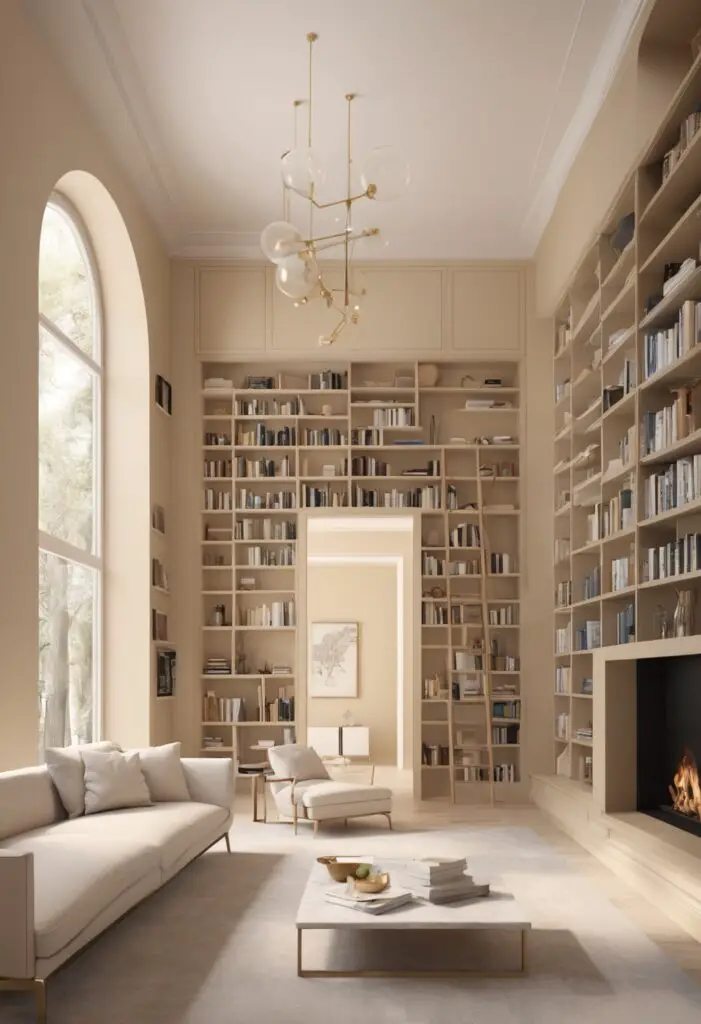
In the ever-evolving landscape of interior design, the choice of paint color holds considerable significance. It sets the tone, establishes the ambiance, and reflects the personality of a space. As we step into 2024, a year marked by innovation and refinement, the color vanillin emerges as a frontrunner for modern libraries. Its subtle elegance, calming undertones, and versatility make it an ideal choice for creating a sophisticated sanctuary where one can immerse oneself in literature, contemplation, and creativity.
Why Vanillin?
Vanillin, a soft, creamy hue reminiscent of vanilla bean, embodies a sense of tranquility and sophistication. Its neutral undertones provide a timeless appeal while exuding warmth and inviting comfort. Here’s why vanillin deserves a prime spot on your library walls:
- Elevated Elegance: Vanillin infuses your library with a touch of understated luxury. Its refined hue adds an air of sophistication without overpowering the space, allowing other elements of your decor to shine.
- Versatile Canvas: As a neutral shade, vanillin serves as a versatile canvas for showcasing your personal style. Whether your library boasts modern minimalism, eclectic charm, or traditional elegance, vanillin provides the perfect backdrop for accentuating your chosen aesthetic.
- Calming Aura: The gentle warmth of vanillin creates a serene ambiance, making it conducive to relaxation and focus. In a space dedicated to reading and reflection, this soothing hue fosters a tranquil environment where you can escape the chaos of the outside world.
- Light Amplification: Vanillin has the remarkable ability to amplify natural light, making your library feel bright and airy. This light-enhancing quality not only enhances the visual appeal of the space but also contributes to a sense of openness and clarity.
- Timeless Appeal: Unlike trendy colors that may quickly fall out of favor, vanillin possesses a timeless elegance that transcends fleeting fads. Investing in vanillin paint ensures that your library remains effortlessly chic for years to come, adapting seamlessly to evolving design trends.
Tips for Matching Color:
When incorporating vanillin into your library design, consider the following tips to achieve harmonious cohesion:
- Contrast with Rich Accents: Offset the softness of vanillin with rich, jewel-toned accents such as emerald green, sapphire blue, or deep burgundy for a striking contrast that adds depth and visual interest.
- Embrace Earthy Neutrals: Pair vanillin with earthy neutrals like warm taupe, soft greige, or sandy beige to create a serene palette inspired by nature. These subtle hues complement vanillin’s warmth while maintaining a harmonious balance.
- Add Metallic Accents: Introduce touches of metallic accents such as brass, copper, or brushed nickel to infuse your library with a hint of glamour. These shimmering finishes play beautifully against vanillin’s creamy backdrop, adding a touch of luxe sophistication.
- Incorporate Textured Fabrics: Incorporate textured fabrics like plush velvet, chunky knits, or natural linens to add tactile interest to your library decor. These tactile elements enhance the cozy atmosphere of the space while complementing vanillin’s softness.
- Experiment with Wood Tones: Integrate various wood tones, from light oak to rich mahogany, to add warmth and depth to your library design. Wood furnishings and accents bring natural warmth to the space, harmonizing beautifully with vanillin’s creamy palette.
Hue Matching:
For a cohesive color scheme, consider the following hues that harmonize beautifully with vanillin:
- Soft Sage: Infuse your library with a sense of tranquility by pairing vanillin with soft sage green. This muted hue complements vanillin’s warmth while adding a refreshing touch of greenery to the space.
- Powder Blue: Create a serene sanctuary by combining vanillin with powdery blue accents. This delicate hue evokes a sense of calmness and serenity, enhancing the soothing ambiance of your library.
- Muted Blush: Add a hint of romance to your library with muted blush tones. Soft pink accents complement vanillin’s warmth while infusing the space with a subtle, feminine charm.
- Charcoal Gray: For a modern twist, pair vanillin with charcoal gray accents for a sophisticated contrast. The deep, rich tones of charcoal add depth and drama to your library design, creating a stylish yet timeless aesthetic.
- Goldenrod Yellow: Infuse your library with warmth and vitality by incorporating goldenrod yellow accents. This vibrant hue adds a pop of color to vanillin’s neutral palette, imbuing the space with energy and optimism.
Alternative Colors from Sherwin Williams and Benjamin Moore:
For those seeking alternative paint options, consider the following selections from Sherwin Williams and Benjamin Moore:
Sherwin Williams:
- Alabaster (SW 7008): A crisp, clean white with subtle undertones of warmth, Alabaster complements vanillin beautifully, creating a fresh and airy atmosphere.
- Agreeable Gray (SW 7029): A versatile greige with a perfect balance of warm and cool tones, Agreeable Gray pairs seamlessly with vanillin, offering a sophisticated backdrop for your library decor.
- Sea Salt (SW 6204): A soft, muted green with gray undertones, Sea Salt adds a hint of coastal charm to your library when combined with vanillin, evoking a sense of serenity and tranquility.
Benjamin Moore:
- Simply White (OC-117): A timeless white with a hint of warmth, Simply White pairs effortlessly with vanillin, creating a classic and elegant backdrop for your library design.
- Revere Pewter (HC-172): A timeless greige with subtle undertones of warmth, Revere Pewter complements vanillin beautifully, adding depth and sophistication to your library space.
- Hale Navy (HC-154): A rich, deep navy blue, Hale Navy provides a striking contrast to vanillin, infusing your library with dramatic flair and timeless elegance.
Other Rooms to Use Vanillin:
In addition to libraries, vanillin can also enhance the ambiance of various other rooms in your home:
Living Room: Create a cozy yet sophisticated atmosphere in your living room by painting the walls in vanillin. Pair with plush sofas, warm wood furnishings, and metallic accents for an inviting space perfect for entertaining or relaxing.
Bedroom: Transform your bedroom into a serene retreat by adorning the walls in vanillin. This soft, soothing hue promotes relaxation and tranquility, setting the stage for restful nights and rejuvenating mornings.
Home Office: Foster a productive work environment in your home office with vanillin walls. The calming ambiance encourages focus and creativity, while the neutral backdrop provides a versatile canvas for personalized decor and furnishings.
Dining Room: Elevate your dining experience by painting the walls of your dining room in vanillin. This elegant hue sets a refined tone for formal gatherings or intimate dinners, enhancing the overall dining experience.
Conclusion:
In the realm of interior design, the choice of paint color holds the power to transform a space, imbuing it with personality, style, and ambiance. As we embark on a new year, vanillin emerges as a timeless yet contemporary hue perfect for modern libraries.
Its subtle elegance, calming aura, and versatility make it an ideal choice for creating a sophisticated sanctuary where one can escape, explore, and unwind. Whether paired with rich accents for a bold contrast or soft hues for a serene palette, vanillin exudes a sense of refined serenity that transcends fleeting trends, ensuring that your library remains a timeless haven of sophistication for years to come.


