
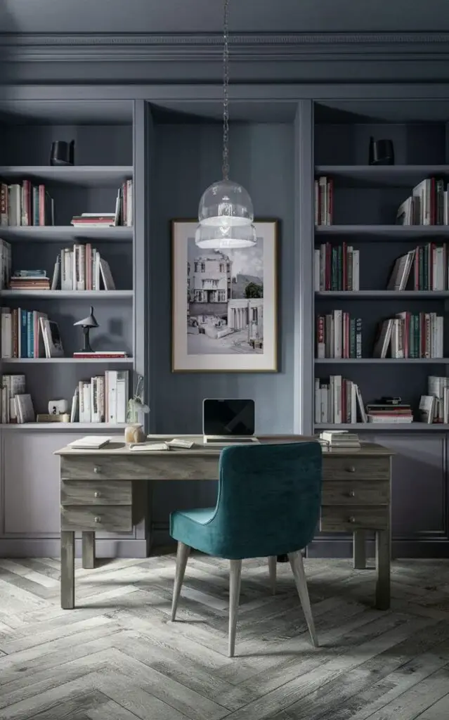
Gray screen paint has emerged as a popular choice for those seeking to infuse their spaces with a touch of sleek sophistication. In 2024, the trend continues to gain momentum, especially in home libraries where the atmosphere demands a perfect blend of modernity and warmth. This versatile color not only elevates the aesthetics of your library but also offers practical benefits such as enhanced focus and concentration. Here’s why you should consider recommending gray screen paint for your library makeover:
Why Gray Screen Paint?
- Timeless Elegance: Gray is a timeless color that effortlessly exudes elegance and refinement. When applied in the form of screen paint, it adds a contemporary twist, making it an ideal choice for both traditional and modern library designs.
- Versatility: Gray screen paint serves as an excellent backdrop for various design elements, including bookshelves, furniture, and artwork. Its neutral nature allows you to experiment with different accent colors and decorative pieces, giving your library a personalized touch.
- Enhanced Ambiance: The subdued tones of gray create a calming ambiance that is conducive to reading and relaxation. Whether you’re curling up with a book or engaging in deep thought, the soothing atmosphere of a gray-painted library provides the perfect setting.
- Light Reflection: Gray screen paint is formulated to enhance light reflection, making your library appear brighter and more spacious. This is particularly advantageous for smaller or dimly lit spaces, where maximizing natural or artificial light is essential.
- Minimal Maintenance: Unlike lighter shades, gray screen paint is less prone to showing stains or imperfections, making it easier to maintain over time. This durability ensures that your library retains its polished appearance with minimal effort.
Tips for Matching Color:
- Consider Lighting: Before selecting a shade of gray, assess the lighting conditions in your library. If the room receives ample natural light, you can opt for a slightly darker hue without compromising on brightness. Conversely, for dimly lit spaces, lighter shades of gray can help amplify the available light.
- Coordinate with Furniture: Take into account the existing furniture and decor in your library. Choose a gray shade that complements the wood tones or upholstery to create a cohesive look. Warm grays pair well with rich wooden finishes, while cooler grays complement sleek, contemporary furnishings.
- Sample Swatches: Test different shades of gray by painting small swatches on your library walls. This allows you to observe how the color interacts with the room’s lighting throughout the day. Consider how the undertones of each shade complement or contrast with your existing decor.
- Accent Colors: Determine whether you want to introduce accent colors into your library design. Gray serves as an excellent backdrop for vibrant accents such as emerald green, navy blue, or mustard yellow. Experiment with accessories like throw pillows, rugs, or artwork to add pops of color and visual interest.
- Consider the Mood: Think about the atmosphere you want to create in your library. Darker shades of gray evoke a sense of coziness and intimacy, perfect for creating a secluded reading nook. Lighter grays, on the other hand, impart an airy and open feel, ideal for larger spaces or multipurpose libraries.
Hue Matching:
- Charcoal Gray: For a sophisticated and dramatic look, consider charcoal gray. This deep hue adds depth to your library walls and pairs well with metallic accents or dark wood furniture.
- Silver Gray: Silver gray exudes a sense of understated luxury, reminiscent of polished silver. It’s a versatile shade that complements both traditional and contemporary decor styles.
- Greige: Greige, a blend of gray and beige, offers warmth and versatility. It’s an excellent choice for libraries seeking a softer, more inviting atmosphere without veering into traditional beige territory.
- Slate Gray: Slate gray strikes a balance between light and dark, making it a versatile option for libraries of all sizes. Its neutral undertones allow for easy pairing with a wide range of accent colors.
- Blue-Gray: Incorporating subtle hints of blue into your gray paint can add depth and dimension to your library. Blue-gray hues evoke a sense of tranquility and serenity, perfect for creating a peaceful reading retreat.
Alternative Colors from Sherwin Williams and
Benjamin Moore:
- Sherwin Williams: Repose Gray (SW 7015): This popular shade from Sherwin Williams is a light gray with warm undertones, making it an excellent choice for libraries seeking a soft and inviting ambiance.
- Sherwin Williams: Gauntlet Gray (SW 7019): Gauntlet Gray offers a deeper, more intense hue that exudes sophistication and depth. It pairs beautifully with lighter furnishings and metallic accents.
- Benjamin Moore: Stonington Gray (HC-170): Stonington Gray is a timeless classic that strikes the perfect balance between warm and cool undertones. Its versatility makes it suitable for a wide range of library designs.
- Benjamin Moore: Kendall Charcoal (HC-166): Kendall Charcoal is a rich, deep gray that adds drama and depth to any space. It’s ideal for creating a cozy, intimate reading nook or accent wall.
- Benjamin Moore: Revere Pewter (HC-172): Revere Pewter is a popular greige shade that seamlessly blends gray and beige undertones. Its neutral palette makes it a versatile choice for libraries with diverse decor styles.
Other Rooms to Use Color:
In addition to libraries, gray screen paint can also be effectively utilized in various other rooms throughout your home:
- Home Office: Create a conducive workspace by painting your home office walls with a calming shade of gray. This promotes focus and productivity while maintaining a professional aesthetic.
- Living Room: Infuse your living room with sophistication by incorporating gray screen paint on feature walls or as an overall color scheme. Pair with plush textiles and metallic accents for a cozy yet contemporary vibe.
- Bedroom: Transform your bedroom into a serene retreat with the soothing hues of gray. Whether you prefer light and airy or dark and moody, gray screen paint sets the perfect tone for relaxation and rejuvenation.
- Dining Room: Elevate your dining experience by painting your dining room walls with a refined shade of gray. This creates an elegant backdrop for entertaining guests and enjoying intimate family meals.
- Hallways: Brighten up narrow hallways and corridors with light gray screen paint, creating a sense of openness and continuity throughout your home.
Conclusion:
In conclusion, gray screen paint offers a myriad of benefits for transforming your library into a sophisticated and inviting space. Its timeless elegance, versatility, and practical advantages make it an ideal choice for homeowners seeking to enhance their reading retreats. By following these tips for color matching and exploring alternative shades from reputable brands like Sherwin Williams and Benjamin Moore, you can achieve the perfect balance of style and functionality in your library and beyond. Whether you’re curling up with a classic novel or delving into scholarly research, the understated charm of gray screen paint sets the stage for countless literary adventures.


