In the ever-evolving world of interior design, choosing the right paint color can make a significant impact on the overall ambiance of a space. One color that stands out in 2024 is Paperwhite—a shade that epitomizes sleek simplicity and modern living. In this comprehensive guide, we will delve into the reasons why Paperwhite is the ideal choice for contemporary spaces, provide tips on matching it with various elements, explore hue alternatives, and suggest alternative colors from Sherwin Williams and Benjamin Moore. Additionally, we will discuss the suitability of Paperwhite for different rooms, ensuring a cohesive and stylish home.
Why Paperwhite?
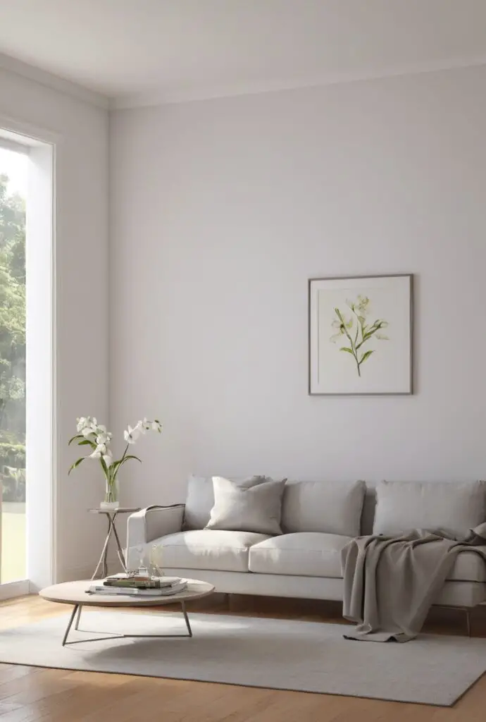
Paperwhite is a versatile and timeless color that effortlessly complements modern design aesthetics. Its subtle warmth adds a touch of sophistication to any space, making it a popular choice for those seeking an elegant yet understated ambiance. The neutral undertones of Paperwhite create a canvas for other design elements to shine, allowing for easy integration with various furniture styles and accessories.
- Versatility: Paperwhite’s neutral undertones make it a versatile choice that pairs well with a myriad of colors and design styles. Whether you prefer a minimalist, Scandinavian, or industrial look, Paperwhite adapts seamlessly to different design philosophies.
- Light Reflectivity: Paperwhite boasts excellent light reflectivity, enhancing the overall brightness of a room. This makes it an ideal choice for spaces with limited natural light, creating an airy and open feel even in smaller rooms.
- Timeless Elegance: Unlike trendy colors that may quickly fall out of fashion, Paperwhite exudes timeless elegance. It provides a neutral backdrop that can be easily updated with accessories, ensuring your space remains chic and stylish for years to come.
- Spatial Illusion: The neutral tones of Paperwhite can visually expand a room, making it appear larger and more open. This is particularly beneficial for smaller spaces or rooms with low ceilings.
- Ease of Styling: Paperwhite’s simplicity makes it a breeze to pair with other colors and textures. Whether you opt for bold accent pieces or a monochromatic scheme, Paperwhite serves as an excellent foundation for your design vision.
Tips for Matching Paperwhite:
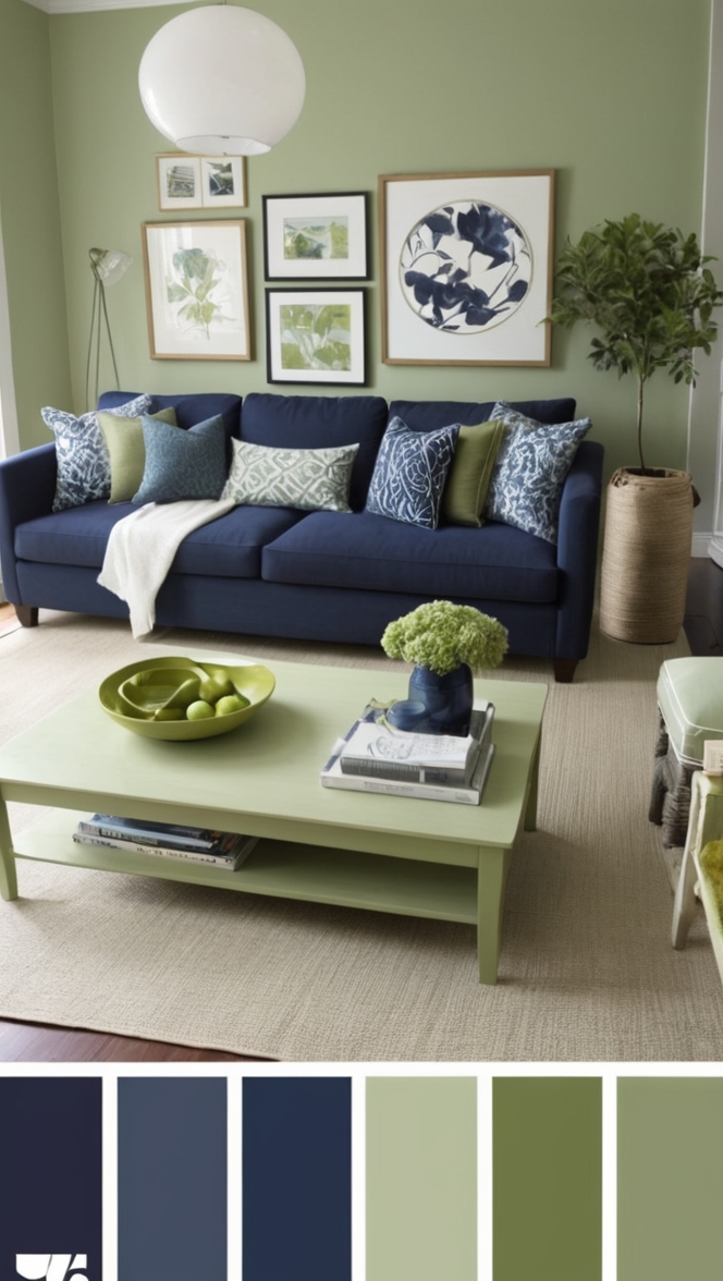
1. Balance with Contrasting Colors: When using Paperwhite, introduce contrasting colors to avoid a monotonous look. Bold accent colors like navy blue, emerald green, or charcoal gray can create a striking visual balance.
2. Texture Play: Enhance the visual appeal of a Paperwhite-dominated space by incorporating various textures. Consider using textured fabrics, wood finishes, or metallic accents to add depth and interest.
3. Natural Elements: Bring the outdoors in by incorporating natural elements such as plants, wooden furniture, or stone surfaces. These elements harmonize beautifully with Paperwhite, creating a serene and balanced environment.
4. Accent Wall: Create focal points within a room by painting one wall in a slightly darker or bolder color. This adds depth to the space while maintaining Paperwhite as the predominant color.
5. Lighting Matters: The choice of lighting can significantly impact how Paperwhite appears in a room. Experiment with different light temperatures and fixtures to achieve the desired ambiance.
Hue Matching with Paperwhite:
1. Navy Blue: For a classic and sophisticated look, pair Paperwhite with navy blue accents. This combination creates a timeless and elegant atmosphere, perfect for living rooms and bedrooms.
2. Blush Pink: Infuse a touch of softness and femininity by combining Paperwhite with blush pink. This subtle and harmonious pairing works well in bedrooms, nurseries, or any space where a gentle and inviting vibe is desired.
3. Charcoal Gray: Add a modern and edgy feel to your space by incorporating charcoal gray with Paperwhite. This combination is particularly effective in kitchens, dining areas, or home offices.
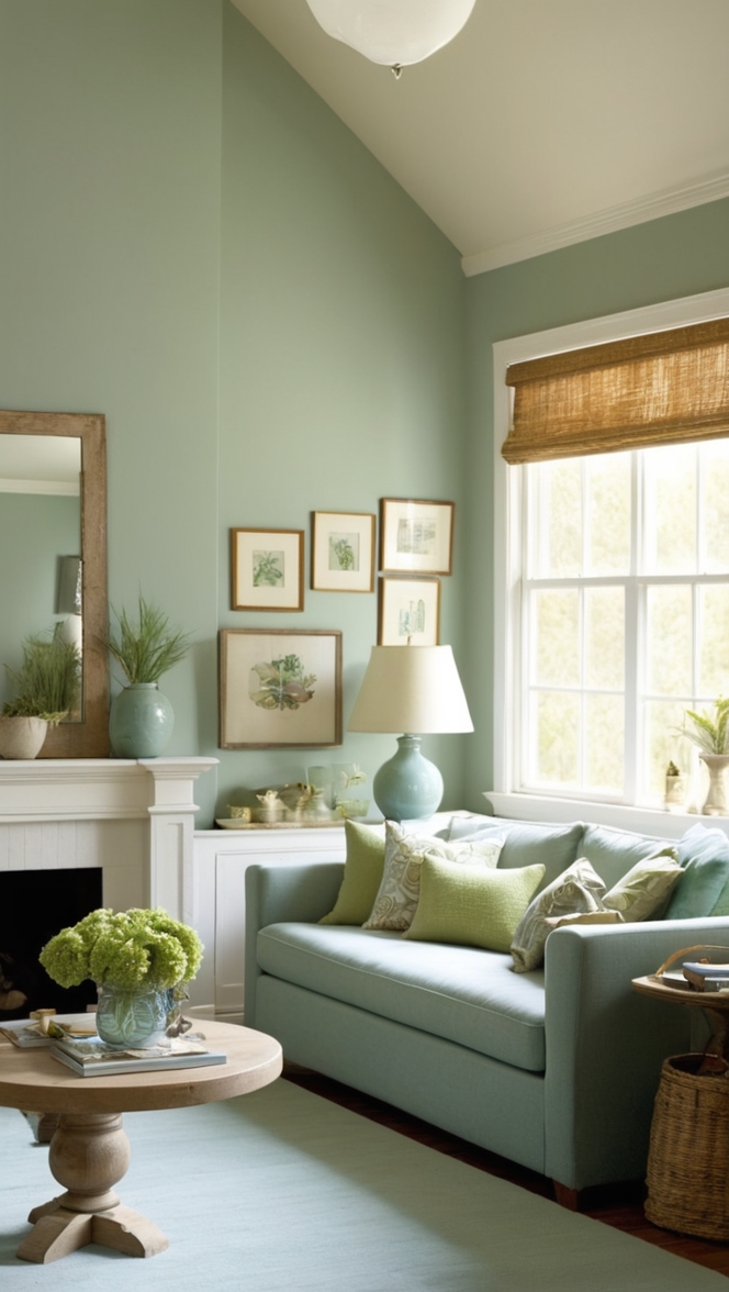
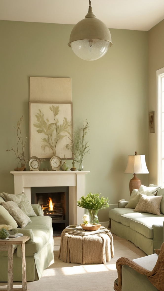
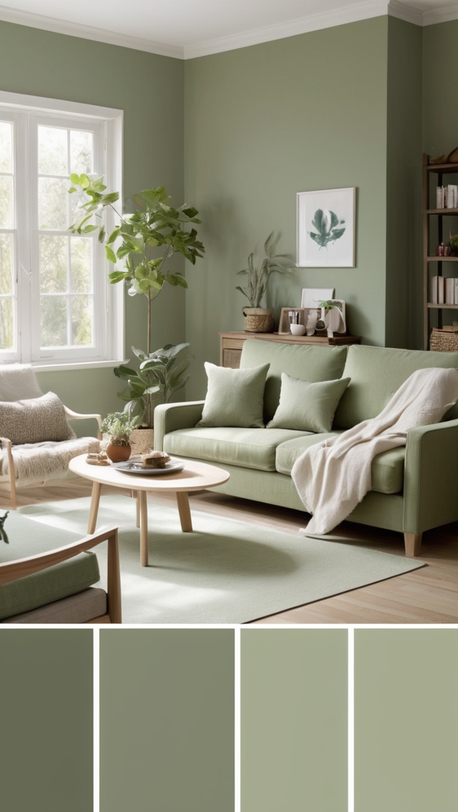
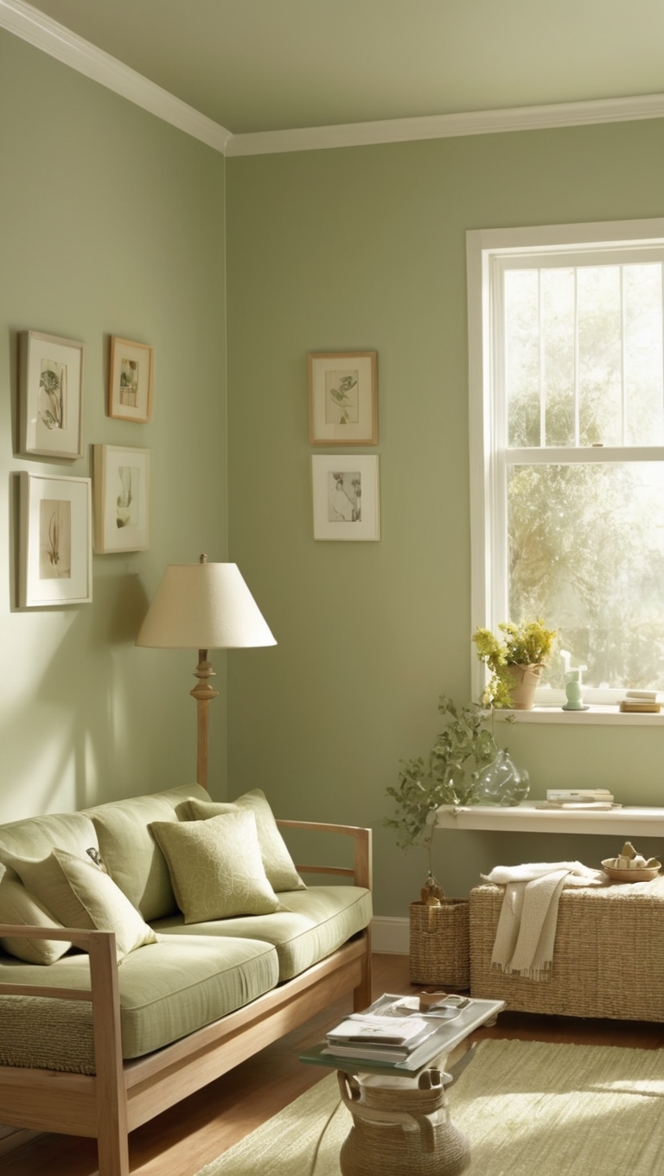
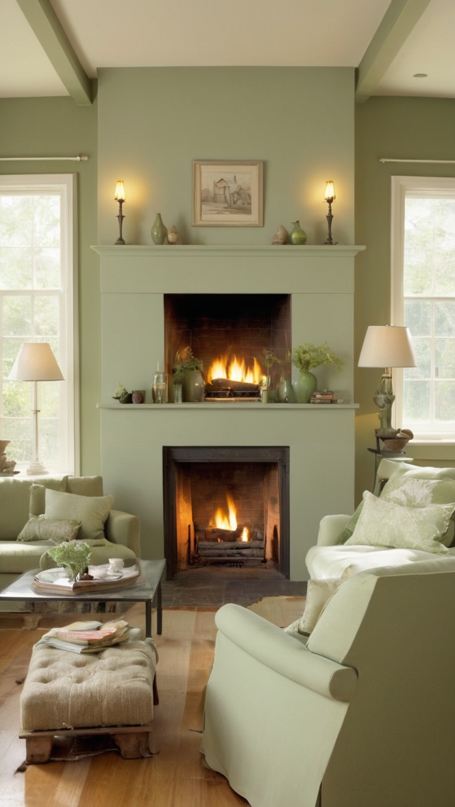
4. Sage Green: Embrace a natural and calming atmosphere by pairing Paperwhite with sage green. This combination is ideal for spaces where relaxation and tranquility are priorities, such as bedrooms or reading nooks.
5. Mustard Yellow: For a bold and energetic look, consider combining Paperwhite with mustard yellow accents. This vibrant pairing works well in spaces where you want to infuse energy and creativity, such as home offices or playrooms.
Alternative Colors from Sherwin Williams and
Benjamin Moore:
*1. Sherwin Williams – Alabaster (SW 7008): If you’re looking for a slightly warmer alternative to Paperwhite, Sherwin Williams’ Alabaster is an excellent choice. Its creamy undertones bring a subtle warmth to a space while maintaining a clean and modern feel.
*2. Benjamin Moore – Chantilly Lace (OC-65): Chantilly Lace is a crisp and pure white that can be a great alternative to Paperwhite. It provides a fresh and clean backdrop for any design style, making it a versatile choice for various rooms in your home.
*3. Sherwin Williams – Repose Gray (SW 7015): For those who prefer a light gray option, Repose Gray offers a subtle and sophisticated alternative to Paperwhite. It pairs well with a wide range of colors and brings a modern touch to any space.
*4. Benjamin Moore – Edgecomb Gray (HC-173): Edgecomb Gray is a warm and neutral gray with beige undertones, making it a fantastic alternative to Paperwhite. It provides a cozy and inviting feel, making it suitable for living rooms and bedrooms.
*5. Sherwin Williams – Agreeable Gray (SW 7029): Another alternative to Paperwhite is Agreeable Gray, which offers a warm and neutral base. It’s a versatile color that works well in various lighting conditions, making it a popular choice for open-concept spaces.
Other Rooms to Use Paperwhite:
1. Living Room: Paperwhite creates an inviting and sophisticated atmosphere in the living room. Combine it with plush textures, comfortable furniture, and bold accent colors for a stylish and cozy space.
2. Bedroom: In the bedroom, Paperwhite fosters a serene and tranquil environment. Pair it with soft linens, calming hues, and warm lighting for a bedroom retreat that exudes relaxation.
3. Kitchen: Paperwhite’s light reflectivity makes it an excellent choice for kitchens. Create a bright and airy culinary space by pairing it with sleek cabinetry, stainless steel appliances, and natural wood accents.
4. Home Office: For a productive and inspiring home office, use Paperwhite as the main color. Combine it with functional furniture, vibrant accessories, and ample natural light for a workspace that promotes focus and creativity.
5. Bathroom: Transform your bathroom into a spa-like oasis with Paperwhite. Combine it with soothing hues, natural materials, and reflective surfaces to create a bright and refreshing atmosphere.
Conclusion:
In the pursuit of modern living, the choice of paint color plays a pivotal role in shaping the ambiance of your home. Paperwhite, with its timeless elegance and versatility, emerges as a frontrunner for those seeking a sleek and sophisticated aesthetic. By following the provided tips for matching, exploring hue alternatives, and considering alternative colors from Sherwin Williams and Benjamin Moore, you can confidently incorporate Paperwhite into your home. From living rooms to bedrooms, kitchens to home offices,
Paperwhite adapts seamlessly to various spaces, creating a cohesive and stylish environment. Embrace the simplicity and sophistication of Paperwhite to elevate your living spaces into havens of modern elegance.