
In the realm of interior design, choosing the right paint color is a pivotal decision that sets the tone for the entire space. The color palette not only reflects personal style but also influences the ambiance and mood of a room. Among the myriad of options available, Silverpointe emerges as a captivating choice for those seeking a modern and tranquil reading haven.
Why Silverpointe?
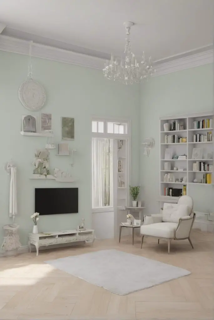
- Soothing Aesthetics: Silverpointe, a delicate and nuanced shade of gray, exudes an understated elegance that instantly creates a soothing atmosphere. This color is a perfect canvas, providing a backdrop that complements various design elements while maintaining a sense of calmness.
- Versatility in Design: One of the remarkable aspects of Silverpointe is its versatility. It seamlessly integrates with both contemporary and traditional decor styles, allowing for a harmonious blend with furniture, artwork, and other design elements. This adaptability ensures that your reading space remains timeless and adaptable to evolving design trends.
- Reflects Natural Light: Silverpointe possesses the unique ability to reflect natural light, making any room appear brighter and more spacious. This characteristic is particularly beneficial for reading spaces, creating an inviting environment that encourages extended periods of reading without straining the eyes.
- Enhances Art and Decor: The neutral nature of Silverpointe acts as an ideal backdrop to showcase art pieces and decorative items. Whether you have a collection of vibrant paintings or subtle sculptures, this color enhances the visual appeal of your decor without overshadowing the focal points.
- Calming Effect: The psychology of color is undeniable, and Silverpointe excels in creating a calm and tranquil environment. The subdued tones evoke a sense of serenity, providing an optimal setting for unwinding with a good book. The tranquility induced by Silverpointe makes it an excellent choice for a dedicated reading space.
5 Tips to Match Colors with Silverpointe :
- Earth Tones: To amplify the calming effect of Silverpointe, consider incorporating earthy hues such as olive green, warm beige, or soft browns. These colors complement the neutrality of Silverpointe while adding a touch of warmth to the overall ambiance.
- Accent Colors: Introduce accent colors like muted blues or dusty lavender to add depth and interest to the room. These accents create visual focal points without overpowering the soothing base of Silverpointe.
- Metallic Touches: Silverpointe pairs exceptionally well with metallic accents. Consider incorporating silver or brushed nickel finishes on furniture, light fixtures, or accessories to enhance the modern aesthetic and add a touch of sophistication.
- White Elements: Crisp white elements, such as trim, molding, or furniture pieces, create a clean and fresh contrast with Silverpointe. This combination ensures a balanced look, preventing the space from feeling too monochromatic.
- Pops of Color: For a modern and lively reading nook, introduce pops of bold colors sparingly. Choose accent pieces like throw pillows, rugs, or artwork in vibrant shades to infuse energy into the space while still harmonizing with Silverpointe.
5 Hue Matching Options with Silverpointe :
- Powder Blue: Embrace a serene palette by pairing Silverpointe with soft powder blue. This combination brings a sense of airiness to the room, making it an ideal choice for creating a tranquil reading retreat.
- Sage Green: For a nature-inspired aesthetic, combine Silverpointe with sage green. The muted tones of both colors create a cohesive and calming environment reminiscent of a quiet forest, enhancing the reading experience.
- Mauve Accents: Add a touch of sophistication by incorporating mauve accents with Silverpointe. This subtle pairing creates a refined and elegant ambiance, perfect for those seeking a modern yet classic reading space.
- Charcoal Gray: Opt for a monochromatic look by complementing Silverpointe with deeper charcoal gray. This pairing adds depth and creates a sophisticated, cohesive atmosphere, ideal for a contemporary reading nook.
- Blush Pink: Infuse a hint of romance and warmth by introducing blush pink alongside Silverpointe. This combination strikes a delicate balance between modern and soft, creating a cozy reading space with a touch of femininity.
5 Alternative Colors from Sherwin Williams and
Benjamin Moore :
- Sherwin Williams – Repose Gray (SW 7015): A close cousin to Silverpointe, Repose Gray offers a warm undertone that complements various design styles. It serves as an excellent alternative for those who prefer a slightly warmer gray.
- Sherwin Williams – Sea Salt (SW 6204): If you desire a subtle and beachy vibe, Sea Salt introduces a hint of blue-green to the mix. This color pairs well with Silverpointe, creating a refreshing and coastal-inspired reading space.
- Benjamin Moore – Edgecomb Gray (HC-173): A timeless and versatile option, Edgecomb Gray from Benjamin Moore works harmoniously with Silverpointe. Its neutral undertones provide a seamless transition between different design elements.
- Benjamin Moore – Revere Pewter (HC-172): For those who appreciate a warmer gray, Revere Pewter pairs beautifully with Silverpointe. This combination creates a cozy and inviting atmosphere, perfect for a snug reading corner.
- Sherwin Williams – Alabaster (SW 7008): If you prefer a lighter and warmer alternative, Alabaster serves as an excellent choice. This off-white color complements Silverpointe, adding a touch of warmth to the overall palette.
Other Rooms to Use Silverpointe :
- Bedroom Retreat: Silverpointe creates a serene and calming atmosphere, making it an ideal choice for a bedroom retreat. Pair it with soft, luxurious bedding and minimalistic decor to achieve a tranquil haven for rest and relaxation.
- Home Office Elegance: Transform your home office into a sophisticated workspace by incorporating Silverpointe. This neutral backdrop fosters focus and concentration while providing a modern and timeless aesthetic.
- Spa-Like Bathroom: Infuse a spa-like ambiance into your bathroom by using Silverpointe on the walls. Combine it with crisp white linens, natural textures, and greenery to create a rejuvenating and luxurious retreat.
- Contemporary Kitchen: Silverpointe can elevate the look of a contemporary kitchen, especially when paired with sleek stainless steel appliances and minimalist cabinetry. The neutral tone ensures a timeless appeal that aligns with evolving design trends.
- Chic Living Room: Extend the modern and tranquil vibes of Silverpointe to your living room. Use this versatile color as the main wall shade and accessorize with contemporary furniture and pops of color to create a chic and inviting space.
Conclusion :
In the quest for a modern and tranquil reading haven, Silverpointe emerges as an impeccable choice. Its soothing aesthetics, versatility in design, and calming effect make it an ideal backdrop for creating a timeless and inviting space. By following the suggested tips for color matching and exploring alternative hues from Sherwin Williams and Benjamin Moore, you can customize your reading nook to reflect your unique style.
Whether you choose to pair Silverpointe with earthy tones, metallic accents, or pops of color, the result will be a harmonious and visually appealing reading space. Extend the elegance of Silverpointe to other rooms, such as the bedroom, home office, bathroom, kitchen, and living room, to create a cohesive and sophisticated home environment.
In essence, Silverpointe paint sets the tone for a modern reading haven that transcends design trends and stands the test of time. Embrace the tranquility and versatility of this timeless color to craft a space that not only enhances your reading experience but also becomes a sanctuary of comfort and style within your home.


