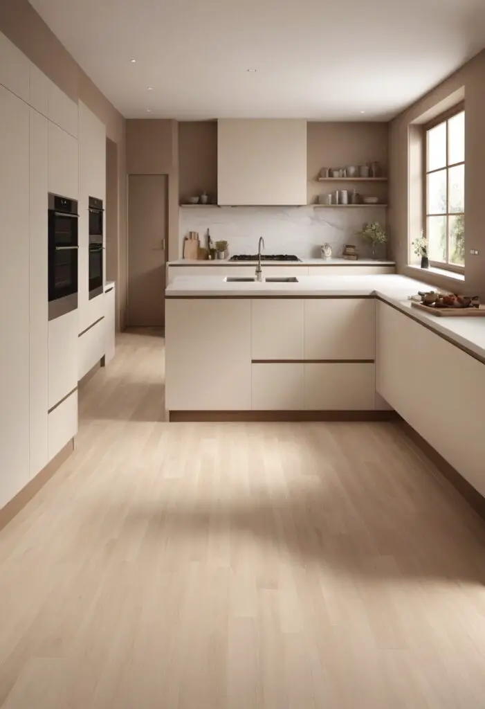
In the realm of interior design, where trends constantly evolve and styles come and go, “Choice Cream” emerges as a timeless hue, particularly enchanting when adorning modern kitchens. This sophisticated shade effortlessly infuses spaces with a sense of refinement and tranquility, making it an ideal choice for those seeking to elevate their culinary sanctuaries to new heights of elegance.
Why Choice Cream Paint?
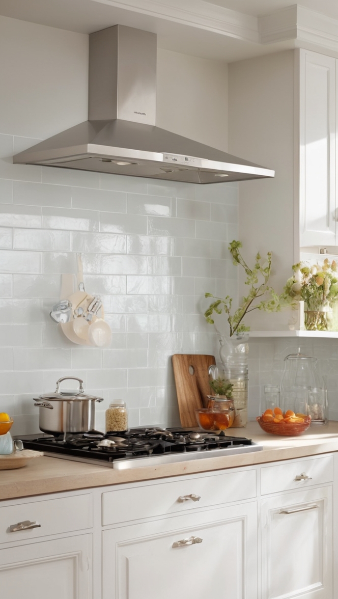
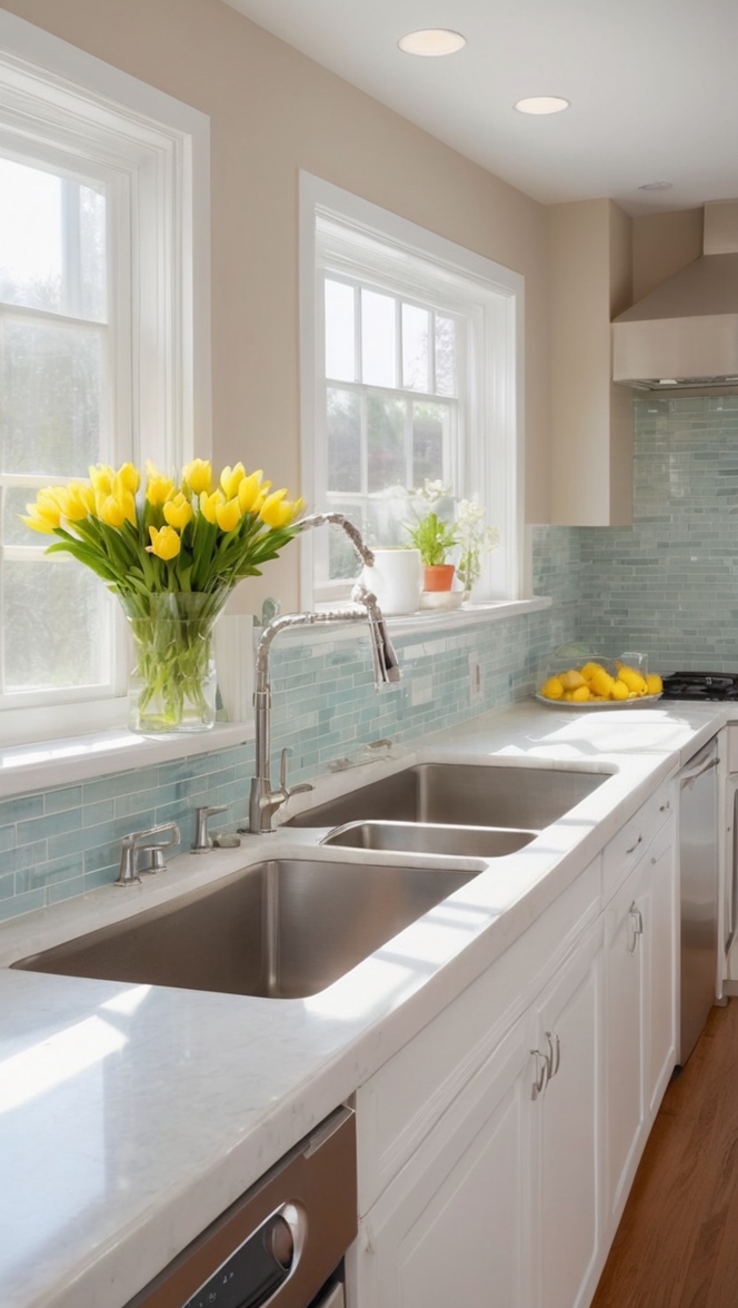
“Choice Cream” offers a harmonious blend of warmth and neutrality, making it versatile enough to complement a wide array of design elements and architectural styles. Its subtle undertones of beige and ivory create a serene ambiance, fostering an inviting atmosphere in the heart of your home. Whether your kitchen boasts sleek minimalist aesthetics or embraces rustic charm, this paint color serves as a captivating canvas upon which to build your culinary dreams.
5 Tips to Match Color:
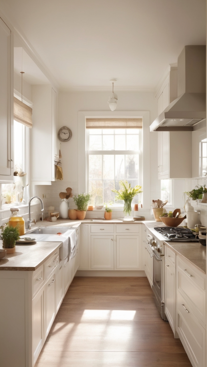
- Consider Natural Light: Before committing to “Choice Cream,” assess how natural light interacts with your kitchen space. This shade beautifully reflects sunlight, enhancing its creamy undertones during the day and imbuing your kitchen with a soft, radiant glow.
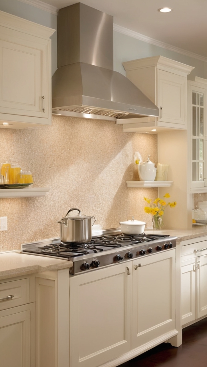
- Pair with Contrasting Accents: To prevent your kitchen from appearing too monochromatic, incorporate contrasting elements such as dark wood finishes, matte black hardware, or vibrant pops of color in decor accents like rugs or artwork. These additions will create visual interest and balance within the space.
- Opt for Complementary Flooring: Choose flooring materials that harmonize with “Choice Cream” to achieve a cohesive look. Light wood, porcelain tiles in earthy tones, or polished concrete floors complement this paint color beautifully, enhancing the overall aesthetic appeal of your kitchen.
- Experiment with Texture: Introduce texture to add depth and dimension to your kitchen design. Consider incorporating textured backsplashes, woven baskets, or plush upholstered seating to create visual intrigue and tactile contrast against the smooth backdrop of “Choice Cream.”
- Customize Cabinetry: If you’re updating your kitchen cabinets, select a finish that complements “Choice Cream” effortlessly. Opt for light wood grains, matte white, or even glass-fronted cabinets to accentuate the airy, sophisticated ambiance of your culinary space.
5 Hue Matching Inspirations:
- Soft Sage: Pairing “Choice Cream” with soft sage accents creates a serene and refreshing atmosphere reminiscent of a tranquil garden retreat. Incorporate sage-green textiles, botanical prints, or potted herbs to infuse your kitchen with natural charm and vitality.
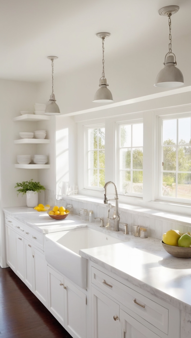
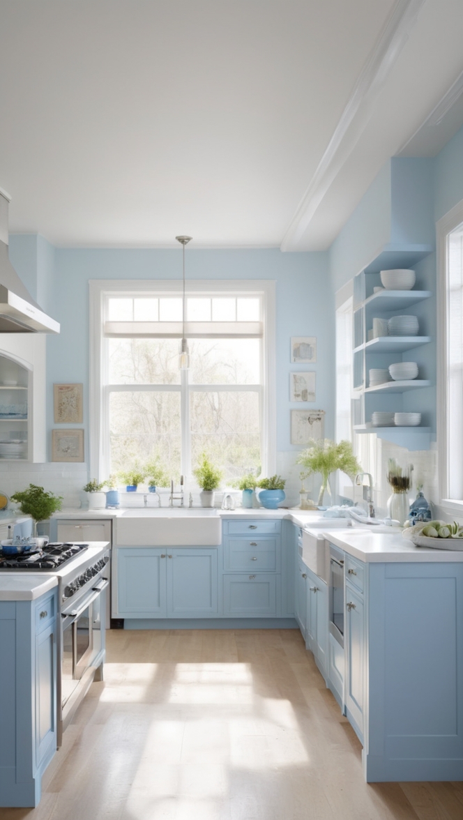
- Subtle Gray: For a contemporary twist, combine “Choice Cream” with subtle gray hues. Gray-toned countertops, stainless steel appliances, or geometric patterned rugs lend a modern edge to your kitchen while maintaining a sense of timeless elegance.
- Rich Navy: Add a touch of drama to your kitchen by juxtaposing “Choice Cream” with rich navy accents. Navy blue cabinetry, statement light fixtures, or navy-striped upholstery injects depth and sophistication into your culinary space, creating a bold yet refined aesthetic.
- Warm Terracotta: Embrace earthy tones by pairing “Choice Cream” with warm terracotta hues. Terracotta tiles, clay pottery, or copper accents infuse your kitchen with rustic charm and Mediterranean-inspired warmth, evoking a sense of timeless allure and comfort.
- Pale Pink: For a subtle hint of romance and femininity, introduce pale pink accents to your “Choice Cream” kitchen. Blush-toned dinnerware, floral arrangements, or pastel pendant lights add a soft, ethereal touch, creating a delicate balance between sophistication and sweetness.
5 Alternative Colors from Sherwin Williams and Benjamin Moore:
- Sherwin Williams – “Alabaster”: A crisp, clean white with subtle undertones of warmth, “Alabaster” complements “Choice Cream” beautifully, creating a harmonious backdrop for your kitchen’s design elements.
- Benjamin Moore – “Revere Pewter”: A timeless greige with a perfect balance of gray and beige, “Revere Pewter” pairs effortlessly with “Choice Cream,” infusing your kitchen with understated elegance and versatility.
- Sherwin Williams – “Sea Salt”: This soothing green-gray hue adds a subtle coastal vibe to your kitchen when combined with “Choice Cream,” evoking a sense of tranquility and relaxation.
- Benjamin Moore – “Hale Navy”: For those who crave a bold contrast, “Hale Navy” complements “Choice Cream” with its deep, rich blue tones, creating a striking yet sophisticated color palette for your kitchen.
- Sherwin Williams – “Accessible Beige”: A warm and inviting neutral, “Accessible Beige” harmonizes effortlessly with “Choice Cream,” creating a timeless and welcoming ambiance in your culinary space.
Other Rooms to Use Choice Cream:
Living Room: Extend the elegant allure of “Choice Cream” into your living room for a cohesive and sophisticated aesthetic. Pair it with plush velvet furniture, metallic accents, and botanical prints for a luxurious yet inviting atmosphere.
Dining Room: Embrace refined dining experiences by adorning your dining room walls with “Choice Cream.” Pair it with a statement chandelier, upholstered dining chairs, and a polished wooden dining table for an ambiance that exudes timeless charm and hospitality.
Bedroom: Transform your bedroom into a serene sanctuary by incorporating “Choice Cream” into your color scheme. Combine it with soft, dreamy textiles, plush bedding, and delicate lighting to create a cozy retreat that encourages relaxation and rejuvenation.
Conclusion:
In the ever-evolving landscape of interior design, “Choice Cream” stands as a beacon of timeless elegance and versatility, particularly enchanting when gracing the walls of modern kitchens. Its subtle warmth and neutral undertones provide a captivating backdrop for culinary creativity, while its compatibility with a myriad of design elements ensures enduring appeal. Whether paired with contrasting accents, harmonizing hues, or alternative shades from Sherwin Williams and Benjamin Moore, “Choice Cream” elevates your kitchen to new heights of sophistication and refinement. Embrace its allure, and let your culinary sanctuary radiate with timeless elegance and warmth.