
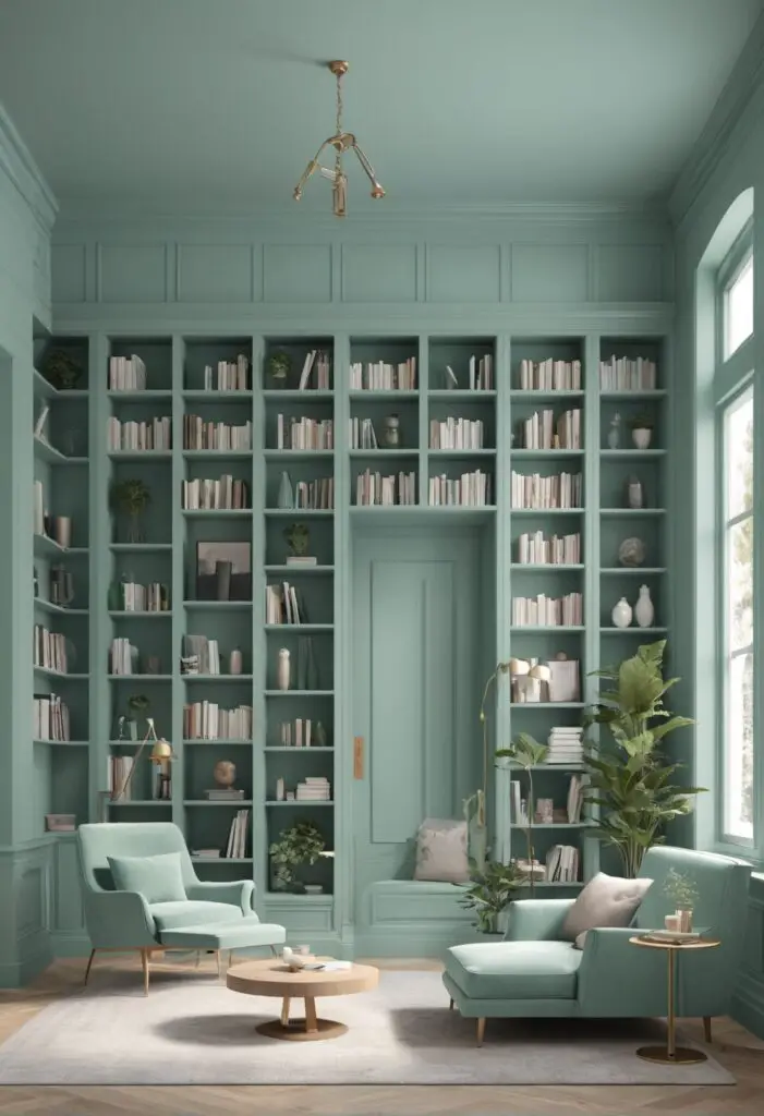
In the realm of interior design, the choice of paint color holds immense power. It has the ability to transform a space, evoke emotions, and set the tone for the entire room. When it comes to creating a modern and inviting library in 2024, Mint Condition emerges as a frontrunner, offering a fresh and sophisticated ambiance. This timeless hue encapsulates tranquility, rejuvenation, and a touch of luxury, making it the perfect choice for a reading retreat.
Why Mint Condition?
Mint Condition paint exudes a sense of serenity and sophistication, creating an environment conducive to concentration and relaxation. Its soft, muted green tones evoke imagery of lush landscapes and tranquil hideaways, instantly transporting you to a world of calm and contemplation. In a modern library setting, this color encourages focus and enhances the overall reading experience.
Mint Condition is versatile, complementing a wide range of interior styles and decor themes. Whether your library boasts a contemporary minimalist aesthetic or leans towards a more traditional design, this color effortlessly blends in, adding a touch of elegance and refinement to the space. Its subtle yet captivating presence allows other elements in the room to shine, from sleek furniture pieces to intricate bookshelves and artwork.
5 Tips to Match Color with Mint Condition:
- Neutral Accents: Pair Mint Condition with neutral accents such as crisp white, soft beige, or warm gray to create a harmonious balance. These understated hues allow Mint Condition to take center stage while adding depth and sophistication to the overall palette.
- Natural Elements: Incorporate natural elements like wood, stone, or rattan furniture to enhance Mint Condition’s organic appeal. These earthy textures complement the color’s botanical undertones, infusing the space with warmth and visual interest.
- Metallic Accents: Introduce metallic accents such as brushed brass or polished chrome to add a touch of glamour and modernity to the room. These reflective surfaces create striking contrasts against Mint Condition’s soft matte finish, elevating the overall aesthetic and lending a contemporary edge.
- Bold Contrasts: Experiment with bold contrasts by pairing Mint Condition with deep navy, charcoal gray, or rich plum accents. These dramatic hues create a sense of depth and intrigue, adding visual dynamism to the space while accentuating Mint Condition’s subtle elegance.
- Statement Pieces: Use statement pieces such as vibrant artwork, geometric rugs, or sculptural lighting to infuse personality and character into the room. These eye-catching elements serve as focal points against Mint Condition’s serene backdrop, injecting a sense of playfulness and creativity into the space.
5 Hue Matching Options for Mint Condition:
- Soft White: A soft white hue complements Mint Condition’s tranquil green tones, creating a clean and airy ambiance. Opt for shades like “Alabaster” or “Pure White” to enhance the color’s luminosity and purity.
- Warm Gray: Warm gray tones like “Agreeable Gray” or “Repose Gray” provide a sophisticated backdrop for Mint Condition, adding depth and warmth to the room. These versatile neutrals balance the color’s cool undertones, creating a timeless and inviting atmosphere.
- Blush Pink: Blush pink accents introduce a soft and feminine touch to Mint Condition’s serene palette. Shades like “Romance” or “First Light” complement the color’s botanical hues, infusing the space with a delicate charm and elegance.
- Navy Blue: Navy blue creates a striking contrast against Mint Condition, adding a sense of drama and sophistication to the room. Opt for deep navy shades like “Naval” or “In the Navy” to create a bold yet refined look that showcases Mint Condition’s understated beauty.
- Soft Gold: Soft gold accents like “Aged Brass” or “Champagne Gold” bring a touch of luxury and warmth to Mint Condition’s tranquil backdrop. These metallic hues add a subtle shimmer to the room, elevating the overall aesthetic and creating a sense of opulence.
5 Alternative Colors from Sherwin Williams and Benjamin Moore:
- Sherwin Williams – Sea Salt: This soft, coastal-inspired hue complements Mint Condition beautifully, evoking imagery of sun-kissed shores and gentle ocean breezes. Its subtle blue-green undertones add a refreshing touch to the space, creating a serene and inviting atmosphere.
- Benjamin Moore – Gray Owl: Gray Owl offers a sophisticated backdrop for Mint Condition, with its soft, neutral tones providing a timeless and elegant canvas for the room. Its subtle warmth enhances Mint Condition’s organic appeal, creating a harmonious and welcoming environment.
- Sherwin Williams – Repose Gray: Repose Gray’s warm undertones provide the perfect complement to Mint Condition, adding depth and richness to the room. This versatile neutral creates a sense of balance and tranquility, allowing Mint Condition to shine as the focal point.
- Benjamin Moore – Hale Navy: Hale Navy creates a bold and dramatic contrast against Mint Condition, infusing the room with a sense of depth and sophistication. Its deep, rich tones add a touch of opulence to the space, while highlighting Mint Condition’s subtle elegance.
- Sherwin Williams – Accessible Beige: Accessible Beige offers a warm and inviting backdrop for Mint Condition, with its soft, creamy tones creating a sense of comfort and tranquility. This versatile neutral pairs beautifully with Mint Condition, allowing for endless design possibilities.
Other Rooms to Use Mint Condition:
Living Room: Incorporate Mint Condition into your living room to create a serene and inviting space for relaxation and entertaining. Pair it with plush upholstery, natural textures, and metallic accents for a sophisticated yet cozy atmosphere.
Bedroom: Transform your bedroom into a tranquil sanctuary by using Mint Condition on the walls or as an accent color. Combine it with soft linens, plush carpets, and ambient lighting to create a soothing retreat that promotes rest and rejuvenation.
Home Office: Boost productivity and creativity in your home office with Mint Condition’s calming presence. Use it as a backdrop for your workspace, and pair it with sleek furniture, ergonomic accessories, and inspiring artwork to create a functional and stylish environment.
Dining Room: Infuse your dining room with elegance and sophistication by incorporating Mint Condition into the decor. Pair it with rich wood tones, luxurious fabrics, and statement lighting to create a refined yet inviting space for entertaining guests and enjoying family meals.
Conclusion:
In 2024, Mint Condition emerges as the quintessential paint color for creating a modern and inviting library. Its tranquil green tones, timeless appeal, and versatility make it the perfect choice for transforming any space into a serene retreat for reading and relaxation. By following these tips for matching colors, exploring hue options, and considering alternative shades from Sherwin Williams and Benjamin Moore, you can effortlessly incorporate Mint Condition into your home decor, creating a stylish and sophisticated environment that reflects your personal taste and lifestyle.


