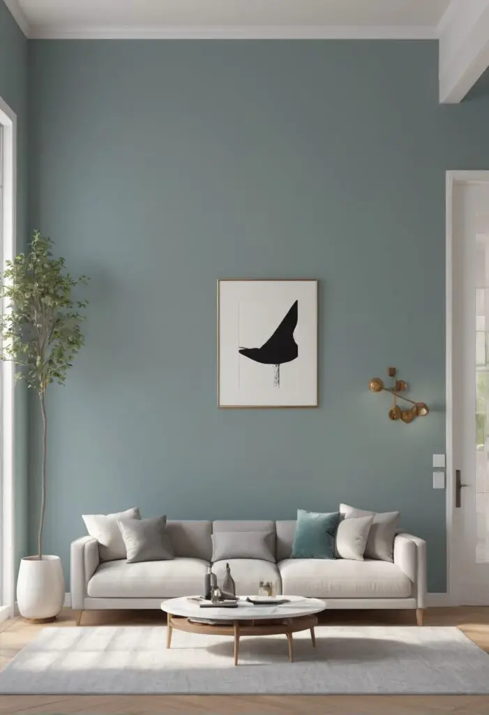
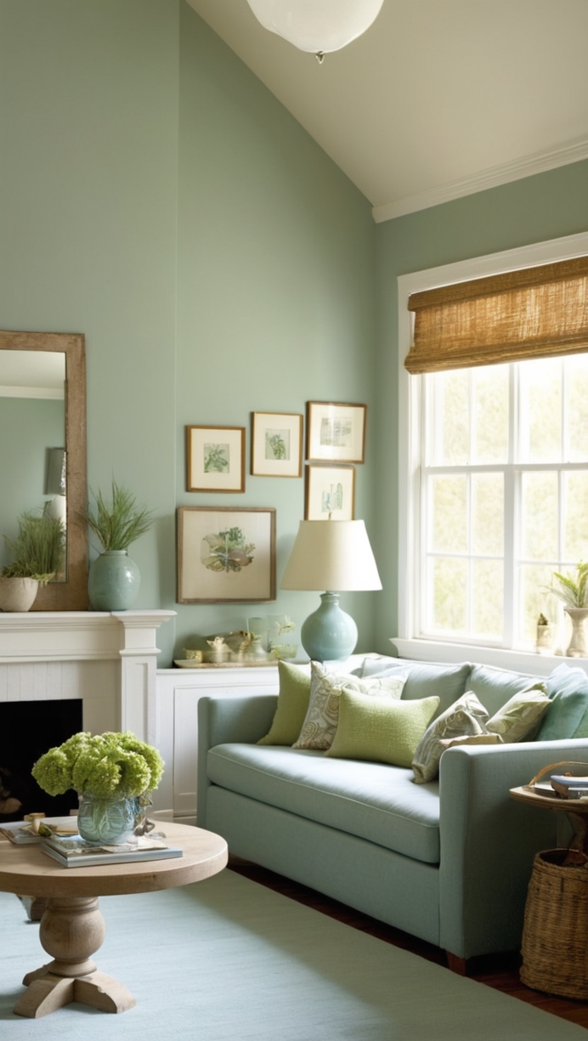
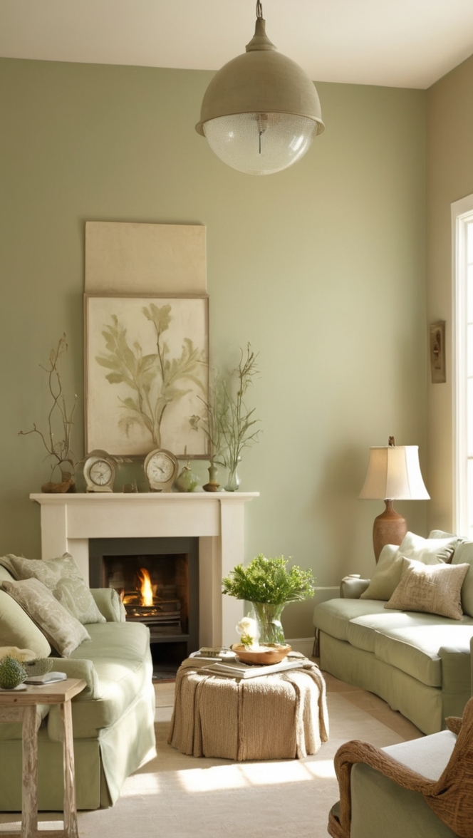
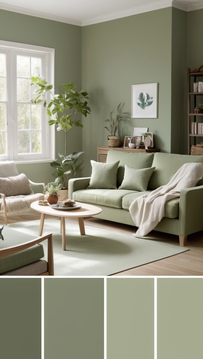
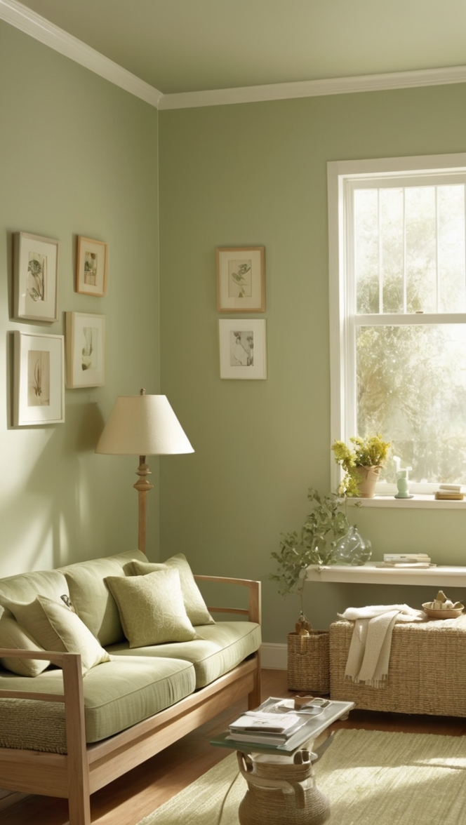
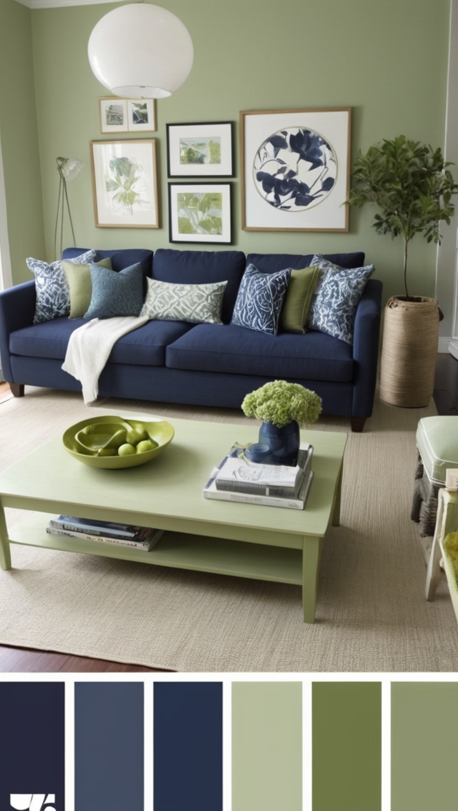
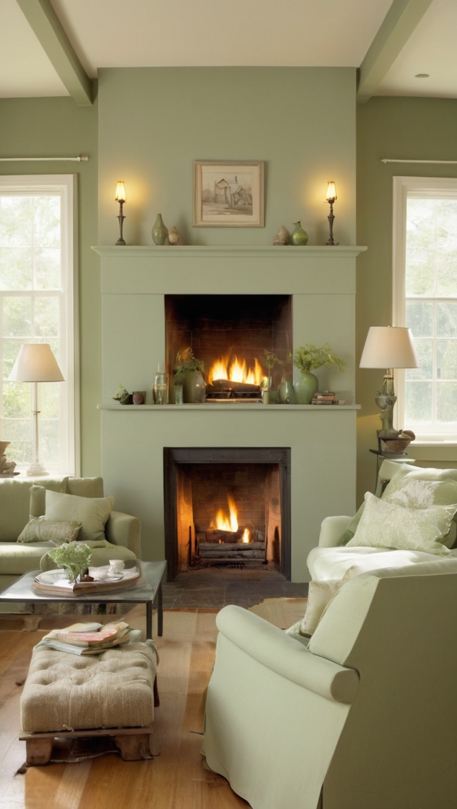
In the ever-evolving landscape of interior design, staying ahead of the curve can be a challenge. However, with the right color choices, you can effortlessly transform your living spaces into modern sanctuaries. Enter Topsail, a timeless hue that promises to breathe new life into your home for the year 2024.
Why Choose Topsail Paint?
Topsail is a serene, soft blue-green hue that exudes tranquility and sophistication. Its versatility allows it to adapt seamlessly to various design styles, making it the perfect choice for modern rooms in 2024. Here’s why Topsail paint should be your top pick for refreshing your living spaces:
- Timeless Elegance: Topsail strikes the perfect balance between calming blue and refreshing green tones, creating a timeless and elegant backdrop for any room in your home.
- Versatile Appeal: Whether you’re aiming for a minimalist, Scandinavian-inspired aesthetic or a more eclectic bohemian vibe, Topsail effortlessly complements a wide range of decor styles, making it a versatile choice for any modern home.
- Reflective Ambiance: The subtle hint of blue in Topsail reflects natural light beautifully, brightening up your space and creating an airy, open feel—a particularly valuable trait for smaller rooms or spaces with limited windows.
- Soothing Atmosphere: In today’s fast-paced world, creating a serene and tranquil environment at home is essential for promoting relaxation and well-being. Topsail’s calming undertones help to foster a sense of peace and serenity, making it an ideal color choice for bedrooms, living rooms, or home office spaces.
- Time-Tested Popularity: As a popular choice among interior designers and homeowners alike, Topsail has already proven its enduring appeal, ensuring that your home remains stylish and on-trend for years to come.
5 Tips to Match Topsail Paint with Your Decor:
- Natural Textures: Pair Topsail with natural textures such as wood, rattan, or jute to enhance its organic feel and create a harmonious, earthy vibe in your space.
- Metallic Accents: Introduce metallic accents like brass or copper to add a touch of luxury and sophistication to your Topsail-infused room. These reflective elements will beautifully complement Topsail’s soft sheen, elevating the overall aesthetic.
- White Accents: For a crisp, clean look, combine Topsail with white accents such as trim, furniture, or accessories. This classic combination creates a fresh and airy atmosphere, perfect for modern interiors.
- Bold Contrasts: Create visual interest by pairing Topsail with bold, contrasting colors like deep navy blue or charcoal gray. This high-impact combination adds depth and drama to your space while still allowing Topsail to shine as the focal point.
- Artwork and Accessories: Use artwork, throw pillows, and other accessories in complementary colors such as blush pink, soft gray, or sandy beige to tie your room together and create a cohesive look that feels curated and intentional.
5 Hue Matching Options for Topsail Paint:
- Blush Pink: Soft blush pink hues harmonize beautifully with Topsail, creating a delicate and feminine color palette that feels elegant and refined.
- Warm Gray: Pairing Topsail with warm gray tones adds depth and sophistication to your space while maintaining a sense of balance and tranquility.
- Sandy Beige: Sandy beige hues bring warmth and coziness to a room anchored by Topsail, creating a welcoming and inviting atmosphere that’s perfect for relaxing.
- Charcoal Gray: For a more dramatic look, consider pairing Topsail with deep charcoal gray accents. This bold contrast adds a sense of modernity and edge to your space.
- Soft Yellow: Soft yellow tones inject a pop of cheerful color into a room adorned with Topsail, creating a playful and uplifting ambiance that’s perfect for lively gathering spaces.
5 Alternative Colors from Sherwin Williams and Benjamin Moore:
- Sherwin Williams’ Sea Salt: Similar to Topsail, Sea Salt is a soft, muted green-blue hue that offers a serene and calming backdrop for any room.
- Benjamin Moore’s Gray Owl: Gray Owl is a versatile light gray hue with subtle blue undertones that pairs beautifully with Topsail, creating a sophisticated and cohesive color scheme.
- Sherwin Williams’ Agreeable Gray: This warm gray hue with subtle beige undertones complements Topsail perfectly, creating a harmonious and inviting atmosphere in any space.
- Benjamin Moore’s Revere Pewter: Revere Pewter is a timeless greige (gray-beige) shade that pairs effortlessly with Topsail, adding depth and warmth to your room’s color palette.
- Sherwin Williams’ Repose Gray: Repose Gray is a light, airy gray hue that provides a subtle yet stunning contrast to Topsail, creating a sophisticated and modern look.
Other Rooms to Use Topsail Paint:
Bedrooms:
Create a tranquil retreat by painting your bedroom walls with Topsail. Pair it with crisp white bedding, soft gray accents, and natural wood furniture for a calming and cozy atmosphere that promotes restful sleep.
Bathrooms:
Transform your bathroom into a spa-like oasis with Topsail paint. Combine it with white subway tiles, brushed nickel fixtures, and plush towels in shades of blush pink or sandy beige for a luxurious and inviting feel.
Home Offices:
Boost productivity and creativity in your home office by painting the walls with Topsail. Add in modern furnishings, such as a sleek desk and ergonomic chair, and incorporate pops of color with vibrant artwork or accessories for a stimulating yet serene workspace.
Conclusion:
In conclusion, Topsail paint offers a winning combination of timeless elegance, versatility, and tranquility, making it the perfect choice for modernizing your home in 2024. By following our tips for matching Topsail with your decor, exploring complementary hues, and considering alternative color options from Sherwin Williams and Benjamin Moore, you can effortlessly revitalize your living spaces and create a home that’s both stylish and serene. So why wait? Embrace the transformative power of Topsail paint and elevate your home to new heights of sophistication and style.

