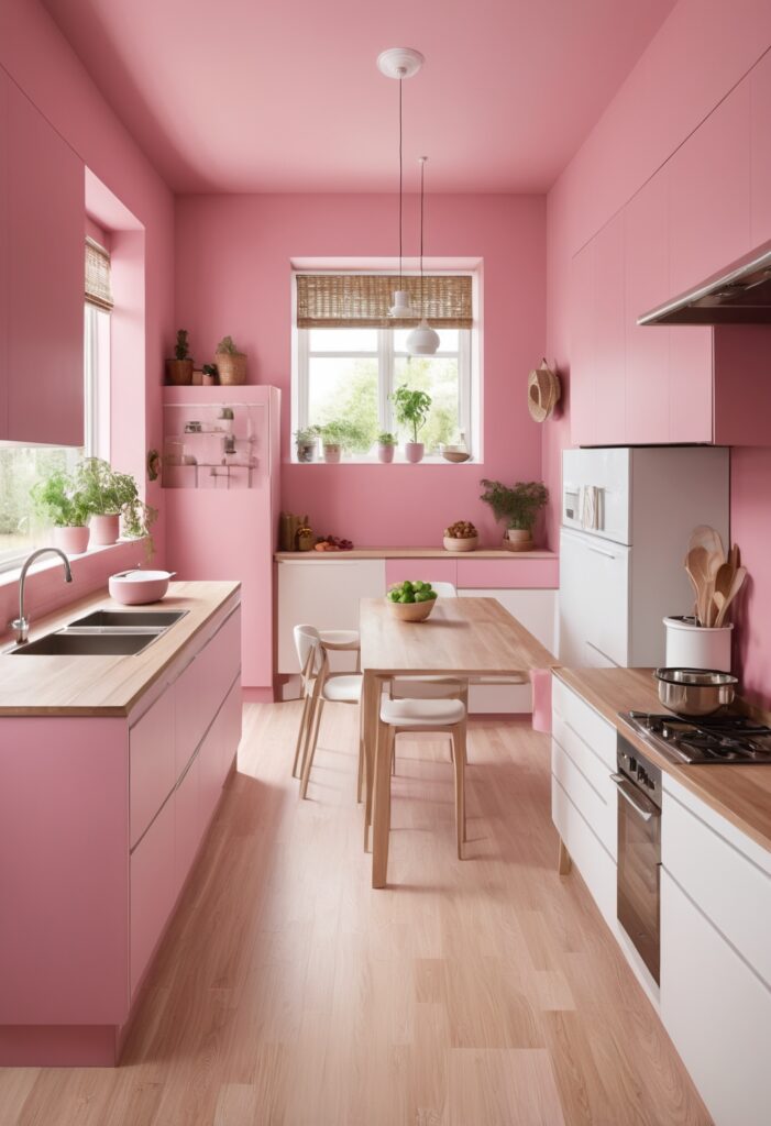
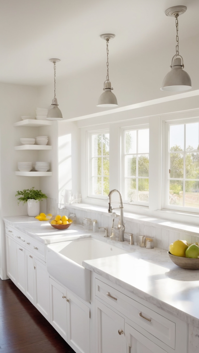
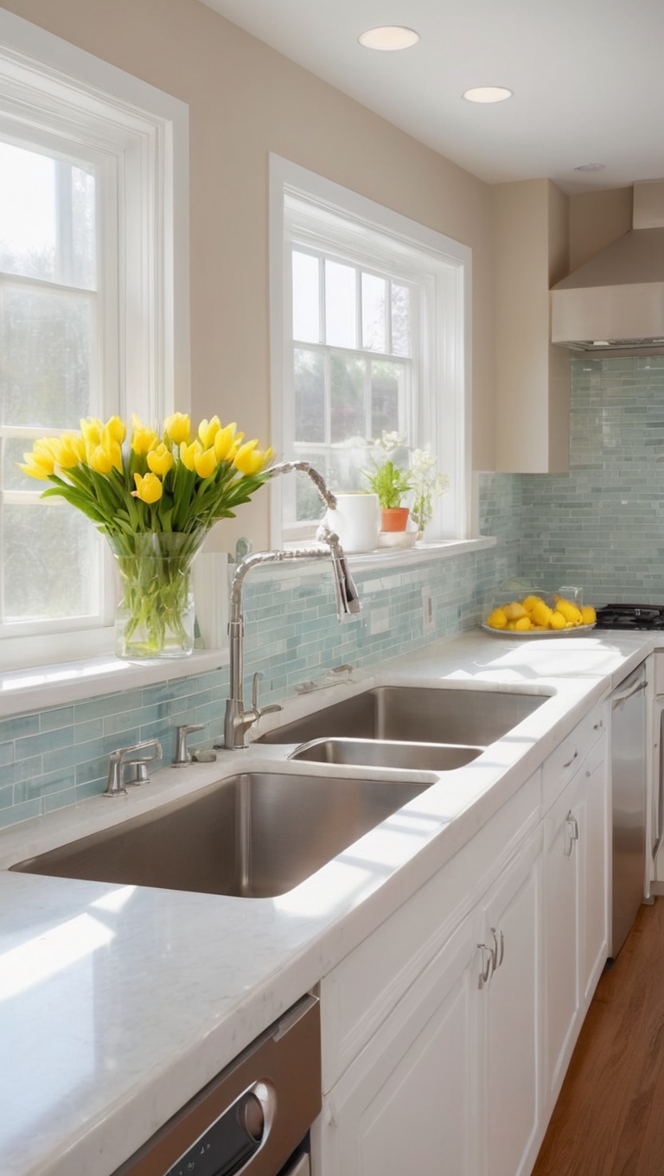
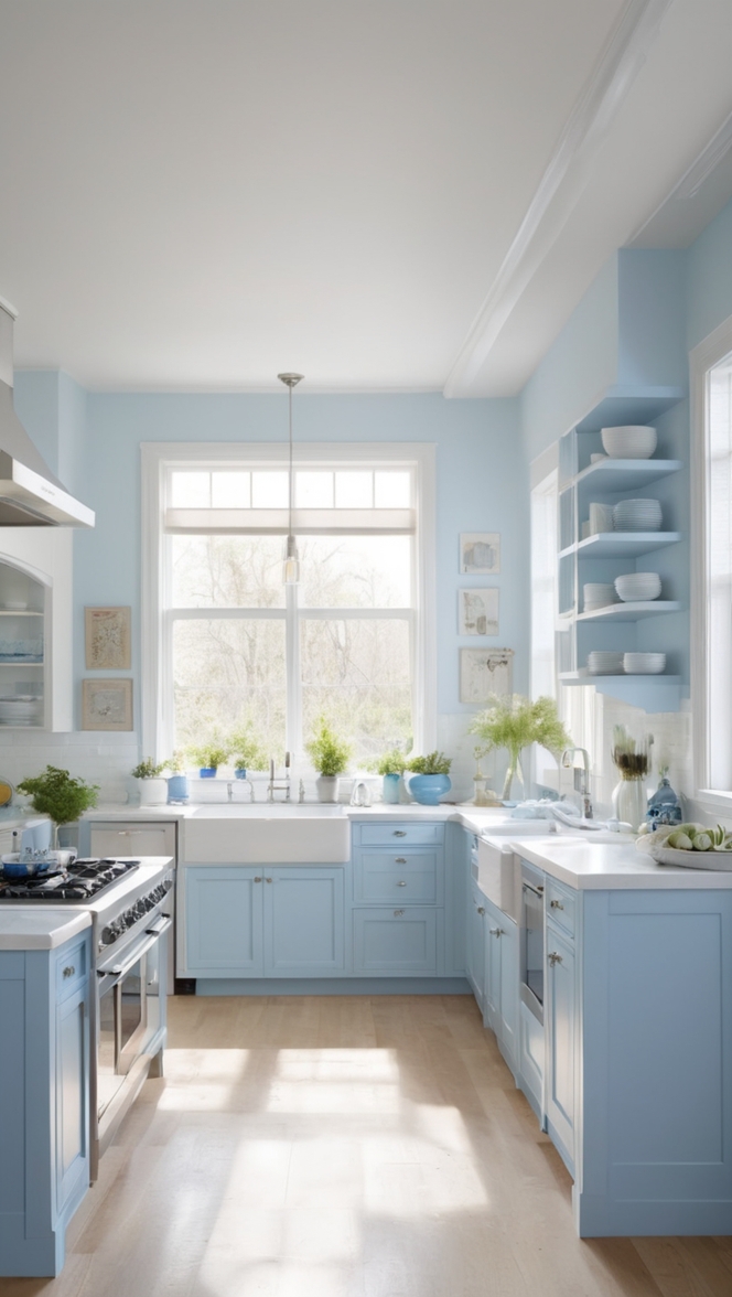
In the realm of interior design, color trends can dramatically transform spaces, creating fresh, modern, and inviting environments. For 2024, “In the Pink” has emerged as a standout choice for kitchen revamps. This chic and contemporary hue brings warmth, elegance, and a touch of playfulness to any kitchen. Here’s why “In the Pink” is the perfect color to revamp your kitchen and how to effectively incorporate it into your space.
Why Choose In the Pink for Your Kitchen?
“In the Pink” is more than just a trendy color; it symbolizes a blend of vibrancy and sophistication. This shade of pink is neither too bold nor too muted, striking the perfect balance that can elevate your kitchen’s aesthetic appeal. Here are some compelling reasons to choose “In the Pink” for your kitchen:
- Warmth and Inviting Ambiance: Pink hues naturally evoke feelings of warmth and coziness, making your kitchen a more inviting space for family and guests.
- Versatility: This shade pairs beautifully with a variety of colors and materials, offering endless possibilities for creative combinations.
- Modern Elegance: “In the Pink” embodies a modern elegance that can make your kitchen look stylish and up-to-date.
- Mood Enhancer: The subtle yet cheerful tone of pink can enhance mood and create a positive atmosphere, perfect for the heart of your home.
- Timeless Appeal: While trendy, “In the Pink” has a timeless quality that ensures your kitchen will look great for years to come.
5 Tips to Match In the Pink Color:
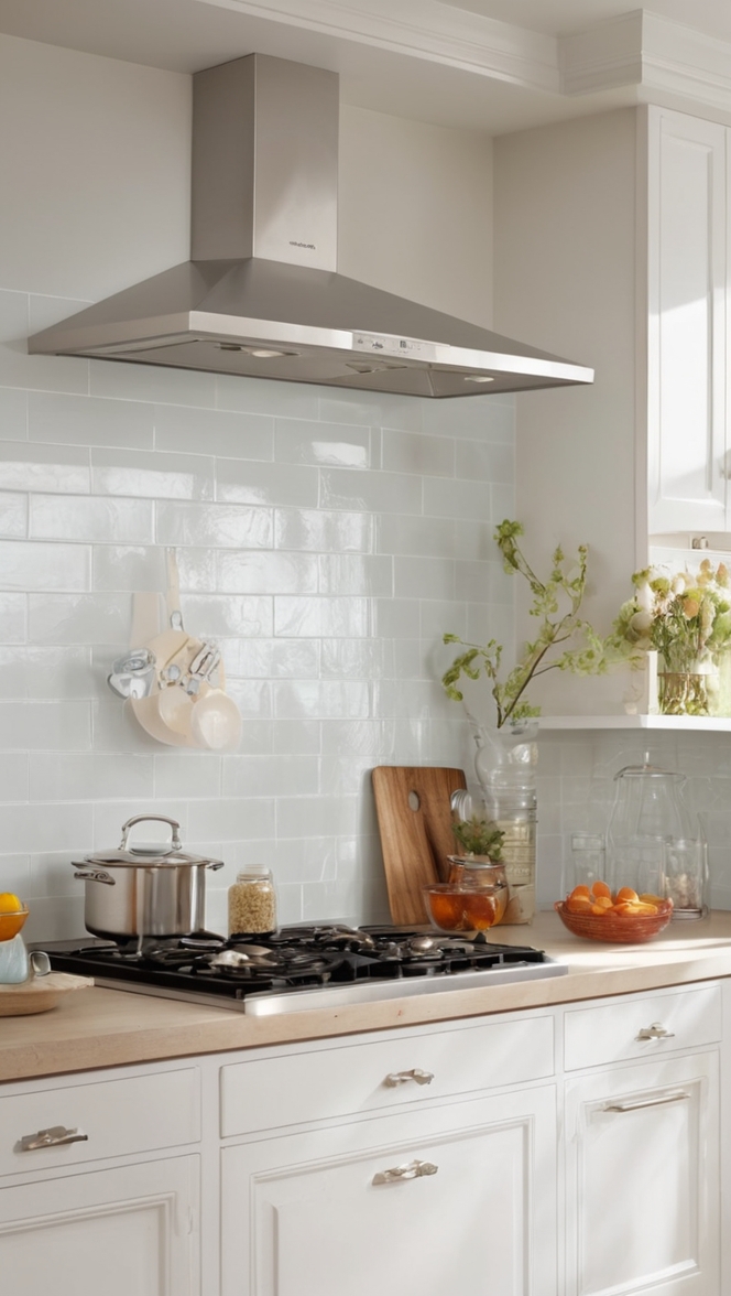
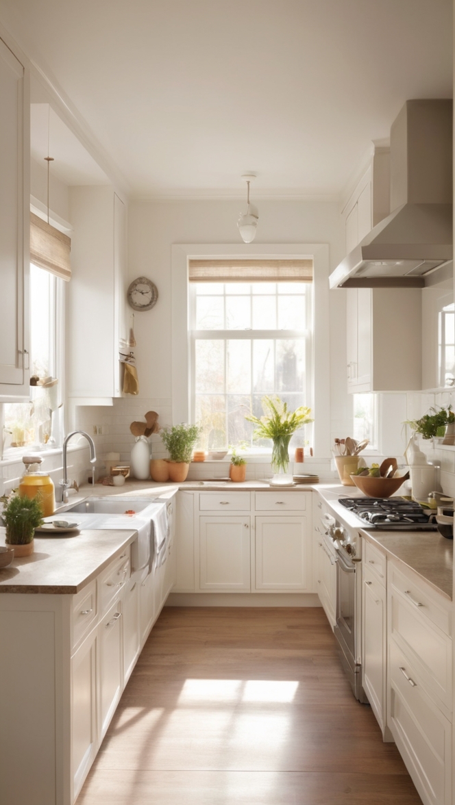
- Pair with Neutrals: Combine “In the Pink” with neutral tones like white, beige, or gray to create a balanced and sophisticated look. These colors help tone down the vibrancy of pink, ensuring it doesn’t overwhelm the space.
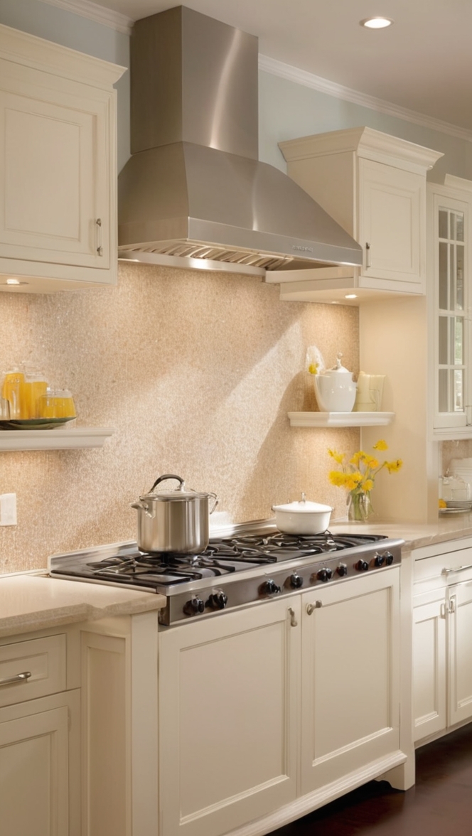
- Incorporate Natural Materials: Use wood, stone, or metal accents to complement the pink. Wooden countertops, stone backsplashes, and metallic hardware can add texture and depth, enhancing the overall aesthetic.
- Accent with Darker Shades: Add elements in darker shades like navy blue, charcoal, or black to provide contrast and depth. This technique can make the pink pop while adding a modern edge.
- Use Patterned Elements: Introduce patterned tiles, fabrics, or wallpapers that incorporate “In the Pink.” Patterns can add visual interest and break up the solid pink, creating a more dynamic space.
- Balance with Cool Tones: Balance the warmth of pink with cool tones such as soft blues or greens. These colors can create a harmonious contrast, making your kitchen feel fresh and vibrant.
5 Hue Matching Ideas:
- Blush and Gold: Pairing “In the Pink” with gold accents creates a luxurious and elegant look. Use gold fixtures, handles, and decor to enhance the pink’s warmth.
- Pink and Gray: A combination of pink and gray is modern and chic. Consider gray cabinetry or countertops to balance the pink walls.
- Pink and Mint: This refreshing duo brings a playful and retro vibe to your kitchen. Mint green accents, such as appliances or accessories, work beautifully with pink.
- Pink and Navy: Navy blue adds a sophisticated touch to pink. Use navy for lower cabinets or as a backsplash to create a striking contrast.
- Pink and White: For a clean and airy look, pair “In the Pink” with white. White upper cabinets and pink lower cabinets or walls can make the space feel open and bright.
5 Alternative Colors from Sherwin-Williams and Benjamin Moore:
Sherwin-Williams
- Rosebud (SW 6288): A slightly deeper pink that adds a rich and inviting feel to your kitchen.
- Blushing (SW 6617): A soft, subtle pink perfect for creating a gentle, serene atmosphere.
- In the Pink (SW 6583): Very similar to our recommended shade, this pink is vibrant yet sophisticated.
- Priscilla (SW 6576): A lighter pink that brings a soft and delicate touch to your kitchen.
- Lotus Flower (SW 6310): A dusty pink that adds a vintage charm and warmth.
Benjamin Moore
- Crushed Berries (2076-30): A bold, vibrant pink that makes a statement in any kitchen.
- First Light (2102-70): A soft, pastel pink that creates a calm and inviting space.
- Touch of Pink (2008-70): A light, airy pink that works well with both modern and traditional designs.
- Pink Damask (890): A sophisticated pink with a hint of peach, offering warmth and elegance.
- Love and Happiness (1191): A bright, cheerful pink that energizes the kitchen environment.
Other Rooms to Use In the Pink:
Living Room
“In the Pink” can make a living room feel cozy and inviting. Use it on accent walls or through decor items like cushions and throws to create a warm and stylish space.
Bedroom
Pink is known for its calming effects, making it an excellent choice for bedrooms. Consider pink bedding, curtains, or even a feature wall to add a touch of tranquility and elegance.
Bathroom
A bathroom can benefit from the cheerful and refreshing qualities of pink. Pink tiles, vanity units, or accessories can create a spa-like atmosphere.
Dining Room
Pink can create an intimate and warm dining experience. Use it on walls or in table settings to foster a welcoming environment for family meals and entertaining guests.
Home Office
“In the Pink” can stimulate creativity and productivity in a home office. Use pink in small doses, like on an accent wall or in office accessories, to create an inspiring workspace.
Conclusion:
Revamping your kitchen with “In the Pink” paint is a fantastic way to bring warmth, elegance, and modernity into your home. This versatile color pairs well with various materials and hues, allowing for endless design possibilities. By following the tips and hue matching ideas provided, you can create a stylish and harmonious kitchen space. Additionally, if you’re looking for alternative shades, Sherwin-Williams and Benjamin Moore offer beautiful pinks that can achieve similar effects. Don’t hesitate to extend this charming color to other rooms in your home to create a cohesive and inviting atmosphere. Embrace the “In the Pink” trend and transform your kitchen into the heart of your home.

