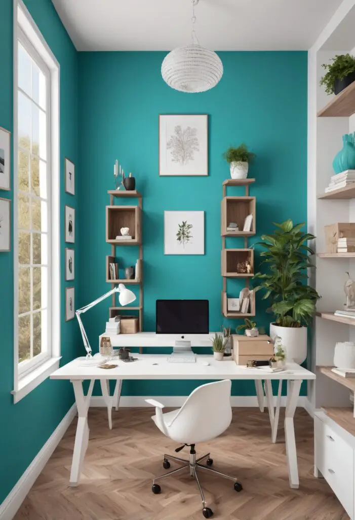
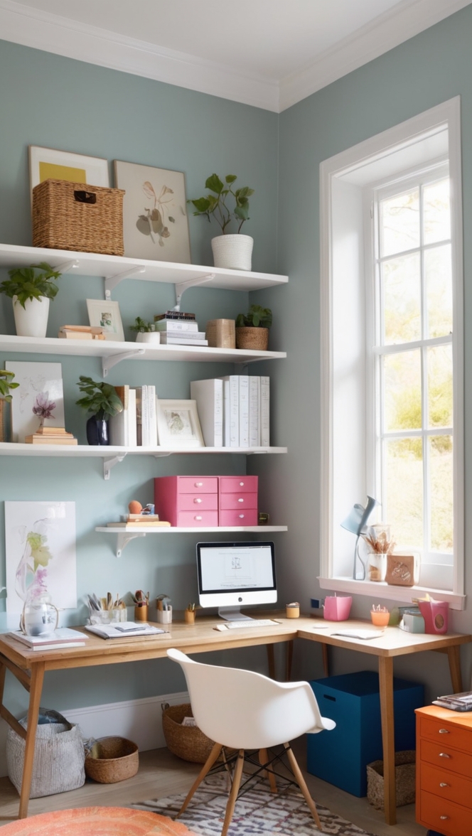
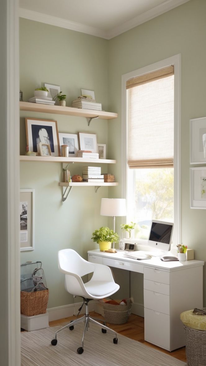
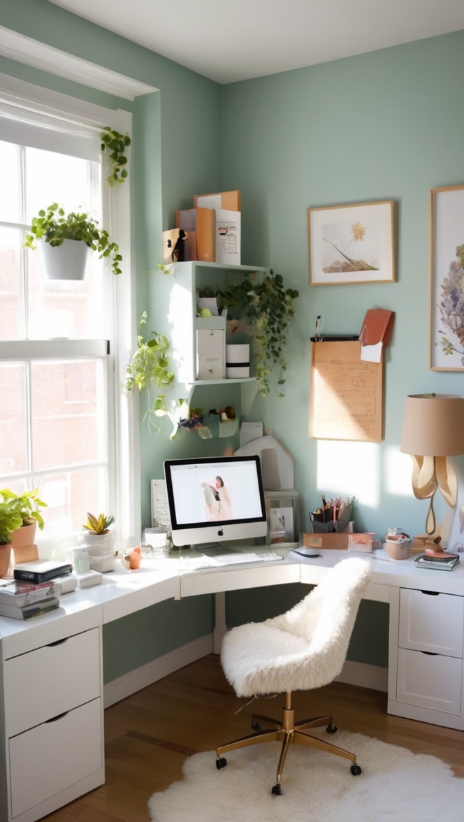
In the ever-evolving landscape of interior design, choosing the right color for your workspace can significantly impact productivity, creativity, and overall ambiance. For 2024, Nifty Turquoise emerges as a standout choice, blending tranquility with vibrancy in a way that rejuvenates any environment.
Why Choose Nifty Turquoise?
Nifty Turquoise is a refreshing hue that brings a sense of calm and clarity, perfect for stimulating focus and creativity in a workspace. Its soothing tones evoke a feeling of serenity, making it an ideal backdrop for long hours of concentration and innovation.
This particular shade of turquoise is versatile enough to complement various interior styles, from minimalist setups to eclectic designs. Its ability to adapt to different lighting conditions ensures that your workspace remains vibrant and inviting throughout the day.
Tips to Match Nifty Turquoise with Your Workspace:
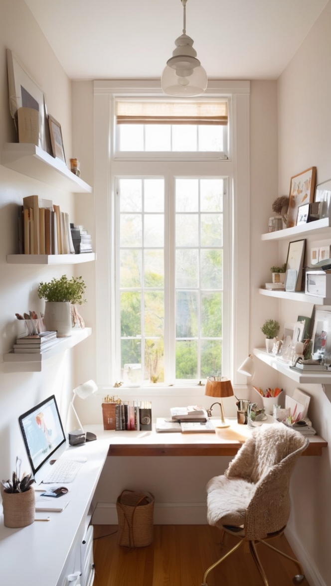
- Neutral Accents: Pair Nifty Turquoise with neutral colors like white, beige, or light gray for a balanced look. This combination prevents the space from feeling overwhelming while still allowing the turquoise to pop.
- Natural Elements: Incorporate natural materials such as wood or bamboo in furniture or decor. These earthy tones harmonize with turquoise, creating a harmonious and grounded atmosphere.
- Metallic Touches: Introduce metallic accents in gold or silver to add a touch of elegance and modernity. These accents reflect light and complement the cool tones of Nifty Turquoise beautifully.
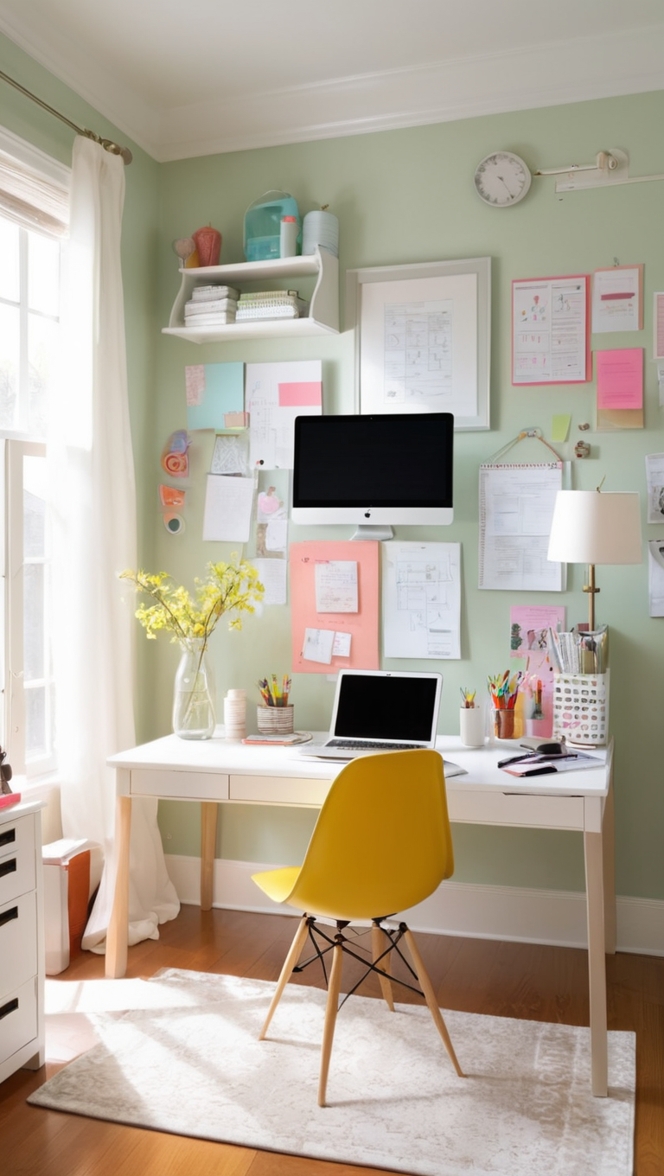
- Complementary Colors: For a bolder statement, consider pairing turquoise with complementary colors like coral, mustard yellow, or deep navy. These combinations create a dynamic and energizing environment without overwhelming the senses.
- Textured Fabrics: Experiment with textured fabrics in cushions, curtains, or rugs. Velvet or linen in soft blues or greens can enhance the depth of Nifty Turquoise while adding tactile interest to your workspace.
Hue Matching with Nifty Turquoise:
When selecting hues to match Nifty Turquoise, consider the following complementary shades:
- Soft Gray: Creates a sophisticated and calming ambiance, ideal for a modern or minimalist workspace.
- Coral: Adds warmth and energy, balancing the coolness of turquoise with a vibrant touch.
- Mustard Yellow: Offers a cheerful contrast, promoting positivity and creativity within the workspace.
- Navy Blue: Provides a deep, grounding effect, perfect for anchoring larger spaces or accent walls.
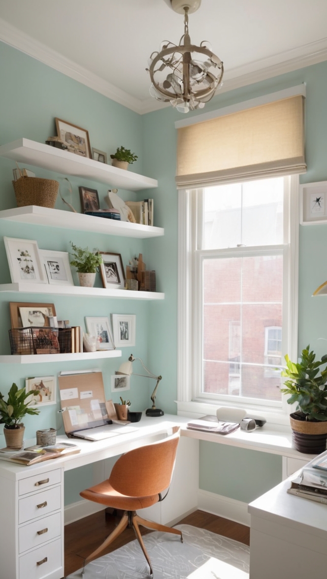
- Mint Green: Harmonizes with turquoise while offering a lighter, fresher alternative for a serene environment.
Alternative Colors from Sherwin Williams and Benjamin Moore:
Explore these alternative colors from Sherwin Williams and Benjamin Moore that complement Nifty Turquoise:
Sherwin Williams
- SW 6478 Watery: A soft, watery blue-green that pairs beautifully with Nifty Turquoise for a cohesive and calming workspace.
- SW 6213 Halcyon Green: A subtle green-gray that adds a touch of elegance and depth, perfect for creating a serene atmosphere.
- SW 7077 Original White: A crisp white shade that enhances the brightness of Nifty Turquoise, ideal for smaller or dimly lit workspaces.
Benjamin Moore
- Benjamin Moore 773 Tropical Dusk: A warm gray with subtle hints of taupe, providing a sophisticated backdrop that complements Nifty Turquoise.
- Benjamin Moore 810 Beach Glass: A soft, muted green-blue that pairs well with turquoise, creating a tranquil and inviting workspace.
- Benjamin Moore 2125-60 Ice Mist: A light, airy gray that adds a sense of openness and clarity to your workspace when paired with Nifty Turquoise.
Other Rooms to Use Nifty Turquoise:
Consider extending the use of Nifty Turquoise beyond your workspace to other areas of your home:
Living Room
In the living room, Nifty Turquoise can serve as a refreshing accent wall or as the main color for furniture such as sofas or armchairs. Pair it with soft neutrals like cream or light gray for a cozy and inviting atmosphere.
Bedroom
In the bedroom, Nifty Turquoise promotes relaxation and tranquility, making it an excellent choice for bedding, curtains, or an accent wall behind the bed. Combine with warm wood tones or soft blush pinks for a harmonious and soothing retreat.
Kitchen
In the kitchen, use Nifty Turquoise for cabinets or backsplashes to inject a burst of energy and creativity into the space. Balance with white countertops and stainless steel appliances for a clean and modern look.
Conclusion:
Choosing Nifty Turquoise as the paint color for your workspace in 2024 is not just a design choice but a strategic decision to enhance productivity and well-being. Its calming yet invigorating properties, combined with its versatility in complementing various design elements, make it an ideal option for creating a conducive environment for work and creativity. By following the tips for matching, exploring complementary hues, and considering alternative colors from Sherwin Williams and Benjamin Moore, you can tailor your workspace to reflect your personal style while optimizing functionality. Embrace the transformative power of Nifty Turquoise and redefine your workspace into a vibrant hub of inspiration and productivity.

