
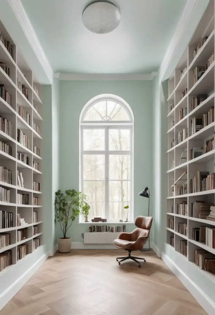
In today’s fast-paced world, where every element of our surroundings influences our mood and productivity, the color of our environment plays a crucial role. Modern libraries, as hubs of learning, creativity, and relaxation, require colors that stimulate the mind while providing a calming atmosphere. In 2024, lighter mint paint has emerged as a popular choice for such spaces, offering a refreshing yet sophisticated ambiance that enhances the reading experience. Let’s delve into why this color is highly recommended for modern libraries.
Why Lighter Mint Paint?
1. Tranquility and Serenity:
Lighter mint paint evokes feelings of tranquility and serenity, essential for creating a peaceful environment conducive to reading and studying. Its soft, pastel hue soothes the senses, promoting a sense of calmness that aids concentration and focus.
2. Freshness and Vitality:
Mint green, especially in its lighter shades, symbolizes freshness and vitality. It infuses the library with a rejuvenating energy, making it an inviting space where readers feel revitalized and inspired to explore new ideas within the pages of their chosen books.
3. Psychological Impact:
According to color psychology, mint green is associated with clarity of thought, mental clarity, and optimism. Its subtle presence in the library environment can uplift moods, alleviate stress, and encourage a positive mindset among visitors, enhancing their overall experience.
4. Versatility and Timelessness:
Lighter mint paint is versatile, blending seamlessly with various design styles and aesthetics. Whether the library boasts a modern, minimalist interior or a classic, traditional ambiance, this color complements diverse decor elements, ensuring a timeless appeal that remains relevant for years to come.
5. Visual Interest Without Distraction:
Unlike bolder hues that may overwhelm the senses or distract from the primary purpose of reading, lighter mint paint adds visual interest to the library without overpowering the space. Its understated elegance allows books and furnishings to take center stage, while still infusing the room with a refreshing charm.
Tips to Match Color:
1. Natural Elements:
Pair lighter mint walls with wooden furniture or accents to create a harmonious blend of natural elements. The warmth of wood complements the coolness of the mint, striking a perfect balance between earthy and refreshing tones.
2. Soft Textures:
Incorporate soft textures such as plush rugs, cozy throws, and upholstered seating in neutral hues like beige or ivory. These textures add depth to the space while enhancing the comfort and inviting nature of the library environment.
3. Accent Colors:
Introduce accents in complementary shades, such as soft peach, pale pink, or muted lavender, to infuse the library with subtle pops of color. Scatter decorative pillows, artwork, or vases strategically throughout the space to create visual interest and cohesion.
4. Statement Lighting:
Illuminate the library with statement lighting fixtures in metallic finishes like brass or copper. These accents not only provide functional lighting but also add a touch of elegance and sophistication to the overall design scheme.
5. Greenery:
Bring the outdoors inside by incorporating potted plants or fresh flowers into the library decor. Greenery not only enhances the aesthetic appeal of the space but also contributes to improved air quality and a sense of connection with nature.
Hue Matching:
1. Soft Peach:
Pair lighter mint paint with soft peach accents for a harmonious color combination that exudes warmth and sophistication. This delicate pairing creates a serene ambiance ideal for quiet reading and contemplation.
2. Pale Pink:
Combine lighter mint walls with pale pink furnishings or accessories to achieve a soft, feminine aesthetic with a modern twist. The subtle contrast between the two hues adds visual interest while maintaining a tranquil atmosphere.
3. Muted Lavender:
Infuse the library with a touch of romance and nostalgia by incorporating muted lavender accents against a backdrop of lighter mint paint. This dreamy color combination creates a whimsical ambiance that invites visitors to escape into the world of literature.
4. Ivory:
Offset the coolness of lighter mint walls with accents in creamy ivory tones for a timeless and elegant look. The soft contrast between the two hues enhances the visual appeal of the space while maintaining a sense of cohesion and balance.
5. Gold:
Add a touch of luxury and glamour to the library with accents in shimmering gold finishes. Whether in the form of metallic frames, decorative objects, or hardware, gold accents complement lighter mint paint beautifully, elevating the overall aesthetic to new heights of sophistication.
Alternative Colors:
1. Sherwin Williams – Sea Salt:
For a slightly deeper and more muted alternative to lighter mint, consider Sherwin Williams’ Sea Salt. This versatile color boasts a subtle green undertone that pairs beautifully with a range of design styles and color palettes.
2. Benjamin Moore – Palladian Blue:
Benjamin Moore’s Palladian Blue offers a serene and airy alternative to traditional mint green. With its soft, grayish-blue hue, this timeless color creates a tranquil backdrop that promotes relaxation and contemplation.
3. Sherwin Williams – Rainwashed:
Sherwin Williams’ Rainwashed is a soft and sophisticated alternative to lighter mint, featuring a subtle blend of green and blue tones. This versatile color adds depth and dimension to any space while maintaining a sense of tranquility and balance.
4. Benjamin Moore – Breath of Fresh Air:
Embrace the essence of springtime with Benjamin Moore’s Breath of Fresh Air, a light and airy alternative to traditional mint green. This refreshing hue instantly brightens any room, infusing it with a sense of vitality and renewal.
5. Sherwin Williams – Silver Strand:
Sherwin Williams’ Silver Strand offers a subtle yet impactful alternative to lighter mint, featuring a delicate balance of gray and blue undertones. This versatile color adds a touch of sophistication and elegance to any space, making it an ideal choice for modern libraries.
Other Rooms to Use Color:
1. Bedroom:
Create a serene and tranquil bedroom retreat by painting the walls in lighter mint paint. Pair with soft, neutral bedding and accents for a calming ambiance that promotes restful sleep and relaxation.
2. Bathroom:
Transform your bathroom into a spa-like oasis with lighter mint walls and crisp white accents. Add plush towels, scented candles, and botanical artwork to enhance the tranquil atmosphere and create a sense of luxury.
3. Kitchen:
Infuse your kitchen with a fresh and airy feel by incorporating lighter mint cabinetry or accent walls. Pair with natural wood finishes and stainless steel appliances for a modern yet inviting space that inspires culinary creativity.
4. Home Office:
Boost productivity and creativity in your home office with lighter mint walls and sleek, contemporary furnishings. Add pops of color with vibrant artwork or accessories to stimulate the mind and enhance focus.
5. Living Room:
Elevate your living room decor with lighter mint accents, such as throw pillows, area rugs, or accent chairs. Pair with neutral upholstery and metallic accents for a sophisticated look that exudes understated elegance.
Conclusion:
In the realm of interior design, color plays a pivotal role in shaping the ambiance and functionality of a space. In the context of modern libraries, where the focus is on promoting learning, creativity, and relaxation, lighter mint paint emerges as a versatile and timeless choice.


