Are you struggling to choose between bright and pastel colors for your kitchen decor? Discover the perfect palette in this article.
Bright colors are perfect for creating a lively and vibrant kitchen atmosphere. They can make the space feel more energetic and inviting. On the other hand, pastel colors create a soft and soothing ambiance, ideal for a more relaxed and calming kitchen environment. When choosing between bright and pastel colors for kitchen decor, consider the size of your kitchen, the amount of natural light it receives, and your personal style preferences. Bright colors can make a small kitchen appear larger, while pastel colors can add a touch of elegance to a larger kitchen. Use color matching techniques to ensure a cohesive look throughout your kitchen decor. Proper space planning is key to achieving a harmonious blend of colors in your home interior design.
How can I incorporate bright colors into my kitchen decor without overwhelming the space?
When incorporating bright colors into your kitchen decor, the key is to find a balance between vibrancy and subtlety. Start by selecting one main bright color as your focal point, such as a bold red, sunny yellow, or vibrant turquoise. You can then complement this color with neutral tones like white, gray, or beige to prevent the space from feeling overwhelming. Consider using bright colors on accent walls, kitchen accessories, or small appliances to add pops of color without dominating the entire room. Additionally, you can incorporate bright colors through artwork, rugs, or curtains to create a cohesive and visually appealing look. Remember to maintain a cohesive color palette and avoid using too many bright colors in one space to prevent sensory overload.
What are some popular pastel color options for kitchen decor?
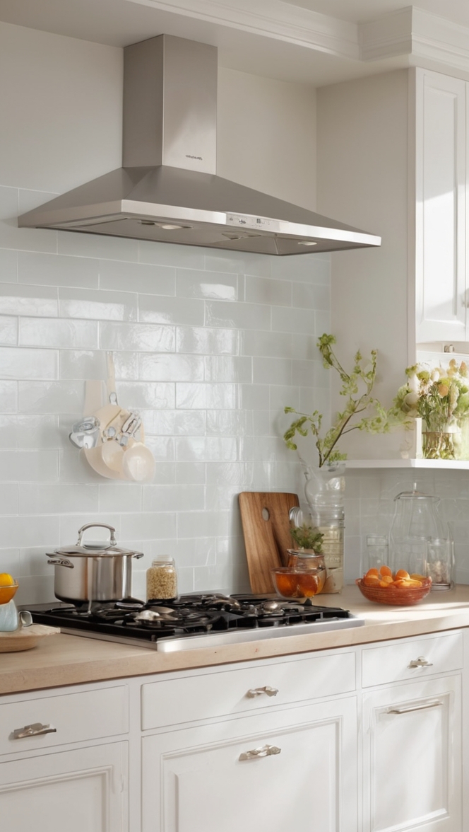
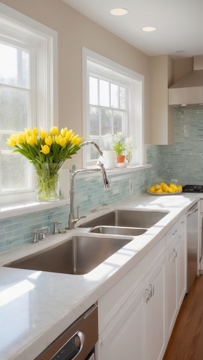
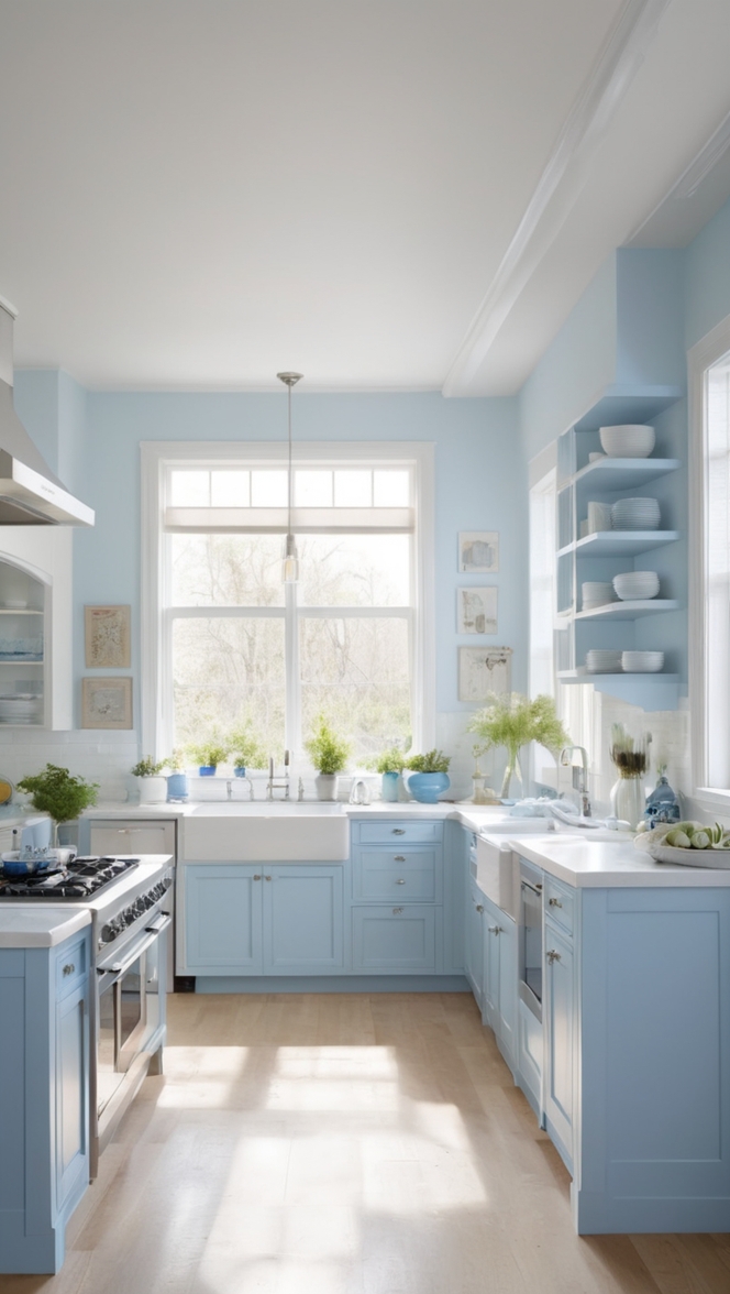
Pastel colors are a popular choice for kitchen decor as they add a soft and calming touch to the space. Some popular pastel color options include soft pink, mint green, pale blue, lavender, and buttery yellow. These colors are perfect for creating a light and airy atmosphere in the kitchen and can complement a variety of design styles. Pastel colors work well with natural light, making the space feel open and inviting. You can incorporate pastel colors through kitchen cabinets, backsplashes, countertops, or even small kitchen appliances for a subtle yet impactful look.
Can I mix bright and pastel colors in my kitchen decor?
Mixing bright and pastel colors in your kitchen decor can create a dynamic and visually appealing space. To successfully combine these color palettes, consider using a ratio of 70% neutral tones, 20% pastel colors, and 10% bright colors. This balance will ensure that the space feels cohesive and harmonious while still incorporating vibrant hues. You can use bright colors as accents to add energy and personality to the room, while pastel colors can help create a sense of balance and tranquility. Experiment with different combinations to find the right balance that suits your style and preferences.
How do I choose the right color scheme for my kitchen based on the existing decor?
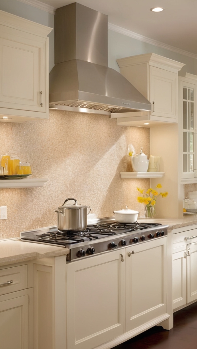
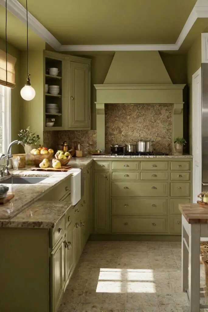
When choosing a color scheme for your kitchen based on the existing decor, it’s essential to consider the style, layout, and materials already present in the space. If you have a modern kitchen with sleek cabinets and stainless steel appliances, you may opt for a monochromatic color scheme with shades of gray or black. Alternatively, if your kitchen features traditional elements like wood cabinets and farmhouse sink, you can introduce warm tones like beige, cream, or soft brown for a cozy and inviting feel. Take inspiration from the existing colors in your kitchen, such as countertops, flooring, and backsplashes, to create a cohesive and harmonious look.
Are there specific color combinations that work well with bright or pastel colors in a kitchen?
When working with bright colors in the kitchen, consider pairing complementary colors to create a dynamic and visually stimulating space. For example, combinations like turquoise and orange, yellow and purple, or red and green can add energy and personality to the room. On the other hand, pastel colors work well with soft neutrals like white, gray, or beige to create a soothing and harmonious look. Consider using analogous color schemes, such as shades of blue and green or pink and purple, to achieve a cohesive and coordinated color palette in your kitchen decor.
What are some alternative paint options to achieve a bright or pastel look in the kitchen?
In addition to traditional paint colors, there are alternative options to achieve a bright or pastel look in your kitchen decor. Consider using chalkboard paint to create a unique and customizable accent wall in a bright color like vibrant yellow or hot pink. This paint allows you to write or draw on the wall, adding a playful and interactive element to the space. Another alternative is removable wallpaper, which comes in a variety of bright and pastel patterns and can be easily changed to suit your mood or seasonal decor. Experiment with peel-and-stick tiles in vibrant colors or soft pastels to create a striking backsplash that can be easily updated or replaced.
How can I organize my kitchen decor to complement bright or pastel colors effectively?
When organizing your kitchen decor to complement bright or pastel colors, consider the following strategies:
– Use color blocking: Create visual interest by grouping items of similar colors together, such as kitchen accessories, dishes, or decorative pieces.
– Consider contrast: Pair bright colors with neutral tones or pastel hues to create a balanced and harmonious look.
– Embrace texture: Incorporate textured materials like wood, glass, or metal to add depth and dimension to the space.
– Limit the color palette: To prevent the space from feeling overwhelming, stick to a few key colors and use them consistently throughout the room.
– Balance the visual weight: Distribute bright and pastel colors evenly across the kitchen to create a sense of equilibrium and flow.
By incorporating these organizational strategies, you can effectively enhance the impact of bright or pastel colors in your kitchen decor while maintaining a cohesive and stylish look.