Discover how to transform your home office with the perfect color scheme. Monochromatic or contrasting – find out which style suits you best.
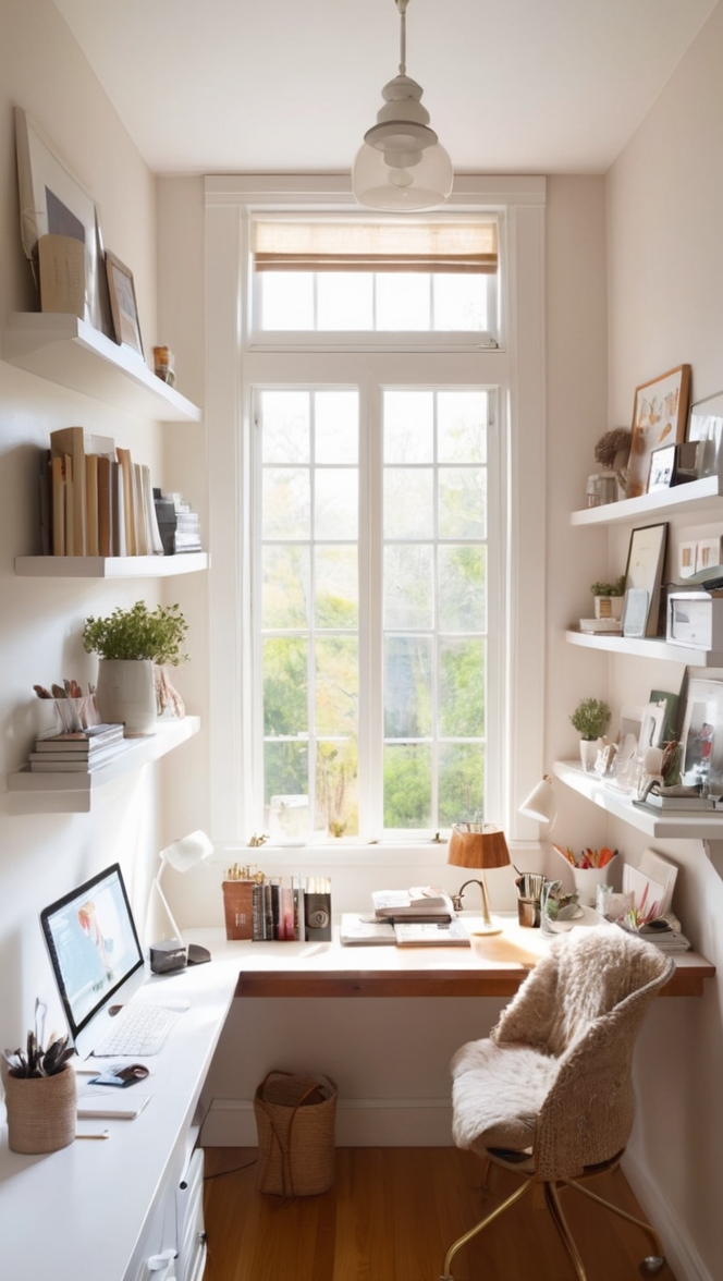
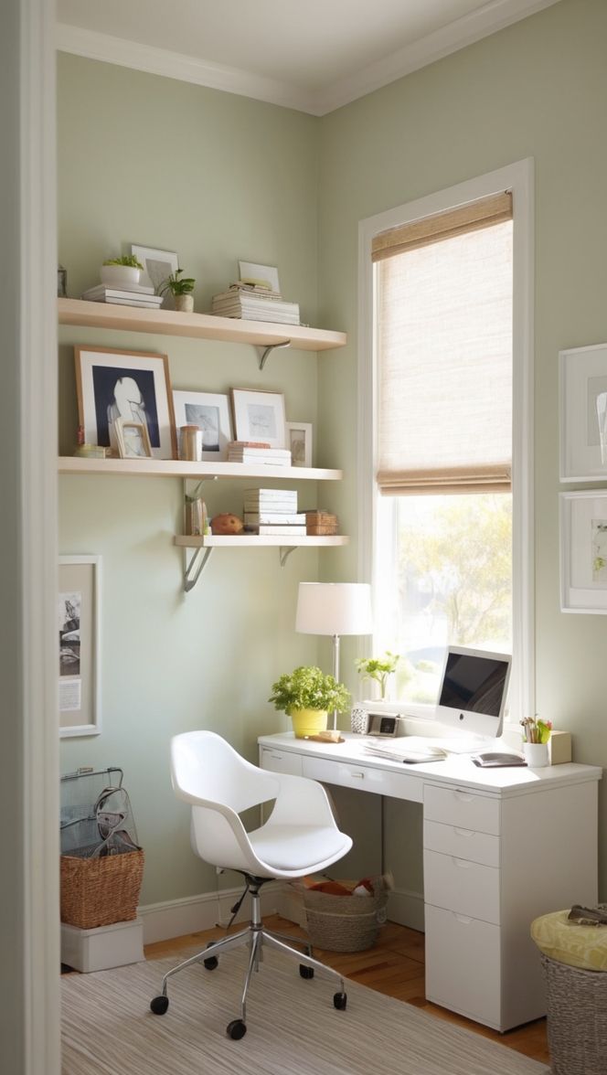
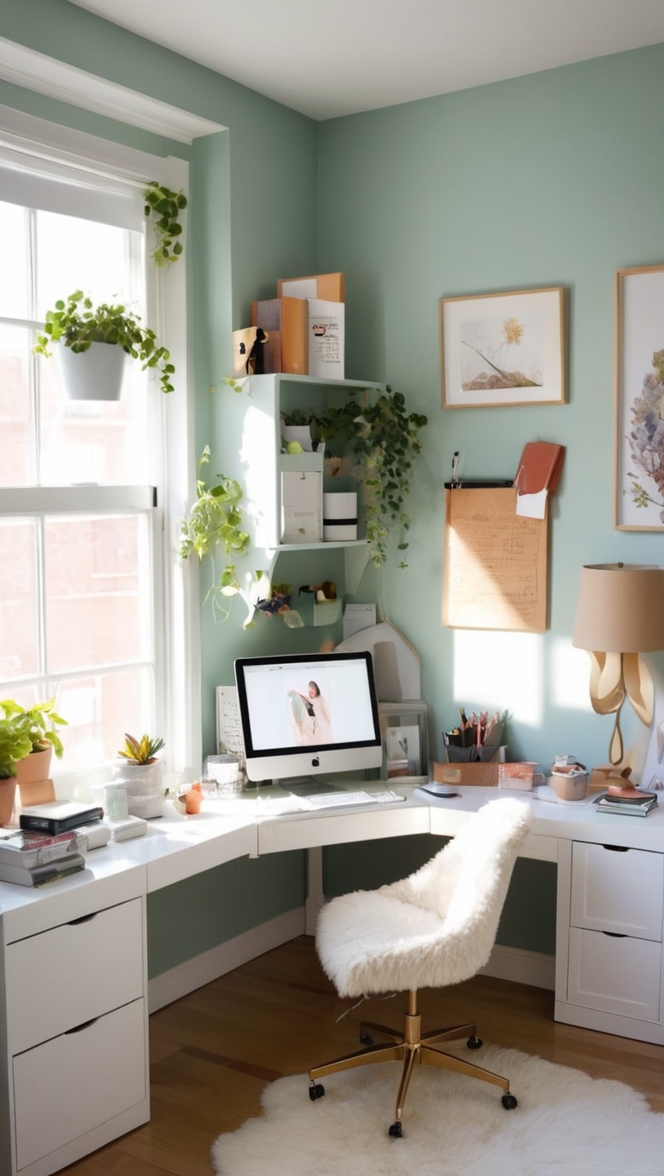
I prefer a monochromatic color scheme in the home office as it creates a cohesive and calming environment that promotes focus and productivity. In interior design, using shades of a single color can make the space feel more streamlined and organized. To achieve a monochromatic look, select different tones of the same color family for the walls, furniture, and decor items. Consider adding pops of texture or metallic accents to prevent the room from feeling flat. Pay attention to lighting and incorporate layers of light to enhance the depth of the monochromatic palette. Ensure proper space planning to optimize functionality and comfort in the home office.
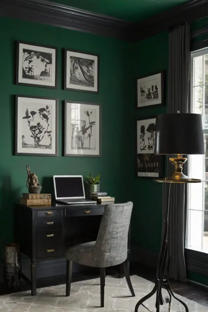
Determining whether a monochromatic or contrasting color scheme would be best for your home office depends on various factors such as personal preference, the overall style of your home, the amount of natural light in the office, and the type of work you do. Monochromatic color schemes consist of different shades of a single color and can create a calming and cohesive look. On the other hand, contrasting color schemes combine colors that are opposite each other on the color wheel and can add energy and visual interest to a space.
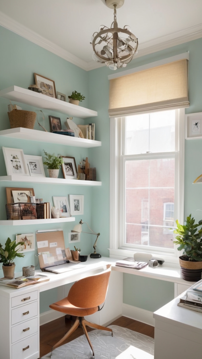
Popular color combinations for a monochromatic color scheme in a home office include various shades of gray, blue, beige, or green. These subtle variations can help create a soothing and harmonious environment that promotes focus and concentration. By sticking to different tones of the same color, you can achieve a chic and sophisticated look without overwhelming the space.
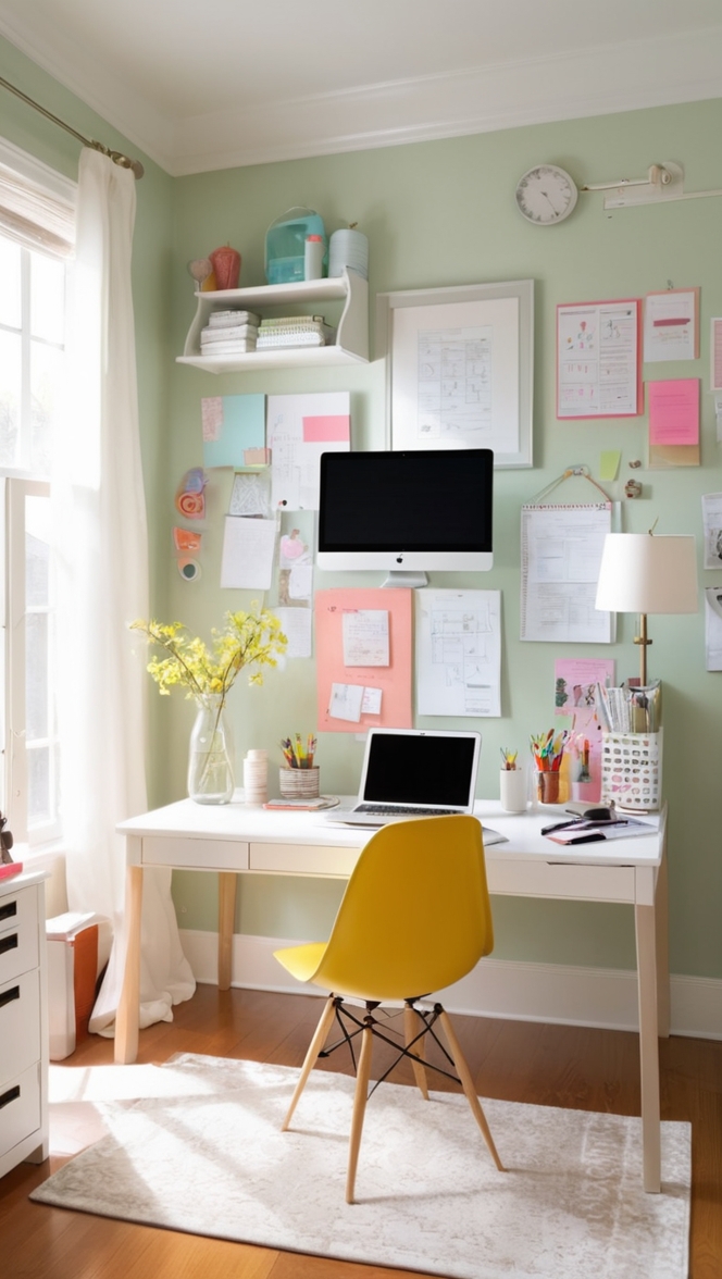
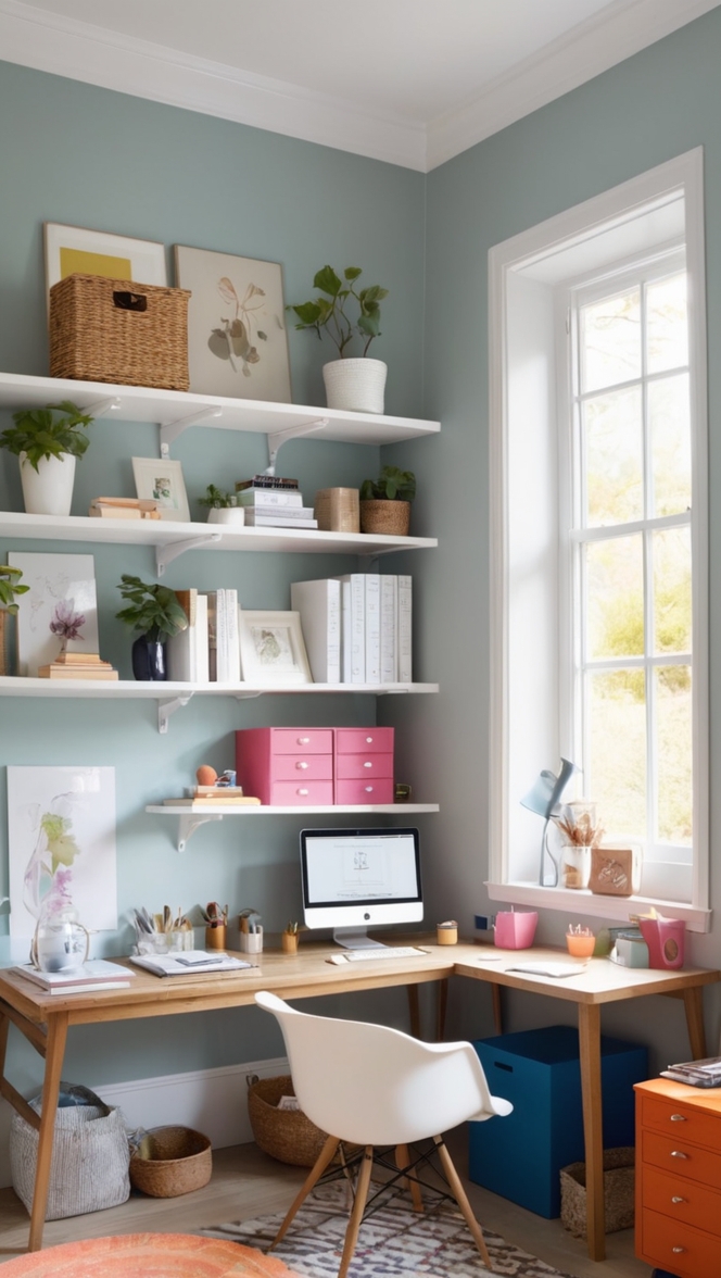
Incorporating pops of color in a monochromatic color scheme can be done strategically to add personality and flair to your home office. Consider adding vibrant accent pieces such as throw pillows, artwork, or desk accessories in a bold color that contrasts with the overall monochromatic palette. This technique can inject a sense of playfulness and creativity into the space while maintaining the overall balance of the color scheme.
Contrasting colors can be used effectively in a home office design to create visual impact and define different areas within the space. For example, you can use a bold accent wall in a contrasting color to highlight a specific area like a workspace or a reading nook. Additionally, incorporating contrasting colors through furniture or decor pieces can help break up the monotony of a monochromatic color scheme and add depth to the overall design.
When selecting colors that complement each other in a home office setting, consider the psychological effects of color on productivity and mood. Warm tones like red and orange are known to stimulate creativity and energy, while cool tones like blue and green can promote calmness and focus. Opt for colors that resonate with you personally and align with the type of work you do in your home office.
Certain colors are believed to boost productivity in a home office environment. For instance, shades of blue are often associated with productivity and concentration, making them an ideal choice for a home office where focus is essential. Green is another color that symbolizes growth, balance, and harmony, creating a sense of calmness and stability in a work environment. Experiment with different hues to find the colors that best enhance your productivity levels.
To ensure that the color scheme in your home office matches well with the overall decor of your home, consider the existing color palette and style of your home. If your home has a minimalist and modern aesthetic, a monochromatic color scheme with clean lines and simple accents would complement the overall design. On the other hand, if your home features a more eclectic or bohemian style, you could opt for a contrasting color scheme with vibrant hues and bold patterns to add a touch of personality to the space.
In conclusion, the choice between a monochromatic or contrasting color scheme in your home office ultimately depends on your personal style, preferences, and the ambiance you want to create. By carefully selecting colors, incorporating pops of color strategically, and ensuring harmony with the overall decor of your home, you can design a home office that not only looks good but also enhances your productivity and well-being.
**Key Takeaways:**
– Consider personal preference, natural light, and work type when choosing between monochromatic and contrasting color schemes.
– Popular monochromatic color combinations include shades of gray, blue, beige, and green for a calming and cohesive look.
– Incorporate pops of color strategically to add personality and creativity to a monochromatic scheme.
– Use contrasting colors effectively to create visual impact and define different areas within the home office.
– Select colors that complement each other based on their psychological effects on productivity and mood.
– Experiment with colors like blue and green known to boost productivity in a home office setting.
– Ensure that the color scheme in your home office harmonizes with the overall decor of your home to create a cohesive look.