
In the fast-paced world of interior design, staying on trend is crucial to creating a space that feels both contemporary and inviting. For 2024, one color that stands out is Taiga Hues. This earthy yet sophisticated shade can transform your reading space into a modern haven, providing a fresh and calming atmosphere. In this article, we will delve into why Taiga Hues is the perfect paint color for your library, offer tips on how to match it with other elements, explore five complementary hues, and provide alternative color options from Sherwin Williams and Benjamin Moore. Additionally, we’ll discuss how Taiga Hues can be incorporated into other rooms, offering versatility for your entire home.
Why Taiga Hues?
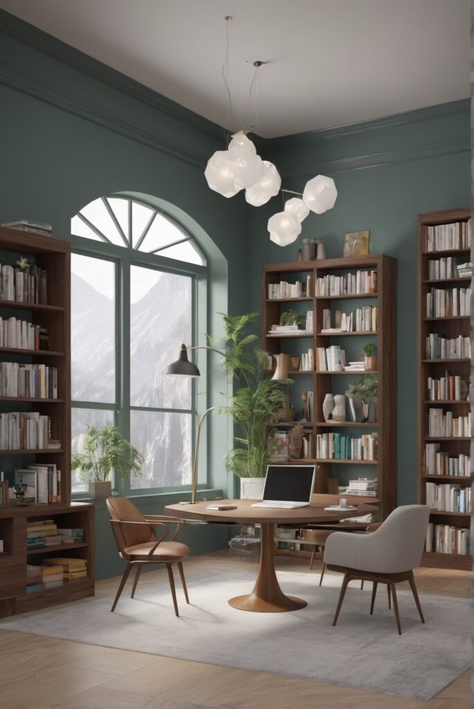
Taiga Hues is a subtle yet impactful green-gray color that brings the tranquility of nature indoors. In 2024, there is a growing trend towards incorporating nature-inspired elements into interior design, and Taiga Hues perfectly captures this aesthetic. Here are some reasons why Taiga Hues is an excellent choice for your reading library:
- Soothing Atmosphere: The soft and muted tones of Taiga Hues create a calming ambiance, making it an ideal choice for a space dedicated to reading and relaxation.
- Versatility: Taiga Hues is a neutral color that pairs well with various design elements. Whether your library is filled with dark wooden furniture or contemporary metal shelving, Taiga Hues adapts seamlessly.
- Connection to Nature: In a library space, the goal is often to create a retreat from the hustle and bustle of daily life. Taiga Hues connects the indoors with nature, fostering a sense of tranquility and harmony.
- Enhanced Focus: The subtle green undertones of Taiga Hues are known to promote concentration and focus. This makes it an excellent choice for a space where reading and studying are the primary activities.
- Timelessness: Taiga Hues is a color that transcends trends. Its timeless appeal ensures that your reading space will remain stylish for years to come, making it a worthwhile investment.
Tips for Matching Colors with Taiga Hues
To fully harness the potential of Taiga Hues in your reading library, consider the following tips for matching colors:
1. Contrast with Neutrals: Taiga Hues pairs beautifully with neutral tones such as whites, grays, and beiges. Consider incorporating these colors for furniture, rugs, and curtains to create a balanced look.
2. Warm Accents: To add warmth to the space, introduce accents in warm colors like mustard yellow, burnt orange, or terracotta. These hues complement the cool undertones of Taiga Hues.
3. Natural Elements: Enhance the connection to nature by incorporating natural materials like wood and stone. These elements add texture and depth, enhancing the overall aesthetic.
4. Metallic Touches: For a touch of modern elegance, introduce metallic accents in gold or brass. These metallic hues create a sophisticated contrast with Taiga Hues.
5. Bold Statements: If you want to make a statement, consider adding pops of deep, rich colors like navy blue or emerald green. These bold hues create visual interest without overwhelming the space.
Five Complementary Hues to Taiga Hues
To further enhance your reading space, consider these five complementary hues that pair exceptionally well with Taiga Hues:
- Eucalyptus Green: A lighter green that complements Taiga Hues, creating a harmonious and nature-inspired palette.
- Dusty Rose: This muted pink adds a touch of femininity and warmth to balance the cool undertones of Taiga Hues.
- Slate Gray: A sophisticated and timeless choice, slate gray pairs effortlessly with Taiga Hues, creating a refined and elegant atmosphere.
- Goldenrod Yellow: Infuse energy and vibrancy into your library with goldenrod yellow accents, creating a lively contrast with Taiga Hues.
- Cocoa Brown: For a rich and grounding effect, incorporate cocoa brown elements, such as leather furniture or wooden bookshelves.
Alternative Colors from Sherwin Williams and
Benjamin Moore
For those looking for alternative options or exploring different paint brands, here are five alternatives to Taiga Hues from Sherwin Williams and Benjamin Moore:
Sherwin Williams:
- SW 6187 Rosemary: A deep green with gray undertones, offering a similar connection to nature as Taiga Hues.
- SW 7031 Mega Greige: A warm and versatile greige that complements a wide range of design styles.
- SW 7064 Passive: A cool gray with blue undertones, providing a serene and modern backdrop.
Benjamin Moore:
- HC-172 Revere Pewter: A classic greige that adds warmth and sophistication to any space.
- HC-147 Woodlawn Blue: A soft and airy blue-gray that pairs well with Taiga Hues for a refreshing combination.
Using Taiga Hues in Other Rooms
While Taiga Hues is an excellent choice for a reading library, its versatility extends to other rooms in your home. Consider incorporating Taiga Hues in the following spaces:
1. Bedroom: Create a serene and restful bedroom by using Taiga Hues on the walls, paired with crisp white linens and natural wood furniture.
2. Home Office: Foster productivity in your home office by combining Taiga Hues with clean white furniture and pops of energizing colors like mustard or coral.
3. Living Room: In the living room, use Taiga Hues as an accent wall or for built-in shelving to add depth and interest to the space.
4. Kitchen: Infuse a sense of calm into your kitchen by incorporating Taiga Hues for cabinets or as a backdrop for open shelving.
5. Bathroom: Create a spa-like atmosphere in the bathroom with Taiga Hues on the walls, complemented by natural materials and soft, plush towels.
Conclusion:
In conclusion, Taiga Hues is a versatile and timeless paint color that can transform your reading library into a modern haven. Its soothing tones, connection to nature, and adaptability make it a standout choice for 2024. By following the tips for matching colors, exploring complementary hues, and considering alternative options from Sherwin Williams and Benjamin Moore, you can customize your space to reflect your unique style. Whether you choose to use Taiga Hues in your reading library or throughout your home, the result will be a timeless and inviting atmosphere that stands the test of time.


