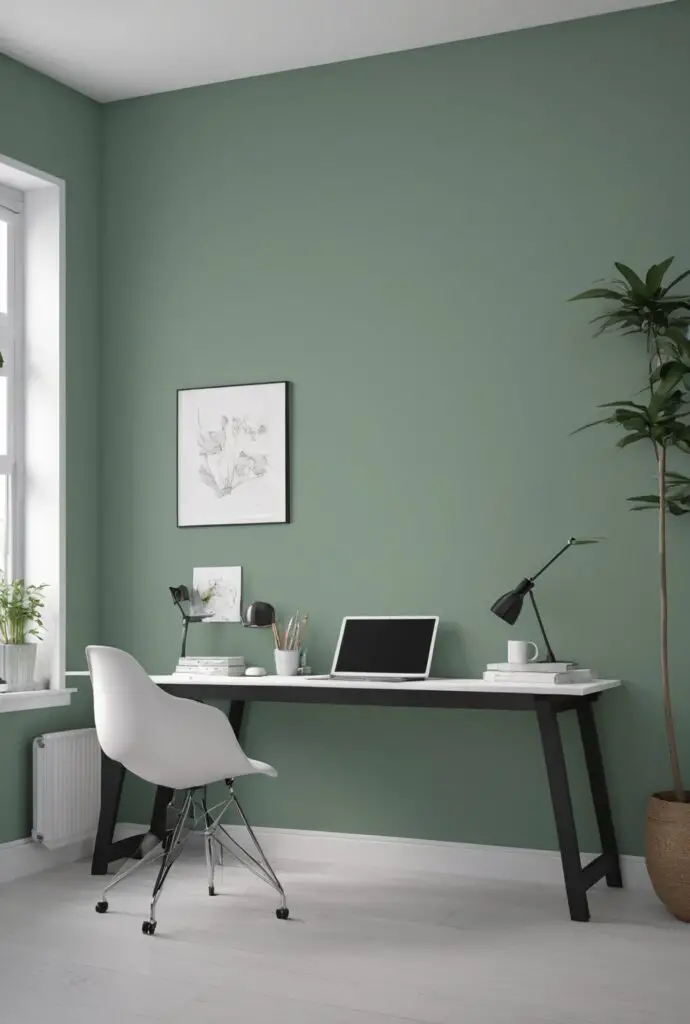
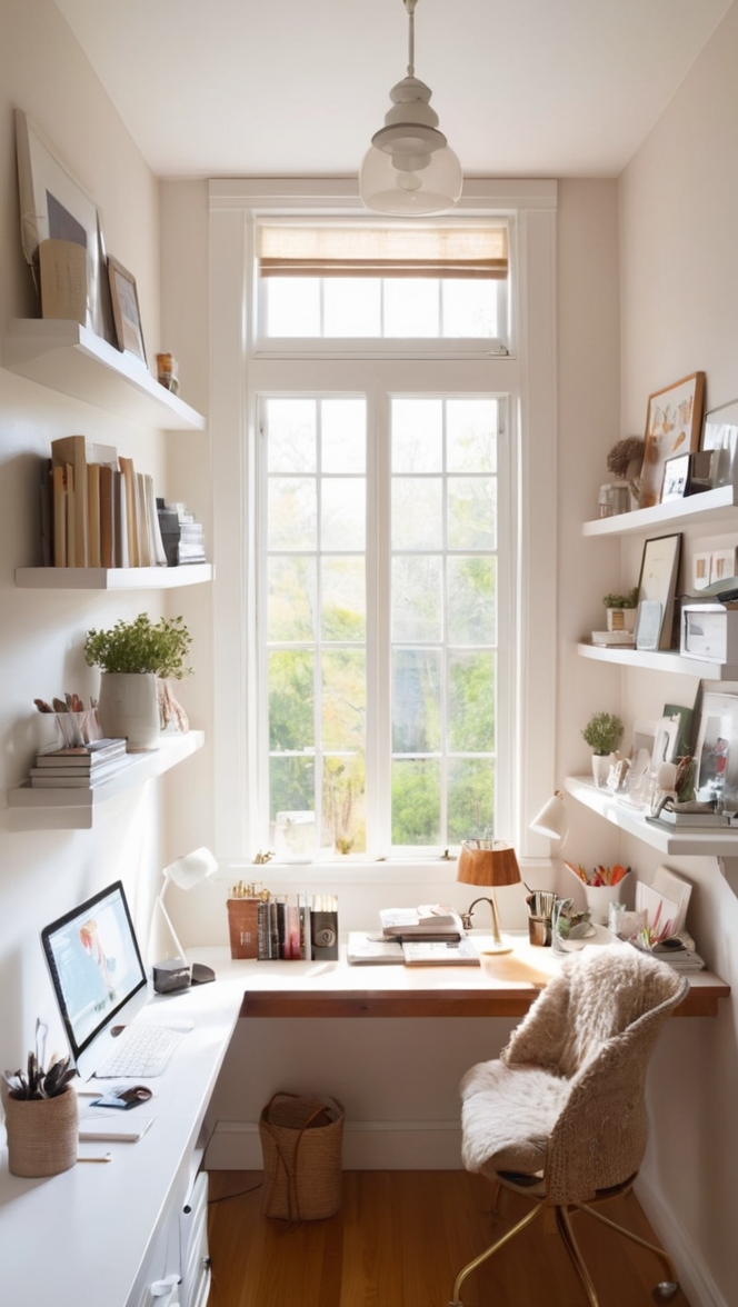
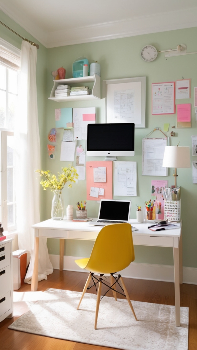
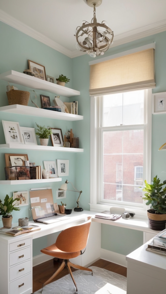
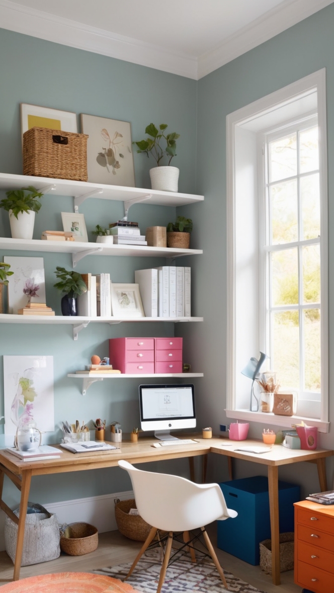
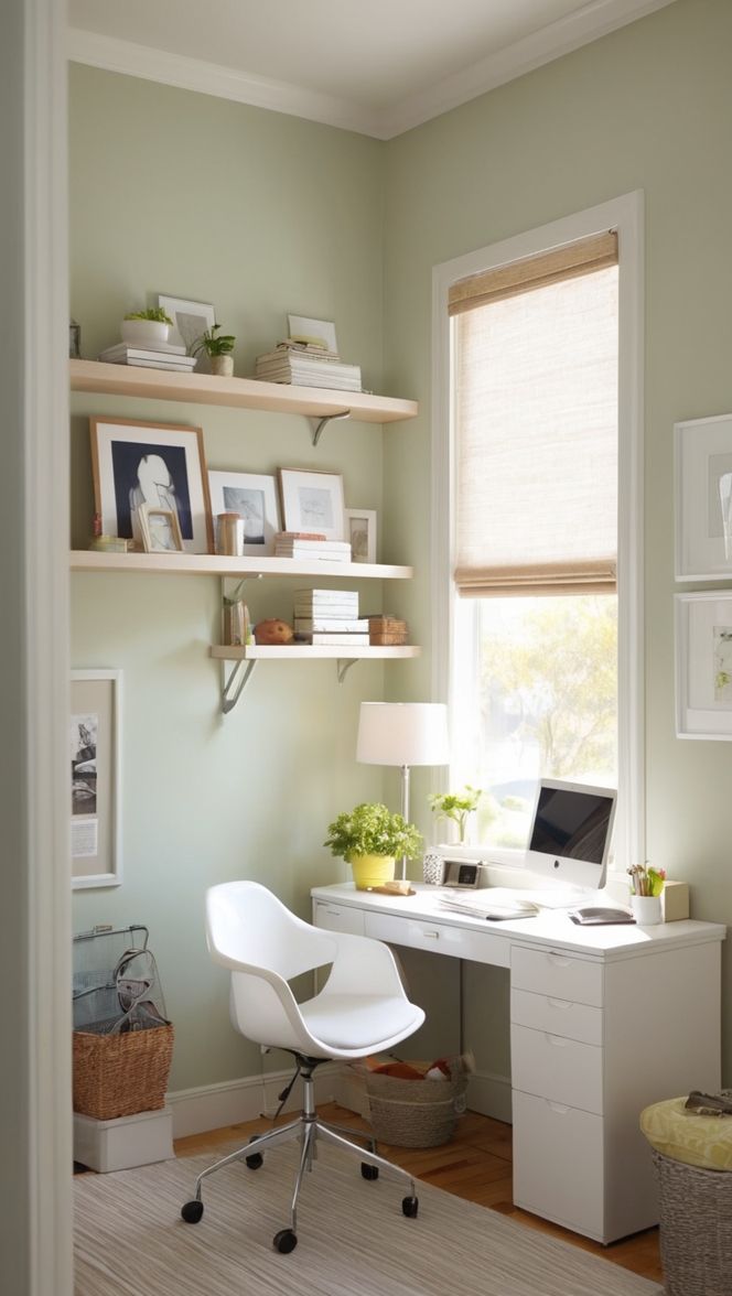
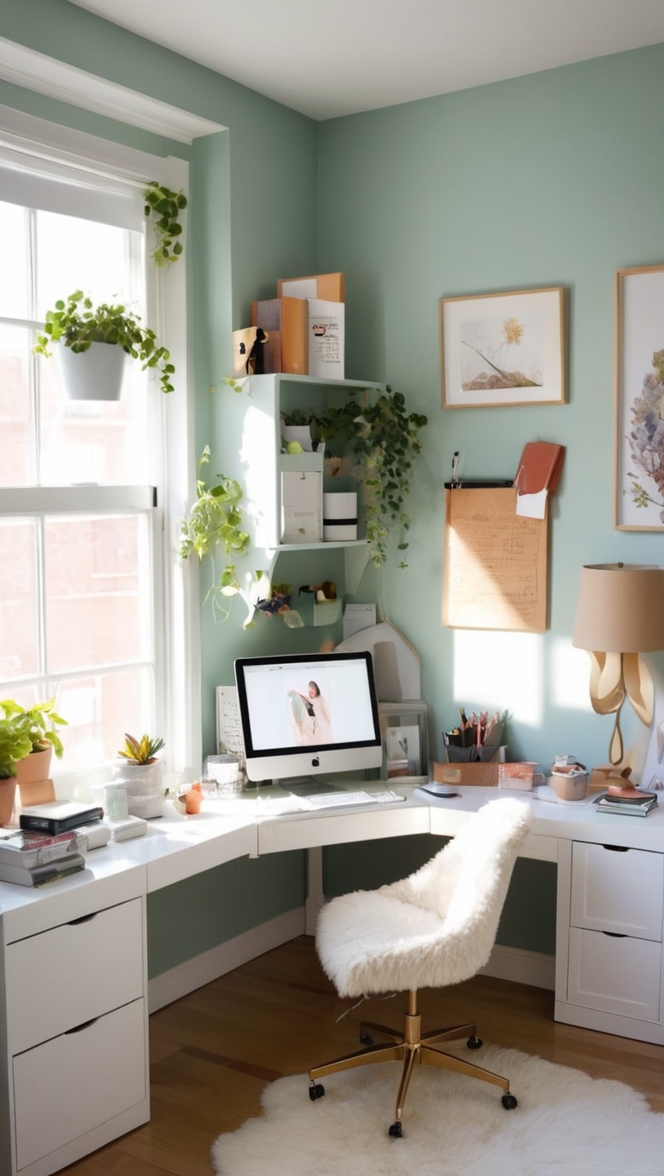
In the fast-paced world of modern offices, creating a workspace that inspires creativity and productivity is essential. One often underestimated yet powerful element in office design is the color palette. In 2024, the trendsetter for modern office spaces is undoubtedly Lattice Paint. This sophisticated color not only brings a contemporary vibe to the environment but also enhances the overall aesthetics. In this article, we’ll explore the reasons why Lattice Paint is a top recommendation for office spaces, along with tips for color matching, hue alternatives, and suggestions for incorporating it into various rooms.
Why Choose Lattice Paint?
1. Soothing Aesthetic:
Lattice Paint, with its muted and neutral tones, offers a soothing and calming aesthetic. In the hustle and bustle of the office environment, a calming color like Lattice can create a serene atmosphere, reducing stress and promoting focus.
2. Versatile and Timeless:
Lattice is a versatile color that effortlessly blends with various design elements. Its neutrality allows for easy pairing with different furniture styles and accent colors. This timeless quality ensures that your office space remains on-trend for years to come.
3. Natural Light Enhancement:
Lattice Paint has the unique ability to enhance natural light in a space. Its subtle undertones reflect and amplify available light, making the office space appear brighter and more welcoming. This feature contributes to a positive and energetic work environment.
4. Flexibility for Accenting:
The neutral nature of Lattice allows for bold and vibrant accent colors to pop. Whether it’s through furniture, decor, or accent walls, Lattice serves as an excellent backdrop, providing the flexibility to experiment with various color combinations to suit your office’s personality.
5. Promotes Collaboration:
Lattice is a color that bridges the gap between cool and warm tones, making it a perfect choice for collaborative spaces. It encourages open communication and teamwork, fostering a sense of unity among employees.
Tips for Matching Colors with Lattice Paint:
1. Consider the Lighting:
When selecting colors to complement Lattice Paint, consider the lighting conditions in your office. Test samples under different lighting to ensure the chosen hues maintain harmony with Lattice in various settings.
2. Balance Warm and Cool Tones:
Lattice has a balanced undertone, making it suitable for both warm and cool color palettes. Balance the color scheme by incorporating a mix of warm and cool tones to create a visually appealing and harmonious workspace.
3. Experiment with Monochromatic Accents:
Explore the monochromatic spectrum for accent colors. Shades slightly lighter or darker than Lattice can add depth and interest without overwhelming the space. This approach keeps the overall look cohesive and refined.
4. Texture and Patterns Matter:
Pair Lattice with textured fabrics and patterns to add visual interest. Consider incorporating textured wallpaper, patterned rugs, or textured furniture in complementary colors to elevate the overall design.
5. Test with Small Elements First:
Before committing to a full office makeover, test potential color combinations with small elements like throw pillows, artwork, or accessories. This allows you to see how the colors interact in the space before making a larger investment.
Hue Matching with Lattice Paint:
1. Soft White:
For a clean and modern look, pair Lattice with soft white hues. This combination creates a timeless and sophisticated atmosphere, especially in areas with ample natural light.
2. Muted Blues and Greens:
Lattice pairs exceptionally well with muted blues and greens. These colors bring a touch of nature indoors, promoting a sense of tranquility and balance within the office environment.
3. Subtle Grays:
Combining Lattice with subtle gray tones adds depth and sophistication. This elegant pairing is ideal for creating a contemporary and polished appearance in conference rooms or executive offices.
4. Earthy Neutrals:
Embrace earthy neutrals like taupe and beige to enhance the warmth of Lattice. This combination creates a welcoming and comfortable atmosphere, making it suitable for collaborative workspaces or breakout areas.
5. Blush and Rose Gold Accents:
To add a touch of glamour and femininity, incorporate blush or rose gold accents with Lattice Paint. These soft and elegant hues bring a sense of luxury to the office space without overpowering the neutral base.
Alternative Colors from Sherwin Williams and
Benjamin Moore:
1. Sherwin Williams – Repose Gray:
A stunning alternative to Lattice Paint, Repose Gray from Sherwin Williams offers a similar neutral elegance. Its versatile undertones make it an excellent choice for creating a modern and sophisticated office environment.
2. Benjamin Moore – Classic Gray:
Classic Gray by Benjamin Moore is a timeless and versatile color that pairs seamlessly with Lattice. Its neutral tone with warm undertones provides a sophisticated backdrop for any office setting.
3. Sherwin Williams – Alabaster:
For those seeking a slightly warmer alternative, consider Alabaster by Sherwin Williams. This off-white shade complements Lattice beautifully, creating a fresh and airy ambiance.
4. Benjamin Moore – Edgecomb Gray:
Edgecomb Gray is a soft and warm alternative from Benjamin Moore. Its balanced undertones make it an excellent choice for creating a cozy and inviting office space.
5. Sherwin Williams – Mindful Gray:
Mindful Gray offers a slightly deeper alternative to Lattice, creating a sophisticated and rich atmosphere. This color is perfect for accent walls or focal points in the office.
Other Rooms to Use Lattice Paint:
1. Conference Rooms :
Lattice Paint is an excellent choice for conference rooms. Its neutral and calming nature promotes focus and collaboration during meetings. Pair it with a large conference table in a complementary hue to create a professional and inviting space.
2. Breakout Areas :
In breakout areas or casual meeting spaces, Lattice can create a relaxed and comfortable ambiance. Combine it with vibrant accent colors, comfortable seating, and inspirational artwork to encourage creativity and informal discussions.
3. Executive Offices :
For executive offices, Lattice Paint provides a sophisticated and timeless backdrop. Pair it with rich wood furniture, plush textiles, and metallic accents to create an elegant and high-end workspace.
4. Reception Areas :
Lattice is ideal for reception areas, creating a welcoming and positive first impression for visitors. Incorporate sleek and modern furniture, live plants, and subtle branding elements to enhance the overall aesthetics.
5. Collaborative Workspaces :
Foster creativity and teamwork in collaborative workspaces by using Lattice Paint. Combine it with flexible and modular furniture, interactive whiteboards, and vibrant pops of color to energize the space and promote collaboration.
Conclusion:
In conclusion, Lattice Paint stands out as the go-to choice for modern office spaces in 2024. Its soothing aesthetic, versatility, and timeless appeal make it a top recommendation for creating a productive and inspiring work environment. To
maximize the impact of Lattice Paint, consider the lighting conditions, balance warm and cool tones, and experiment with monochromatic accents. Additionally, explore hue alternatives from Sherwin Williams and Benjamin Moore, such as Repose Gray and Classic Gray, for a customized look that suits your office’s personality.
By following these tips and exploring alternative colors, you can seamlessly integrate Lattice Paint into various rooms, including conference rooms, breakout areas, executive offices, reception areas, and collaborative workspaces. This strategic use of color contributes to a cohesive and harmonious office design that fosters creativity, productivity, and a positive work culture.
In the ever-evolving landscape of office design, Lattice Paint emerges as the magic touch that transforms workplaces into modern, vibrant, and inspiring hubs for innovation and collaboration. Upgrade your office space with the contemporary charm of Lattice Paint and embark on a journey towards a more productive and aesthetically pleasing work environment in 2024.

