
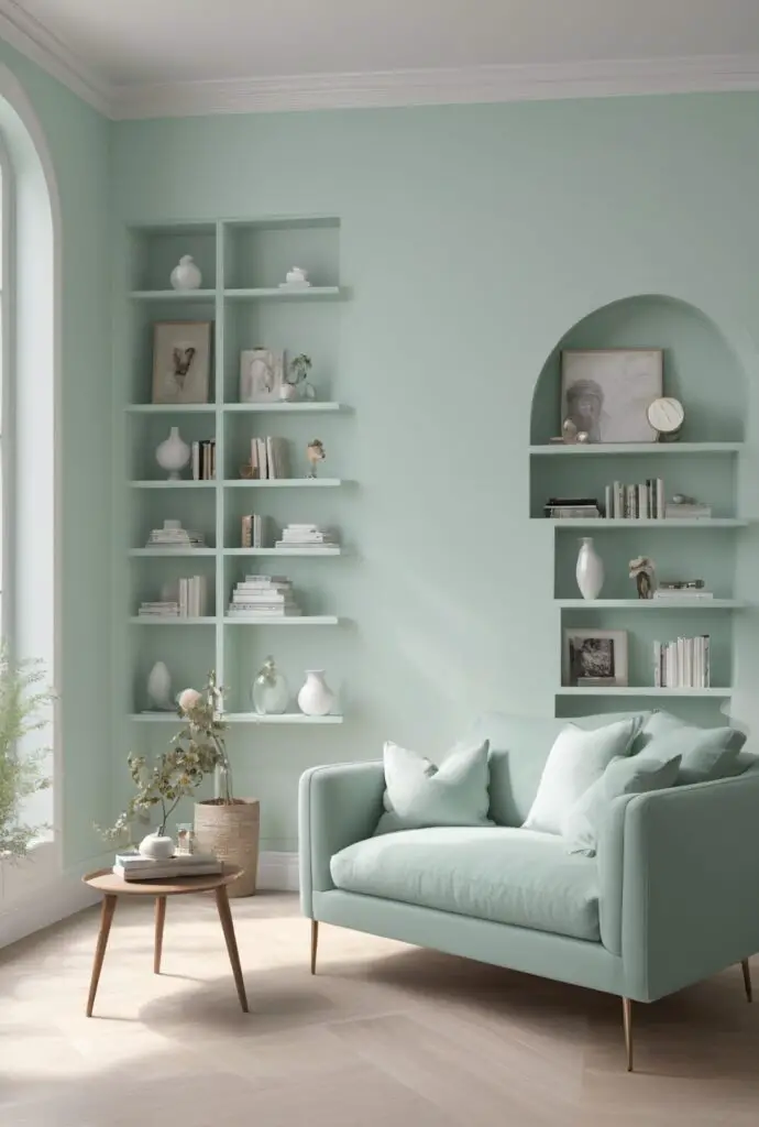
In the realm of interior design, selecting the perfect paint color can make a significant difference in the ambiance and overall feel of a space. As we step into 2024, the trend of using soft, soothing tones continues to gain traction, with white mint emerging as a popular choice among homeowners and designers alike. This refreshing and contemporary hue strikes a delicate balance between elegance and modernity, making it an ideal option for revamping your library space.
Why Choose White Mint Paint?
- Calming Atmosphere: White mint paint infuses your library with a sense of tranquility and serenity. The subtle green undertones evoke feelings of harmony and balance, creating an environment conducive to relaxation and focused reading sessions.
- Enhanced Brightness: One of the key advantages of opting for white mint paint is its ability to brighten up the room. The soft, pale hue reflects natural light effectively, making the space appear more spacious and inviting, perfect for long hours spent immersed in your favorite novels.
- Versatile Aesthetic: White mint serves as a versatile backdrop that complements a wide range of interior styles. Whether your library boasts a minimalist, Scandinavian-inspired design or leans towards a more eclectic aesthetic, this understated hue effortlessly blends in, adding a touch of freshness to the space.
- Timeless Appeal: Unlike bolder, trend-driven color choices that may quickly fall out of favor, white mint possesses a timeless quality that ensures longevity. By opting for a classic yet contemporary shade, you can future-proof your library’s design, ensuring it remains relevant for years to come.
- Ease of Coordination: Pairing white mint walls with furniture and decor accents is a breeze. This versatile hue harmonizes effortlessly with a variety of materials and finishes, allowing you to get creative with your design choices without worrying about clashing colors.
5 Tips to Match Color with White Mint Paint:
- Natural Wood Accents: Incorporate elements of natural wood into your library design to complement the soothing tones of white mint. Opt for bookshelves, tables, and chairs crafted from warm wood finishes such as oak or walnut to add warmth and depth to the space.
- Soft Neutral Textiles: Choose soft, neutral textiles such as linen or cotton for upholstery, curtains, and throw pillows to maintain a cohesive color scheme. Shades like beige, ivory, or light gray harmonize beautifully with white mint, creating a serene and inviting atmosphere.
- Metallic Accents: Introduce metallic accents in brass or gold to add a touch of luxury and sophistication to your library. Whether through light fixtures, decorative accessories, or hardware, metallic elements contrast beautifully against the softness of white mint walls, infusing the space with visual interest.
- Botanical Greenery: Incorporate indoor plants and botanical prints to bring a natural element into your library. Lush green foliage adds vibrancy and life to the space, while botanical artwork or wallpaper enhances the overall aesthetic, complementing the fresh, botanical-inspired hue of white mint.
- Subtle Pops of Color: Introduce subtle pops of color through artwork, decorative accents, or upholstery to inject personality and character into your library. Opt for soft pastel hues like blush pink, dusty blue, or lavender to complement the gentle tones of white mint, creating a cohesive and visually appealing look.
5 Hue Matching Options:
- Soft Gray: Pairing white mint with soft gray accents creates a sophisticated and timeless color scheme. The cool undertones of gray complement the subtle green hues of white mint, resulting in a harmonious and balanced palette that exudes elegance.
- Powder Blue: For a light and airy feel, consider pairing white mint with powder blue accents. The soft, tranquil tones of both colors work together seamlessly, evoking a sense of calm and relaxation reminiscent of a breezy summer day.
- Blush Pink: Infuse your library with a touch of romance by incorporating blush pink accents alongside white mint walls. The delicate, feminine hue of blush pink adds warmth and charm to the space, creating a cozy and inviting ambiance perfect for curling up with a good book.
- Charcoal Gray: For a more dramatic look, juxtapose white mint walls with accents of charcoal gray. The deep, rich tones of charcoal gray provide a striking contrast against the softness of white mint, adding depth and sophistication to your library’s design.
- Golden Yellow: Inject a pop of color and energy into your library by pairing white mint with accents of golden yellow. The warm, sunny hues of golden yellow create a cheerful and uplifting atmosphere, making your reading space feel bright and inviting even on the gloomiest of days.
5 Alternative Colors from Sherwin Williams and
Benjamin Moore:
- Sherwin Williams: Sea Salt (SW 6204): This soft, muted green-gray shade from Sherwin Williams complements white mint beautifully, creating a cohesive and calming color palette reminiscent of tranquil coastal landscapes.
- Sherwin Williams: Repose Gray (SW 7015): For a timeless and versatile option, consider Repose Gray from Sherwin Williams. This warm gray hue pairs effortlessly with white mint, adding depth and sophistication to your library’s design.
- Benjamin Moore: Pale Oak (OC-20): Pale Oak by Benjamin Moore is a soft, neutral shade with subtle green undertones that complements white mint perfectly. This timeless hue lends a sense of warmth and elegance to your library space.
- Benjamin Moore: Revere Pewter (HC-172): Revere Pewter is a classic greige shade from Benjamin Moore that pairs beautifully with white mint walls. The warm, earthy tones of Revere Pewter create a cozy and inviting atmosphere, perfect for curling up with a good book.
- Benjamin Moore: Edgecomb Gray (HC-173): Edgecomb Gray is a versatile greige shade with warm undertones that harmonizes beautifully with white mint. This soft and understated hue adds a touch of sophistication to your library’s design, creating a timeless and inviting space.
Other Rooms to Use White Mint Paint:
Living Room:
Transform your living room into a serene retreat by painting the walls in white mint. Pair with plush neutral furnishings, botanical prints, and metallic accents for a fresh and inviting ambiance.
Bedroom:
Create a tranquil oasis in your bedroom with white mint walls. Layer with soft bedding, textured throws, and ambient lighting for a cozy and rejuvenating space that promotes restful sleep.
Bathroom:
Infuse your bathroom with spa-like serenity by opting for white mint walls. Pair with natural stone finishes, crisp white linens, and lush greenery for a luxurious and refreshing retreat.
Kitchen:
Elevate your kitchen’s design with white mint cabinetry or accent walls. Combine with marble countertops, brass fixtures, and natural wood accents for a chic and contemporary culinary space.
Home Office:
Enhance productivity and creativity in your home office with white mint walls. Pair with sleek modern furnishings, vibrant artwork, and ample natural light for a stimulating and inspiring workspace.
Conclusion:
In conclusion, white mint paint offers a versatile and contemporary option for updating your library space in 2024. With its calming atmosphere, enhanced brightness, and timeless appeal, white mint serves as the perfect backdrop for creating a serene and inviting reading environment. By following the provided tips for color matching and exploring alternative
hues from Sherwin Williams and Benjamin Moore, you can effortlessly elevate your library’s design with this refreshing and sophisticated shade. Additionally, consider extending the use of white mint paint to other rooms in your home, such as the living room, bedroom, bathroom, kitchen, and home office, to create a cohesive and harmonious design scheme throughout your living space.


