
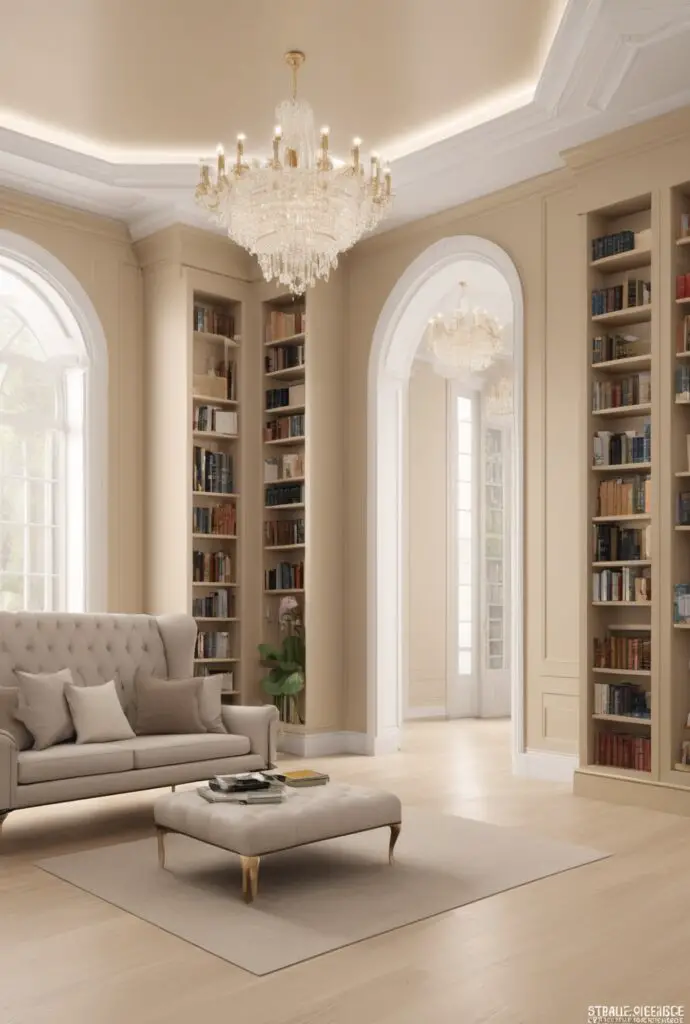
In the realm of interior design, selecting the perfect paint color can significantly enhance the ambiance and overall aesthetic of a space. Amidst the myriad of options available, Champagne paint stands out as a sophisticated and versatile choice, particularly for creating a modern library design. Its subtle warmth and timeless elegance make it an excellent option for those seeking to infuse their reading haven with a touch of luxury and refinement.
Why Champagne Paint?
Champagne paint exudes understated elegance, making it an ideal choice for modern library designs in 2024. Here’s why you should consider this captivating hue for your reading sanctuary:
- Sophistication and Versatility: Champagne paint strikes the perfect balance between sophistication and versatility. Its neutral undertones blend seamlessly with various decor styles, from contemporary to traditional, allowing for endless design possibilities.
- Warmth and Serenity: The soft, warm tones of Champagne paint create a cozy and inviting atmosphere, perfect for curling up with a good book on a chilly evening. This subtle warmth promotes a sense of serenity and relaxation, enhancing the reading experience.
- Reflective Qualities: Champagne paint possesses reflective qualities that can amplify natural light, making the space feel brighter and more spacious. In a library setting, ample lighting is essential for comfortable reading, and Champagne paint effortlessly enhances luminosity.
- Timeless Elegance: Unlike trendy colors that may quickly go out of style, Champagne paint exudes timeless elegance that transcends fleeting trends. Investing in this classic hue ensures that your library remains chic and sophisticated for years to come.
- Complementary Palette: Champagne paint serves as an excellent backdrop for showcasing artwork, book collections, and furnishings. Its neutral undertones complement a wide range of colors, allowing you to experiment with accents and accessories to personalize your space.
5 Tips to Match Champagne Paint:
- Natural Elements: Pair Champagne paint with natural materials such as wood, stone, and leather to create a harmonious and inviting environment. These earthy textures complement the warmth of the hue, adding depth and character to the space.
- Metallic Accents: Introduce metallic accents such as brass, copper, or gold to accentuate Champagne paint’s reflective qualities. Consider incorporating metallic finishes through light fixtures, hardware, or decorative accessories for a touch of glamour.
- Soft Furnishings: Choose soft furnishings in muted tones such as ivory, taupe, or blush to complement Champagne paint’s subtle warmth. Opt for plush fabrics like velvet or linen to enhance the cozy ambiance of your library.
- Statement Pieces: Add visual interest to your library with statement pieces in bold hues that contrast against Champagne paint. Consider incorporating a vibrant area rug, artwork, or accent chair to inject personality and depth into the space.
- Layered Lighting: Illuminate your library with layered lighting to create ambiance and functionality. Combine overhead fixtures, task lighting, and accent lamps to enhance the overall atmosphere and highlight key areas such as reading nooks and shelving displays.
5 Hue Matching Options:
- Soft Ivory: Soft ivory complements Champagne paint beautifully, creating a serene and cohesive color palette. Use ivory for trim, molding, and upholstery to add subtle contrast and elegance to your library design.
- Subtle Gray: Subtle gray tones provide a sophisticated backdrop that enhances Champagne paint’s warmth and depth. Consider incorporating gray accents through furniture upholstery, area rugs, or window treatments for a timeless aesthetic.
- Pale Blush: Pale blush hues add a delicate touch of femininity and warmth to a Champagne-painted library. Introduce blush tones through decorative pillows, throws, or artwork to infuse the space with softness and charm.
- Warm Taupe: Warm taupe hues complement Champagne paint’s neutral undertones, creating a cohesive and inviting color scheme. Use taupe for wall accents, furniture finishes, or decorative accessories to add depth and richness to your library.
- Sage Green: Sage green offers a refreshing pop of color that harmonizes beautifully with Champagne paint. Incorporate sage green accents through plants, upholstery, or artwork to infuse your library with a sense of tranquility and nature-inspired charm.
5 Alternative Colors from Sherwin Williams and
Benjamin Moore:
- Sherwin Williams – Repose Gray (SW 7015): Repose Gray is a versatile greige hue that pairs seamlessly with Champagne paint, creating a modern and sophisticated aesthetic. Its balanced undertones complement the warmth of Champagne, resulting in a harmonious color palette.
- Sherwin Williams – Alabaster (SW 7008): Alabaster is a timeless off-white hue that enhances Champagne paint’s reflective qualities, creating a luminous and inviting atmosphere. Use Alabaster for trim, molding, and ceilings to brighten the space and highlight architectural details.
- Benjamin Moore – Edgecomb Gray (HC-173): Edgecomb Gray is a soft and understated greige hue that coordinates beautifully with Champagne paint, lending a sense of warmth and tranquility to the space. Its subtle undertones create a serene backdrop for showcasing artwork and furnishings.
- Benjamin Moore – Revere Pewter (HC-172): Revere Pewter is a classic greige hue with warm undertones that complement Champagne paint’s neutral palette. Use Revere Pewter for accent walls or built-in cabinetry to add depth and dimension to your library design.
- Benjamin Moore – Pale Oak (OC-20): Pale Oak is a light and airy greige hue that pairs effortlessly with Champagne paint, creating a sophisticated and inviting ambiance. Its subtle undertones enhance natural light, making the space feel bright and spacious.
Other Rooms to Use Champagne Paint:
- Master Bedroom: Transform your master bedroom into a serene retreat by painting the walls with Champagne paint. Pair it with soft linens, plush bedding, and metallic accents for a luxurious and inviting ambiance.
- Dining Room: Create an elegant dining space by incorporating Champagne paint on the walls or as an accent color. Pair it with rich wood furniture, upholstered chairs, and statement lighting to set the stage for memorable gatherings and intimate dinners.
- Home Office: Foster creativity and productivity in your home office with Champagne paint. The warm, serene tones create a conducive environment for focus and concentration, while stylish furnishings and decor elements enhance functionality and style.
Conclusion:
In conclusion, Champagne paint offers a sophisticated and versatile option for modern library design in 2024. Its understated elegance, warmth, and timeless appeal make it the perfect choice for creating a cozy and inviting reading sanctuary. By following the tips provided, you can seamlessly integrate Champagne paint into your design scheme and elevate your space to new heights of style and sophistication. Whether used alone or paired with complementary hues, Champagne paint is sure to transform your library into a luxurious retreat that inspires relaxation, creativity, and intellectual pursuits.


