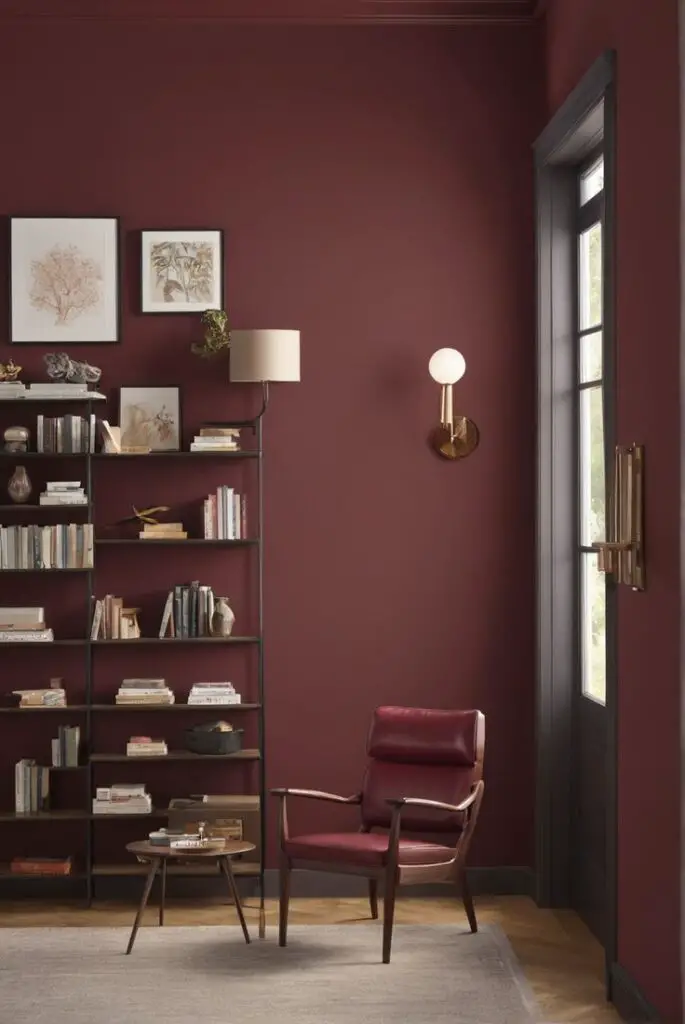
The library—a space of quiet reflection, creativity, and intellectual exploration—deserves a design that reflects its profound purpose. In 2024, the dark red palette emerges as a leading trend for modern libraries, exuding sophistication and a timeless allure. Whether you’re revamping a home library or redesigning a professional reading space, dark red creates a cocoon of elegance and focus. Below, we explore the appeal of this bold choice, offer tips for matching hues, recommend alternatives from top brands, and suggest other spaces where dark red thrives.
Why Choose Dark Red for Your Library?
Dark red is a symbol of power, passion, and refinement. In libraries, it fosters an ambiance of warmth and contemplation. This shade’s deep tones complement the intellectual energy of books while adding a touch of drama to the room.
Its versatility works with traditional and modern library styles, making it suitable for various themes. Whether paired with vintage wooden furniture or sleek metal accents, dark red creates a harmonious visual balance. Moreover, this color enhances focus and creativity, ideal for reading and working environments.
5 Tips to Match Colors with Dark Red
To ensure your dark red palette doesn’t overwhelm the room, use these tips:
1. Pair with Neutrals for Balance
Combine dark red with neutrals like beige, taupe, or off-white to prevent the room from feeling too heavy. Neutrals soften the boldness of red, offering a balanced aesthetic.
2. Add Metallic Accents for Glamour
Gold or brass accents in lighting fixtures, bookends, and hardware pair beautifully with dark red. These metallic touches add a luxurious feel while reflecting light to brighten the space.
3. Incorporate Natural Textures
Wood, leather, and natural fibers like jute complement the richness of dark red. Opt for medium to dark wood tones for furniture to maintain a cohesive look.
4. Use Patterns Sparingly
Introduce patterns with caution, such as in rugs or cushions, to add depth without overwhelming the space. Geometric or floral designs in muted shades work well.
5. Leverage Greenery for Contrast
Indoor plants, such as fiddle-leaf figs or snake plants, bring life and contrast to a dark red library. The green hues create a striking yet soothing visual effect.
5 Hue Combinations That Work with Dark Red
Discover complementary hues to enhance the dark red palette:
1. Cream and Beige
Soft creams and beiges lighten the space, creating an inviting atmosphere. These hues keep the focus on dark red without competing for attention.
2. Charcoal Gray
For a modern and edgy vibe, pair dark red with charcoal gray. This combination creates a sophisticated and contemporary library.
3. Deep Navy
Dark red and navy blue evoke a sense of regality and tradition, perfect for a classic library design.
4. Forest Green
Combine dark red with forest green for a dramatic and bold aesthetic. This duo works best in well-lit spaces.
5. Mustard Yellow
Add warmth and contrast with mustard yellow accents. This pairing lends a cozy and eclectic feel to your library.
5 Alternative Colors from Sherwin-Williams and Benjamin Moore
If dark red feels too bold, consider these alternative shades from renowned paint brands:
1. Sherwin-Williams “Rave Red” (SW 6608)
A slightly brighter red that retains richness and warmth. Ideal for those who want a bold yet vibrant library.
2. Sherwin-Williams “Poised Taupe” (SW 6039)
A versatile taupe with a subtle red undertone, creating a more muted yet elegant ambiance.
3. Benjamin Moore “Caliente” (AF-290)
A bold, spicy red that offers the same dramatic appeal with a slightly modern twist.
4. Benjamin Moore “Kendall Charcoal” (HC-166)
This deep gray complements dark red as an accent or standalone wall color for a balanced look.
5. Benjamin Moore “Rustic Brick” (2087-10)
For a more earthy and vintage vibe, Rustic Brick is an excellent option. It leans into the warmth of dark red without overpowering the space.
Other Rooms to Use Dark Red
Dark red’s versatility extends beyond libraries. Here’s where else this striking color shines:
Dining Room
Dark red evokes appetite and conversation, making it an excellent choice for dining rooms. Pair it with warm lighting and wooden furniture for a cozy atmosphere.
Home Office
Create a productive yet inspiring workspace with dark red. Its depth promotes focus and a sense of purpose, ideal for a home office setup.
Living Room
Introduce dark red as an accent wall or through furnishings in the living room. It adds drama and a touch of elegance to the social hub of the home.
Bedroom
For those who love bold interiors, dark red brings warmth and intimacy to the bedroom. Balance it with soft bedding and neutral accessories for comfort.
Powder Room
In small spaces like powder rooms, dark red makes a statement without feeling overwhelming. Use glossy finishes for added glamour.
Conclusion
Dark red is a transformative color that brings sophistication, warmth, and depth to any modern library. With the right matching tips, complementary hues, and alternative shades, you can create a space that’s both stylish and functional. Its adaptability makes it suitable for other rooms, allowing you to extend its charm throughout your home.
Elevate your library in 2024 by embracing the dark red palette. From fostering focus to exuding timeless elegance, this color promises a space that inspires and delights. Let dark red redefine your interior design journey, and enjoy a library that feels uniquely yours.
Ready to embark on your color transformation? Share your library design ideas in the comments and follow us for more interior design inspiration!

