Discover how to enhance your kitchen’s visual impact by mastering color contrast. Unleash the power of vibrant hues for a stunning transformation!
Creating contrast in your kitchen color scheme is essential for maximizing visual impact in your home interior design. By playing with colors, you can achieve a dynamic and engaging space that reflects your personal style.
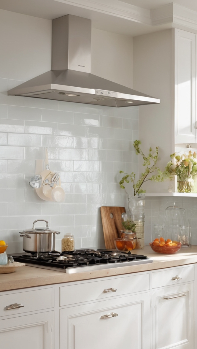
When working with an interior designer on your kitchen color scheme, consider contrasting light and dark hues to create visual interest. For example, pairing a light grey wall with dark wood cabinets can add depth to the space.
Additionally, using complementary colors like blue and orange or purple and yellow can create a harmonious yet striking palette. Be sure to test paint colors with primer first to ensure they match your desired look.
Consider organizing your color swatches and samples in a table to easily compare and select the perfect hues for your kitchen design. With careful planning and attention to detail, you can create a kitchen color scheme that makes a lasting impression on your home interior.
How can I create contrast in my kitchen color scheme?
Creating contrast in your kitchen color scheme is essential for maximizing visual impact. One effective way to achieve this is by using complementary colors. Complementary colors are opposite each other on the color wheel, such as blue and orange or red and green. When used together, they create a striking visual effect that can make your kitchen stand out.
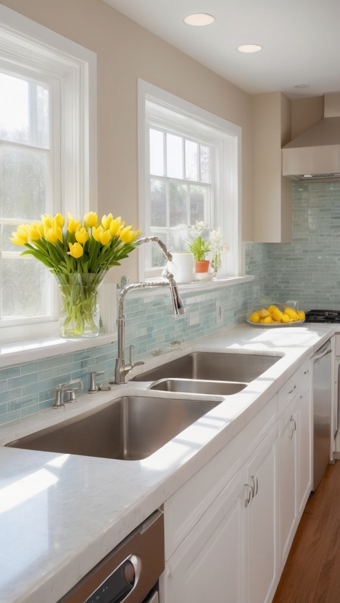
Another way to create contrast is by using light and dark colors. Pairing light cabinets with a dark countertop or vice versa can create a sense of depth and dimension in your kitchen. Additionally, incorporating black or white elements into your color scheme can help create a bold contrast that catches the eye.
Texture is also an important element in creating contrast. Mixing different textures in your kitchen, such as smooth countertops with textured backsplashes or shiny hardware with matte finishes, can add visual interest and depth to the space.
What colors work best together to maximize visual impact in a kitchen?
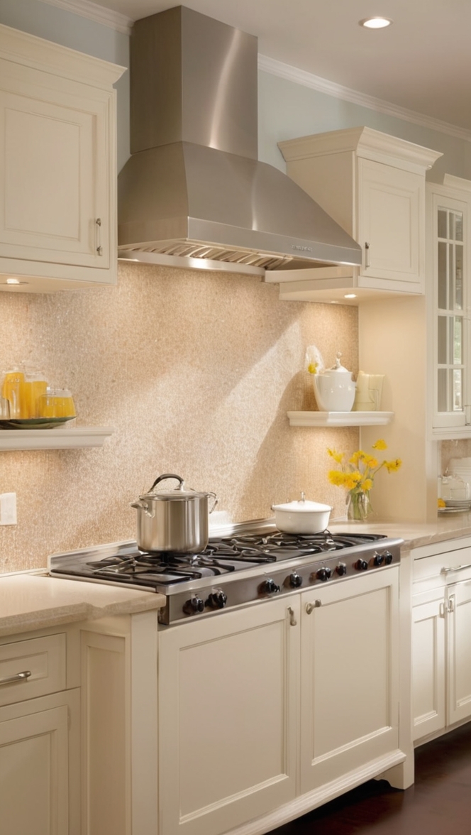
When it comes to maximizing visual impact in your kitchen color scheme, certain color combinations work particularly well. White and navy blue create a classic and timeless look that can make your kitchen feel both fresh and sophisticated. Another winning combination is gray and yellow, which adds a pop of color while still maintaining a sense of elegance.
For a more modern and dramatic look, consider pairing black and gold. This striking color combination adds a touch of luxury and glamour to your kitchen. If you prefer a more subtle approach, shades of green paired with wood accents can create a natural and inviting feel.
Can I use different shades of the same color to create contrast in my kitchen?
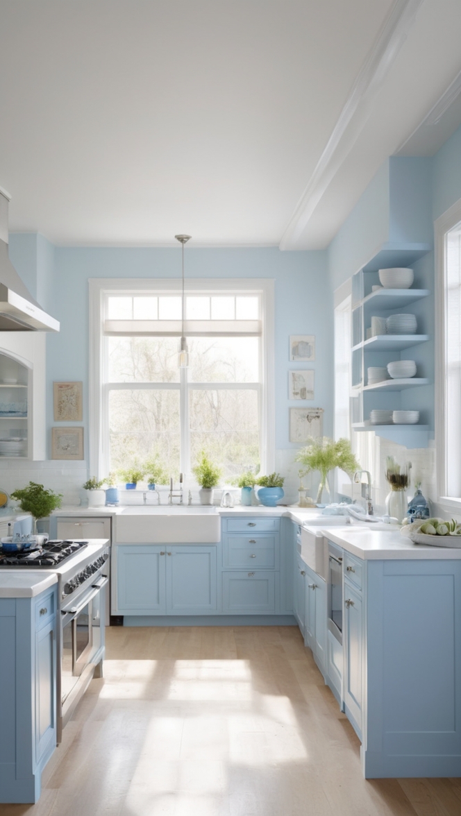
Yes, using different shades of the same color is a great way to create contrast in your kitchen color scheme. This approach can add depth and complexity to your space while maintaining a cohesive and harmonious look. For example, combining light and dark shades of blue or gray can create a sophisticated and modern feel in your kitchen.
Mixing different tones of the same color throughout your kitchen, from the walls to the cabinets to the accessories, can create a layered and dynamic effect that enhances the overall design. Just be sure to vary the intensity and saturation of the shades to create visual interest and prevent the space from feeling flat.
How important is contrast in a kitchen color scheme for visual impact?
Contrast plays a crucial role in maximizing visual impact in a kitchen color scheme. Without contrast, the space can appear flat, dull, and lacking in personality. By incorporating contrasting colors, textures, and tones, you can create a dynamic and visually stimulating environment that draws the eye and makes a lasting impression.
Contrast helps to highlight key elements in your kitchen, such as countertops, cabinets, or backsplashes, making them stand out and enhancing the overall design. Whether you prefer a bold and dramatic look or a more subtle and understated feel, contrast is essential for creating a visually striking kitchen that reflects your personal style.
What are some alternative paint colors I can use to create a contrasting effect in my kitchen?
If you’re looking to create a contrasting effect in your kitchen color scheme, there are several alternative paint colors you can consider. One option is to mix warm and cool tones, such as pairing a warm beige with a cool gray. This combination adds depth and balance to your space while creating a subtle yet striking contrast.
Another alternative is to use jewel tones, such as emerald green, sapphire blue, or ruby red. These rich and vibrant colors can add a touch of luxury and sophistication to your kitchen while creating a bold and statement-making look. For a more soothing and tranquil feel, consider shades of soft pastels, such as blush pink, mint green, or lavender.
How can I incorporate contrasting colors in my kitchen without it looking too busy?
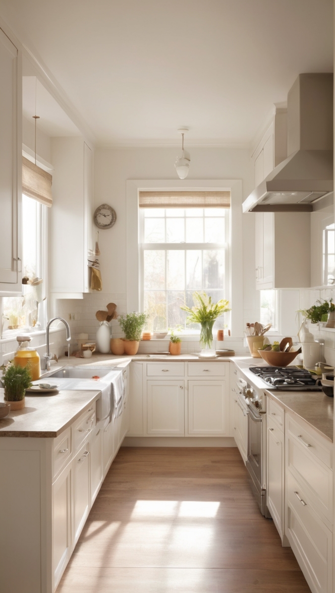
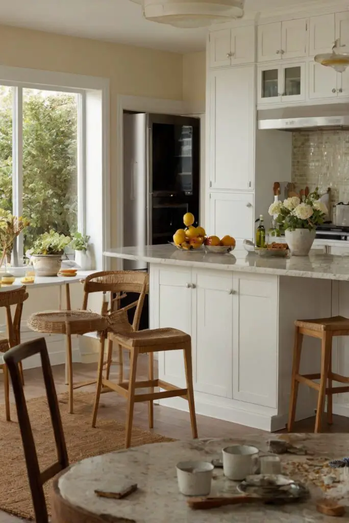
Incorporating contrasting colors in your kitchen without it looking too busy requires careful planning and execution. One approach is to choose a neutral base color, such as white, gray, or beige, as the foundation of your color scheme. Then, selectively add pops of contrasting colors in small doses to create visual interest without overwhelming the space.
Another strategy is to use a monochromatic color scheme with subtle variations in hue, saturation, and intensity. This allows you to create contrast while maintaining a cohesive and harmonious look. For example, you could pair light gray cabinets with a darker gray backsplash or countertops to add depth and dimension to your kitchen.
Additionally, consider incorporating contrasting colors through accessories, such as throw pillows, rugs, artwork, or small appliances. This allows you to experiment with different color combinations and easily change them out if you want to refresh the look of your kitchen.
What role does room decor play in maximizing visual impact in a kitchen color scheme?
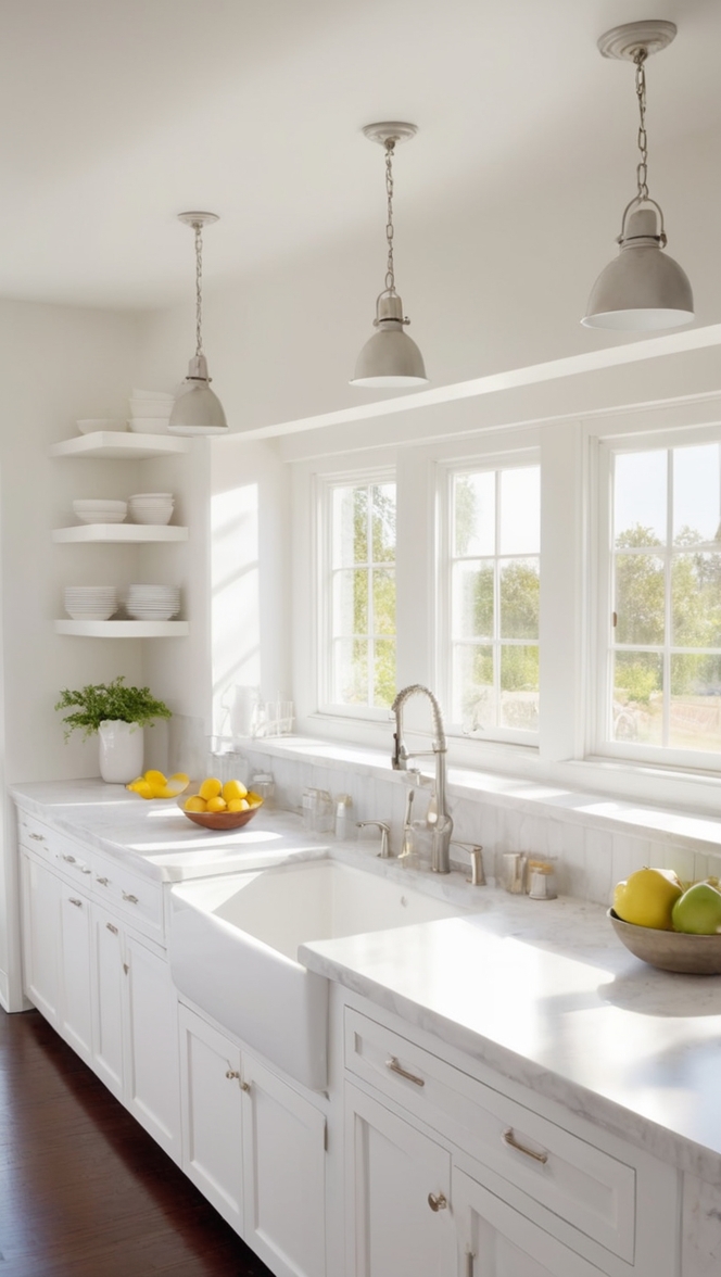
Room decor plays a significant role in maximizing visual impact in a kitchen color scheme. The decor elements you choose, such as lighting fixtures, furniture, textiles, and artwork, can complement and enhance your color scheme, adding depth, texture, and personality to the space.
Lighting is particularly crucial in showcasing your color scheme and creating atmosphere in your kitchen. Consider using a combination of task lighting, ambient lighting, and accent lighting to highlight key elements and create a well-balanced and inviting environment.
Furniture and textiles, such as bar stools, rugs, curtains, and linens, provide opportunities to introduce additional colors and patterns that complement your color scheme. By selecting decor pieces that echo the colors and tones of your kitchen, you can create a cohesive and coordinated look that ties the space together.
Artwork and accessories are the finishing touches that can help tie your color scheme together and add personality and flair to your kitchen. Choose pieces that reflect your style and taste while enhancing the overall design scheme. Whether you opt for bold and statement-making art or subtle and understated accents, decor plays a vital role in maximizing visual impact in your kitchen.