In the ever-evolving world of interior design, the choice of paint color can significantly influence the ambiance and aesthetic of a space. For a 2024 kitchen makeover, the color Nacre stands out as an innovative and chic option. This exquisite hue, inspired by the iridescent interior of seashells, offers a unique blend of sophistication and versatility. In this post, we will delve into why Nacre is the perfect choice for your kitchen, how to match it with other elements, complementary hues, alternative colors from leading paint brands, and other rooms where Nacre can shine.
Why Choose Nacre for Your Kitchen Makeover?
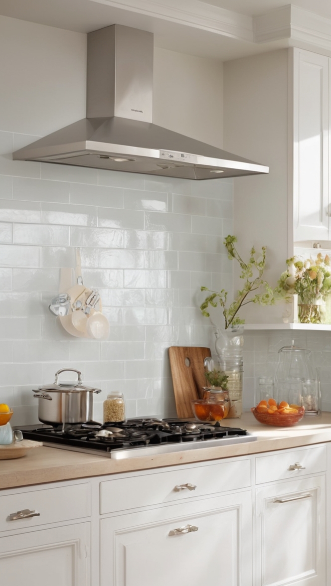
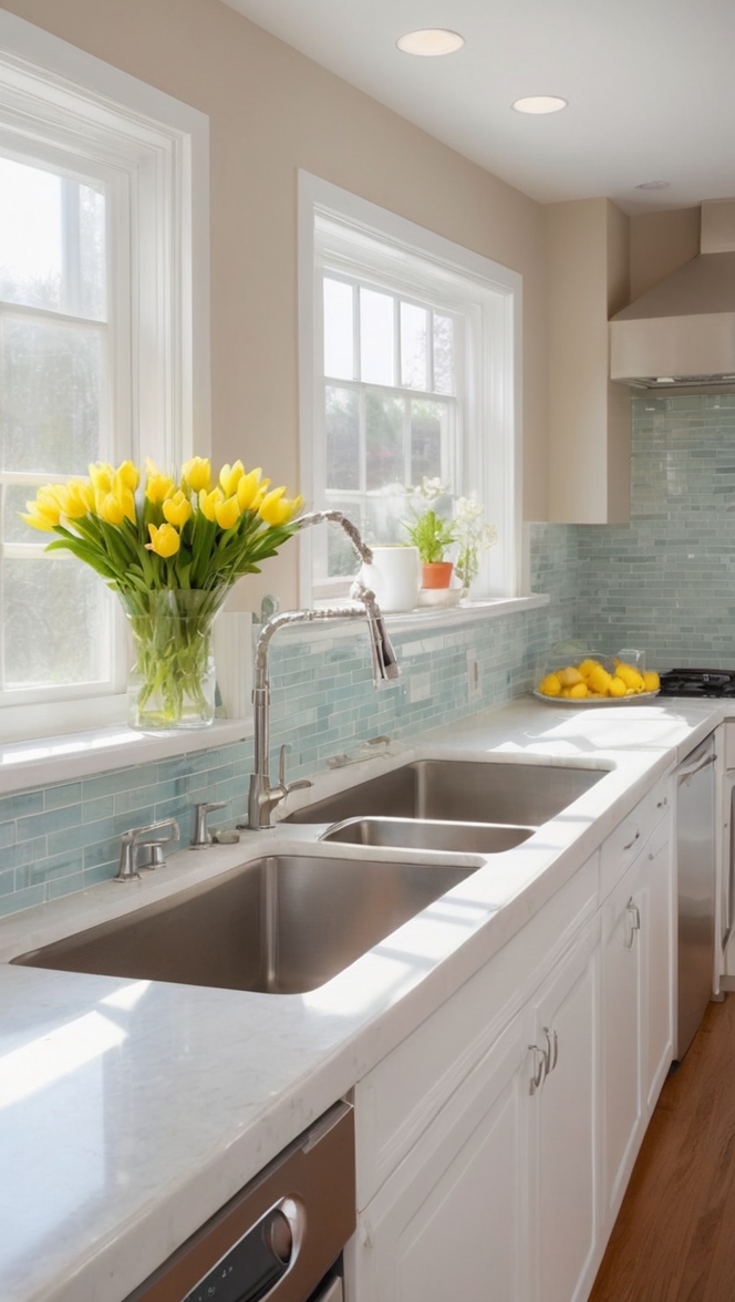
Nacre, often referred to as mother-of-pearl, is a stunning blend of soft white and delicate gray with subtle hints of iridescence. Its gentle yet sophisticated tone can transform your kitchen into a serene and stylish sanctuary. Here are several reasons why Nacre is an excellent choice for a 2024 kitchen makeover:
- Timeless Elegance: Nacre’s understated elegance ensures that it will remain stylish and relevant for years to come. Its neutral palette provides a classic backdrop that can easily adapt to changing trends and personal tastes.
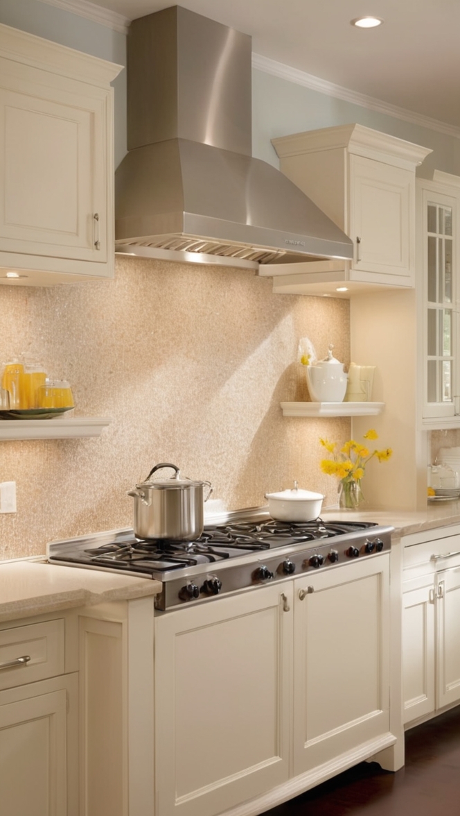
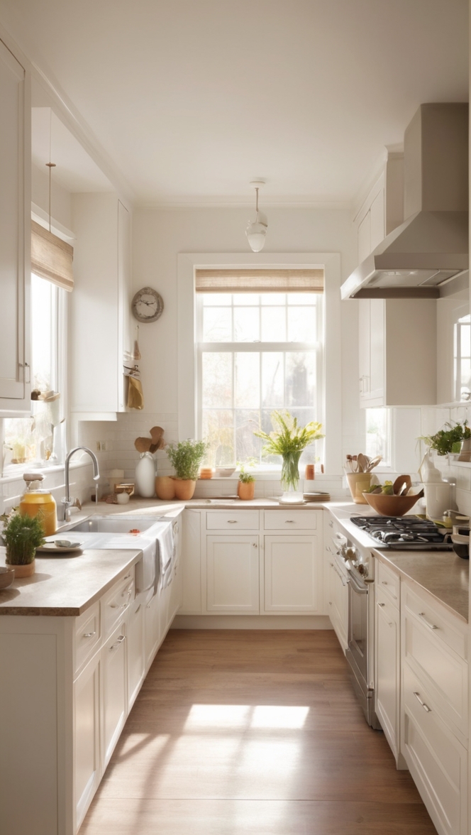
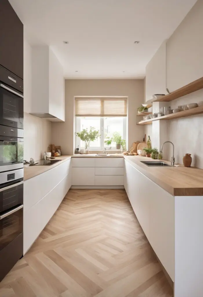
- Versatility: The neutral and soothing tones of Nacre make it incredibly versatile. It can complement a wide range of materials, from natural wood to sleek stainless steel, and works well with various design styles, including modern, traditional, and transitional.
- Enhances Light: Nacre’s light-reflective qualities can brighten up your kitchen, making it feel more spacious and inviting. This is particularly beneficial for kitchens with limited natural light.
- Calming Effect: The soft, iridescent quality of Nacre creates a calming and serene environment, perfect for a space where you start and end your day. This tranquil atmosphere can make cooking and dining a more enjoyable experience.
- Sophisticated Backdrop: Nacre serves as a sophisticated backdrop that allows other elements of your kitchen, such as cabinetry, countertops, and decorative pieces, to stand out and shine.
Tips for Matching Nacre with Other Elements:
Choosing a paint color is just the beginning. To create a harmonious and visually appealing kitchen, it’s essential to consider how Nacre will interact with other elements in the space. Here are five tips for matching Nacre with other kitchen elements:
1. Cabinetry
Opt for cabinetry in complementary shades to enhance the beauty of Nacre. Light-colored wood or painted cabinets in soft gray or white can create a cohesive look. For a bolder contrast, consider darker woods or deep navy blue.
2. Countertops
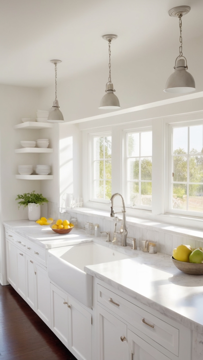
Choose countertops that balance the subtlety of Nacre. Marble or quartz with veining that picks up the hues in Nacre can create a seamless flow. Alternatively, butcher block countertops add warmth and texture.
3. Backsplash
A backsplash is an excellent opportunity to introduce texture and pattern. Subway tiles in glossy white or pearlized finish can enhance the iridescent quality of Nacre. For a more dramatic effect, consider mosaic tiles with metallic accents.
4. Hardware
Hardware in brushed nickel, chrome, or matte black can provide a striking contrast against Nacre’s softness. These finishes add a modern touch while maintaining the overall elegance of the space.
5. Lighting
Proper lighting is crucial to showcase Nacre’s reflective qualities. Consider pendant lights or chandeliers with metallic finishes to enhance the luminous effect. Under-cabinet lighting can also highlight the iridescence and create a warm glow.
Hue Matching with Nacre:
To create a harmonious and balanced kitchen, it’s important to select hues that complement Nacre. Here are five color pairings that work beautifully with Nacre:
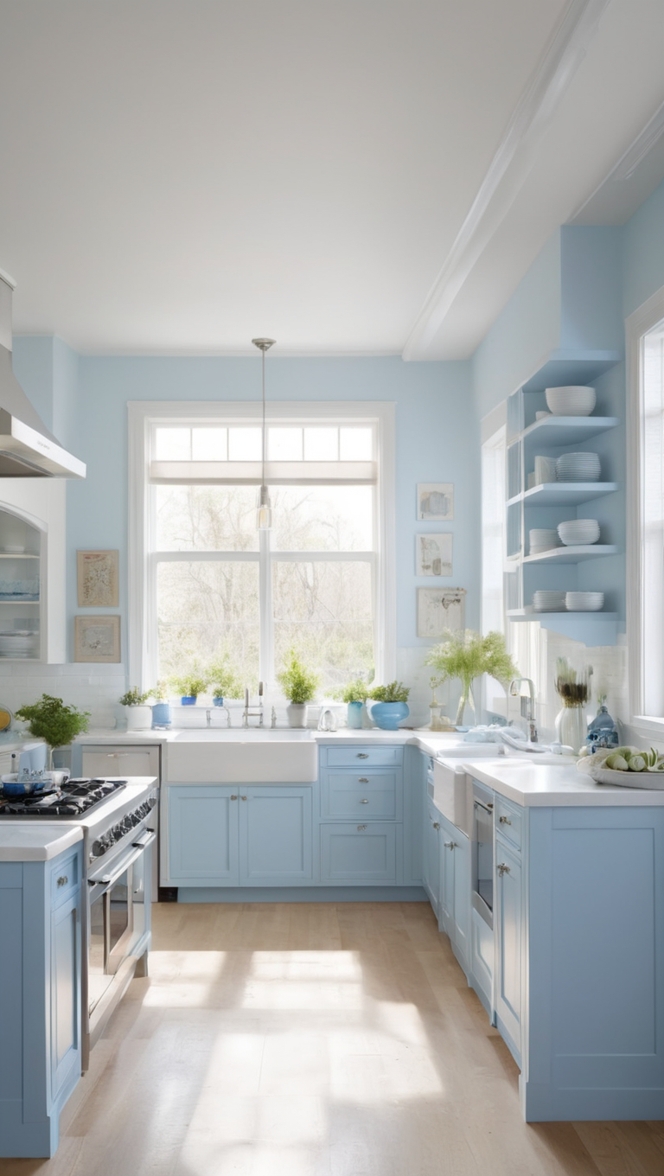
1. Soft Blues
Soft blues, such as powder blue or sky blue, enhance the calming effect of Nacre and create a serene coastal vibe.
2. Warm Neutrals
Warm neutrals like beige, taupe, and warm gray provide a cozy and inviting atmosphere. These colors add depth and warmth without overpowering Nacre.
3. Greens
Muted greens, such as sage or olive, introduce a touch of nature and tranquility, making the kitchen feel fresh and lively.
4. Metallics
Metallic hues like silver, gold, and bronze can add a touch of glamour and sophistication. These colors highlight Nacre’s iridescent quality.
5. Earthy Tones
Earthy tones like terracotta and clay offer a warm contrast to Nacre’s cool elegance. These hues can create a grounded and balanced look.
Alternative Colors from Sherwin-Williams and Benjamin Moore:
If you love the idea of Nacre but want to explore similar shades, here are five alternative colors from Sherwin-Williams and Benjamin Moore:
1. Sherwin-Williams Alabaster (SW 7008)
Alabaster is a warm, creamy white that exudes a similar elegance and versatility as Nacre. It’s a great option for creating a soft and inviting kitchen.
2. Benjamin Moore White Dove (OC-17)
White Dove is a classic, soft white with a hint of gray. It offers a timeless appeal and works well with various design styles.
3. Sherwin-Williams Repose Gray (SW 7015)
Repose Gray is a light gray with warm undertones, providing a cozy and sophisticated feel that complements Nacre’s aesthetic.
4. Benjamin Moore Classic Gray (OC-23)
Classic Gray is a light, neutral gray that offers subtle warmth and pairs beautifully with a wide range of colors and materials.
5. Sherwin-Williams Agreeable Gray (SW 7029)
Agreeable Gray is a warm, light gray that blends seamlessly with other elements, creating a harmonious and balanced look.
Other Rooms to Use Nacre:
While Nacre is an excellent choice for the kitchen, its versatility and elegance make it suitable for other areas of the home as well:
1. Living Room
Nacre can create a serene and inviting living room. Pair it with plush furnishings and natural textures for a cozy and sophisticated space.
2. Bedroom
The calming qualities of Nacre make it perfect for the bedroom. It creates a tranquil environment conducive to rest and relaxation.
3. Bathroom
In the bathroom, Nacre can enhance the sense of cleanliness and freshness. Pair it with marble accents and metallic fixtures for a spa-like retreat.
4. Dining Room
Nacre provides a sophisticated backdrop for the dining room, allowing the focus to be on the dining table and decorative elements.
5. Home Office
Create a calming and focused workspace with Nacre. Its neutral tones can help reduce visual distractions and promote productivity.
Conclusion:
Nacre is an innovative and chic paint color that can elevate the aesthetic of your kitchen makeover in 2024. Its timeless elegance, versatility, and light-enhancing qualities make it a standout choice. By carefully matching Nacre with complementary elements, exploring harmonious hues, and considering alternative colors, you can create a kitchen that is both stylish and functional. Furthermore, Nacre’s adaptability makes it suitable for other rooms in your home, ensuring a cohesive and sophisticated look throughout.
Incorporate Nacre into your kitchen makeover to experience the beauty and serenity this unique hue brings. Whether you’re drawn to its subtle iridescence or its calming effect, Nacre is sure to make a lasting impression in your home.