Transform your kitchen into a bold yet inviting space by mastering the art of blending neutral colors seamlessly. Unlock the secrets to a vibrant kitchen design!
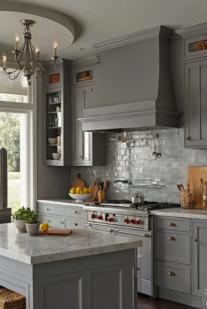
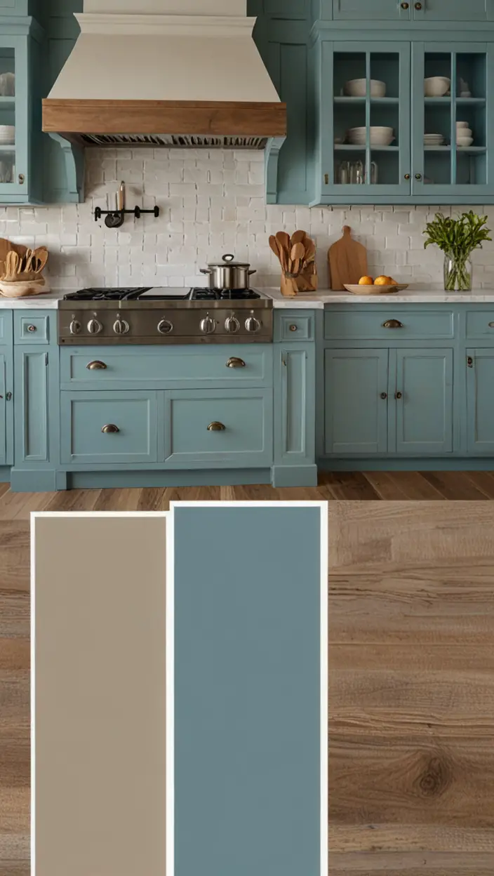
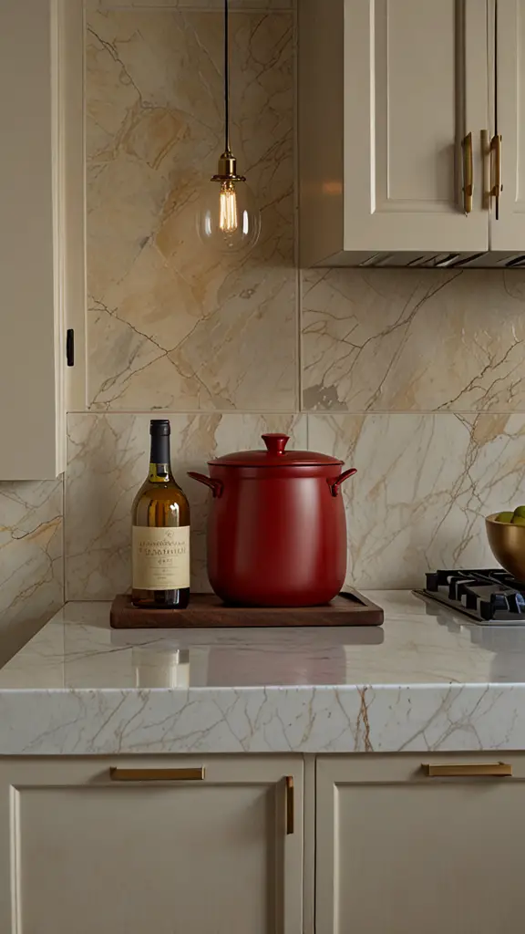
To incorporate neutral colors into a vibrant kitchen design, start with a neutral base for larger elements such as the walls, cabinets, and countertops. This provides a versatile backdrop that allows for more adventurous choices with colorful accents like accessories, small appliances, and wall art. Selecting hues from the same color family will help maintain a cohesive look, while adding pops of complementary colors can bring energy and personality to the space. Consider the natural light in your kitchen when choosing colors to ensure they look their best under different lighting conditions. Remember to balance bold and neutral elements to create a harmonious and inviting atmosphere.
How to select the right neutral colors for a vibrant kitchen design?
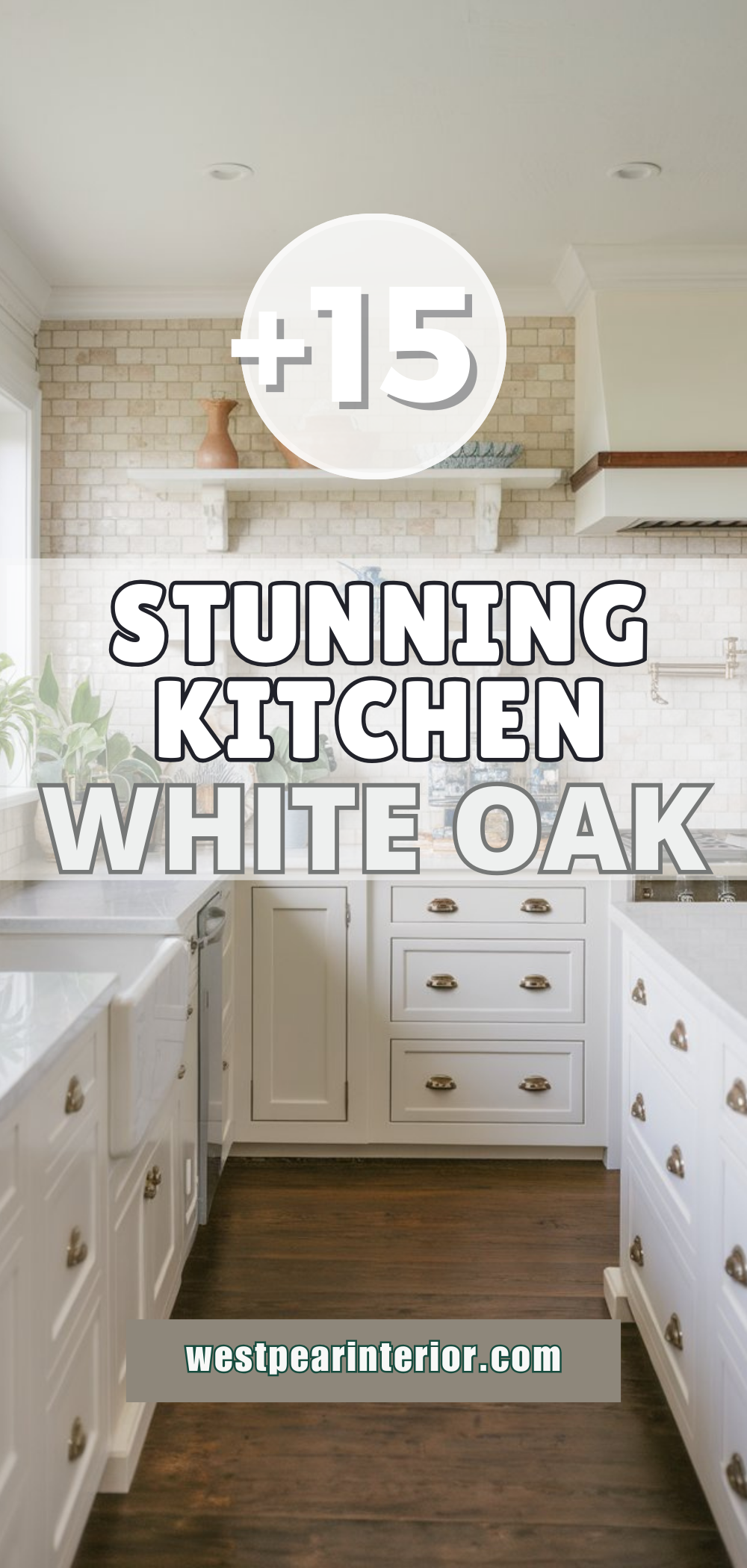
Selecting the right neutral colors for a vibrant kitchen design is crucial in creating a harmonious and balanced space. When choosing neutral colors, consider tones like white, beige, grey, or taupe as they provide a versatile backdrop for colorful accents. Opt for warm neutrals like cream or soft yellow to add a welcoming feel to the kitchen. Cool neutrals like light blue or pale green can create a calming atmosphere. It’s essential to test samples in your kitchen’s lighting conditions to ensure they complement your space.
Can I combine bright colors with neutral tones in my kitchen?
My Lovely Spring Paint for 2025
Ready for a Spring Makeover? Explore the Freshest 2025 Paint Trends!
White Sage/Green SW Pistachio green Soft blue Honeysweet/Orange Pink Sugar Sage Tint BMAs an Amazon Associate, I may earn a commission from qualifying purchases at no extra cost to you.
Yes, you can definitely combine bright colors with neutral tones in your kitchen. The key is to find the right balance. Use neutral colors for big-ticket items like cabinets, countertops, and walls, while incorporating bright colors in smaller doses through accessories, textiles, or appliances. This approach allows you to experiment with vibrant hues without overwhelming the space. Consider using colorful kitchen tools, artwork, or even a single bold accent wall to add personality and energy to the room.
What is the best way to incorporate pops of color in a neutral kitchen?
Incorporating pops of color in a neutral kitchen can be done through various elements such as decorative accents, fabrics, artwork, or even plants. Choose a color palette that complements your neutrals and select a few key pieces in vibrant shades to create visual interest. For example, brightly colored bar stools, a patterned rug, or a colorful backsplash can all add personality to a neutral kitchen without overwhelming the space. Remember to keep the overall color scheme cohesive by repeating the pops of color throughout the room.
How can I make my kitchen feel more vibrant without overwhelming it with color?
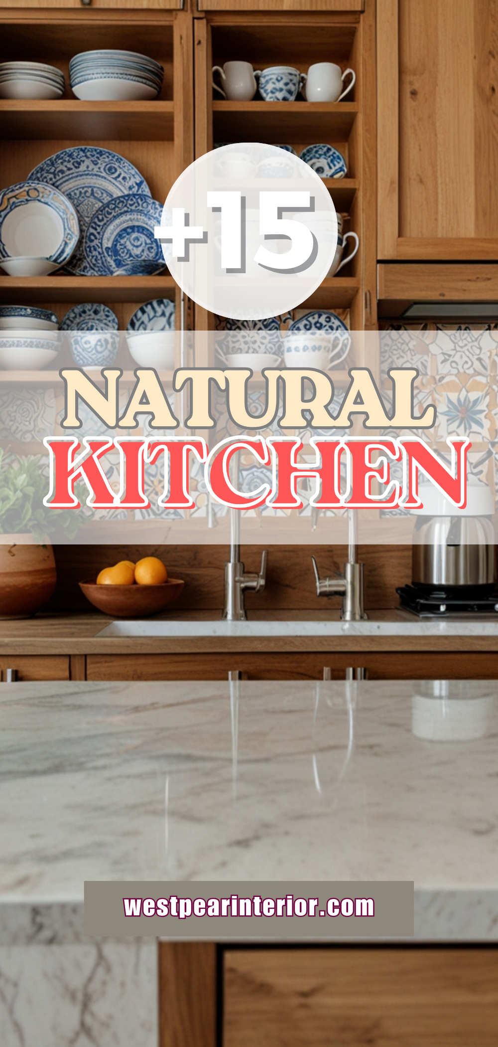
To make your kitchen feel more vibrant without overwhelming it with color, focus on introducing texture, patterns, and varying finishes. Use natural materials like wood, stone, or metal to add depth and visual interest. Consider incorporating patterns through textiles, wallpaper, or tile to create a dynamic look. Mixing matte and glossy finishes can also add dimension to the space. Additionally, don’t forget the power of proper lighting, as a well-lit kitchen can make colors pop and create a lively atmosphere.
What are some alternative paint colors that work well with neutral tones in a kitchen?
My fAV Spring DECOR for 2025
Discover Spring’s Best 2025 Decor Combinations – Perfect for Any Room!
Oversized Indoor Plants White Curved Sofas Rugs BOH Brown Cream Moroccan Hype Boho Rug Outdoor Patio Furniture Sets Topfinel Pillow CoversAs an Amazon Associate, I may earn a commission from qualifying purchases at no extra cost to you.
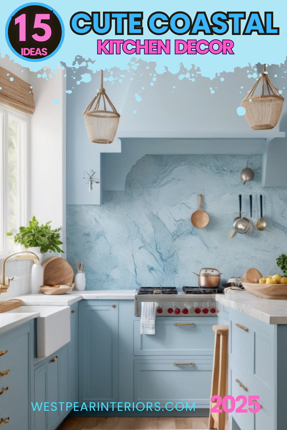
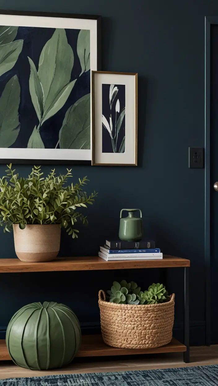
When looking for alternative paint colors to complement neutral tones in a kitchen, consider shades like muted pastels, rich jewel tones, or earthy hues. Soft blues, pale greens, or blush pinks can add a hint of color without overpowering the neutrality of the space. Deep navy, emerald green, or terracotta can create a dramatic statement while still harmonizing with neutral elements. Experimenting with different shades can help you find the perfect balance between vibrancy and subtlety in your kitchen design.
How to maintain balance in a kitchen design when using both neutral and vibrant colors?
Maintaining balance in a kitchen design that combines neutral and vibrant colors is key to a cohesive and visually appealing space. Start by establishing a dominant neutral color palette for larger surfaces like cabinets and countertops. Use vibrant colors as accents in smaller elements like decor, textiles, or appliances. Creating a focal point with a bold hue can draw the eye and anchor the design. Consider using a 60-30-10 rule where 60% is the dominant color, 30% is a secondary color, and 10% is the accent color to ensure a balanced composition.
What are some tips for organizing a kitchen that has a mix of neutral and vibrant colors?
When organizing a kitchen with a mix of neutral and vibrant colors, it’s essential to maintain a cohesive look while keeping functionality in mind. Start by categorizing items and keeping similar items together for a streamlined organization. Use neutral storage solutions like baskets, bins, and containers to unify the look of the space. Incorporate pops of color through smaller accessories or kitchen tools to tie in the vibrant elements without overwhelming the visual balance. Utilize open shelving or glass-front cabinets to showcase colorful dishes or cookware as decorative accents.

