Discover the secrets to incorporating high-contrast colors in your home office without straining your eyes. Find out how to elevate your workspace effortlessly.
To incorporate high-contrast colors into your home office without causing visual fatigue, it is important to strike a balance. Start by selecting a dominant color for the walls and larger furniture pieces, then add pops of contrasting colors through decor items like throw pillows, rugs, and artwork. Consider the natural lighting in the room and how different colors will interact with it. Stick to a color palette that complements each other to create a cohesive look. Additionally, use primer paint for walls before applying color to ensure a smooth finish. By focusing on color matching and space planning, you can create a visually interesting and comfortable home office environment.
How can I choose high-contrast colors for my home office without making it feel overwhelming?
Choosing high-contrast colors for your home office is a strategic decision that can significantly impact the ambiance and productivity of the space. To avoid overwhelming the room, consider the following tips:
1. **Start with a Neutral Base:** Begin by selecting a neutral color as the base for your home office walls and larger furniture pieces. Neutral tones like white, beige, or light gray provide a calming backdrop that can balance out the high-contrast accents.
2. **Limit the Number of Colors:** When incorporating high-contrast colors, stick to a maximum of three hues to prevent the space from looking chaotic. Select a primary color for the walls or main furniture, a secondary color for accent walls or additional furniture, and a third color for accessories or decor pieces.
3. **Consider the Light:** Pay attention to the natural light in your home office when choosing high-contrast colors. Dark colors can absorb light and make the space feel smaller, while light colors can reflect light and create a more open atmosphere.
4. **Use Color Samples:** Before committing to a color scheme, test various combinations by painting small sections of the wall or using color swatches. This allows you to see how the colors interact in different lighting conditions before making a final decision.
5. **Balance Warm and Cool Tones:** Mix warm and cool tones within your high-contrast color palette to create depth and visual interest. For example, pair a warm red with a cool blue to achieve a harmonious balance.
6. **Incorporate Texture:** Introduce different textures like wood, metal, or fabric in your office decor to break up the color contrast and add tactile appeal. Texture can soften the impact of bold colors and create a more dynamic visual experience.
7. **Accessorize Thoughtfully:** Use rugs, curtains, artwork, and plants to introduce pops of color in a controlled manner. Accessories can be easily swapped out or updated, allowing you to experiment with different color combinations without a major overhaul.
What are some tips for combining high-contrast colors in a way that is visually appealing and not fatiguing?
Combining high-contrast colors effectively requires a thoughtful approach to ensure visual appeal without causing fatigue:
1. **Consider Color Proportions:** Distribute high-contrast colors throughout the room in a balanced way. Aim for a mix of dominant, secondary, and accent colors to create harmony and prevent any single color from overpowering the space.
2. **Use the 60-30-10 Rule:** Follow the 60-30-10 rule of decorating, which suggests dividing the colors in a room as 60% of a dominant color, 30% of a secondary color, and 10% of an accent color. This proportion helps maintain a cohesive and visually appealing color scheme.
3. **Play with Intensity:** Experiment with the intensity of high-contrast colors to achieve the desired mood. Pairing a bright, saturated color with a muted or pastel shade can create a dynamic contrast that is visually engaging yet not overwhelming.
4. **Create Focal Points:** Designate focal points in your home office where high-contrast colors are concentrated. This could be a feature wall, a piece of furniture, or a unique decor item that draws the eye and anchors the color scheme.
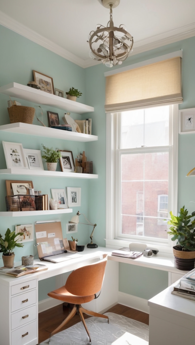
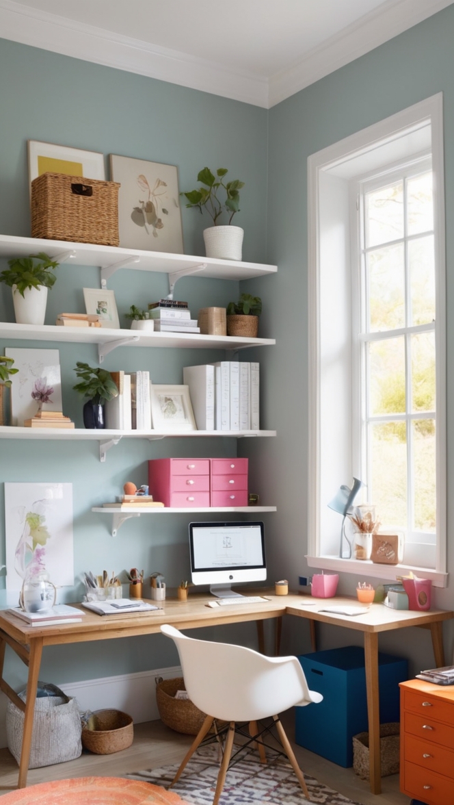
5. **Blend with Neutrals:** Balance out bold high-contrast colors with neutral tones like white, black, or gray. Neutrals act as a visual break between vibrant hues, allowing the eyes to rest and preventing visual fatigue.
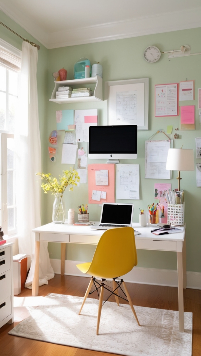
6. **Use Color Psychology:** Take into account the psychological effects of colors when combining high-contrast hues. Blues and greens are known for promoting calm and focus, while yellows and oranges can add energy and creativity to a space.
7. **Experiment with Patterns:** Introduce patterns like stripes, geometric shapes, or florals that incorporate high-contrast colors. Patterns can add a dynamic visual element to the room and break up large blocks of color.
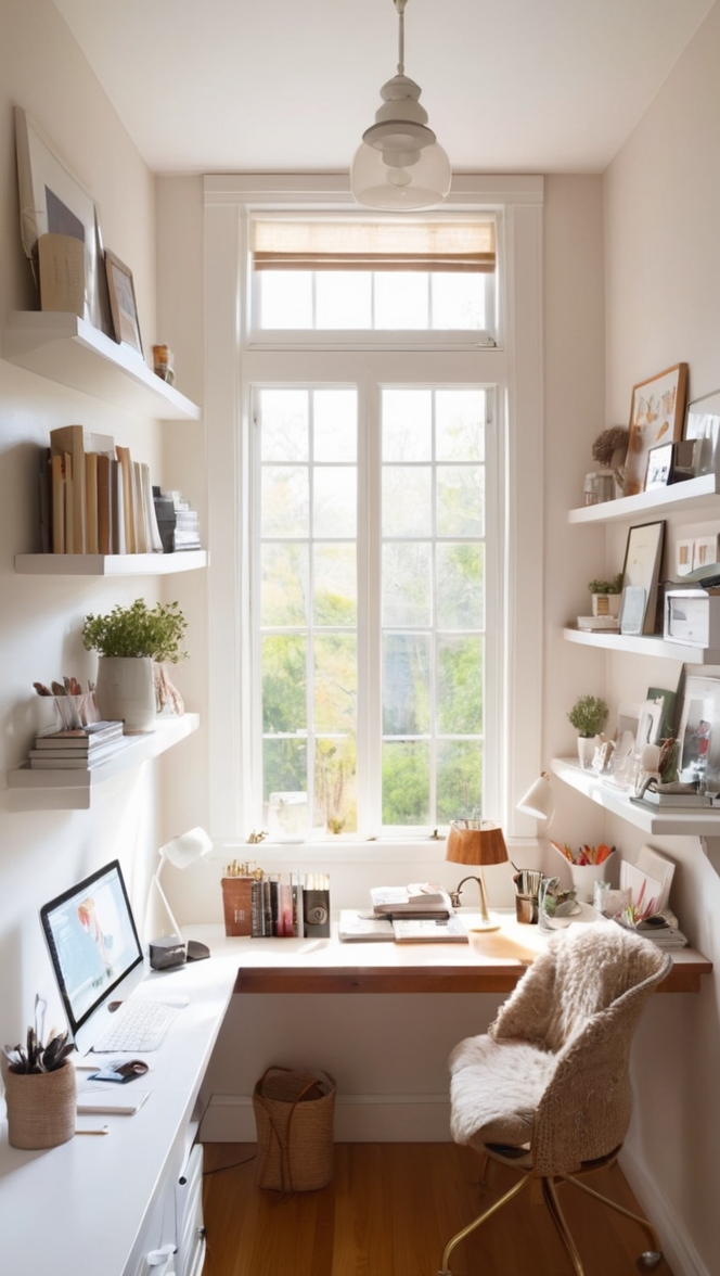
Can I incorporate high-contrast colors into my home office if I have a small space?
Absolutely! High-contrast colors can be effectively incorporated into a small home office to create a vibrant and visually stimulating environment without overwhelming the space. Consider the following strategies:
1. **Focus on Accent Walls:** Opt for one or two accent walls painted in high-contrast colors to add depth and dimension to a small office. This approach allows you to introduce bold hues without closing in the room.
2. **Embrace Vertical Space:** Use high-contrast colors vertically to draw the eye upward and create the illusion of height in a small space. Consider painting the ceiling or using tall bookshelves in contrasting shades to elongate the room.
3. **Choose Multifunctional Furniture:** Select furniture pieces that serve dual purposes, such as a desk with built-in storage or a fold-down table. By keeping the furniture minimal and functional, you can prevent the room from feeling overcrowded with color.
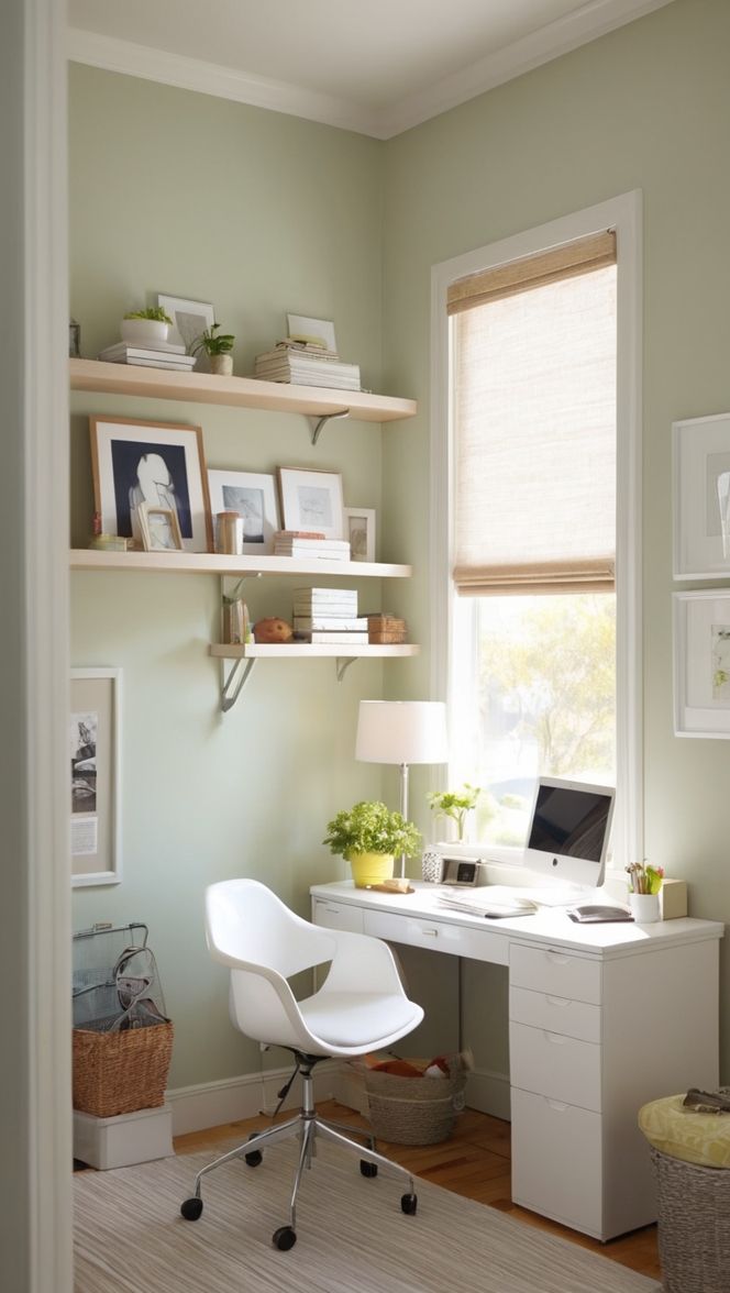
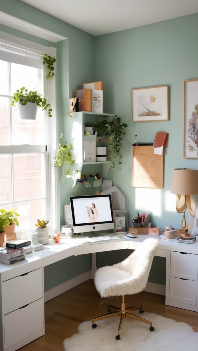
4. **Opt for Lighter Shades:** If you have a small home office, lean towards lighter shades of high-contrast colors to maximize the sense of openness and airiness. Pastels, soft blues, or pale yellows can create a bright and inviting atmosphere.
5. **Utilize Mirrors:** Incorporate mirrors strategically to reflect light and visually expand the space. Placing a large mirror on a high-contrast accent wall can amplify the color impact while making the room feel larger.
6. **Integrate Floating Shelves:** Install floating shelves in contrasting colors to display decor items and keep the floor area free from clutter. Floating shelves add visual interest and storage space without overwhelming the walls.
7. **Keep it Cohesive:** Maintain a cohesive color palette throughout the small home office to ensure visual continuity. Limit the number of high-contrast colors used and tie the scheme together with consistent accents and accessories.
What are some color combinations that work well for creating a high-contrast look in a home office?
Choosing the right color combinations is essential for achieving a high-contrast look in your home office. Here are some color pairings that work effectively together:
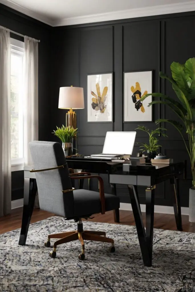
1. **Black and White:** The classic combination of black and white creates a timeless and striking contrast that is perfect for a modern home office. Use black furniture against white walls or vice versa for a sleek and sophisticated aesthetic.
2. **Navy Blue and Yellow:** Navy blue and yellow complement each other beautifully to create a bold yet balanced color scheme. Consider painting one wall in navy blue and incorporating yellow accents through decor items like pillows, rugs, or artwork.
3. **Emerald Green and Coral:** Emerald green and coral are vibrant and energizing colors that can liven up a home office space. Pair emerald green walls with coral curtains or accessories to add a pop of color and personality.
4. **Charcoal Gray and Mustard Yellow:** Charcoal gray provides a sophisticated backdrop for mustard yellow accents to stand out. Mix and match gray and yellow furniture pieces, rugs, and throw blankets for a cozy and stylish home office.
5. **Teal and Coral:** Teal and coral create a dynamic color combination that is both soothing and invigorating. Use teal for the walls and coral for accent furniture or decor elements to achieve a harmonious and balanced look.
6. **Purple and Chartreuse:** Purple and chartreuse offer a bold and unexpected pairing that can add a sense of luxury and drama to a home office. Incorporate these colors in a strategic way, such as a purple accent wall with chartreuse accessories.
7. **Red and Turquoise:** Red and turquoise create a vibrant and eclectic color scheme that exudes energy and creativity. Balance the intensity of these hues by using red as the primary color and turquoise as a secondary accent in the decor.
How can I use accessories and decor to add high-contrast colors to my home office?
Accessories and decor play a crucial role in enhancing the high-contrast color scheme of your home office. Here are some ways to effectively incorporate bold hues through accessories:
1. **Throw Pillows:** Add throw pillows in high-contrast colors to your office chair, sofa, or lounge area. Pillows with geometric patterns or textured fabrics can bring visual interest and comfort to the space.
2. **Rugs:** Invest in a vibrant rug with high-contrast colors to anchor the room and define specific areas within the home office. A bold rug can tie the color scheme together and create a cozy atmosphere.
3. **Artwork:** Display artwork featuring high-contrast colors on the walls to infuse personality and style into your home office. Choose pieces that resonate with your aesthetic and complement the overall color palette.
4. **Desk Accessories:** Incorporate colorful desk accessories like pencil holders, organizers, or computer peripherals in contrasting hues. These small touches can add a playful element to your workspace while remaining functional.
5. **Plants:** Introduce greenery through potted plants or succulents to add a natural pop of color to your home office. Plants not only enhance the aesthetic appeal but also contribute to a healthier and more productive environment.
6. **Lighting Fixtures:** Select lighting fixtures in high-contrast colors or metallic finishes to illuminate the space and create a focal point. Pendant lights, desk lamps, or floor lamps can serve as decorative accents while providing essential task lighting.
7. **Curtains and Drapes:** Choose curtains or drapes in bold hues or patterns to frame windows and enhance the overall color scheme of the room. Floor-to-ceiling curtains in high-contrast colors can make a dramatic statement and elevate the decor.
What are some alternative ways to incorporate high-contrast colors into a home office without painting the walls?
If painting the walls is not an option, there are plenty of alternative ways to infuse high-contrast colors into your home office without a major renovation. Consider the following creative approaches:
1. **Removable Wallpaper:** Use peel-and-stick wallpaper in bold patterns and colors to create an accent wall or focal point in your home office. Removable wallpaper is easy to install and remove, making it an ideal solution for renters or those who want a temporary color enhancement.
2. **Colorful Furniture:** Invest in furniture pieces in high-contrast colors to make a statement in your home office. Opt for a vibrant sofa, a colored desk, or bright shelving units that add personality and visual interest without the need for wall painting.
3. **Area Rugs:** Lay down a large area rug in a high-contrast color or pattern to define the workspace and introduce a burst of color. An eye-catching rug can anchor the room and tie together the various elements of your home office decor.
4. **Decorative Screens:** Use decorative folding screens or room dividers in bold colors to partition the space and add a touch of elegance. Screens can serve as both functional room dividers and artistic accents that elevate the room’s aesthetic.
5. **Colorful Shelving:** Install floating shelves or bookcases in contrasting colors to showcase books, decor items, and office supplies. Colorful shelving units can double as storage solutions and vibrant design elements in your home office.
6. **Textile Accents:** Layer textiles like curtains, throw blankets, and upholstery in high-contrast colors to introduce warmth and texture. Textiles can be easily swapped out to refresh the color scheme or experiment with new color combinations over time.
7. **Accent Lighting:** Incorporate colorful accent lighting through lamps, string lights, or LED strips to illuminate the room in a soft glow of contrasting hues. Lighting fixtures in bold colors can create ambiance and highlight specific areas of your home office.
How can I ensure that my high-contrast color scheme in my home office promotes productivity and focus?
To harness the power of high-contrast colors for increased productivity and focus in your home office, consider the following strategies:
1. **Select Calming Colors:** Choose high-contrast colors that promote a sense of calm and serenity while keeping the energy levels balanced. Blues, greens, and neutrals are known for their calming effects and can help maintain focus during work hours.
2. **Incorporate Natural Elements:** Introduce natural elements like wood accents, indoor plants, or stone decor to ground the high-contrast color scheme and create a connection to nature. Natural elements can foster a sense of well-being and enhance productivity in the workspace.
3. **Organize Mindfully:** Maintain a clutter-free and organized home office to prevent distractions and promote mental clarity. Use storage solutions in coordinating colors to keep office supplies, paperwork, and technology neatly stored and easily accessible.
4. **Create Zones:** Define different work zones within your home office using color cues or furniture placement. Designate specific areas for tasks like focused work, creative brainstorming, and relaxation to optimize productivity and workflow.
5. **Limit Distractions:** Minimize visual distractions by choosing a focused color palette that supports concentration and reduces visual noise. Avoid overly stimulating patterns or bright colors that may hinder cognitive performance and task completion.
6. **Personalize with Purpose:** Infuse your home office with personal touches and decor items in high-contrast colors that inspire and motivate you. Balance personalization with functionality to create a workspace that reflects your style while enhancing productivity.
7. **Ergonomic Considerations:** Prioritize ergonomic furniture and accessories that support proper posture, comfort, and productivity. Choose office chairs, desks, and lighting solutions that promote a healthy work environment and reduce physical strain during long hours of work.