Discover how to infuse vibrant hues into a sleek minimalist kitchen for a striking yet understated design statement.
**What are some ways to incorporate color into a minimalist kitchen design?**
One effective way to add color to a minimalist kitchen design is by painting an accent wall in a bold hue. This can create a focal point without overwhelming the space. Additionally, consider incorporating colorful accessories such as kitchen towels, utensil holders, or small appliances. Another approach is to introduce color through artwork or decorative items like vibrant bowls or plates. For a cohesive look, match the colors in your kitchen with the overall color scheme of your home interior. This will create a sense of continuity throughout your living spaces. Remember to maintain balance and restraint to ensure a harmonious and stylish result.
How can I choose the right color palette for a minimalist kitchen design?
When selecting a color palette for a minimalist kitchen design, it’s essential to consider a few key factors. First and foremost, **simplicity** is the cornerstone of minimalism, so opt for colors that are clean, neutral, and calming. Whites, grays, beiges, and light pastels are popular choices for minimalist kitchens as they create a sense of **openness and serenity**. These colors serve as a perfect backdrop for the sleek lines and minimalistic design elements typically found in such kitchens.
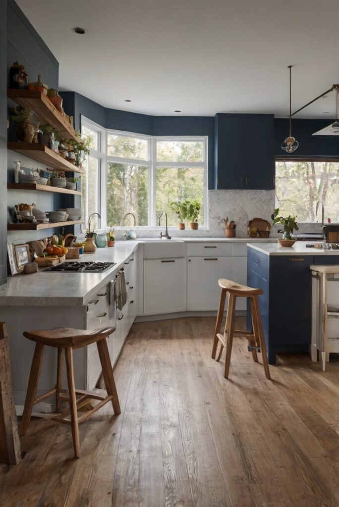
It’s also crucial to think about **contrast** when choosing colors for a minimalist kitchen. Pairing light and dark shades can add depth and visual interest to the space without compromising its minimalist aesthetic. For example, you might consider incorporating a dark charcoal gray island against a backdrop of white cabinets for a striking yet minimalist look.
Additionally, **natural elements** can enhance the warmth and liveliness of a minimalist kitchen. Wood accents or natural stone surfaces can introduce earthy tones and textures that complement a neutral color palette. These elements bring a touch of nature indoors, adding a sense of balance and harmony to the space.
Lastly, keep in mind the **overall ambiance** you want to create in your kitchen. Cool tones like blues and greens evoke a sense of calmness, while warmer tones like yellows and oranges can add energy and vibrancy to the space. Consider your personal preferences and the atmosphere you wish to cultivate when finalizing your color palette.
What are some ways to add pops of color to a neutral-toned minimalist kitchen?
Incorporating pops of color into a neutral-toned minimalist kitchen can be a great way to infuse personality and visual interest into the space. **Accent pieces** such as colorful bar stools, pendant lights, or kitchen tools can serve as focal points that break up the monotony of a neutral color palette. Opt for vibrant hues like **deep blues, rich greens, or bold yellows** to create a striking contrast against the subdued backdrop.
**Artwork** is another excellent way to introduce color into a minimalist kitchen. Hang a piece of colorful abstract art or a gallery wall of vibrant prints to add a splash of personality to the space. The artwork can serve as a visual focal point and tie together different colors and elements within the kitchen.
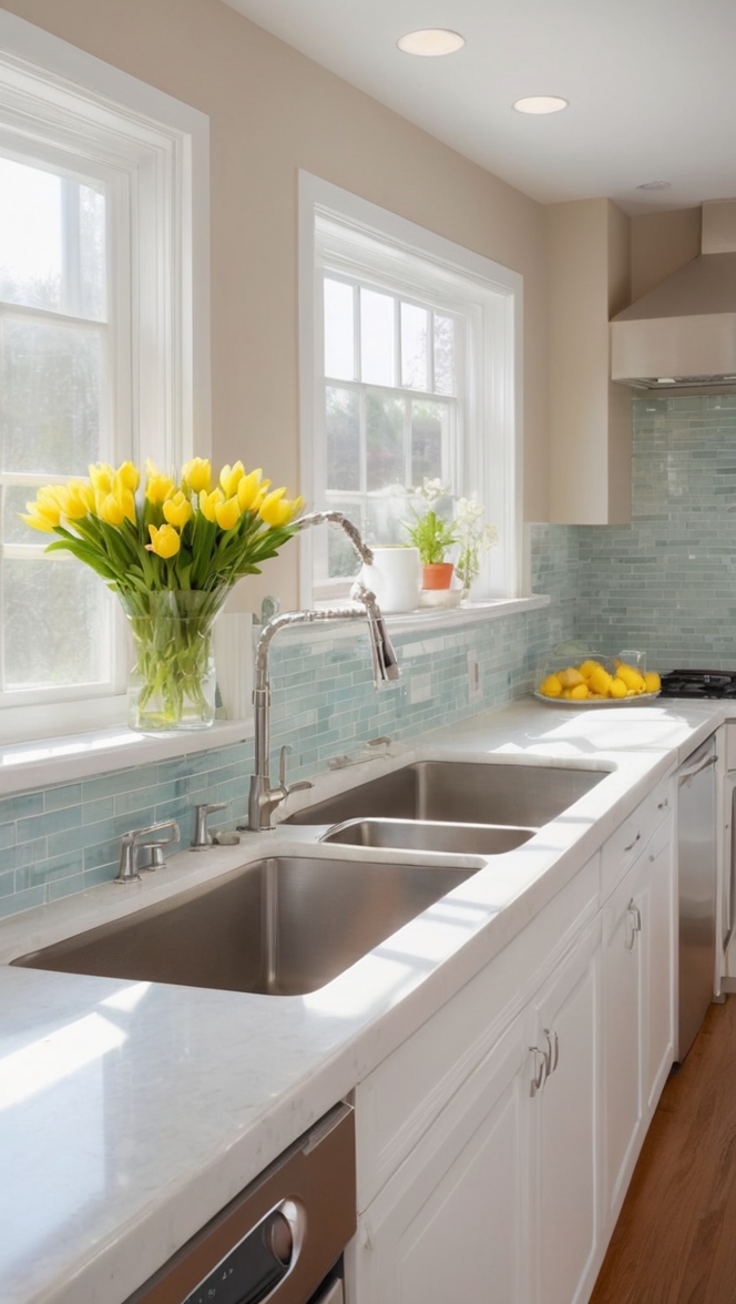
**Fresh flowers** or **indoor plants** can also liven up a neutral-toned kitchen with their natural colors and textures. Place a vase of colorful blooms on the countertop or incorporate potted plants on shelves or windowsills to bring a touch of the outdoors inside. Greenery adds a refreshing and organic element to the space, enhancing its overall aesthetic.
For a more temporary and versatile option, consider **textiles** like colorful rugs, curtains, or seat cushions. These items can easily be swapped out or changed to update the color scheme of the kitchen and reflect your mood or the changing seasons. Playful patterns or bold hues can inject energy and personality into the space without overwhelming its minimalist design.
Can I incorporate color through kitchen accessories in a minimalist design?
Yes, incorporating color through **kitchen accessories** is a fantastic way to introduce visual interest and personality into a minimalist design. Small **appliances**, **utensils**, **cookware**, and **dinnerware** can all serve as opportunities to infuse color into an otherwise neutral kitchen. Choose items in bold or complementary hues that complement the overall color palette of the space.
For example, consider displaying a set of brightly colored mixing bowls on open shelves or a pop of color through a sleek **coffee maker** on the countertop. Colorful utensils or cutting boards can also add a playful touch to the kitchen while remaining functional and practical.
Another creative way to incorporate color through accessories is by **layering textiles**. Colorful **tea towels**, **oven mitts**, or **pot holders** can provide a quick and easy way to introduce new hues into the kitchen. These items can be switched out seasonally or as desired to refresh the space and create a dynamic color scheme.
What is the best way to balance minimalism with using multiple colors in a kitchen design?
Balancing minimalism with multiple colors in a kitchen design requires careful consideration and strategic planning. The key is to maintain a sense of **harmony and cohesion** among the different colors while still adhering to the principles of minimalism. Here are some tips to help you achieve a balanced and visually appealing color scheme:
**Limit the number of colors**: While you can certainly incorporate multiple colors into a minimalist kitchen, it’s essential to exercise restraint. Stick to a **limited color palette** of two to three hues to prevent the space from feeling overwhelming or chaotic. Select colors that complement each other and create a cohesive look throughout the kitchen.
**Create visual balance**: Distribute the colors strategically throughout the space to achieve a sense of visual balance. Consider using a **dominant color** for the larger surfaces like cabinets or walls, a **secondary color** for accents or smaller elements, and a **neutral tone** to tie everything together. This hierarchy of colors helps create a sense of order and unity in the kitchen.
**Use color blocking**: Opt for **color blocking** techniques to define different zones or areas within the kitchen. This approach involves grouping similar colors together to create visually distinct areas. For example, you might use one color for the upper cabinets and another for the lower cabinets to delineate the space while maintaining a minimalist aesthetic.
**Incorporate texture**: Introducing **different textures** alongside multiple colors can help add depth and visual interest to a minimalist kitchen. Consider using materials like **wood**, **metal**, or **stone** in various finishes to complement the color scheme and create a tactile experience in the space. Texture can enhance the overall design while harmonizing the different colors used.
By following these strategies, you can strike a balance between minimalism and using multiple colors in your kitchen design, creating a harmonious and visually appealing space that reflects your personal style.
How can I select colors that create a cohesive look in a minimalist kitchen?
Choosing colors that create a cohesive look in a minimalist kitchen involves careful consideration of various elements to ensure a harmonious and unified design. To achieve a cohesive color scheme, follow these guidelines:
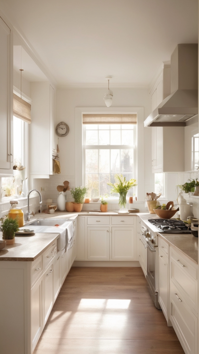
**Consider the lighting**: Natural and artificial lighting can significantly affect how colors appear in a space. Take into account the **lighting conditions** in your kitchen when selecting colors to ensure they look consistent and balanced throughout the day. Test paint samples or swatches under different lighting to see how they react to light.
**Create a mood board**: Compile **inspirational images**, **color swatches**, and **material samples** to visualize how different colors will work together in your kitchen. A mood board can help you see the relationships between various hues, textures, and finishes, allowing you to make informed decisions about your color palette.
**Focus on undertones**: Pay attention to the **undertones** of the colors you choose to ensure they harmonize with each other. Warm undertones like yellow or red can pair well with other warm tones, while cool undertones like blue or gray complement cool hues. Keeping the undertones consistent helps create a seamless and coordinated look in the kitchen.
**Use a mix of hues**: Incorporate a variety of **shades** and **tints** within your chosen color palette to add depth and dimension to the space. Mix light and dark tones to create contrast and visual interest while maintaining a cohesive overall look. Experiment with different intensities of the same color to create a dynamic and layered effect.
**Refer to color theory**: Familiarize yourself with **color theory** principles such as **complementary**, **analogous**, or **monochromatic** schemes to guide your color choices. These color harmonies can help you create a cohesive and visually pleasing palette that balances different hues in a harmonious way. For example, a monochromatic scheme using varying shades of white, gray, and black can create a sophisticated and unified look in a minimalist kitchen.
By incorporating these strategies into your color selection process, you can create a cohesive and visually balanced design in your minimalist kitchen that reflects your style and taste.
Are there certain colors that work best for creating a minimalist aesthetic in a kitchen?
When aiming to create a minimalist aesthetic in a kitchen, certain colors are particularly well-suited to achieve this streamlined and sophisticated look. **Neutral tones** such as white, beige, gray, and taupe are classic choices for minimalist kitchens due to their timeless appeal and ability to create a sense of **calm and simplicity**.
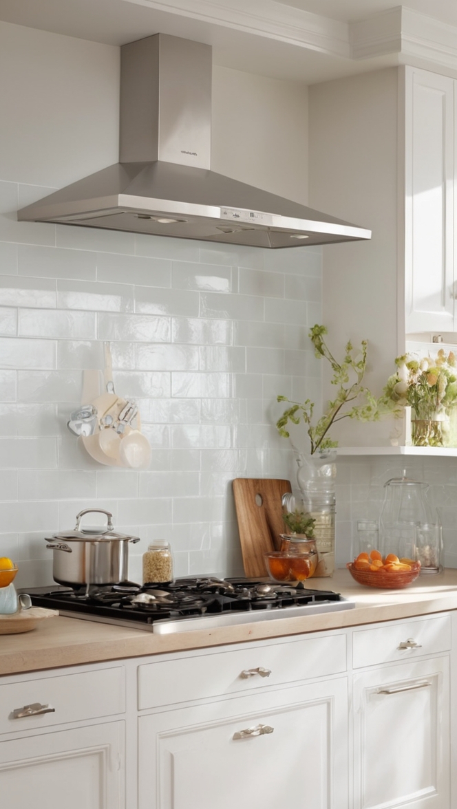
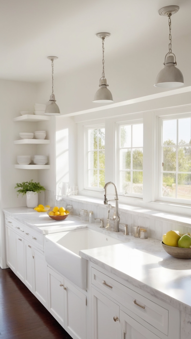
White, in particular, is a go-to color for minimalist designs as it reflects light, creates an illusion of spaciousness, and serves as a blank canvas to showcase clean lines and minimalistic features. Using white as the predominant color in a kitchen can establish a sense of purity and elegance while allowing other elements to stand out.
**Monochrome color schemes** are also effective in minimalist kitchens, where a single color is used in varying shades and tones to create a cohesive and unified look. For example, a kitchen designed in shades of gray can exude sophistication and modernity while maintaining a minimalist aesthetic. Monochrome schemes streamline the color palette and bring a sense of continuity to the space.
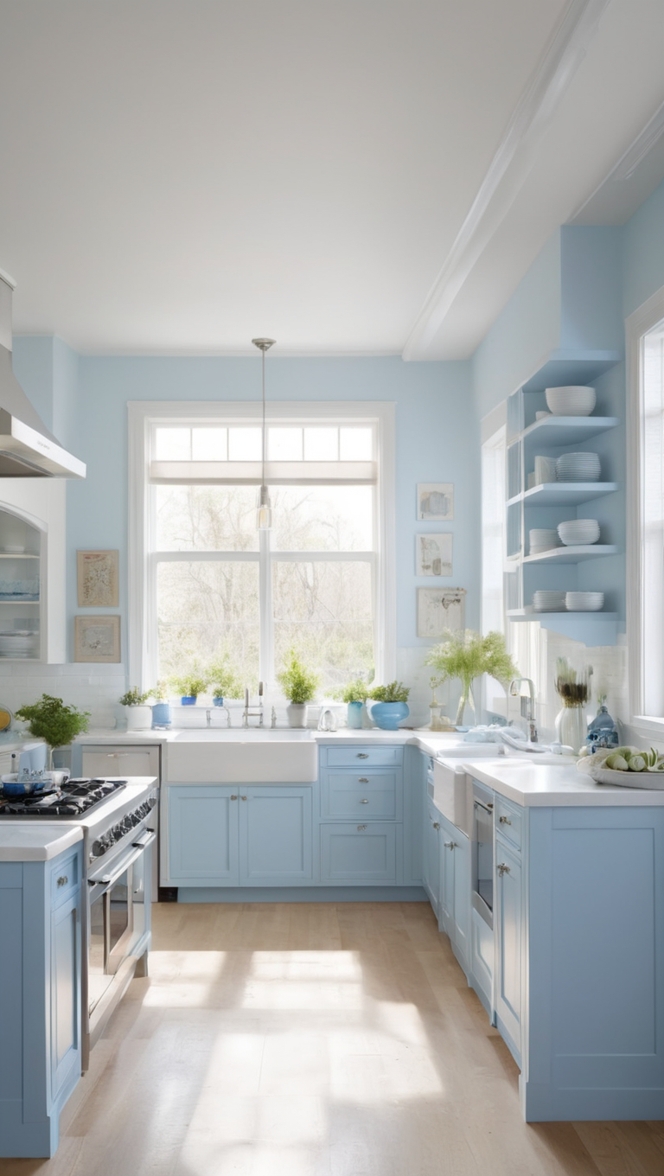
**Earthy tones** like soft greens, warm browns, or gentle blues can add warmth and organic elements to a minimalist kitchen design. These colors evoke a sense of nature and tranquility, contributing to a serene and inviting atmosphere in the space. Incorporating natural hues through materials like wood or stone can further enhance the minimalist aesthetic while introducing texture and visual interest.
Ultimately, the best colors for creating a minimalist aesthetic in a kitchen are those that promote a sense of simplicity, tranquility, and harmony. By choosing neutral tones, monochrome schemes, or earthy hues, you can achieve a sleek and contemporary look that embodies the essence of minimalism in your kitchen design.
Can I use different shades of the same color to add variety to a minimalist kitchen design?
Yes, incorporating different shades of the same color is a smart strategy to add variety and depth to a minimalist kitchen design while maintaining a cohesive and harmonious look. Utilizing **tonal variations** within a single color family can create interest and dimension without introducing contrasting hues that may disrupt the minimalist aesthetic.
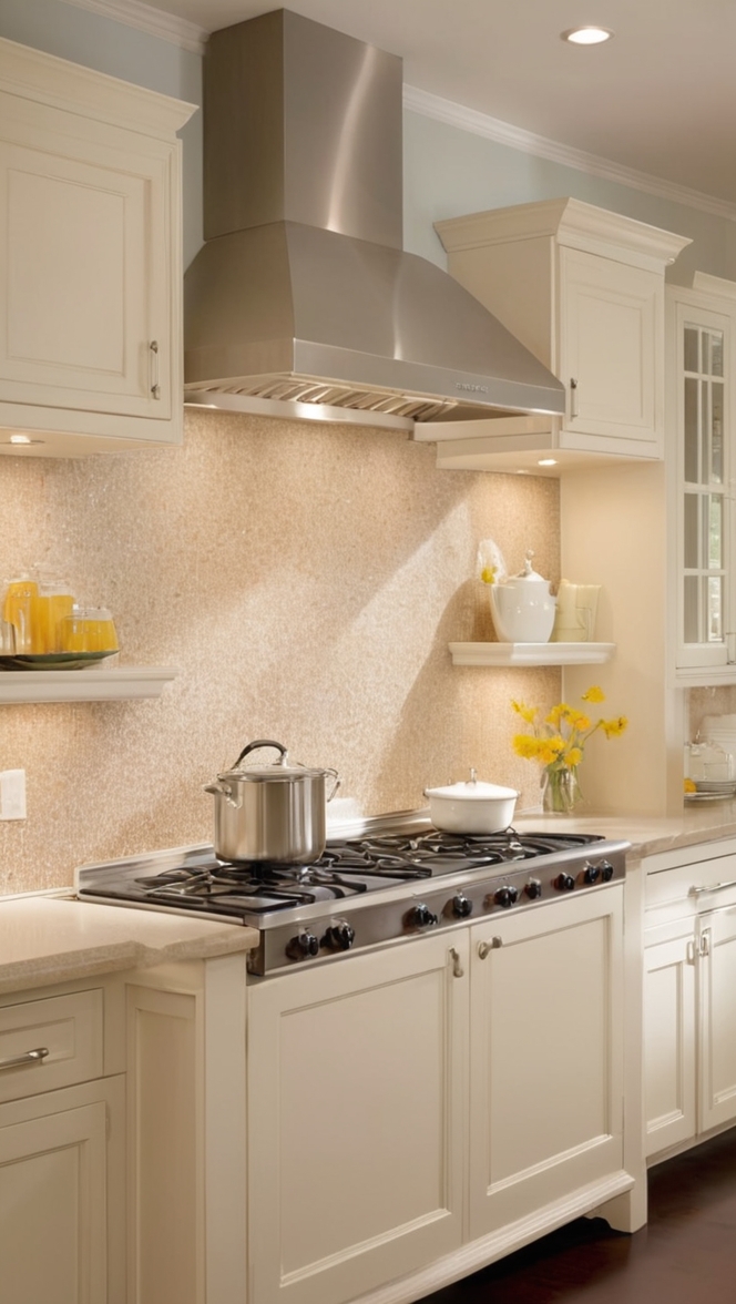
For instance, if you opt for a neutral color like white as the dominant shade in your kitchen, consider incorporating **subtle variations** such as off-white, ivory, or dove gray to introduce texture and nuance. These tonal shifts can be applied to different elements like cabinetry, countertops, or backsplashes to create a layered and sophisticated design.
**Playing with light and dark contrasts** within the same color spectrum is another effective way to add visual intrigue to a minimalist kitchen. Pairing a light shade with a slightly darker tint can create a dynamic interplay of light and shadow, highlighting architectural features and creating a sense of depth in the space. This technique allows you to explore the nuances of a single color while maintaining a minimalist sensibility.
**Gradation** is also key when incorporating different shades of the same color in a minimalist kitchen. Consider using a spectrum of tones, from the lightest to the darkest, to create a **monochromatic gradient** that subtly transitions throughout the space. This gradual shift in color adds sophistication and refinement to the design, emphasizing the clean lines and simplicity of a minimalist aesthetic.
By embracing tonal variations and subtle contrasts within a single color palette, you can introduce richness and diversity to your minimalist kitchen design while preserving its pared-down and elegant essence.
Key Takeaways:
– **Simplicity and neutrality** are foundational principles for choosing a color palette in a minimalist kitchen design.
– **Contrast** and **balance** are essential when incorporating pops of color into a neutral-toned space.
– **Accessories** and **textiles** offer versatile ways to add color and personality to a minimalist kitchen.
– **Harmony** and **cohesion** are key to balancing multiple colors in a minimalist design.
– Consider **lighting**, **undertones**, and **texture** when selecting colors for a cohesive look in a minimalist kitchen.
– **Neutral tones**, **monochrome schemes**, and **earthy hues** work best for creating a minimalist aesthetic in a kitchen.
– **Tonal variations** and **gradations** of the same color can add variety and depth to a minimalist kitchen design while maintaining a cohesive look.

