
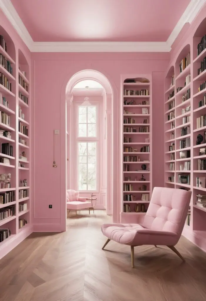
In the realm of interior design, the color of a space can evoke emotions, inspire creativity, and set the tone for the entire atmosphere. When it comes to libraries, a place of learning, solace, and community, the choice of paint color is paramount. Enter “In the Pink” – a sophisticated and inviting hue that can transform library spaces into vibrant hubs of intellectual engagement and relaxation.
Why In the Pink?
“In the Pink” is not merely a color; it’s an experience. This soft, yet dynamic shade of pink infuses warmth, positivity, and tranquility into any room it graces. Here’s why it’s the perfect choice for library spaces in 2024:
- Warmth and Comfort: Libraries are spaces where individuals seek refuge from the hustle and bustle of daily life. “In the Pink” envelops visitors in a cozy embrace, inviting them to unwind, delve into a good book, or engage in quiet contemplation.
- Stimulating Creativity: Pink is often associated with creativity and innovation. By incorporating “In the Pink” into library walls, furniture, or accents, you can stimulate the minds of patrons and encourage them to explore new ideas with a fresh perspective.
- Gender-Neutral Appeal: Gone are the days when pink was strictly associated with femininity. “In the Pink” strikes a harmonious balance between masculine and feminine energies, making it a welcoming color choice for individuals of all genders and ages.
- Enhanced Focus and Concentration: Studies have shown that certain shades of pink can have a calming effect on the mind, promoting focus and concentration. In a library setting, where quiet contemplation and deep thought are valued, “In the Pink” can help patrons immerse themselves in their studies or research.
- Community Connection: Pink is often linked to feelings of empathy, compassion, and connection. By enveloping library spaces in “In the Pink,” you create an environment that fosters a sense of community and belonging, where visitors feel supported and understood.
Tips for Matching In the Pink:
- Balance with Neutrals: Pair “In the Pink” walls with neutral-colored furniture, such as light gray or beige, to create a harmonious balance and prevent the space from feeling overwhelming.
- Accent with Metallics: Add a touch of sophistication by incorporating metallic accents, such as gold or silver, into the decor. This will elevate the elegance of the space while complementing the softness of the pink hue.
- Introduce Natural Elements: Bring the outdoors in by incorporating natural elements like wood, rattan, or plants into the design scheme. These earthy textures will add depth and warmth to the space, enhancing the overall ambiance.
- Layer with Textiles: Experiment with different textures and patterns through textiles like throw pillows, area rugs, and curtains. Opt for fabrics in complementary colors or subtle patterns to add visual interest without overwhelming the room.
- Play with Lighting: The right lighting can enhance the beauty of “In the Pink” while setting the mood for different activities. Consider incorporating a mix of ambient, task, and accent lighting to create a versatile and inviting atmosphere.
Hue Matching for In the Pink:
- Soft Gray: Pairing “In the Pink” with soft gray accents creates a sophisticated and contemporary look, perfect for modern library spaces.
- Muted Green: Incorporating touches of muted green, such as sage or moss, adds a refreshing contrast to the warmth of “In the Pink” while invoking feelings of serenity and balance.
- Powder Blue: For a subtle yet striking combination, consider pairing “In the Pink” with accents of powder blue. This delicate hue creates a sense of tranquility and airiness, perfect for promoting relaxation and focus.
- Creamy Beige: Soften the vibrancy of “In the Pink” with accents of creamy beige. This classic combination exudes elegance and timelessness, creating a serene and inviting atmosphere.
- Dusty Rose: Embrace the romantic charm of “In the Pink” by pairing it with accents of dusty rose. This complementary hue adds depth and sophistication to the space while maintaining a cohesive color palette.
Alternative Colors from Sherwin Williams and Benjamin Moore:
- Sherwin Williams – Romance (SW 6323): This soft, rosy hue complements “In the Pink” beautifully, creating a romantic and inviting atmosphere reminiscent of a bygone era.
- Sherwin Williams – Silver Peony (SW 6547): Infuse a touch of glamour into your library space with this subtle yet sophisticated shade of pink. “Silver Peony” adds a hint of shimmer and elegance, perfect for creating a refined ambiance.
- Benjamin Moore – First Light (2102-70): As Benjamin Moore’s Color of the Year 2020, “First Light” offers a contemporary twist on traditional pink hues. Pair it with “In the Pink” for a modern and stylish look that’s sure to impress.
- Benjamin Moore – Pink Bliss (2093-70): Soft, serene, and timeless, “Pink Bliss” is the epitome of understated elegance. Use it alongside “In the Pink” to create a harmonious and inviting environment that encourages relaxation and reflection.
- Benjamin Moore – Head Over Heels (2080-40): With its rich, velvety texture and warm undertones, “Head Over Heels” adds depth and sophistication to any space. Pair it with “In the Pink” for a luxurious and refined look that exudes timeless charm.
Other Rooms to Use In the Pink:
Living Rooms: Create a cozy and inviting gathering space by incorporating “In the Pink” into your living room decor. Pair it with plush furnishings and metallic accents for a touch of glamour.
Bedrooms: Transform your bedroom into a serene retreat by painting the walls in “In the Pink.” Add layers of soft textiles and natural textures for a comfortable and inviting atmosphere.
Nurseries: Create a soothing and nurturing environment for your little one by using “In the Pink” in their nursery. Pair it with gentle neutrals and playful accents for a space that’s as functional as it is beautiful.
Dining Rooms: Set the stage for memorable meals and lively conversations by incorporating “In the Pink” into your dining room decor. Pair it with rich wood tones and elegant tableware for a sophisticated and inviting ambiance.
Conclusion:
In the ever-evolving landscape of interior design, the right paint color can make all the difference in transforming a space from ordinary to extraordinary. “In the Pink” stands out as a timeless and versatile hue that elevates library spaces with its warmth, creativity, and sense of community. By following these tips for matching, exploring complementary hues, and considering alternative colors from Sherwin Williams and Benjamin Moore, you can create a library that not only inspires, but also welcomes individuals from all walks of life. So go ahead, paint the town “In the Pink” and watch as your library becomes a beacon of warmth, creativity, and connection in 2024 and beyond.


