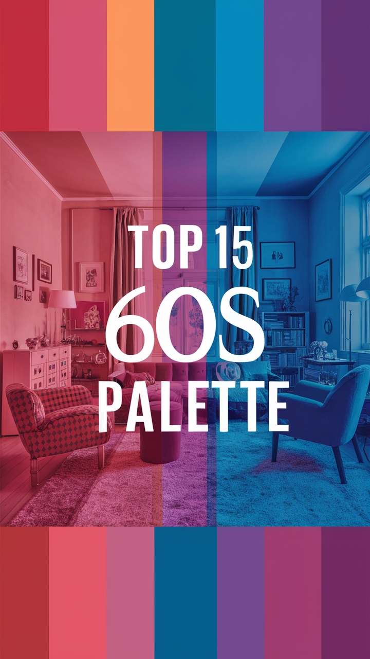
Curious about the iconic hues from the 1960s color palette? Explore vintage 60s colors and groovy color schemes here.
Disclosure: This post contains affiliate links. We may earn a commission at no extra cost to you.
What are some iconic hues in the 60s color palette?
60s color palette
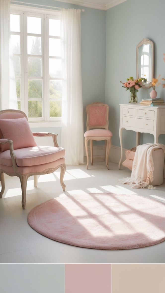
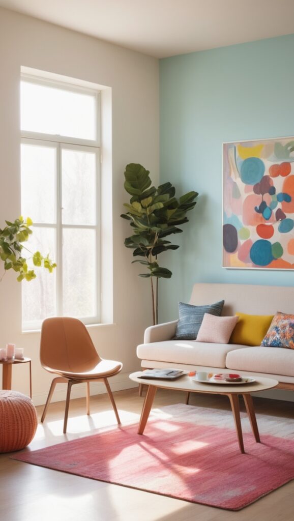
The 60s color palette was characterized by vibrant and bold hues such as burnt orange, avocado green, mustard yellow, and turquoise. These colors can add a retro and groovy vibe to your home decor. When incorporating these hues, consider starting with accent pieces like throw pillows or wall art to avoid overwhelming the space. Mixing these colors with neutral tones like white or grey can help balance the look. Additionally, using these hues in moderation can create a nostalgic and stylish atmosphere in your home.
What are some iconic hues in the 60s color palette?
1. Were bold and vibrant colors a defining feature of the 60s color palette?
As a homeowner who appreciates the design aesthetics of the 60s, I can attest that bold and vibrant colors were indeed a defining feature of the era’s color palette. Colors like bright oranges, yellows, and greens were commonly used in interior design, reflecting the bold and adventurous spirit of the decade.
2. How did the psychedelic movement influence the color choices of the 60s?
The psychedelic movement of the 60s had a significant impact on color choices during that time. The use of vivid, neon colors and intricate patterns in art, fashion, and interior design was a direct result of the psychedelic influence. As a homeowner, incorporating these bold and trippy colors can add a touch of retro flair to any living space.
3. Were earthy tones and nature-inspired colors prevalent in the 60s color palette?
Yes, earthy tones and nature-inspired colors were also prevalent in the 60s color palette. Shades of brown, green, and mustard were often used to create a connection to the natural world and promote a sense of harmony and balance in interior design. As a homeowner, incorporating these earthy hues can bring a sense of calm and tranquility to your home.
4. Did popular culture and music impact the color trends of the 60s?
Popular culture and music played a significant role in shaping the color trends of the 60s. The vibrant and energetic music scene of the era, along with iconic pop culture references, influenced the use of bold and unconventional colors in interior design. As a homeowner, drawing inspiration from the colorful world of 60s pop culture can create a fun and lively atmosphere in your home.
5. Were pastel shades and softer colors also part of the 60s color palette?
While bold and vibrant colors were predominant in the 60s color palette, pastel shades and softer colors also had their place. Soft pinks, blues, and greens were used to create a more subdued and calming atmosphere in interior design. As a homeowner, incorporating these pastel hues can add a touch of elegance and sophistication to your living space.
6. How did the use of color in fashion reflect the social changes of the 60s?
The use of color in fashion during the 60s reflected the social changes of the era. Bold and unconventional color choices in clothing were a form of self-expression and rebellion against traditional norms. As a homeowner, drawing inspiration from 60s fashion can help you create a unique and personalized interior design that reflects your individuality.
7. Were there any specific color combinations that were particularly popular in the 60s?
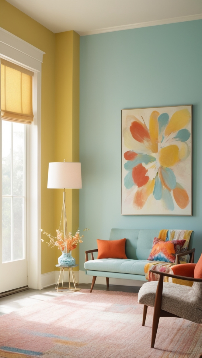
Yes, there were several specific color combinations that were particularly popular in the 60s. One iconic pairing was orange and brown, which created a warm and inviting atmosphere in interior design. Another popular combination was turquoise and yellow, which added a vibrant and playful touch to any space. As a homeowner, experimenting with these classic color combinations can help you achieve a retro-chic look in your home.

What are some iconic hues in the 60s color palette?
60s Color Palette
The 60s color palette was filled with vibrant and bold hues that defined the era. Some of the iconic colors from the 60s include:
1. Burnt Orange
Burnt Orange was a popular color in the 60s, symbolizing warmth and energy. It can add a retro touch to your home decor, especially when paired with neutral tones like beige or cream.
2. Avocado Green
Avocado Green was another standout color from the 60s, representing nature and freshness. This color can bring a sense of calm and tranquility to your space, perfect for creating a relaxing atmosphere.
3. Mustard Yellow
Mustard Yellow exudes warmth and vitality, making it a great choice for adding a pop of color to your home. Pairing mustard yellow with darker shades like navy blue or charcoal can create a sophisticated and stylish look.
4. Turquoise
Turquoise was a popular choice for adding a vibrant and playful touch to interiors in the 60s. This color can instantly brighten up a room and create a cheerful ambiance. Consider incorporating turquoise accents through decor items like vases or cushions.
When using these iconic hues from the 60s color palette, it’s important to strike a balance and avoid overwhelming the space. Start with small accent pieces like throw pillows or wall art to introduce these colors gradually. Mixing them with neutral tones like white or grey can help create a harmonious and visually appealing look.
By incorporating these iconic hues from the 60s color palette in a thoughtful and tasteful manner, you can create a nostalgic and stylish atmosphere in your home that pays homage to the design trends of the past.