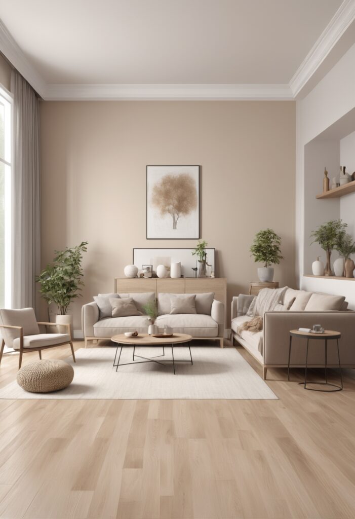
In the realm of interior design, selecting the perfect paint color is akin to laying the foundation of a masterpiece. It sets the tone, defines the ambiance, and serves as the canvas upon which your decor flourishes. Amidst the myriad of hues available, 2024’s trendiest choice, Balanced Beige, emerges as a versatile and sophisticated option, capable of transforming any space into a sanctuary of tranquility and style.
Why Choose Balanced Beige?
Balanced Beige exudes a timeless elegance that effortlessly harmonizes with various design styles, making it a top choice for contemporary homeowners. Its neutral undertones strike the delicate balance between warmth and serenity, creating a welcoming atmosphere while allowing other elements in the room to shine. Here’s why Balanced Beige deserves a prime spot on your walls:
- Versatility: Balanced Beige serves as a chameleon in the world of interior design, seamlessly adapting to diverse color schemes and decor preferences. Whether your aesthetic leans towards minimalist chic or traditional charm, this adaptable hue effortlessly complements your vision.
- Serene Ambiance: In our fast-paced lives, creating a serene oasis at home is paramount. The subtle undertones of Balanced Beige evoke a sense of calmness and relaxation, transforming any room into a tranquil retreat where you can unwind after a long day.
- Enhanced Lighting: Light plays a pivotal role in interior design, influencing the perceived size and ambiance of a space. Balanced Beige possesses a unique ability to amplify natural and artificial light, infusing your room with a luminous glow that accentuates its beauty.
- Timeless Appeal: While trends come and go, Balanced Beige stands the test of time with its enduring allure. Unlike bolder hues that may fall out of favor, this classic shade ensures that your space remains stylish and relevant for years to come, sparing you the hassle of frequent repainting.
- Ease of Styling: Whether you’re a seasoned decorator or a novice enthusiast, styling around Balanced Beige is a breeze. From vibrant accent pieces to muted furnishings, this neutral backdrop provides endless opportunities for creative expression, allowing you to personalize your space with ease.
5 Tips to Match Color with Balanced Beige:
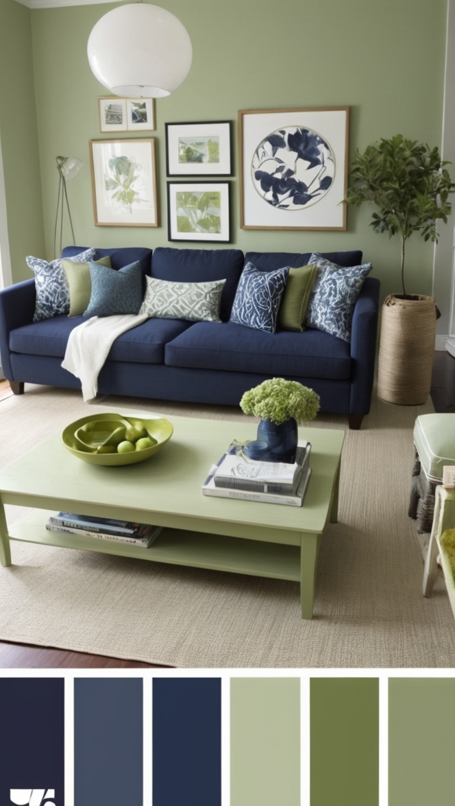
- Bold Contrasts: Offset the understated elegance of Balanced Beige with pops of bold color such as navy blue, emerald green, or mustard yellow. These vibrant accents inject personality into your space while creating a striking visual contrast against the neutral backdrop.
- Monochromatic Harmony: Embrace the allure of monochromatic design by layering various shades of beige and cream alongside Balanced Beige. This sophisticated approach adds depth and dimension to your space, exuding a sense of understated luxury.
- Natural Elements: Infuse your space with the organic beauty of nature by incorporating natural materials such as wood, rattan, and stone. These earthy textures harmonize effortlessly with Balanced Beige, lending warmth and authenticity to your interior decor.
- Metallic Accents: Elevate the elegance of Balanced Beige with the subtle shimmer of metallic accents. Opt for fixtures, hardware, and accessories in finishes like brushed brass or polished chrome to add a touch of glamour to your space without overpowering its inherent tranquility.
- Soft Fabrics: Embrace coziness and comfort by layering soft fabrics such as velvet, faux fur, and cashmere throughout your space. These tactile elements create a sense of intimacy and relaxation, complementing the soothing ambiance of Balanced Beige.
5 Hue Matching Options for Balanced Beige:
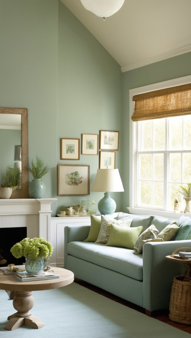
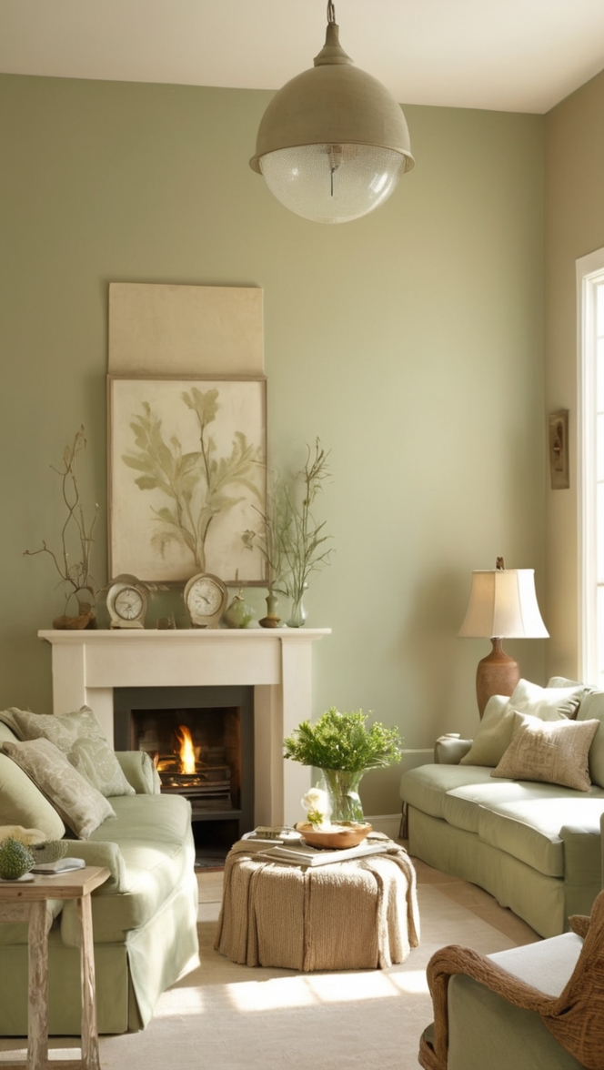
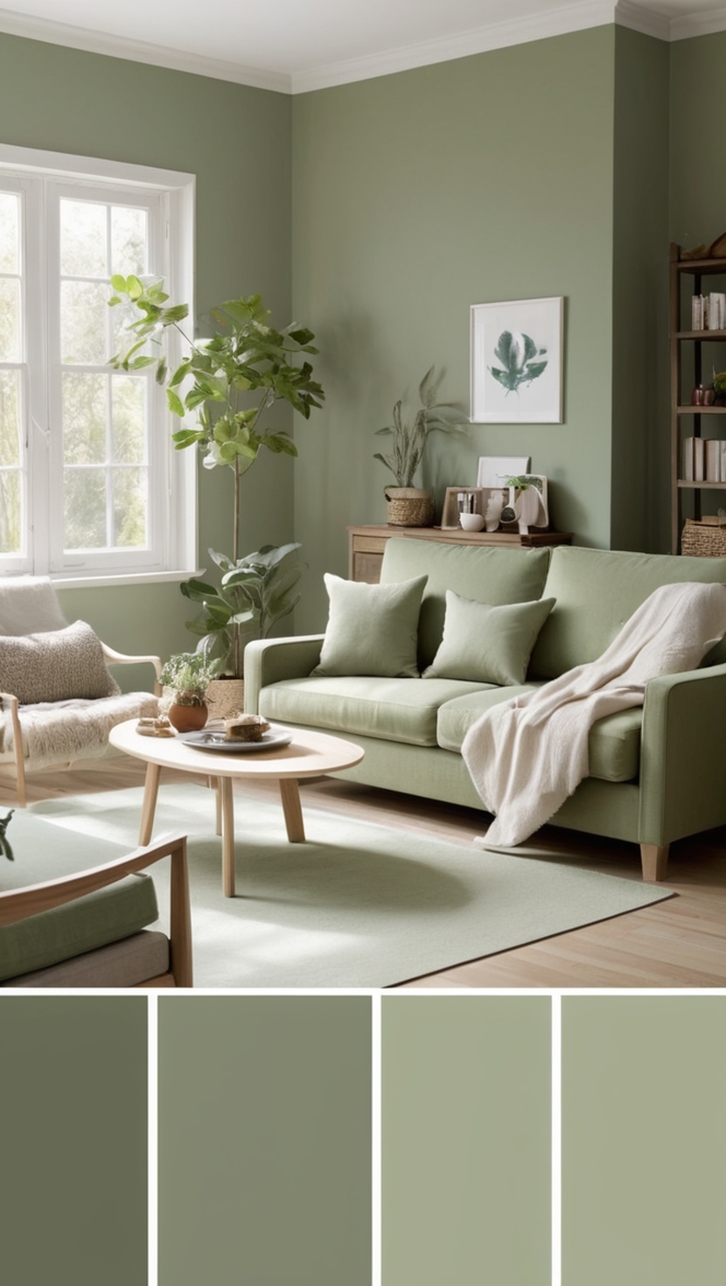
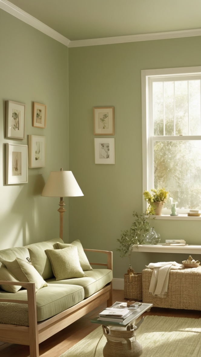
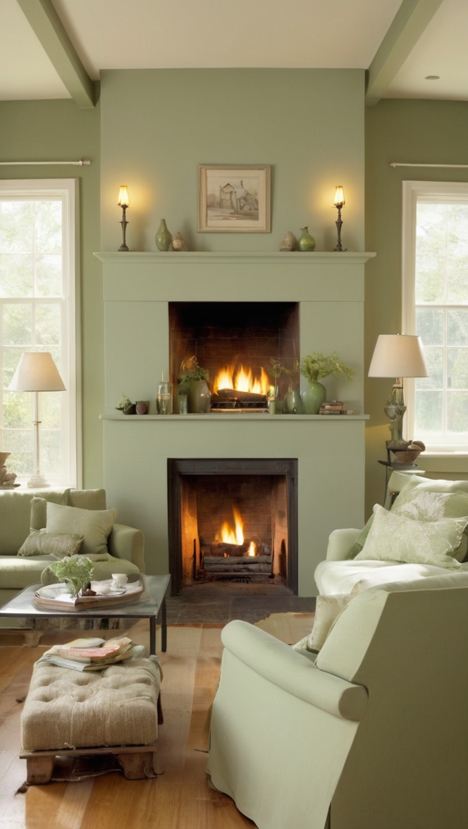
- Soft Sage Green: Pair Balanced Beige with soft sage green for a harmonious color scheme inspired by nature’s tranquility. This soothing combination evokes images of lush landscapes and verdant meadows, infusing your space with a sense of serenity and freshness.
- Warm Terracotta: Embrace the earthy warmth of terracotta alongside Balanced Beige for a cozy and inviting aesthetic. This rich hue adds depth and character to your space, creating a welcoming ambiance that beckons you to unwind and relax.
- Cool Gray: Create a sophisticated and contemporary look by combining Balanced Beige with cool gray accents. This timeless pairing strikes the perfect balance between warmth and coolness, resulting in a versatile color scheme that exudes modern elegance.
- Soft Blush Pink: Infuse your space with softness and femininity by incorporating blush pink hues alongside Balanced Beige. This delicate combination radiates warmth and charm, creating a romantic ambiance that’s perfect for bedrooms, nurseries, or cozy reading nooks.
- Deep Navy Blue: For a bold and dramatic contrast, juxtapose Balanced Beige with deep navy blue accents. This striking combination exudes a sense of opulence and sophistication, adding depth and visual interest to your space while maintaining its overall sense of balance.
5 Alternative Colors from Sherwin Williams and Benjamin Moore:
- Sherwin Williams Accessible Beige (SW 7036): Similar to Balanced Beige, this warm neutral shade from Sherwin Williams exudes timeless elegance and versatility, making it a popular choice for interior spaces of all styles.
- Benjamin Moore Revere Pewter (HC-172): Renowned for its soft, greige undertones, Revere Pewter complements Balanced Beige beautifully, creating a cohesive and harmonious color palette that’s both modern and inviting.
- Sherwin Williams Agreeable Gray (SW 7029): Embrace understated sophistication with Agreeable Gray, a versatile neutral hue that pairs effortlessly with Balanced Beige, creating a cohesive and serene ambiance throughout your space.
- Benjamin Moore Edgecomb Gray (HC-173): With its warm undertones and soft, muted appearance, Edgecomb Gray offers a subtle yet impactful complement to Balanced Beige, resulting in a timeless and refined color scheme.
- Sherwin Williams Repose Gray (SW 7015): Achieve a serene and contemporary look by combining Balanced Beige with Repose Gray, a versatile neutral shade that adds depth and dimension to your space while maintaining its overall sense of balance and harmony.
Other Rooms to Use Balanced Beige:
Living Room: Create a cozy and inviting atmosphere in your living room by painting the walls in Balanced Beige. Pair with plush sofas, accent chairs, and soft textiles for a space that exudes warmth and comfort.
Dining Room: Set the stage for memorable gatherings with a dining room adorned in Balanced Beige. Enhance the elegance of this neutral backdrop with a statement chandelier, a chic dining set, and subtle pops of color through artwork and accessories.
Bedroom: Foster a tranquil oasis in your bedroom with walls bathed in Balanced Beige. Layer with luxurious bedding, plush rugs, and soothing lighting to create a serene sanctuary where you can retreat and rejuvenate.
Home Office: Boost productivity and creativity in your home office by surrounding yourself with the calming presence of Balanced Beige. Pair with sleek furniture, ample storage solutions, and inspiring decor to cultivate a space that’s both functional and aesthetically pleasing.
Conclusion:
In the ever-evolving landscape of interior design, Balanced Beige emerges as a timeless and versatile choice that transcends fleeting trends. Its neutral undertones and understated elegance make it the perfect canvas for creating spaces.

