In the ever-evolving realm of interior design, selecting the right color for a space is crucial. A color not only sets the tone but also reflects the personality and purpose of the room. One shade that stands out in 2024 is Frostbite, a cool and sophisticated choice that exudes elegance in modern libraries.
Why Recommend Frostbite?
1. Timeless Sophistication:
Frostbite is a timeless hue that effortlessly combines cool undertones with a touch of warmth. Its subtle elegance adds a sophisticated aura to any space. In modern libraries, where a blend of classic and contemporary elements is often sought, Frostbite becomes the perfect choice.
2. Versatility in Design:
Frostbite’s neutrality makes it a versatile option for various design styles. Whether your library boasts a minimalist, industrial, or traditional theme, Frostbite adapts seamlessly, providing a consistent and harmonious backdrop for diverse aesthetics.
3. Enhances Natural Light:
Libraries often benefit from ample natural light, and Frostbite complements this beautifully. Its reflective properties enhance the play of light, creating an inviting and comfortable environment for reading and intellectual pursuits.
4. Stimulates Focus and Creativity:
The cool undertones of Frostbite are known to stimulate focus and creativity. In a library setting, where concentration is key, this color choice fosters an atmosphere conducive to reading, research, and intellectual exploration.
5. Modern Aesthetic Appeal:
Frostbite aligns seamlessly with the modern design trends of 2024. Its clean and crisp appearance adds a touch of contemporary elegance to the library, making it a space that not only caters to intellectual pursuits but also aligns with the aesthetics of the present.
Tips to Match Frostbite with:
1. Neutral Furnishings:
Opt for neutral-colored furniture to complement Frostbite. Shades like white, light gray, or beige create a balanced and cohesive look, allowing Frostbite to shine as the primary color.
2. Accent Colors:
Introduce pops of color through accent pieces such as throw pillows, rugs, or artwork. Earthy tones like olive green, mustard yellow, or navy blue can add warmth and depth to the cool elegance of Frostbite.
3. Natural Elements:
Incorporate natural elements like wooden furniture or indoor plants to add warmth and texture. These elements not only complement Frostbite but also contribute to a well-balanced and inviting library space.
4. Layered Textures:
Experiment with different textures in the decor, such as plush rugs, textured upholstery, or metallic accents. These textures create visual interest and prevent the space from feeling monotonous.
5. Soft Lighting:
Choose soft, warm lighting fixtures to balance Frostbite’s cool tones. This not only enhances the overall ambiance but also ensures a comfortable and inviting atmosphere in the library.
Hue Matching with:
1. Cool Gray:
Frostbite pairs harmoniously with cool gray tones. Consider using a complementary cool gray for trim or accent walls to enhance the visual appeal of the library.
2. Icy Blue:
For a monochromatic and serene look, pair Frostbite with icy blue hues. This combination evokes a sense of calmness and tranquility, creating an ideal environment for intellectual pursuits.
3. Muted Lavender:
Muted lavender tones complement Frostbite’s cool undertones while adding a touch of femininity and sophistication to the library space.
4. Soft Sage Green:
Soft sage green provides a nature-inspired contrast to Frostbite. This combination brings a sense of freshness and vitality to the library, creating an environment that feels rejuvenating.
5. Charcoal Gray:
For a bold and contemporary twist, pair Frostbite with charcoal gray accents. This combination adds depth and drama, making the library a visually intriguing space.
Alternative Colors from Sherwin Williams and
Benjamin Moore with:
1. Sherwin Williams – Repose Gray:
Repose Gray from Sherwin Williams is a versatile alternative with warm undertones. It complements Frostbite beautifully and creates a harmonious balance in the library.
2. Sherwin Williams – Naval:
Naval is a rich and deep navy blue that contrasts elegantly with Frostbite. Consider using Naval for accent elements or furniture pieces to add a touch of drama.
3. Benjamin Moore – Revere Pewter:
Revere Pewter by Benjamin Moore is a timeless greige (gray-beige) that pairs well with Frostbite. This combination creates a sophisticated and neutral palette for a modern library.
4. Benjamin Moore – Hale Navy:
Hale Navy is a classic deep blue that complements Frostbite’s cool tones. Incorporate Hale Navy for bookshelves or accent furniture to add depth and visual interest.
5. Sherwin Williams – Alabaster:
Alabaster is a warm white from Sherwin Williams that serves as an excellent contrasting color for Frostbite. Use Alabaster for trim, molding, or built-in shelving to create a clean and crisp look.
Other Rooms to Use Frostbite with:
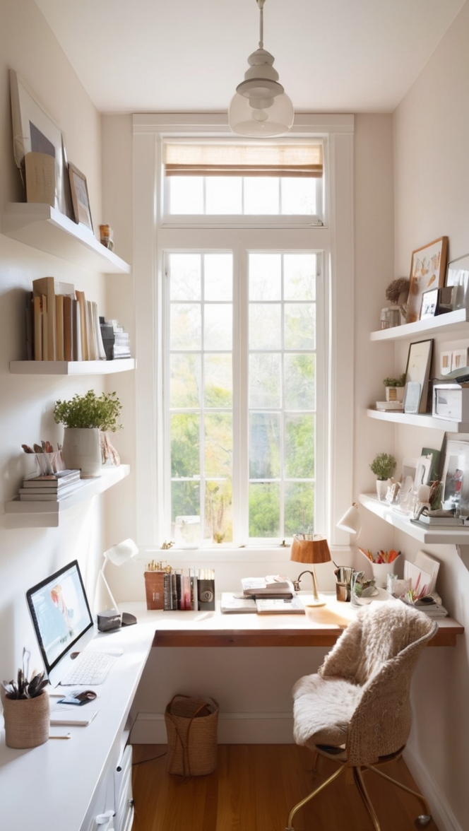
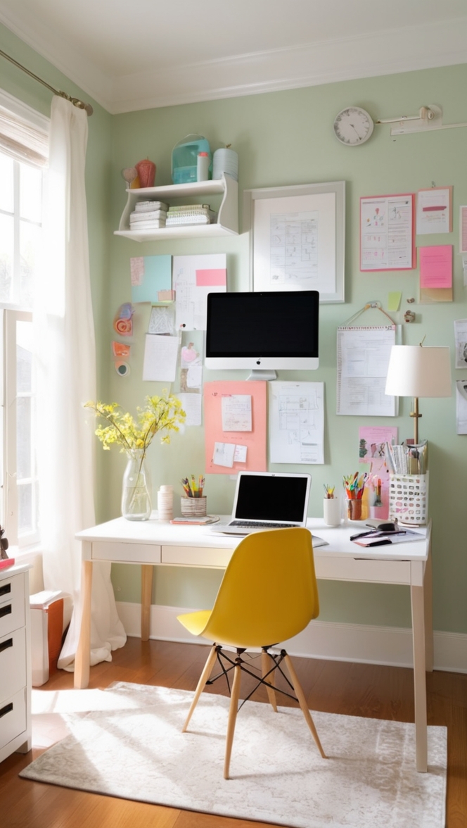
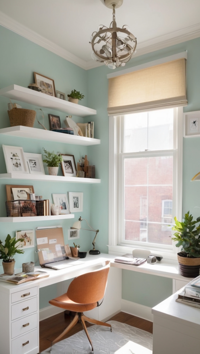
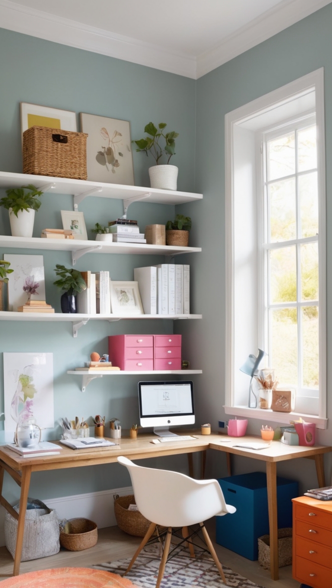
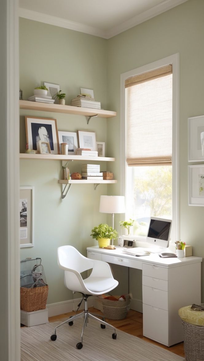
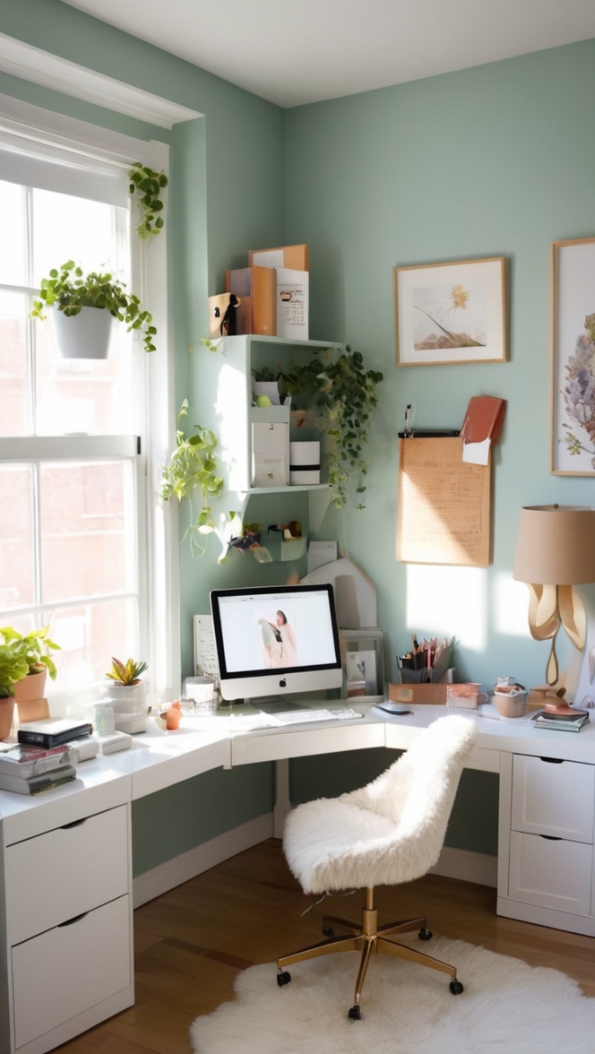
1. Home Office:
Extend the elegance of Frostbite to your home office for a conducive work environment. The color’s stimulating properties and modern appeal make it ideal for fostering productivity.
2. Bedroom Retreat:
Create a serene and calming bedroom retreat by incorporating Frostbite on the walls. Pair it with soft textiles, plush bedding, and subtle lighting for a cozy and sophisticated atmosphere.
3. Reading Nook:
Design a cozy reading nook or corner in the living room with Frostbite as the dominant color. Add a comfortable chair, a well-lit reading lamp, and a bookshelf for a perfect reading escape.
4. Guest Room:
Infuse the guest room with Frostbite for a welcoming and stylish space. Combine it with neutral bedding and artwork to create a serene atmosphere for your guests.
5. Dining Area:
Transform your dining area into an elegant space by incorporating Frostbite on the walls. Pair it with a modern dining set and statement lighting for a sophisticated and inviting ambiance.
Conclusion:
In conclusion, Frostbite emerges as an impeccable choice for modern libraries in 2024, bringing together timeless sophistication, versatility, and a touch of modern aesthetic appeal. The color’s ability to enhance natural light, stimulate focus, and seamlessly adapt to various design styles makes it a standout option for creating an elegant and functional library space.
By following the provided tips for matching Frostbite with furnishings and incorporating complementary hues from Sherwin Williams and Benjamin Moore, you can achieve a cohesive and visually appealing design. Additionally, extending Frostbite to other rooms, such as the home office, bedroom retreat, reading nook, guest room, and dining area, allows you to create a unified and elegant aesthetic throughout your home.
Make your library a haven of intellectual pursuits and refined style with Frostbite, a color that transcends trends and stands the test of time.