Discover how to elevate your design game by mastering color schemes. Find out the best techniques to create a stunning visual impact.
**What’s your favorite way to use color schemes?**
My favorite way to use color schemes as a daily routine with an interior designer involves starting by understanding the client’s preferences and the purpose of the space. I always begin by selecting a base color for the room and then adding accents in complementary hues. It’s important to consider the natural lighting in the room to ensure the colors will look their best. I also pay attention to the furniture and decor already present, making sure the color schemes will enhance and not clash with them. To stay organized, I create a color palette chart with swatches for easy reference. By following these steps, I can achieve a harmonious and aesthetically pleasing home interior design.
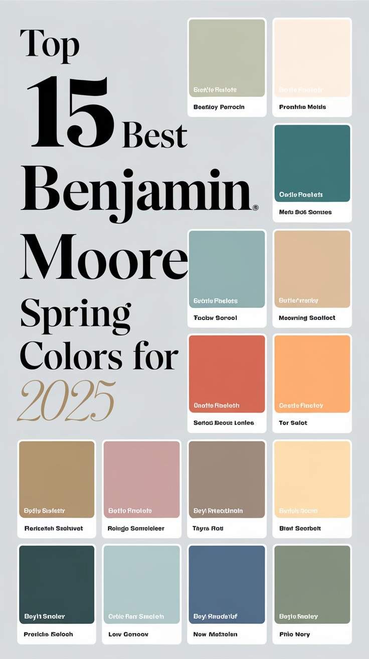
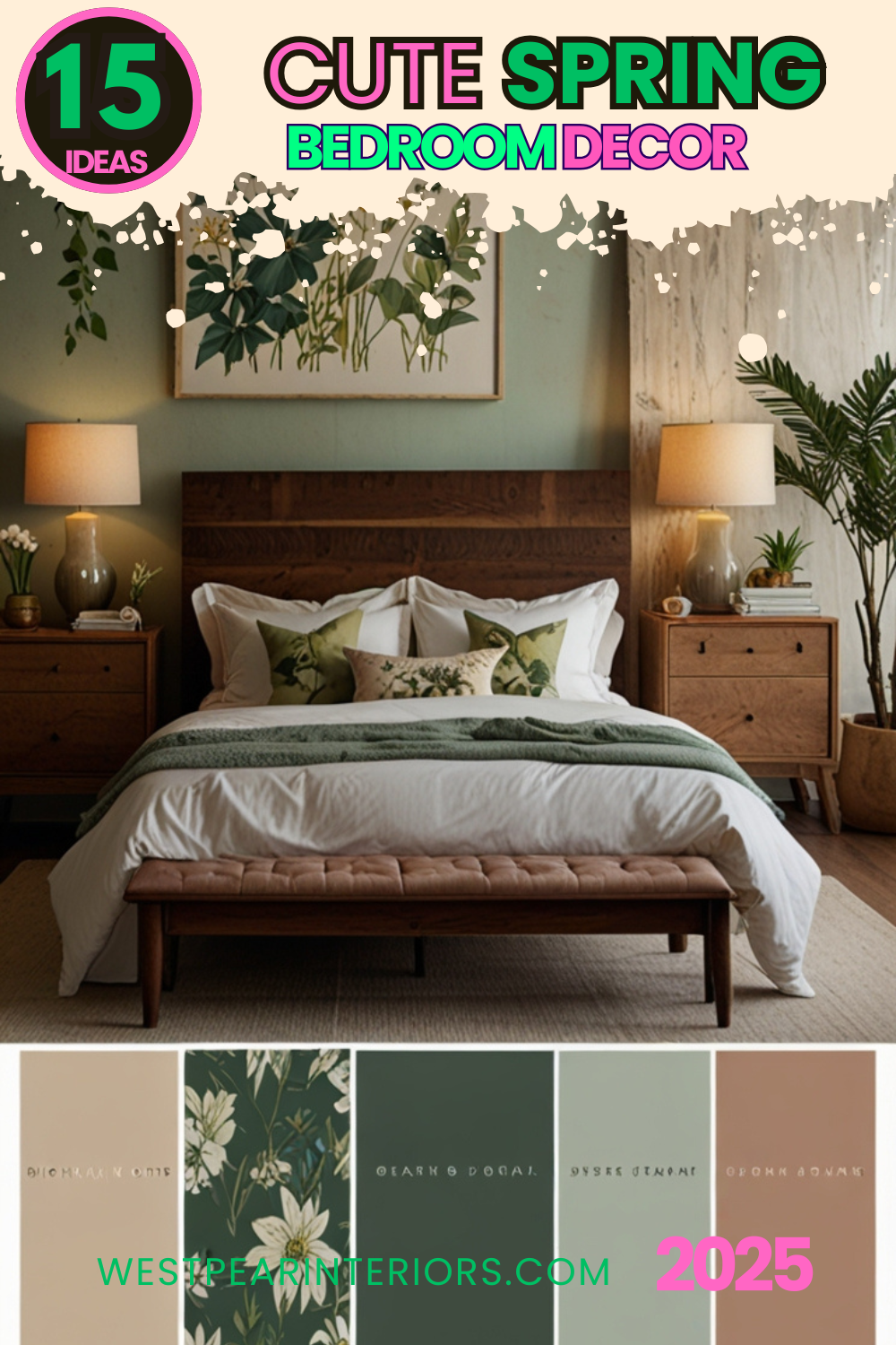
My Lovely Spring Paint for 2025
Ready for a Spring Makeover? Explore the Freshest 2025 Paint Trends!
White Sage/Green SW Pistachio green Soft blue Honeysweet/Orange Pink Sugar Sage Tint BMAs an Amazon Associate, I may earn a commission from qualifying purchases at no extra cost to you.
Choosing a color scheme for a specific room in your house starts with considering the purpose and atmosphere you want to create. Here are some key points to help you select the best color scheme:
1. **Understand the Room’s Function**: The function of the room will guide your color choices. For example, calming colors like blues and greens are ideal for bedrooms, while vibrant hues like reds and yellows work well in energizing spaces like kitchens or dining rooms.
2. **Consider Natural Light**: Take into account the amount of natural light the room receives. Rooms with less natural light may benefit from lighter colors to create a brighter, more expansive feel, while rooms with ample natural light can handle darker, richer hues.
My fAV Spring DECOR for 2025
Discover Spring’s Best 2025 Decor Combinations – Perfect for Any Room!
Oversized Indoor Plants White Curved Sofas Rugs BOH Brown Cream Moroccan Hype Boho Rug Outdoor Patio Furniture Sets Topfinel Pillow CoversAs an Amazon Associate, I may earn a commission from qualifying purchases at no extra cost to you.
3. **Use the 60-30-10 Rule**: When selecting colors, follow the 60-30-10 rule, which involves using 60% of a dominant color, 30% of a secondary color, and 10% of an accent color to achieve a balanced look.
4. **Take Inspiration from a Focal Point**: If the room has a focal point, such as a piece of furniture or artwork, draw inspiration from its colors to create a cohesive color scheme.
5. **Consider Color Psychology**: Different colors evoke different emotions. For instance, blues and greens promote a sense of calmness, while yellows and oranges are associated with energy and warmth. Choose colors that align with the mood you want to create.
6. **Sample Colors Before Committing**: It’s important to test paint samples on the walls and observe how they look at different times of the day to ensure they complement each other and create the desired ambiance.
7. **Seek Professional Advice**: If you’re unsure about choosing a color scheme, consider consulting with an interior designer who can provide expert guidance based on your preferences and the room’s layout.
Incorporating multiple color schemes throughout your home while maintaining cohesiveness requires a thoughtful approach. Here are some strategies to achieve a harmonious flow of color:
1. **Create a Consistent Color Palette**: Establish a consistent color palette that transitions smoothly from one room to another. You can vary the intensity of colors or use different shades of the same color family to create a seamless connection.
2. **Use Color Accents**: Introduce pops of color in each room that tie back to the main color scheme of your home. This can be achieved through accessories, textiles, or artwork that feature similar hues.
3. **Consider a Neutral Base**: Choosing a neutral color as a base for your home provides a versatile backdrop that can easily complement different color schemes in various rooms.
4. **Coordinate Through Open Spaces**: If your home has open-concept areas, consider how colors will interact across spaces. Opt for colors that flow well together and create a visual link between areas.
5. **Utilize Transition Spaces**: Entryways, hallways, and staircases can serve as transition spaces where you can introduce elements of different color schemes gradually to maintain continuity.
Complementary colors play a vital role in color schemes as they enhance each other when paired together. Here’s why they are significant:
1. **Enhanced Contrast**: Complementary colors are located opposite each other on the color wheel, creating a high level of contrast when used together. This contrast adds visual interest and excitement to a room.
2. **Color Balance**: Pairing complementary colors in a color scheme ensures a harmonious balance between warm and cool tones, creating a dynamic yet unified look.
3. **Highlighting Accents**: Using complementary colors for accents or focal points within a room can draw attention to specific elements and create a striking visual impact.
When it comes to using color schemes to enhance the mood of a room, consider the following tips:
1. **Warm and Cozy**: To evoke a warm and cozy atmosphere, opt for earthy tones like browns, terracotta, and deep greens. These colors create a sense of intimacy and comfort.
2. **Bright and Airy**: Lighter shades of blues, whites, and pastels can make a room feel brighter and more spacious. They reflect light, creating an airy and refreshing ambiance.
3. **Energizing**: For a vibrant and energetic space, incorporate bold colors like reds, oranges, and yellows. These hues stimulate the senses and add a lively feel to the room.
4. **Relaxing**: Cool tones such as blues, greens, and purples have a calming effect and are ideal for creating a peaceful and serene environment, perfect for bedrooms or relaxation areas.
Mixing and matching different color schemes in one room can be an effective way to add visual interest and personality. Here are some tips for successfully combining multiple color schemes:
1. **Layer Colors**: Start with a base color scheme and layer additional colors gradually. Consider the proportion of each color to maintain a balanced composition.
2. **Use a Unifying Element**: Incorporate a unifying element, such as a piece of furniture, rug, or artwork, that features colors from each scheme to tie everything together.
3. **Consider Color Flow**: Ensure that colors flow seamlessly from one area to another within the room. Use transitions like borders or architectural features to create a cohesive look.
4. **Experiment with Textures**: Different textures can help blend diverse color schemes by adding depth and visual interest. Mix smooth and rough textures to enhance the overall design.
When choosing paint alternatives to match your color scheme, consider the following options:
1. **Wallpaper**: Wallpaper comes in a variety of patterns and colors, making it a versatile choice to complement your color scheme. Select wallpaper that coordinates with your existing colors for a cohesive look.
2. **Textured Paint**: Textured paint finishes, such as suede or metallic, can add dimension to your walls and enhance the visual impact of your chosen color scheme.
3. **Color Blocking**: Experiment with color blocking techniques by painting different sections of the wall in contrasting colors. This technique can create a bold statement and accentuate your color scheme.
4. **Accent Walls**: Painting an accent wall in a bold or contrasting color can add a focal point to the room and highlight specific elements of your color scheme.
When working with multiple color schemes in home decor, staying organized is essential to ensure a cohesive and harmonious design. Here are some useful tips:
1. **Create a Mood Board**: Compile swatches of paint colors, fabric samples, and inspiration images on a mood board to visualize how different color schemes will work together.
2. **Use a Color Wheel**: Refer to a color wheel to identify complementary or analogous color schemes that harmonize well. This tool can help you make informed color choices.
3. **Label Samples**: Label paint and fabric samples with the corresponding color scheme they belong to. This will prevent confusion and streamline the decision-making process.
4. **Plan Ahead**: Before making any purchases, plan out how each color scheme will be incorporated into the room. Consider the placement of furniture, accessories, and lighting to ensure a cohesive design.
Key Takeaways:
– **Understanding the room’s function is crucial when choosing a color scheme for a specific space in your home.**
– **Creating a consistent color palette and incorporating color accents are effective ways to maintain cohesion throughout your home.**
– **Complementary colors enhance each other and create a harmonious balance in a color scheme.**
– **Using color schemes strategically can help enhance the mood of a room, whether it’s warm and cozy or bright and airy.**
– **Mixing and matching different color schemes in one room can add visual interest, but it’s important to consider color flow and unifying elements.**
– **When working with multiple color schemes, staying organized through mood boards, color wheels, and planned arrangements is key to achieving a cohesive design.**