Revitalize your neutral home office with vibrant pops of color. Discover creative ways to infuse personality and productivity into your workspace.
My favorite way to incorporate pops of color into a neutral home office is by adding colorful accent pieces such as throw pillows, rugs, curtains, and artwork. I also like to paint an accent wall in a bold hue to create a focal point in the room. When selecting colors, I consider the existing furniture and decor in the space to ensure everything complements each other. Using a color wheel can help in choosing complementary or analogous colors for a cohesive look. Additionally, I make sure to balance the pops of color throughout the office to maintain a harmonious and balanced design.
In choosing the right color palette for a neutral home office, it is essential to consider the overall mood and atmosphere you want to create. Opting for a neutral base such as whites, grays, or beiges can provide a calming and sophisticated backdrop for your workspace. Here are some key considerations when selecting a color palette:
1. **Harmony:** Ensure the colors you choose harmonize with the existing decor and furnishings in your home office. This will create a seamless and cohesive look.
2. **Lighting:** Take into account the natural light in the room as it can influence how colors appear. Test paint or swatches in different lighting conditions to find the right balance.
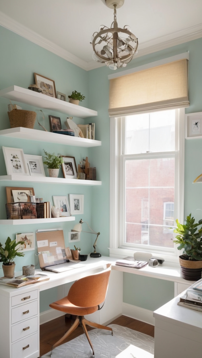
3. **Warmth vs. Coolness:** Decide whether you want to introduce warm or cool tones into your neutral space. Warm colors like soft yellows or blush pinks can add a welcoming feel, while cool tones such as blues or greens can promote a sense of tranquility.
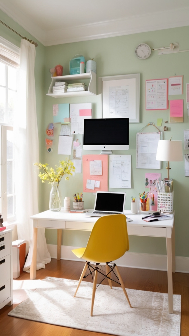
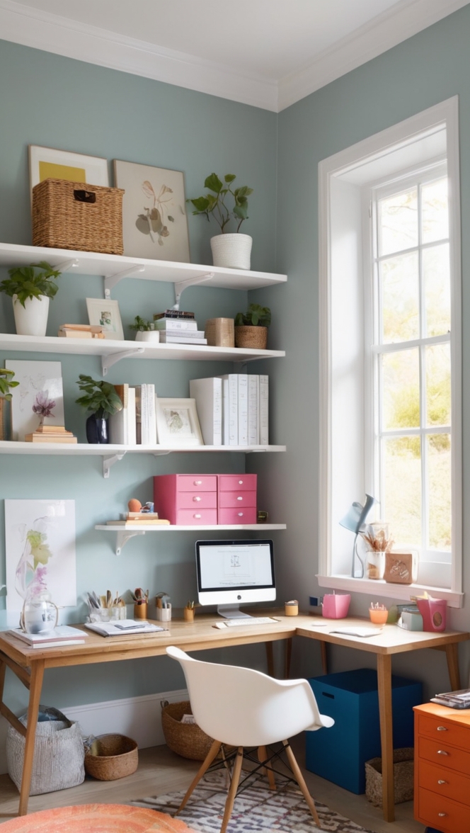
4. **Accent Colors:** Consider accent colors that complement the neutrals in your office. Bold accents like deep navy, emerald green, or mustard yellow can inject personality and energy into the space.
5. **Texture:** Experiment with different textures like plush rugs, velvet cushions, or metallic accents to add depth and interest to the room.
6. **Personal Taste:** Ultimately, choose colors that resonate with your personal style and preferences. Your home office should reflect your personality and inspire creativity.
7. **Balance:** Strive for a balance between neutral tones and pops of color. Too much color can overwhelm the space, while too many neutrals can feel dull. Find a happy medium that energizes and motivates you.
When looking to add pops of color to a neutral home office, there are several easy and effective ways to brighten up the space:
1. **Artwork:** Hang colorful art pieces or prints on the walls to introduce vibrant hues and create a focal point in the room.
2. **Plants:** Incorporate greenery with potted plants or fresh flowers. Not only do they add color, but they also purify the air and promote a sense of well-being.
3. **Textiles:** Use colorful throw pillows, curtains, or rugs to infuse the room with warmth and personality.
4. **Decorative Accessories:** Display decorative objects like vases, candles, or sculptures in bold shades to instantly uplift the space.
5. **Furniture:** Consider adding a statement piece of furniture in a striking color, such as a bright yellow chair or a colorful desk, to add visual interest.
6. **Accent Wall:** Paint one wall in a vibrant color to create a focal point and add depth to the room without overwhelming the space.
7. **Lighting:** Install colorful pendant lights or table lamps to create a warm and inviting ambiance while adding a pop of color.
Incorporating bold colors into a neutral home office can be done effectively by following a few key guidelines:
1. **Accent Pieces:** Introduce bold colors through accent pieces such as a statement armchair, a colorful desk lamp, or vibrant artwork to create focal points in the room.
2. **Color Blocking:** Experiment with color blocking by pairing bold hues with neutrals. Consider painting one wall in a bold shade or using colorful accessories to create visual interest.
3. **Textiles:** Add bold colors through textiles like rugs, curtains, or throw pillows to inject personality and warmth into the space.
4. **Artwork:** Choose artwork with vibrant colors that complement the neutral backdrop to create a lively and dynamic atmosphere.
5. **Statement Furniture:** Incorporate bold furniture pieces, such as a vibrant sofa or a colorful shelving unit, to make a bold statement in the room.
6. **Accent Wall:** Paint one wall in a bold color to create a striking focal point while keeping the rest of the room neutral for balance.
7. **Accessorize:** Use bold accessories like decorative objects, vases, or frames in bright colors to add visual interest and personality to the space.
When considering colors that pair well with neutral tones in a home office setting, it is essential to choose hues that complement the existing palette while adding depth and visual interest. Here are some color combinations that work harmoniously with neutrals:
1. **Navy and White:** Navy blue is a classic color that pairs beautifully with neutrals like white, beige, or gray. It adds a touch of sophistication and elegance to the space.
2. **Blush Pink and Gray:** Soft blush pink tones soften the neutrality of grays and create a serene and calming environment, perfect for a home office.
3. **Mustard Yellow and Charcoal:** Mustard yellow adds warmth and energy to a neutral space, especially when paired with dark charcoal or black accents for contrast.
4. **Emerald Green and Cream:** Emerald green brings a rich and luxurious feel to a neutral room, particularly when combined with cream or ivory for a fresh and modern look.
5. **Slate Blue and Taupe:** Slate blue paired with taupe or beige creates a tranquil and soothing atmosphere, ideal for a serene and productive workspace.
6. **Terracotta and White:** Terracotta tones add earthy warmth to neutral whites or creams, creating a cozy and inviting environment that promotes creativity.
7. **Teal and Beige:** Teal is a versatile color that pairs well with beige, creating a harmonious and sophisticated palette suitable for a modern home office.
To balance colorful accents with a minimalist design in a home office, consider the following strategies:
1. **Neutral Base:** Start with a neutral base of white, gray, or beige for walls, furniture, and flooring to create a clean and understated backdrop.
2. **Statement Pieces:** Introduce a few colorful statement pieces such as a bold armchair, a vibrant rug, or colorful artwork to add personality and visual interest.
3. **Color Blocking:** Use color blocking techniques by pairing bold hues with neutrals in a deliberate and strategic way to create a balanced and cohesive look.
4. **Restraint:** Practice restraint when adding pops of color to avoid overwhelming the space. Select a few key pieces in complementary hues rather than incorporating multiple bright accents.
5. **Natural Elements:** Incorporate natural elements like wood, stone, or metal to add texture and warmth to the room while complementing colorful accents.
6. **Minimalist Accessories:** Choose minimalist accessories in simple shapes and muted tones to balance out the vibrant colors and maintain a clean and uncluttered look.
7. **Negative Space:** Embrace the concept of negative space by allowing areas of the room to remain free of color or decoration, creating visual breathing room and enhancing the minimalist aesthetic.
When looking for specific colors that stimulate creativity and productivity in a home office environment, consider the following hues:
1. **Blue:** Blue is associated with calmness, focus, and productivity. Light blue hues can promote a sense of tranquility, while deeper blues can stimulate productivity and concentration.
2. **Green:** Green is linked to nature, growth, and balance. It can reduce stress, improve focus, and create a sense of harmony in a workspace.
3. **Yellow:** Yellow is energizing and uplifting, making it ideal for enhancing creativity and boosting mood. Lighter shades of yellow can promote optimism and positivity.
4. **Orange:** Orange is a warm and motivating color that can stimulate creativity and enthusiasm. It helps foster a sense of energy and excitement in a workspace.
5. **Purple:** Purple is associated with creativity, luxury, and inspiration. It can encourage innovation and spark imagination in a home office setting.
6. **Red:** Red is a powerful and dynamic color that can increase energy levels and passion. However, use it sparingly as it can be overwhelming in large doses.
7. **Neutrals:** While bold colors can stimulate creativity and productivity, neutrals like whites, grays, and beiges provide a calming and grounding effect, allowing for focus and clarity in a workspace.
To create a cohesive and visually appealing home office space using color, consider the following tips:
1. **Color Scheme:** Choose a harmonious color scheme that flows throughout the room, using a combination of neutrals, accents, and pops of color for balance.
2. **Consistency:** Maintain consistency in color choices for walls, furniture, accessories, and decor to create a cohesive and unified look in the home office.
3. **Color Psychology:** Consider the psychological effects of color when designing your workspace. Use calming colors for areas of focus and energetic colors for areas of creativity.
4. **Accent Colors:** Use accent colors strategically to draw attention to specific areas or features in the home office, creating visual interest and depth.
5. **Contrast:** Incorporate contrasting colors to add drama and impact to the space. Pair light and dark hues or warm and cool tones to create a dynamic and visually engaging environment.
6. **Texture:** Introduce varied textures through fabrics, materials, and finishes to add depth and dimension to the room while enhancing the overall color palette.
7. **Personal Touch:** Infuse your personality and style into the space by incorporating colors that resonate with you. Your home office should reflect your tastes and preferences to create a space that inspires and motivates you.
In summary, when designing a neutral home office, the right color palette can significantly impact the overall look and feel of the space. By carefully selecting colors that complement neutrals, incorporating pops of color strategically, and balancing bold hues with minimalist design principles, you can create a cohesive, stimulating, and visually appealing workspace that enhances creativity and productivity.
**Key Takeaways:**
– **Harmony and Balance:** Choose a color palette that harmonizes with existing decor and strikes a balance between neutrals and pops of color.
– **Strategic Color Choices:** Use color strategically through accent pieces, artwork, textiles, and accessories to add vibrancy and personality to a neutral home office.
– **Color Psychology:** Consider the psychological effects of colors on creativity, productivity, and mood when selecting hues for the workspace.
– **Texture and Contrast:** Incorporate varied textures and contrasting colors to add depth and visual interest to the room.
– **Personalization:** Infuse your personality and style into the space by selecting colors that resonate with you and inspire creativity.
– **Minimalist Approach:** Maintain a minimalist design while adding pops of color to create a clean, uncluttered, and visually appealing home office.
– **Focus on Creativity:** Choose colors that stimulate creativity and productivity, such as blues, greens, yellows, and purples, to enhance the work environment.