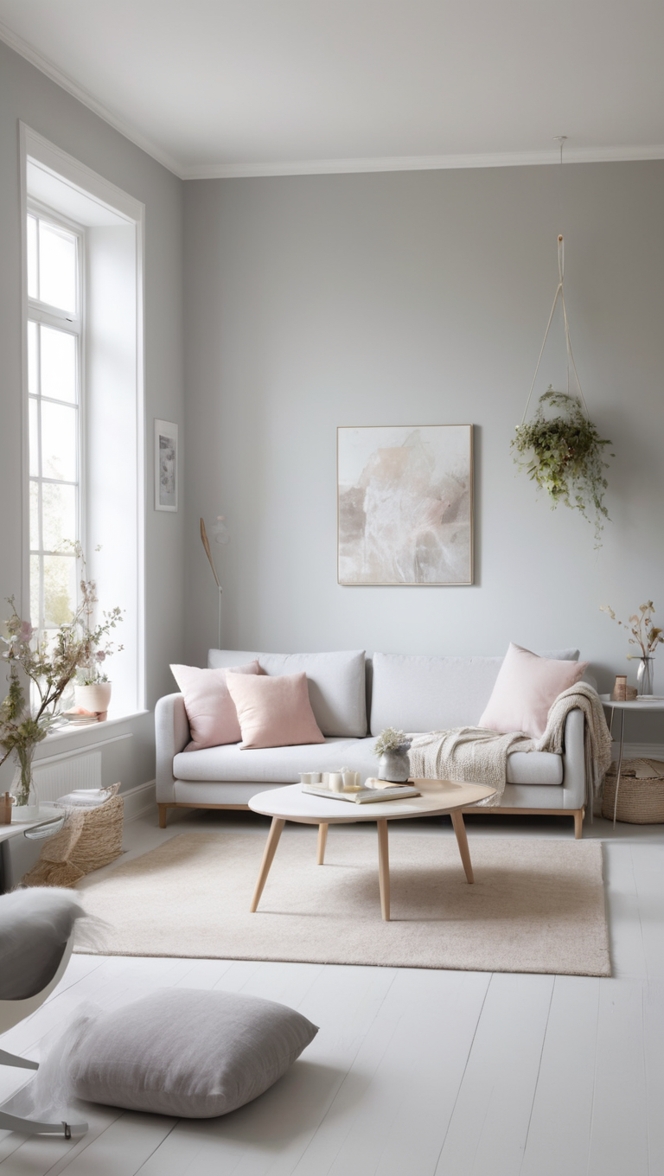
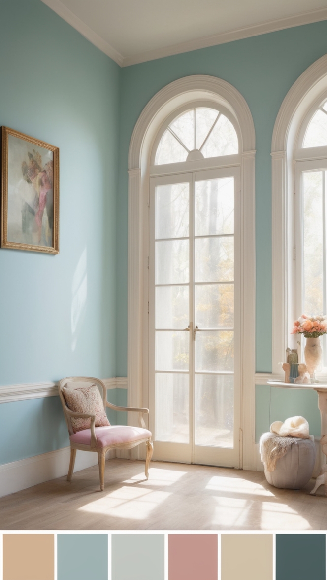
In the ever-evolving realm of interior design, Novel Lilac color plays a pivotal role in transforming spaces and influencing emotions. One enchanting hue that has taken the spotlight in 2024 is Lilac, a delicate and sophisticated shade that adds a touch of magic to any room. In this exploration, we will delve into the reasons behind recommending Lilac paint and provide valuable insights on how to incorporate it seamlessly into your living spaces.
Why Choose Novel Lilac Paint?
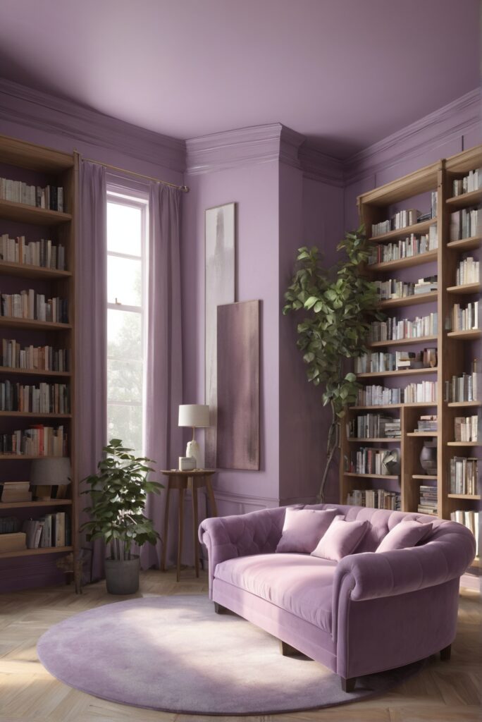
Lilac, a beautiful blend of purple and pink undertones, introduces a sense of serenity and elegance to your surroundings. This ethereal hue is known for its calming effect, making it an excellent choice for reading spaces. Here are some compelling reasons to consider Lilac for your walls:
- Tranquil Atmosphere: Lilac promotes a serene ambiance, making it an ideal choice for reading spaces where relaxation and focus are paramount. The subtle and soothing undertones of Lilac create a peaceful environment, allowing you to immerse yourself in the world of books.
- Versatility: Lilac is a versatile color that can complement various design styles. Whether your reading nook boasts a modern, minimalist aesthetic or a more traditional and ornate charm, Lilac effortlessly adapts, enhancing the overall visual appeal of the space.
- Enhanced Creativity: Studies have shown that certain colors can stimulate creativity and boost concentration. Lilac, with its unique blend of purple and pink, is associated with sparking imagination. Introducing this color to your reading space can potentially enhance your creative thinking and make your reading experience even more enjoyable.
- Timeless Elegance: Lilac transcends trends, embodying a timeless elegance that can withstand changing design preferences. By choosing Lilac, you invest in a color that will stand the test of time, providing a classic and sophisticated backdrop for your literary adventures.
- Aesthetic Harmony: Lilac has the ability to create aesthetic harmony within a room. Whether used as the main wall color or as an accent, Lilac pairs well with a variety of other colors, allowing you to experiment with different decor elements and furnishings to achieve the perfect balance.
Tips for Matching Lilac Paint in Your Reading Space:
To ensure a harmonious and visually appealing reading space, here are five practical tips for matching Lilac paint:
1. Natural Light Enhancement
- Tip: Utilize natural light to enhance Lilac’s ethereal qualities.
- Explanation: Lilac flourishes in natural light, casting a gentle glow that elevates its beauty. Position your reading nook near windows to maximize the impact of Lilac and create a bright yet calming atmosphere.
2. Complementary Furnishings
- Tip: Choose furnishings in neutral tones to complement Lilac.
- Explanation: Neutral colors such as white, beige, or light gray pair seamlessly with Lilac, creating a balanced and sophisticated look. Opt for furniture pieces, such as bookshelves or reading chairs, in these neutral hues to enhance the overall aesthetic.
3. Accent with Metallics
- Tip: Incorporate metallic accents for a touch of glamour.
- Explanation: Lilac’s soft tones can be accentuated with metallic finishes like gold or silver. Consider metallic bookends, lamp bases, or frames to add a touch of sophistication and create a visually appealing contrast.
4. Introduce Greenery
- Tip: Bring in indoor plants for a refreshing touch.
- Explanation: Lilac pairs beautifully with natural elements. Introducing indoor plants not only adds a pop of color but also contributes to a vibrant and refreshing reading space. Consider placing potted plants on bookshelves or in corners to create a harmonious blend of colors.
5. Layer with Textures
- Tip: Add textured elements to create depth.
- Explanation: To prevent the space from feeling flat, incorporate textured elements such as throw pillows, rugs, or curtains. These textures not only add visual interest but also complement Lilac’s soft and inviting aura.
Hue Matching with Lilac Paint:
Selecting hues that complement Lilac is essential for achieving a cohesive and visually appealing reading space. Here are five hues that pair harmoniously with Lilac:
1. Soft Gray
- Explanation: Soft gray creates a sophisticated and muted backdrop that enhances Lilac’s calming effect. Consider using gray for furniture or as an accent color to maintain a tranquil atmosphere.
2. Mint Green
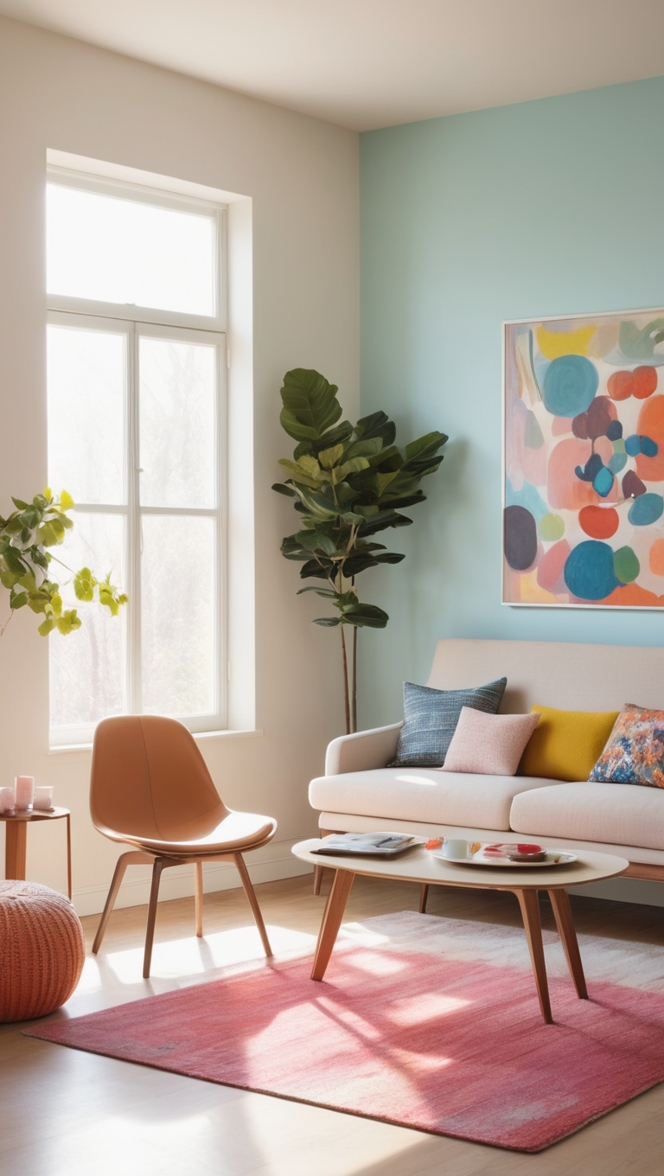
- Explanation: Mint green provides a refreshing contrast to Lilac, creating a balanced and visually stimulating environment. Incorporate mint green through decor items, such as cushions or wall art, to add a pop of color.
3. Dusty Rose
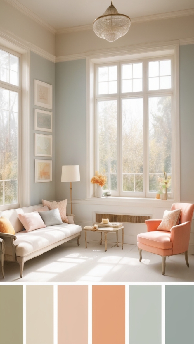
- Explanation: Dusty rose complements Lilac’s pink undertones, creating a romantic and charming aesthetic. Introduce dusty rose through upholstery, throw blankets, or decorative accessories for a cohesive look.
4. Navy Blue
- Explanation: Navy blue adds depth and richness to Lilac, creating a sophisticated and timeless color palette. Consider using navy blue for accent furniture or as a secondary wall color to achieve a classic and elegant vibe.
5. Golden Yellow
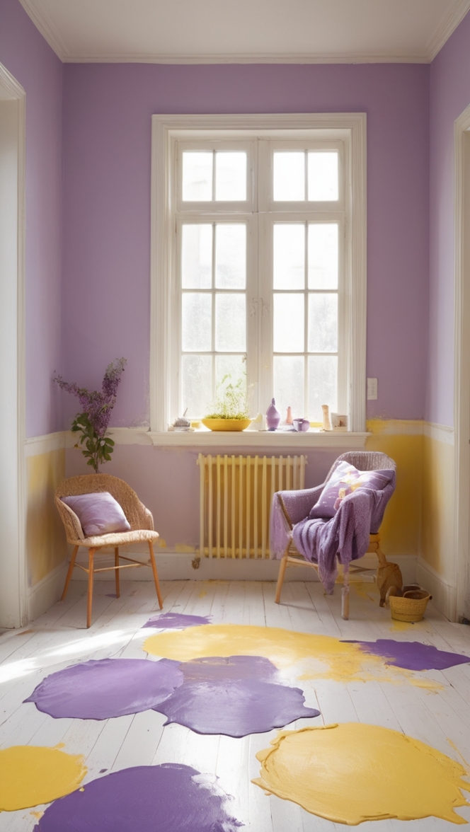
- Explanation: Golden yellow injects warmth and vibrancy into Lilac-infused spaces. Use golden yellow for accessories, such as lamps or artwork, to create a striking contrast and uplift the overall mood.
Alternative Colors from Sherwin Williams and
Benjamin Moore:
For those seeking alternative Lilac-inspired shades, both Sherwin Williams and Benjamin Moore offer a variety of options that capture the essence of Lilac while providing unique twists. Here are five alternatives from each brand:
Sherwin Williams Alternatives
1. SW 6820 Elation
- Explanation: Elation offers a slightly warmer take on Lilac, with subtle hints of mauve. This alternative is perfect for those who prefer a cozier and more intimate reading space.
2. SW 6837 Baroness
- Explanation: Baroness introduces deeper violet tones to the Lilac spectrum, creating a rich and regal atmosphere. Use Baroness as an accent color to add a touch of drama to your reading nook.
3. SW 6851 Hibiscus
- Explanation: Hibiscus leans towards a pinker hue, adding a vibrant and lively element to Lilac-inspired designs. Incorporate Hibiscus through furnishings or accessories for a pop of color.
4. SW 6973 Free Spirit
- Explanation: Free Spirit offers a muted and understated alternative to Lilac. This shade is perfect for those who prefer a more neutral and subdued color palette in their reading spaces.
5. SW 7067 Cityscape
- Explanation: Cityscape, a sophisticated gray, pairs exceptionally well with Lilac. Use Cityscape for furniture or accent pieces to create a contemporary and chic reading space.
Benjamin Moore Alternatives:
1. BM 1386 Mayflowers
- Explanation: Mayflowers captures the essence of Lilac with a touch of lavender, creating a delicate and enchanting alternative. This shade is ideal for those seeking a subtle and understated vibe.
2. BM 2074-60 Desert Twilight
- Explanation: Desert Twilight introduces deeper purple tones, adding a sense of mystery and intrigue to Lilac-inspired designs. Incorporate this alternative for a more dramatic reading space.
3. BM 2073-50 Pale Lilac
- Explanation: Pale Lilac provides a lighter and airier alternative to Lilac, perfect for creating a soft and serene reading nook. Pair Pale Lilac with white furnishings for a clean and timeless look.
4. BM 1440 Purple Poppy
- Explanation: Purple Poppy offers a bolder take on Lilac, with vibrant purple hues. Use this alternative as an accent color for a playful and energetic reading space.
5. BM 1441 Misty Lilac
- Explanation: Misty Lilac embodies a muted and subdued alternative to Lilac, creating a tranquil and sophisticated atmosphere. Use Misty Lilac for a subtle and calming reading space.
Other Rooms to Infuse with Lilac:
While Lilac is a perfect choice for reading spaces, its versatility allows it to flourish in various rooms throughout your home. Here are some suggestions for incorporating Lilac in different areas:
1. Bedroom Retreat
- Explanation: Create a dreamy and calming bedroom retreat by using Lilac as the main wall color. Pair it with soft bedding, plush textures, and metallic accents for a romantic and soothing atmosphere.
2. Home Office Haven
- Explanation: Foster a focused and serene home office environment by incorporating Lilac into the decor. Use Lilac for accent walls, furnishings, or decor items to promote concentration and creativity.
3. Chic Living Room
- Explanation: Elevate your living room’s sophistication by incorporating Lilac as an accent color. Pair it with neutral tones, metallic accents, and plush textiles for a chic and inviting living space.
4. Calming Bathroom
- Explanation: Infuse your bathroom with tranquility by using Lilac as a wall color or through accessories like towels and shower curtains. Lilac creates a spa-like atmosphere, transforming your bathroom into a relaxing sanctuary.
5. Kitchen Elegance
- Explanation: Add a touch of elegance to your kitchen by incorporating Lilac in subtle ways. Consider Lilac-hued dishware, kitchen accessories, or even a small accent wall to infuse a sense of sophistication into the heart of your home.
Conclusion:
In conclusion, Lilac paint stands as a captivating choice for creating ethereal reading spaces and beyond in 2024. Its tranquil aura, versatility, and timeless elegance make it a perfect canvas for designing enchanting environments. By following the provided tips for matching Lilac paint and exploring complementary hues and alternative shades from Sherwin Williams and Benjamin Moore, you can embark on a journey to transform your living spaces into havens of beauty and serenity.
Elevate your surroundings with Lilac, and let the magic unfold as you immerse yourself in the captivating world of literature within the embrace of this enchanting color.

