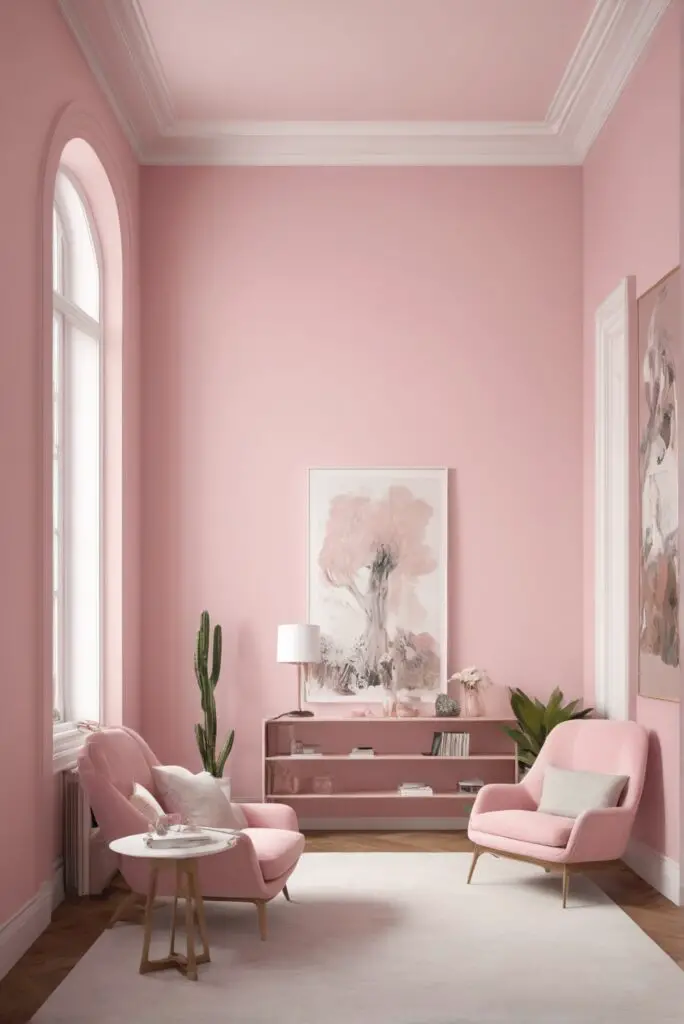
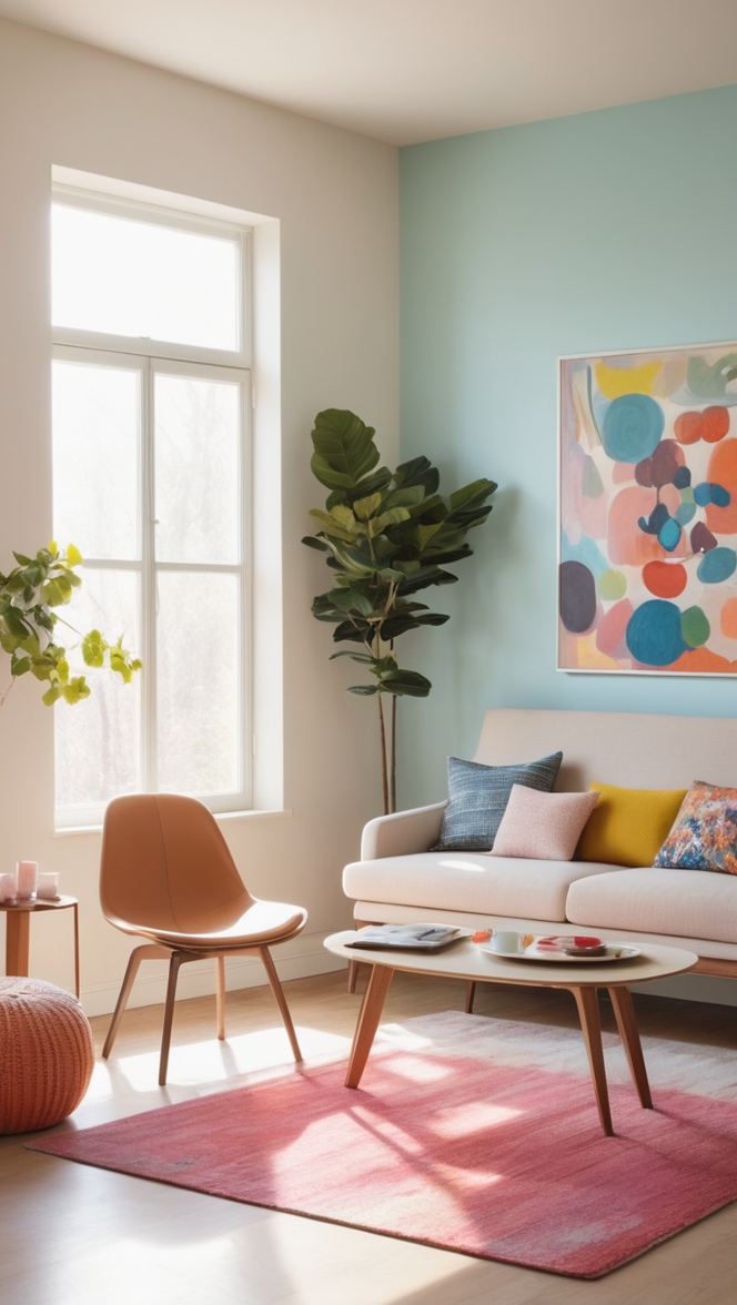
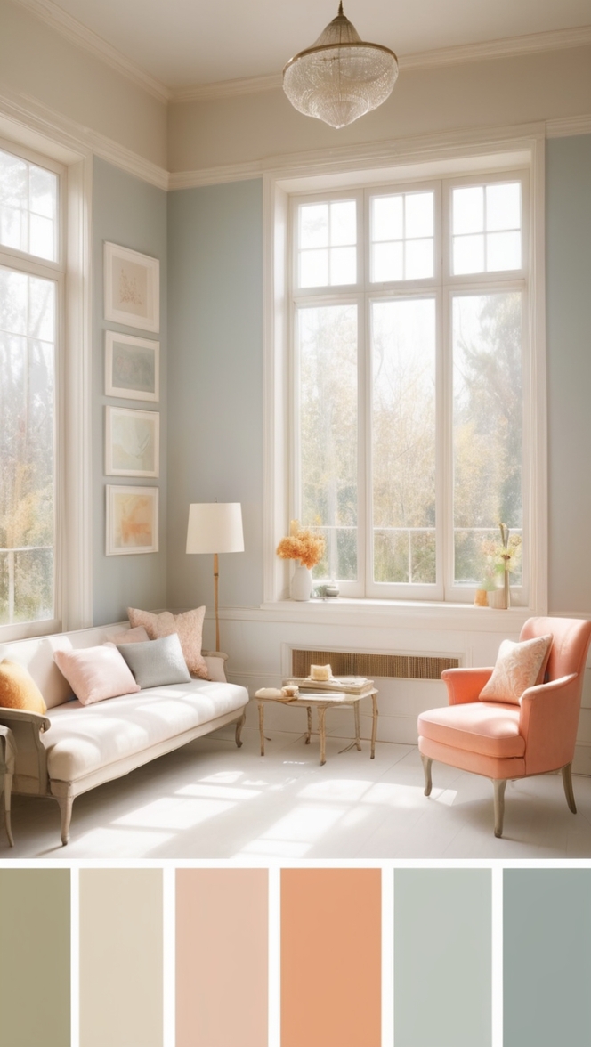
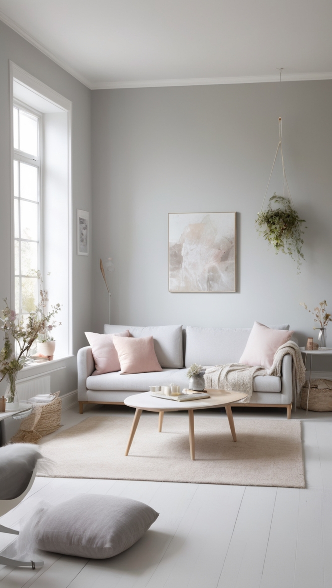
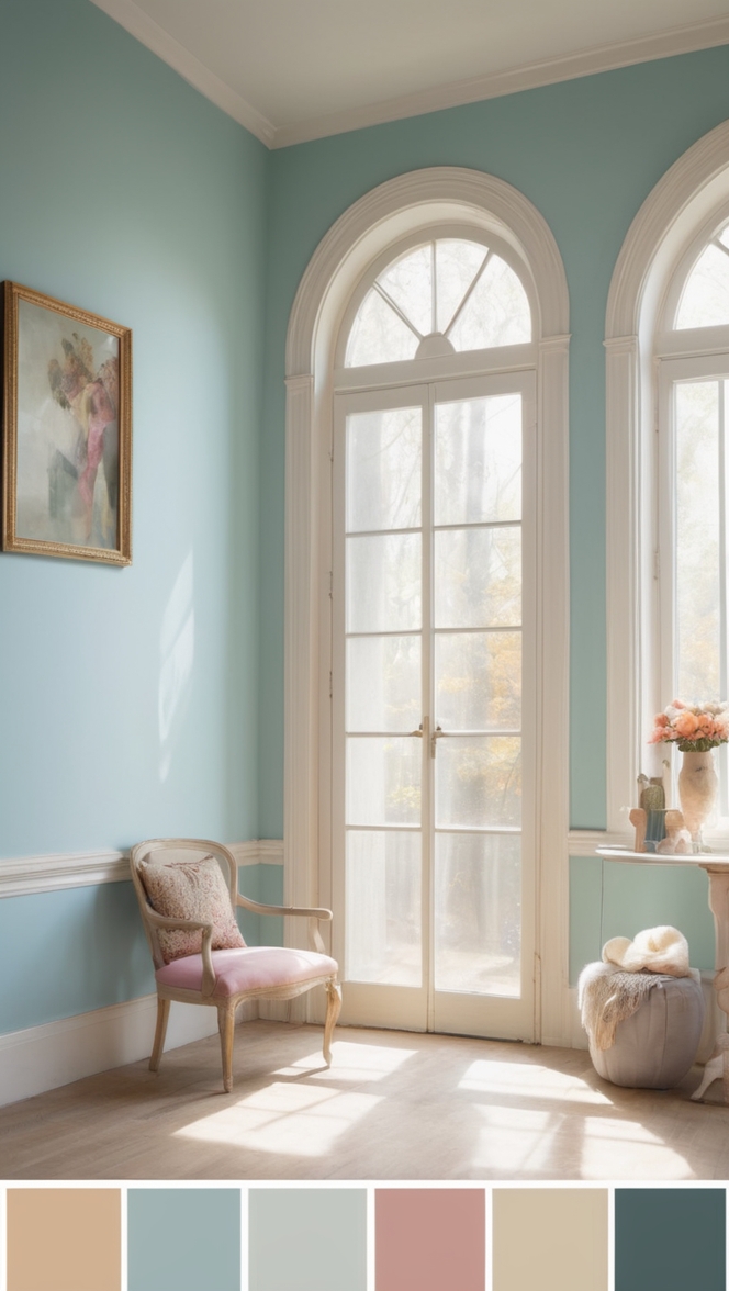
In the ever-evolving world of interior design, the choice of paint color can significantly impact the ambiance and character of a space. As we step into 2024, the trend for modern libraries leans towards colors that evoke tranquility, sophistication, and a sense of enlightenment. Alyssum, a nuanced and calming shade, emerges as a top recommendation for those looking to create a contemporary and inviting atmosphere in their libraries.
Why Alyssum Paint?
Alyssum, with its delicate balance of cool and warm undertones, proves to be a versatile and timeless choice for a modern library setting. Here’s why it is highly recommended:
- Soothing Aesthetic: The soft and neutral nature of Alyssum creates a calming environment, perfect for a space dedicated to reading and intellectual pursuits. The gentle undertones promote relaxation, allowing library-goers to immerse themselves in books without distractions.
- Versatility in Design: Alyssum acts as an excellent backdrop for various design elements. Whether your library boasts contemporary furniture or leans towards a more traditional setting, Alyssum effortlessly complements a wide array of styles, making it adaptable for different library themes.
- Natural Light Enhancement: Libraries often benefit from ample natural light, and Alyssum maximizes this advantage. Its reflective properties brighten up the space, giving it an airy and open feel. This is particularly beneficial for smaller libraries or rooms with limited windows.
- Harmonious Color Palette: Alyssum’s ability to seamlessly blend with other colors makes it an ideal choice for those who wish to experiment with contrasting or complementary hues. This versatility allows for the creation of a harmonious color palette that enhances the overall visual appeal of the library.
- Timeless Elegance: Trends come and go, but Alyssum stands the test of time. Choosing a classic and elegant color like Alyssum ensures that your library remains stylish and relevant for years to come, sparing you the need for frequent repaints to keep up with fleeting design fads.
5 Tips to Match Alyssum with Your Library Decor:
To make the most of Alyssum’s potential, here are five tips to guide you in seamlessly integrating this color into your library decor:
1. Contrasting Accents:
- Pair Alyssum with bold and contrasting accents, such as deep navy or emerald green, to add visual interest without overwhelming the space.
2. Warm Wooden Tones:
- Incorporate warm wooden furniture and shelves to enhance the cozy and inviting feel of Alyssum. Oak or walnut finishes work exceptionally well with this neutral shade.
3. Artwork and Textiles:
- Introduce vibrant artwork or textiles with splashes of color. This not only adds personality to the library but also breaks the monotony, creating a dynamic and visually appealing atmosphere.
4. Metallic Finishes:
- Consider metallic finishes in gold or brass for lighting fixtures and hardware. These accents add a touch of glamour and sophistication to the library, elevating its overall aesthetic.
5. Greenery and Plants:
- Bring in elements of nature by incorporating indoor plants. The greenery complements Alyssum’s neutral tones and introduces a refreshing and organic vibe to the space.
5 Hue Matching Options with Alyssum:
To create a cohesive and visually pleasing library, consider these five hue-matching options that pair seamlessly with Alyssum:
1. Slate Gray:
- The cool undertones of slate gray complement Alyssum beautifully, creating a sophisticated and modern color scheme. This combination is particularly effective for contemporary libraries with minimalist design elements.
2. Blush Pink:
- For a touch of elegance and femininity, blush pink works harmoniously with Alyssum. This combination is perfect for creating a refined and inviting atmosphere, especially in libraries with a focus on comfort and relaxation.
3. Navy Blue:
- The deep richness of navy blue adds a sense of depth and contrast to Alyssum. This pairing is well-suited for libraries aiming for a more traditional or nautical theme, providing a timeless and classic aesthetic.
4. Olive Green:
- Earthy and muted, olive green complements Alyssum’s neutrality while introducing a subtle hint of color. This combination is ideal for libraries that seek a connection with nature, fostering a serene and grounded ambiance.
5. Terracotta:
- Warm and inviting, terracotta pairs well with Alyssum to create a cozy and welcoming atmosphere. This combination is perfect for libraries with a focus on comfort and a desire to evoke a sense of nostalgia.
5 Alternative Color Options from Sherwin Williams
and Benjamin Moore:
If Alyssum doesn’t resonate with your vision, here are five alternative color options from Sherwin Williams and Benjamin Moore that can achieve a similar effect:
1. Sherwin Williams – Repose Gray (SW 7015):
- A versatile and light gray with subtle undertones, Repose Gray complements various design styles and creates a neutral canvas for any library setting.
2. Sherwin Williams – Sea Salt (SW 6204):
- With a hint of aqua, Sea Salt adds a refreshing touch to your library. This color works well with both modern and coastal-inspired designs.
3. Benjamin Moore – Revere Pewter (HC-172):
- A timeless and classic greige (gray-beige), Revere Pewter adapts to different lighting conditions and complements a wide range of color schemes.
4. Benjamin Moore – Hale Navy (HC-154):
- For a bold and dramatic look, Hale Navy pairs well with neutral shades like Alyssum, creating a striking contrast that adds depth to the library.
5. Sherwin Williams – Alabaster (SW 7008):
- A warm and inviting white, Alabaster works as an alternative to Alyssum for those who prefer a brighter and airier feel in their library.
Other Rooms to Use Alyssum:
While Alyssum is an excellent choice for libraries, its versatility extends to other rooms within your home. Consider using Alyssum in the following spaces:
1. Home Office :
- Alyssum creates a serene and focused atmosphere, making it an ideal color for home offices. The neutral backdrop promotes productivity and concentration.
2. Bedroom Retreat :
- In the bedroom, Alyssum fosters a tranquil and restful environment. Pair it with soft textiles and muted accents for a cozy retreat.
3. Living Room Elegance :
- Alyssum’s timeless elegance makes it suitable for the living room. Combine it with plush furniture and metallic accents for a sophisticated and inviting space.
4. Dining Room Sophistication :
- For a refined dining experience, Alyssum sets the tone for a sophisticated and welcoming atmosphere. It pairs well with various dining room furniture styles and color schemes.
5. Bathroom Serenity :
- Bring a spa-like serenity to your bathroom with Alyssum. This neutral shade creates a clean and calming backdrop, enhancing the overall sense of relaxation.
Conclusion:
In conclusion, Alyssum stands out as a timeless and versatile paint color that can transform your modern library into a space of sophistication and tranquility. Its neutral nature allows for endless possibilities in design, making it an excellent choice for those who seek a classic yet contemporary aesthetic. By following the provided tips for matching decor, exploring hue options, and considering alternative colors, you can tailor Alyssum to suit your unique vision for a modern library in 2024. Whether used in libraries or other rooms throughout your home, Alyssum’s subtle charm is sure to create an enlightened and welcoming atmosphere for years to come. Elevate your space with the understated beauty of Alyssum, and let your library be a haven of inspiration and relaxation in the heart of your home.

