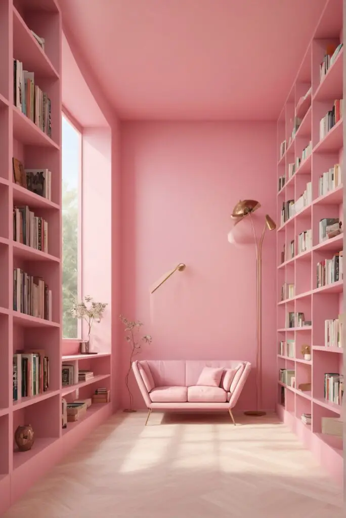
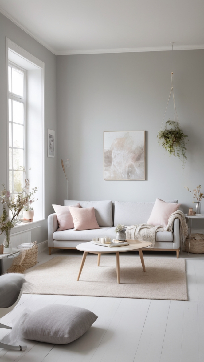
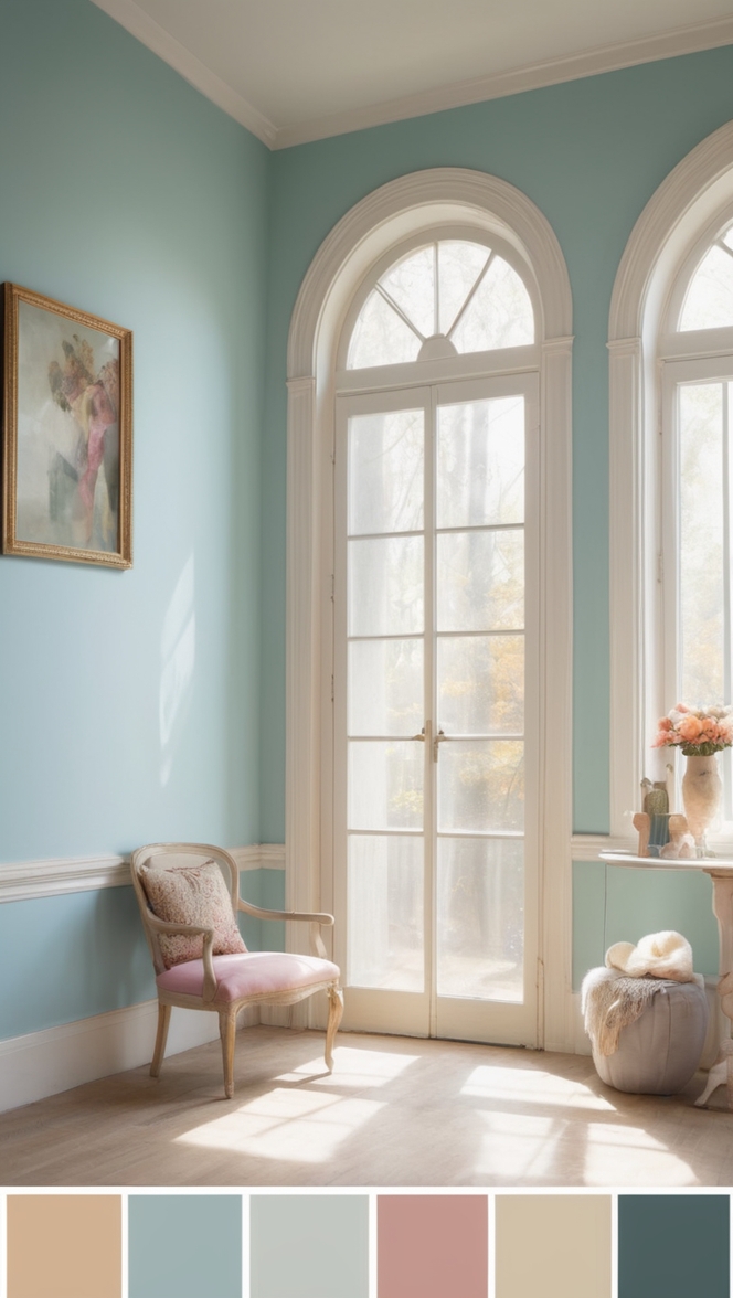
In 2024, interior design trends are embracing lighthearted and uplifting colors to infuse spaces with joy and elegance. Among these, pink stands out as a versatile choice, capable of transforming any room into a sophisticated sanctuary. If you’re considering a makeover for your library, here’s why you should consider painting it with a lighthearted pink hue.
Why Choose Lighthearted Pink?
Pink is often associated with softness, romance, and serenity. When applied in a lighthearted shade, it adds a touch of playfulness while maintaining an air of sophistication, making it perfect for libraries.
- Creates a Tranquil Ambiance: In a library, where peace and tranquility are paramount, lighthearted pink creates a serene atmosphere conducive to reading and contemplation.
- Elevates the Aesthetic: Pink, when used tastefully, can elevate the aesthetic of any space. Its gentle hue adds warmth and character without overwhelming the senses.
- Versatile Pairing: Lighthearted pink is surprisingly versatile and complements a wide range of interior styles, from classic to contemporary, making it suitable for libraries with diverse decor themes.
- Promotes Relaxation: Studies have shown that certain shades of pink have a calming effect on the mind, making it an ideal choice for spaces dedicated to relaxation and intellectual pursuits.
- Reflects Natural Light: Lighter shades of pink reflect natural light effectively, brightening up the room and creating an illusion of spaciousness, which is particularly beneficial for smaller library spaces.
5 Tips to Match Color:
- Neutral Accents: Pair lighthearted pink walls with neutral-colored furniture and accents, such as beige or cream, to create a balanced and harmonious look.
- Metallic Touches: Incorporate metallic elements like gold or brass in bookshelves, light fixtures, or accessories to add a touch of glamour and sophistication to the pink backdrop.
- Contrast with Darker Tones: Introduce contrast by incorporating darker tones like navy blue, charcoal gray, or forest green in upholstery or decor pieces to create visual interest and depth.
- Natural Textures: Enhance the cozy ambiance of your library by incorporating natural textures like wood, rattan, or linen, which complement the softness of lighthearted pink while adding tactile appeal.
- Artwork Selection: Choose artwork or wall decor in complementary colors or themes to enhance the overall aesthetic and tie the room together cohesively.
5 Hue Matching Options:
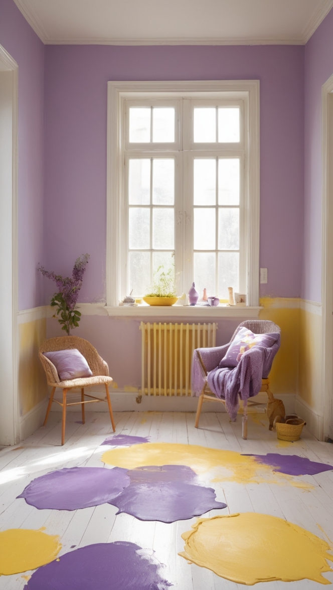
- Soft Lavender: Pair lighthearted pink with soft lavender accents for a dreamy and feminine vibe that exudes tranquility and elegance.
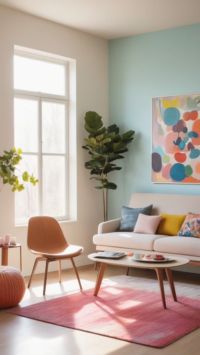
- Mint Green: Combine lighthearted pink with mint green for a refreshing and youthful palette that evokes feelings of vitality and optimism.
- Pale Yellow: Infuse warmth and cheerfulness into your library by pairing lighthearted pink with accents in pale yellow, creating a sunny and inviting atmosphere.
- Dusty Blue: For a sophisticated yet understated look, pair lighthearted pink with dusty blue hues, adding a sense of calm and sophistication to the space.
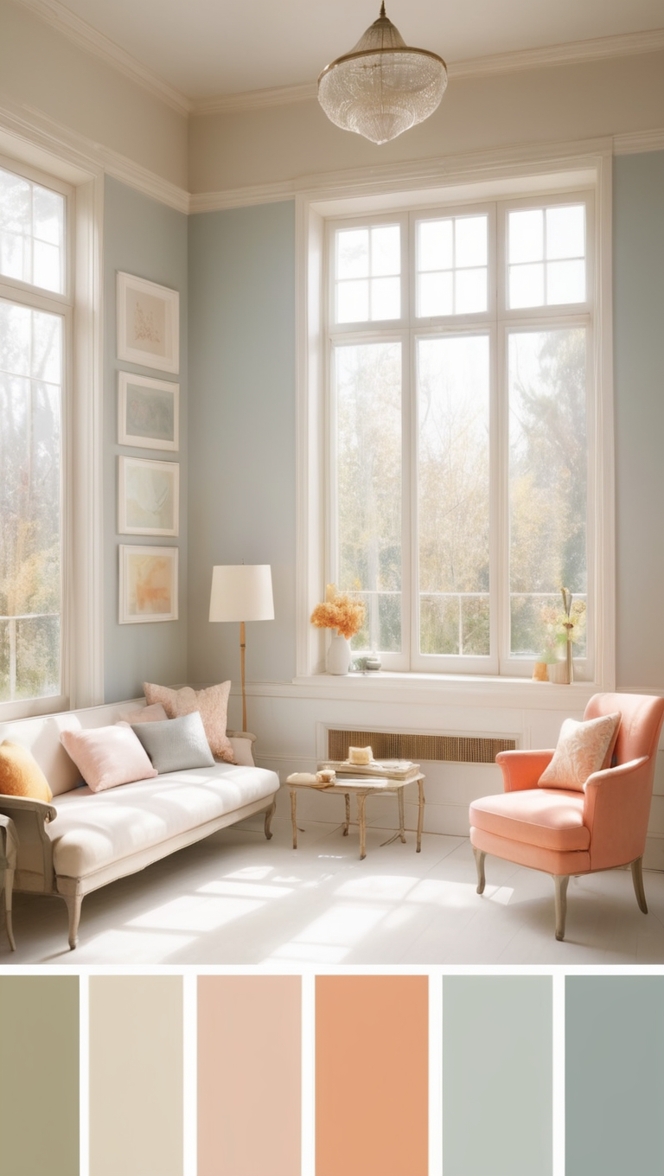
- Blush Nude: Create a chic and timeless aesthetic by combining lighthearted pink with blush nude tones, striking the perfect balance between modernity and classic elegance.
5 Alternative Colors from Sherwin Williams and
Benjamin Moore:
- Sherwin Williams – Rose Quartz: A soft and subtle pink hue that complements lighthearted pink beautifully, creating a cohesive and harmonious color scheme.
- Sherwin Williams – Charming Pink: A delicate and charming pink shade that adds a touch of whimsy and romance to any space, perfect for creating a cozy reading nook in your library.
- Benjamin Moore – First Light: A soft, rosy pink hue that exudes warmth and sophistication, creating an inviting and uplifting atmosphere in your library.
- Benjamin Moore – Pink Bliss: A serene and tranquil pink shade that promotes relaxation and introspection, ideal for creating a serene sanctuary in your library.
- Benjamin Moore – Opal Pink: A sophisticated and understated pink hue with subtle undertones of gray, adding depth and elegance to your library’s color palette.
Other Rooms to Use Color:
In addition to libraries, lighthearted pink can also work wonders in other rooms throughout your home:
- Bedroom: Create a cozy and romantic bedroom retreat by painting the walls in lighthearted pink and layering with soft, luxurious bedding and accents.
- Nursery: Nurseries adorned in lighthearted pink evoke a sense of warmth and tenderness, creating a nurturing environment for your little one.
- Home Office: Foster creativity and productivity in your home office by incorporating lighthearted pink accents in decor, furniture, or wall paint, promoting a positive and uplifting work environment.
- Living Room: Infuse your living room with a touch of elegance and sophistication by incorporating lighthearted pink in upholstery, throw pillows, or statement furniture pieces.
- Dining Room: Create a stylish and inviting dining space by pairing lighthearted pink walls with complementary accents and decor, setting the stage for memorable gatherings with family and friends.
Conclusion:
Incorporating lighthearted pink into your library can elevate its ambiance, promote relaxation, and add a touch of elegance and sophistication to the space. By following these tips for color matching and exploring alternative hues from Sherwin Williams and Benjamin Moore, you can create a truly enchanting and timeless retreat where you can escape into the world of literature and imagination. Whether you’re curling up with a good book or hosting intimate gatherings, lighthearted pink will infuse your library with charm and warmth for years to come.

