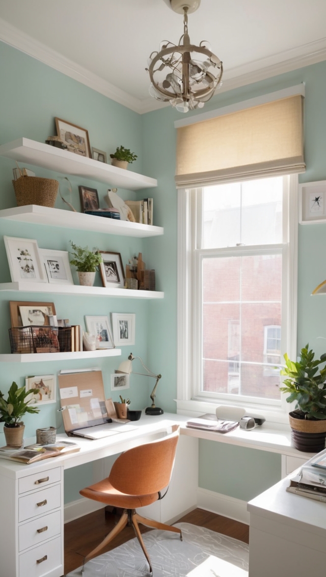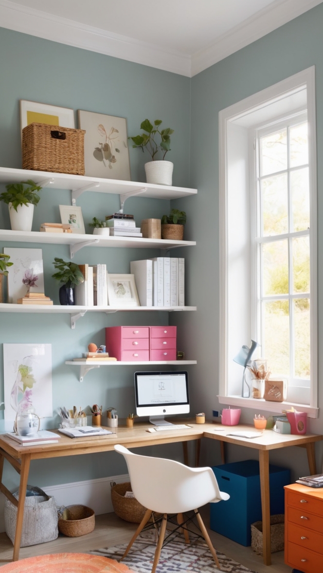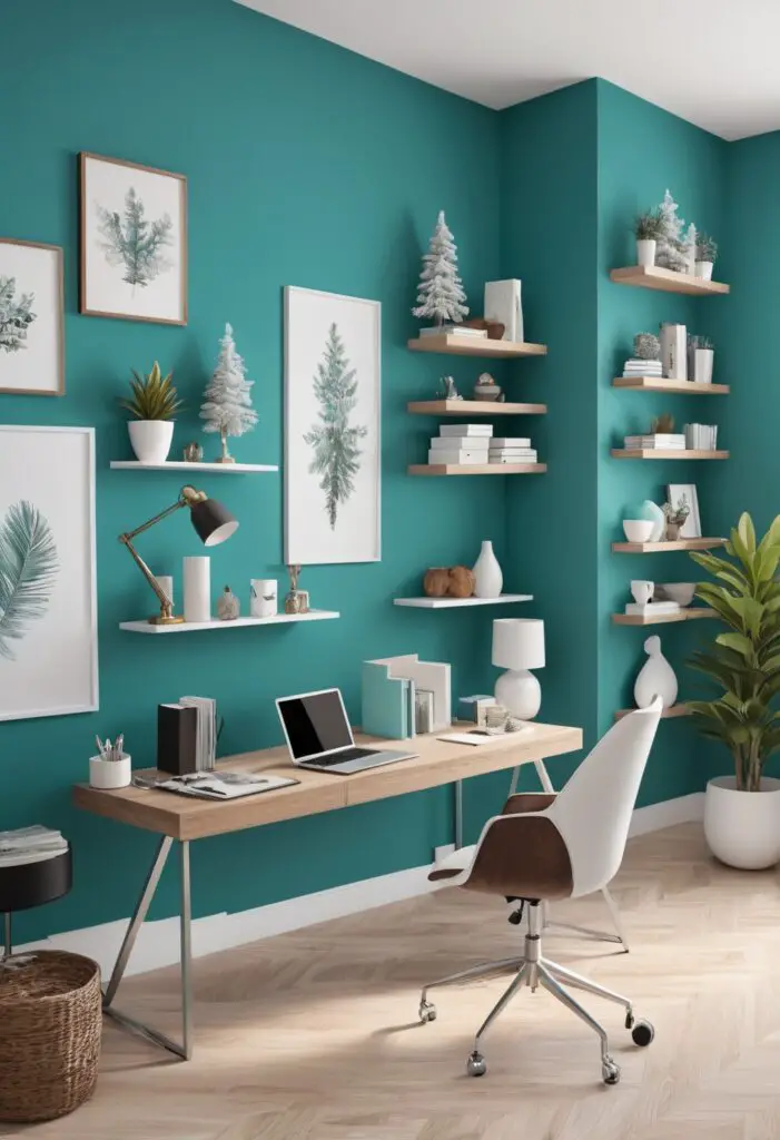
In the fast-paced world of modern offices, creating a serene and calming environment can significantly impact productivity, creativity, and overall well-being. As we step into 2024, there’s a growing trend towards integrating soothing elements into office spaces, with Holiday Turquoise emerging as a top choice for interior paint color. This refreshing hue not only evokes feelings of tranquility but also infuses spaces with a sense of vitality and rejuvenation. Let’s delve into why Holiday Turquoise is the perfect paint color for your office in 2024.
5 Tips to Match Color:
- Consider Natural Light: Before committing to Holiday Turquoise, assess the natural light in your office space. This vibrant hue works exceptionally well in well-lit areas, as it reflects light beautifully, creating a bright and airy ambiance. However, in dimly lit spaces, it may appear darker than intended, so be mindful of your office’s lighting conditions.
- Balance with Neutrals: While Holiday Turquoise adds a pop of color, it’s essential to balance it with neutral tones to prevent overwhelming the space. Opt for crisp whites, soft grays, or warm beiges for furniture, flooring, and decor to create a harmonious and cohesive look.
- Experiment with Textures: Incorporating various textures can enhance the visual appeal of Holiday Turquoise. Pair it with natural materials like wood, rattan, or woven fabrics to add depth and interest to your office decor. Textured elements not only complement the color but also add tactile richness to the environment.
- Customize Accent Pieces: Infuse your office with personality by customizing accent pieces in complementing colors. Choose furnishings, such as chairs, throw pillows, or artwork, in shades of teal, aqua, or navy to accentuate the Holiday Turquoise walls. This subtle variation in hue adds visual interest without overpowering the space.
- Test Samples: Before painting your entire office in Holiday Turquoise, test samples in different areas to gauge how the color interacts with light throughout the day. Observing the color under various lighting conditions allows you to make informed decisions and ensures the final result aligns with your vision for a tranquil workspace.
5 Hue Matching Options:
- Soft Gray: Pairing Holiday Turquoise with soft gray accents creates a sophisticated and contemporary aesthetic. The cool undertones of gray complement the refreshing hue of turquoise, resulting in a calming yet stylish ambiance.
- Crisp White: For a timeless and airy feel, combine Holiday Turquoise with crisp white elements. White furniture, trim, and accessories provide a clean backdrop that allows the vibrant turquoise walls to take center stage, creating a visually stunning and uplifting environment.
- Sandy Beige: Infuse warmth into your office space by pairing Holiday Turquoise with sandy beige hues. The earthy tones of beige add a grounding effect, balancing the energetic vibe of turquoise and creating a welcoming atmosphere that promotes focus and productivity.
- Pale Yellow: Create a cheerful and invigorating workspace by pairing Holiday Turquoise with pale yellow accents. The sunny hue of yellow complements the coolness of turquoise, infusing the office with a sense of optimism and creativity.
- Subtle Lavender: For a touch of elegance and serenity, consider pairing Holiday Turquoise with subtle lavender tones. The soft purples harmonize with the cool blues of turquoise, creating a tranquil and sophisticated environment that fosters relaxation and inspiration.
5 Alternative Colors from Sherwin Williams and Benjamin Moore:
- Sherwin Williams – Rainwashed: This soft and muted green-blue hue from Sherwin Williams offers a subtle alternative to Holiday Turquoise. Rainwashed exudes a sense of tranquility and freshness, making it an ideal choice for offices seeking a serene atmosphere.
- Sherwin Williams – Sea Salt: With its pale green-gray undertones, Sea Salt by Sherwin Williams adds a hint of coastal charm to any office space. This versatile color pairs beautifully with both warm and cool tones, creating a soothing and timeless look.
- Benjamin Moore – Beach Glass: Inspired by the colors of the sea, Beach Glass by Benjamin Moore is a pale aqua shade that evokes feelings of relaxation and serenity. This subtle yet impactful color choice transforms offices into tranquil retreats, perfect for fostering creativity and focus.
- Benjamin Moore – Silver Lake: For a modern and sophisticated vibe, consider Silver Lake by Benjamin Moore. This soft blue-gray hue brings a sense of calm and balance to office interiors, creating an atmosphere conducive to productivity and well-being.
- Sherwin Williams – Oyster Bay: Infuse your office with a sense of coastal elegance with Oyster Bay by Sherwin Williams. This muted green-gray color exudes understated sophistication, creating a serene backdrop that promotes focus and creativity.
Other Rooms to Use Color:
Conference Rooms: Implement Holiday Turquoise in conference rooms to inspire creativity and encourage open communication during meetings and brainstorming sessions. The calming effect of this color can help alleviate stress and foster collaboration among team members.
Break Rooms: Create a relaxing and inviting atmosphere in break rooms by incorporating Holiday Turquoise on accent walls or furniture. This soothing hue can help employees unwind and recharge during their breaks, promoting overall well-being and morale.
Reception Areas: Make a lasting impression on visitors and clients by using Holiday Turquoise in reception areas. The vibrant yet welcoming color creates a positive first impression and sets the tone for the rest of the office environment, reflecting professionalism and creativity.
Collaborative Spaces: Foster a sense of community and teamwork in collaborative workspaces by introducing Holiday Turquoise on feature walls or shared workstations. This vibrant hue energizes the space and encourages interaction and idea-sharing among colleagues.
Executive Offices: Elevate executive offices with Holiday Turquoise accents or statement pieces to create a serene and sophisticated environment for decision-making and strategic planning. The calming effect of this color can enhance focus and productivity, empowering leaders to thrive in their roles.
Conclusion:
In the pursuit of creating harmonious and productive office environments, the choice of paint color plays a crucial role. Holiday Turquoise emerges as a frontrunner for 2024, offering a perfect blend of tranquility, vitality, and sophistication. By following the tips for matching colors, exploring hue alternatives, and considering various applications, offices can harness the power of Holiday Turquoise to inspire creativity, foster collaboration, and enhance overall well-being. Embrace tranquility in your workspace with Holiday Turquoise and elevate your office design to new heights in 2024 and beyond.