
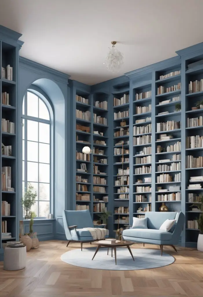
Libraries are sanctuaries of knowledge, tranquility, and intellectual exploration. They serve as havens where individuals can immerse themselves in the written word and embark on journeys through the vast realms of literature. The ambiance of a library plays a pivotal role in shaping the reading experience, and one of the most impactful elements in this regard is the choice of color scheme. In 2024, a subtle yet profound shift in library aesthetics is taking place, with minor blue paint emerging as the frontrunner in redefining the visual landscape of these sacred spaces.
Why Embrace Minor Blue Paint?
Minor blue paint exudes a sense of tranquility, sophistication, and intellectual stimulation, making it the perfect choice for libraries seeking to create an atmosphere conducive to concentration and contemplation. Its calming effect on the mind helps to promote focus and enhance the overall reading experience. Here are several compelling reasons to embrace minor blue paint in your library:
- Calming Influence: The soft, muted tones of minor blue evoke feelings of serenity and relaxation, providing visitors with a respite from the hustle and bustle of everyday life. This calming influence can help patrons unwind and immerse themselves fully in the world of literature.
- Enhanced Concentration: Studies have shown that certain colors can have a significant impact on cognitive function, with blue being particularly effective at promoting concentration and mental clarity. By incorporating minor blue paint into your library’s color scheme, you can create an environment that fosters deep focus and uninterrupted reading sessions.
- Timeless Elegance: Unlike trendy color fads that come and go, minor blue boasts a timeless elegance that transcends fleeting design trends. Its classic appeal ensures that your library will maintain its aesthetic allure for years to come, providing visitors with a timeless backdrop for their literary adventures.
- Versatile Pairing: Minor blue paint pairs seamlessly with a wide range of interior decor styles, from traditional to contemporary. Whether your library features antique bookshelves and leather armchairs or sleek modern furnishings, minor blue serves as a versatile canvas that complements any design aesthetic.
- Psychological Association: Blue is often associated with trust, intelligence, and wisdom, making it an ideal choice for environments dedicated to learning and knowledge dissemination. By incorporating minor blue paint into your library, you can subtly reinforce these positive associations and instill a sense of confidence in your patrons.
5 Tips to Match Minor Blue Paint:
- Natural Wood Accents: Pair minor blue paint with natural wood accents such as bookshelves, tables, and flooring to create a harmonious blend of warmth and tranquility. The earthy tones of wood complement the coolness of blue, adding depth and texture to your library’s aesthetic.
- Soft Neutral Fabrics: Choose soft neutral fabrics for upholstery, curtains, and rugs to balance the coolness of minor blue paint. Creams, beiges, and light grays provide a soothing contrast that enhances the overall comfort and coziness of the space.
- Metallic Accents: Incorporate metallic accents such as brass or copper light fixtures, drawer pulls, and picture frames to add a touch of elegance and sophistication to your library. The reflective surfaces of metallic elements create visual interest and introduce subtle hints of warmth to offset the coolness of minor blue.
- Accent Colors: Introduce accent colors in muted tones such as soft greens, blush pinks, or warm yellows to add depth and dimension to your library’s color palette. These understated hues complement minor blue beautifully, infusing the space with a sense of harmony and balance.
- Artwork Selection: Choose artwork that complements the serene ambiance of minor blue paint, such as landscapes, abstracts, or literary-themed prints. Opt for pieces with subtle color accents that tie into the overall color scheme of your library, creating a cohesive visual narrative that enhances the reading experience.
5 Hue Matching Options:
- Sky Blue: For a lighter alternative to minor blue, consider sky blue paint. This delicate hue mimics the softness of a clear summer sky, imbuing your library with a sense of airiness and openness.
- Slate Blue: If you prefer a deeper, more saturated shade of blue, slate blue is an excellent choice. This rich hue adds a touch of drama and sophistication to your library’s aesthetic, creating a cozy atmosphere perfect for curling up with a good book.
- Powder Blue: Powder blue offers a delicate, ethereal quality that evokes a sense of nostalgia and whimsy. This charming hue brings a sense of lightness and playfulness to your library, making it feel like a whimsical escape from reality.
- Teal: For a bold and vibrant take on blue, consider teal paint. This striking hue combines the calming properties of blue with the energizing influence of green, creating a dynamic and invigorating atmosphere in your library.
- Navy Blue: For a classic and sophisticated look, navy blue is an excellent choice. This deep, dark hue adds a sense of gravitas and refinement to your library’s aesthetic, creating a space that exudes timeless elegance and charm.
5 Alternative Colors from Sherwin Williams and Benjamin Moore:
- Sherwin Williams – Misty (SW 6232): Misty is a soft, misty blue-gray that pairs beautifully with minor blue paint. This subtle hue adds depth and dimension to your library’s color palette, creating a serene and inviting atmosphere.
- Sherwin Williams – Silver Strand (SW 7057): Silver Strand is a soothing blue-green-gray that complements minor blue paint perfectly. This versatile hue adds a touch of sophistication to your library, creating a serene backdrop for quiet contemplation and reflection.
- Benjamin Moore – Gray Owl (OC-52): Gray Owl is a timeless pale gray that serves as an excellent complement to minor blue paint. This understated hue enhances the calming ambiance of your library, providing a neutral backdrop for showcasing your collection of books and artwork.
- Benjamin Moore – Revere Pewter (HC-172): Revere Pewter is a warm gray with subtle undertones of beige that pairs beautifully with minor blue paint. This versatile hue adds depth and warmth to your library’s color scheme, creating a cozy and inviting atmosphere that encourages relaxation and introspection.
- Benjamin Moore – Edgecomb Gray (HC-173): Edgecomb Gray is a soft, warm gray that complements minor blue paint with its subtle undertones of taupe. This versatile hue adds a touch of warmth and sophistication to your library, creating a welcoming and inviting space for reading and contemplation.
Other Rooms to Use Minor Blue Paint:
Living Room: In the living room, minor blue paint can create a serene and inviting atmosphere perfect for entertaining guests or relaxing with family. Pair it with plush sofas, soft throws, and natural accents for a cozy yet elegant aesthetic.
Bedroom: Transform your bedroom into a tranquil retreat with minor blue paint. This calming hue promotes relaxation and restful sleep, making it the perfect choice for creating a peaceful sanctuary where you can unwind and recharge.
Home Office: Enhance productivity and focus in your home office by incorporating minor blue paint into the decor. This soothing hue helps to create a conducive work environment, fostering creativity and mental clarity as you tackle your daily tasks.
Bathroom: Bring a sense of spa-like serenity to your bathroom with minor blue paint. This calming hue creates a tranquil oasis where you can unwind and rejuvenate after a long day, turning your bathroom into a luxurious retreat for self-care and relaxation.
Kitchen: Infuse your kitchen with a touch of sophistication by using minor blue paint on the walls or cabinetry. This versatile hue adds depth and dimension to the space, creating a stylish backdrop for cooking, dining, and entertaining guests.
Conclusion:
In the ever-evolving landscape of interior design, minor blue paint stands out as a timeless and versatile choice for libraries and beyond. Its calming influence, timeless elegance, and compatibility with a wide range of decor styles make it the perfect option for creating serene and inviting spaces where individuals can escape into the world of literature and contemplation. By embracing minor blue paint in your library, you can redefine its aesthetics for 2024 and beyond, transforming it into a sanctuary of knowledge and tranquility for generations to come.


