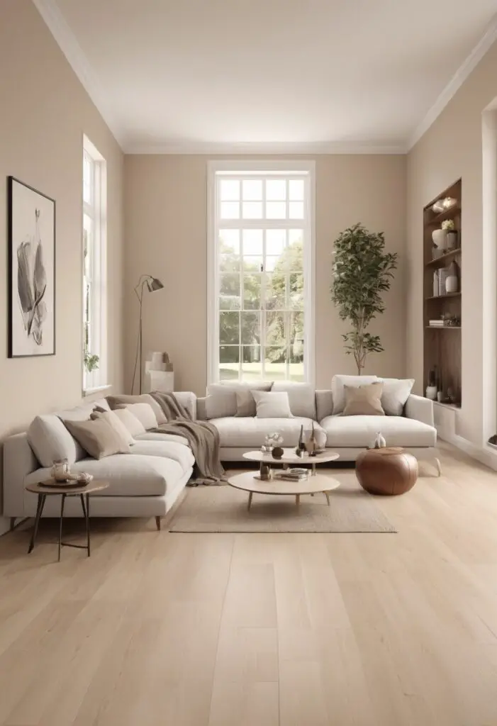
In the pursuit of revamping your living space, selecting the right paint color can be a transformative decision. For 2024, the interior design landscape is embracing a hue that exudes sophistication and versatility: “Choice Cream.” This elegant shade offers a contemporary twist on traditional neutrals, making it the ideal choice for those seeking a timeless yet modern aesthetic. Let’s delve into why “Choice Cream” should be your top pick for revitalizing your home.
Why Choice Cream Paint?
“Choice Cream” boasts a delicate balance of warmth and lightness, creating an inviting atmosphere in any room it graces. Here are several reasons why this paint color is a must-have for your home:
- Versatility: “Choice Cream” serves as an excellent backdrop for various decor styles, whether you prefer minimalist, Scandinavian, or eclectic aesthetics. Its neutral undertones effortlessly complement a wide array of furnishings and accessories, allowing you to unleash your creativity without fear of clashing colors.
- Timelessness: Unlike trendy hues that may quickly fall out of favor, “Choice Cream” possesses a timeless appeal that ensures longevity. By opting for this classic shade, you can future-proof your interior design, avoiding the need for frequent repainting to keep up with fleeting trends.
- Light Reflectance: The light, creamy nature of this color has the remarkable ability to brighten up even the darkest of spaces. Whether you’re working with a compact apartment or a spacious villa, “Choice Cream” infuses rooms with a sense of airiness and luminosity, enhancing their overall ambiance.
- Enhanced Relaxation: The soft, calming undertones of “Choice Cream” promote a tranquil atmosphere conducive to relaxation and unwinding. After a long day, stepping into a room adorned with this soothing hue can instantly melt away stress and foster a sense of serenity.
- Visual Cohesion: Using “Choice Cream” throughout different areas of your home fosters visual cohesion and flow, creating a sense of harmony that ties the space together seamlessly. Whether you’re painting an accent wall or revamping an entire room, this versatile color ensures a cohesive look that enhances the overall aesthetic appeal.
5 Tips to Match Color with Choice Cream Paint:
- Bold Accents: Offset the understated elegance of “Choice Cream” by incorporating pops of bold color throughout the room. Consider adding vibrant throw pillows, statement artwork, or eye-catching area rugs to inject personality and visual interest into the space.
- Natural Elements: Pair “Choice Cream” with natural materials such as wood, stone, and rattan to create a harmonious connection with the outdoors. This juxtaposition of creamy neutrals against organic textures adds depth and warmth to the room, resulting in a cozy yet contemporary atmosphere.
- Metallic Finishes: Introduce metallic accents like gold, brass, or silver to elevate the sophistication of “Choice Cream.” Whether through light fixtures, hardware, or decorative objects, these shimmering touches infuse the space with a touch of glamour while complementing the paint color’s refined aesthetic.
- Monochromatic Scheme: Embrace a monochromatic color scheme by layering different shades of cream, beige, and taupe alongside “Choice Cream.” This cohesive palette creates a sense of cohesion and serenity, allowing the subtle variations in tone to add depth and dimension to the room.
- Texture Play: Experiment with texture to add visual interest and tactile appeal to a room painted in “Choice Cream.” Incorporate plush textiles, like velvet or faux fur, alongside smooth finishes such as glass or polished metal to create a dynamic interplay of surfaces that enhances the overall sensory experience.
5 Hue Matching Options:
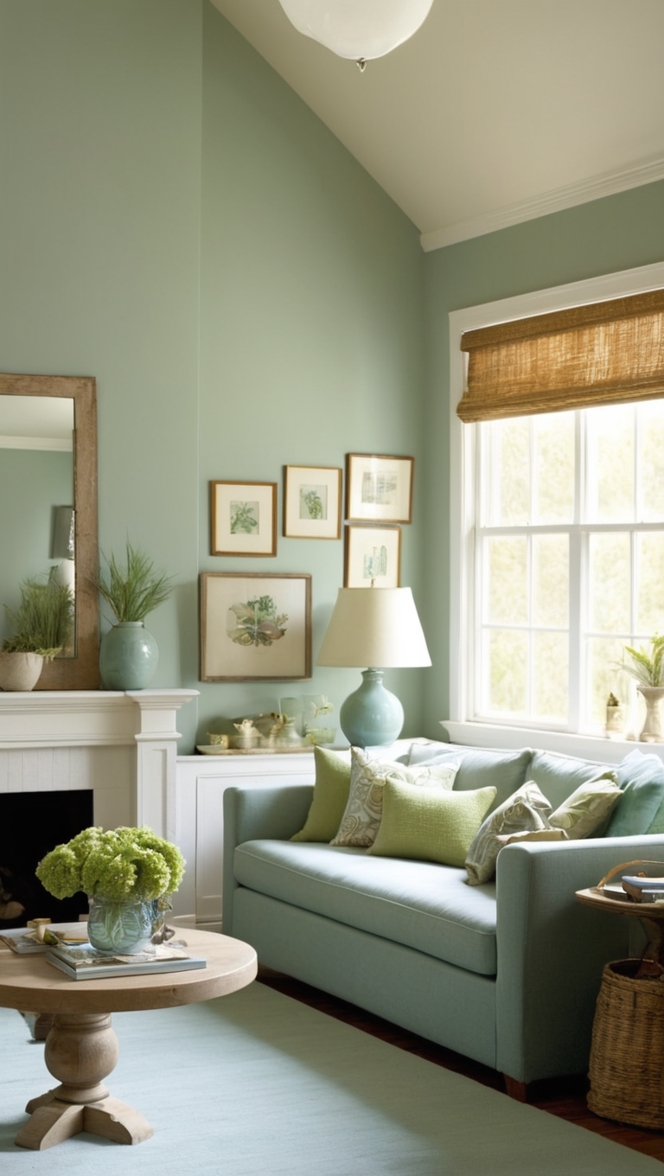
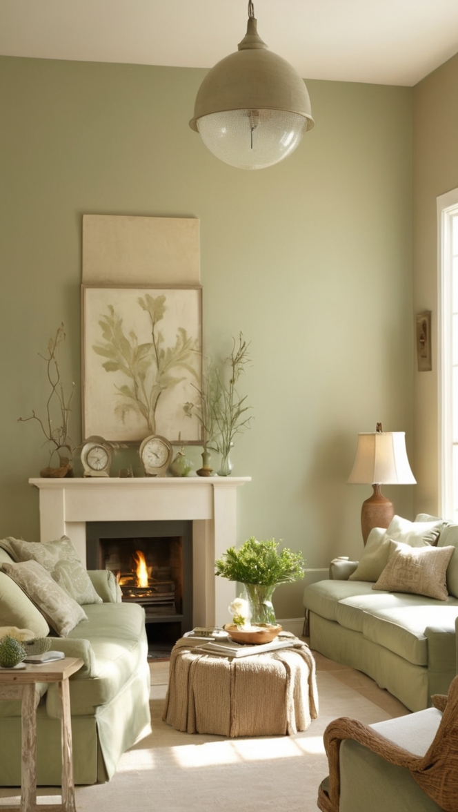
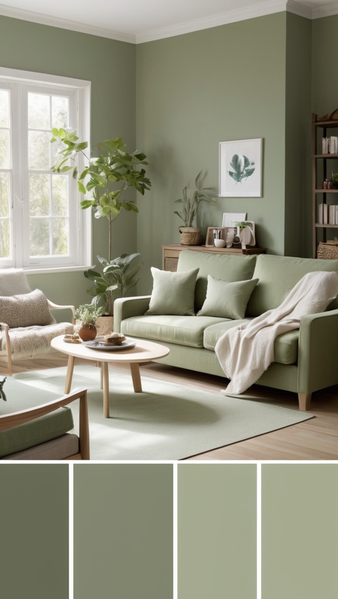
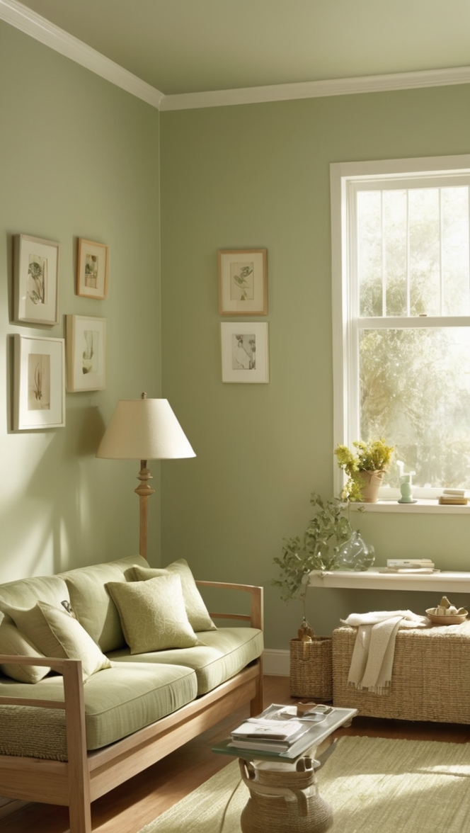
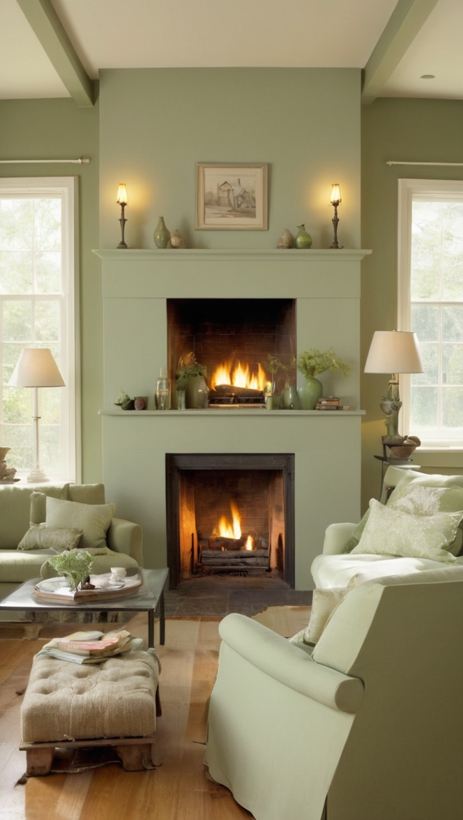
- Soft Sage: Pairing “Choice Cream” with soft sage green accents creates a tranquil and harmonious ambiance reminiscent of nature’s serenity. Incorporate sage green throw pillows, potted plants, or botanical artwork to infuse the space with a refreshing burst of color.
- Dusty Rose: For a touch of romance and sophistication, combine “Choice Cream” with dusty rose accents. This subtle yet elegant pairing evokes a sense of timeless beauty and femininity, making it perfect for bedrooms, living rooms, or intimate dining areas.
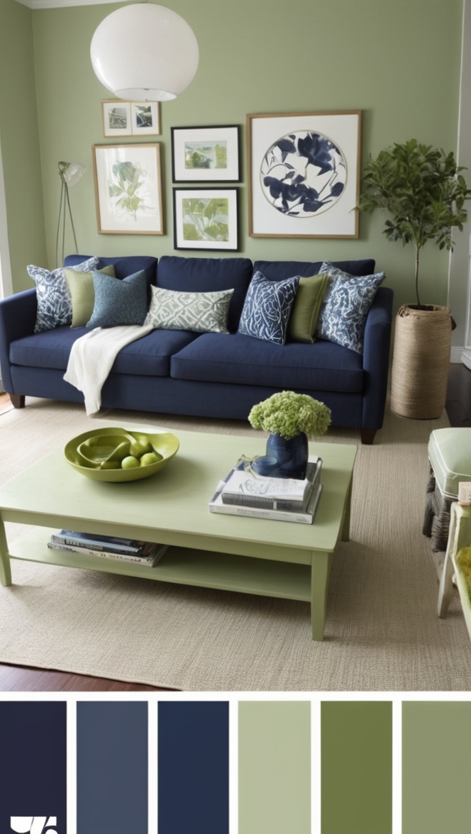
- Navy Blue: Contrast the lightness of “Choice Cream” with the depth and richness of navy blue accents. Whether through navy blue upholstery, area rugs, or wall art, this striking combination adds a sense of drama and sophistication to any space, making a bold yet refined statement.
- Charcoal Gray: Create a modern and sleek look by incorporating charcoal gray accents alongside “Choice Cream.” The juxtaposition of light and dark hues lends a contemporary edge to the room, while the neutral color palette ensures a timeless appeal that transcends fleeting trends.
- Terracotta: Infuse warmth and earthiness into your space by pairing “Choice Cream” with terracotta accents. Whether through terracotta pottery, throw blankets, or accent walls, this vibrant hue adds a touch of Mediterranean-inspired charm and coziness to any room.
5 Alternative Colors from Sherwin Williams and Benjamin Moore:
- Sherwin Williams – “Alabaster”: This creamy white hue from Sherwin Williams offers a slightly cooler undertone compared to “Choice Cream,” making it an excellent alternative for those seeking a crisp, clean look with a hint of warmth.
- Benjamin Moore – “Balboa Mist”: With its subtle gray undertones, “Balboa Mist” by Benjamin Moore pairs beautifully with “Choice Cream,” creating a soft and sophisticated color palette that exudes understated elegance.
- Sherwin Williams – “Accessible Beige”: For a warmer alternative to “Choice Cream,” consider Sherwin Williams’ “Accessible Beige.” This versatile neutral boasts warm undertones that lend a cozy and inviting vibe to any space.
- Benjamin Moore – “Edgecomb Gray”: Featuring a delicate balance of beige and gray, “Edgecomb Gray” by Benjamin Moore complements “Choice Cream” seamlessly, offering a sophisticated yet understated backdrop for any interior.
- Sherwin Williams – “Kilim Beige”: Embrace timeless elegance with Sherwin Williams’ “Kilim Beige,” a classic neutral that pairs effortlessly with “Choice Cream,” creating a harmonious and inviting atmosphere in any room.
Other Rooms to Use Choice Cream Paint:
Revitalize various spaces in your home with “Choice Cream” paint to infuse them with timeless elegance and sophistication:
Living Room:
Transform your living room into a stylish sanctuary by painting the walls in “Choice Cream.” Pair with plush seating, metallic accents, and statement artwork for a space that exudes comfort and luxury.
Bedroom:
Create a serene and inviting bedroom retreat by adorning the walls with “Choice Cream” paint. Layer with soft linens, cozy throws, and ambient lighting to cultivate a tranquil atmosphere conducive to rest and relaxation.
Kitchen:
Elevate your kitchen’s aesthetic appeal by incorporating “Choice Cream” paint on the walls or cabinetry. Pair with marble countertops, brass fixtures, and natural wood accents for a chic and sophisticated culinary space.
Dining Room:
Set the stage for memorable gatherings with a dining room adorned in “Choice Cream” paint. Pair with a statement chandelier, upholstered dining chairs, and a rustic farmhouse table for
an inviting and stylish ambiance.
Home Office:
Create a productive and inspiring workspace by painting the walls of your home office in “Choice Cream.” Combine with sleek modern furnishings, ample storage solutions, and personal touches to foster creativity and focus.
Conclusion:
In the realm of interior design, the right paint color can make all the difference in transforming a space from ordinary to extraordinary. For 2024, “Choice Cream” emerges as the ultimate hue for those seeking to infuse their home with timeless elegance and modern sophistication. With its versatility, timelessness, and ability to enhance relaxation, “Choice Cream” paint offers endless possibilities for revitalizing your living space. Whether you’re looking to refresh a single room or embark on a full-scale renovation, embracing “Choice Cream” is the key to achieving a stylish and inviting home environment that stands the test of time.