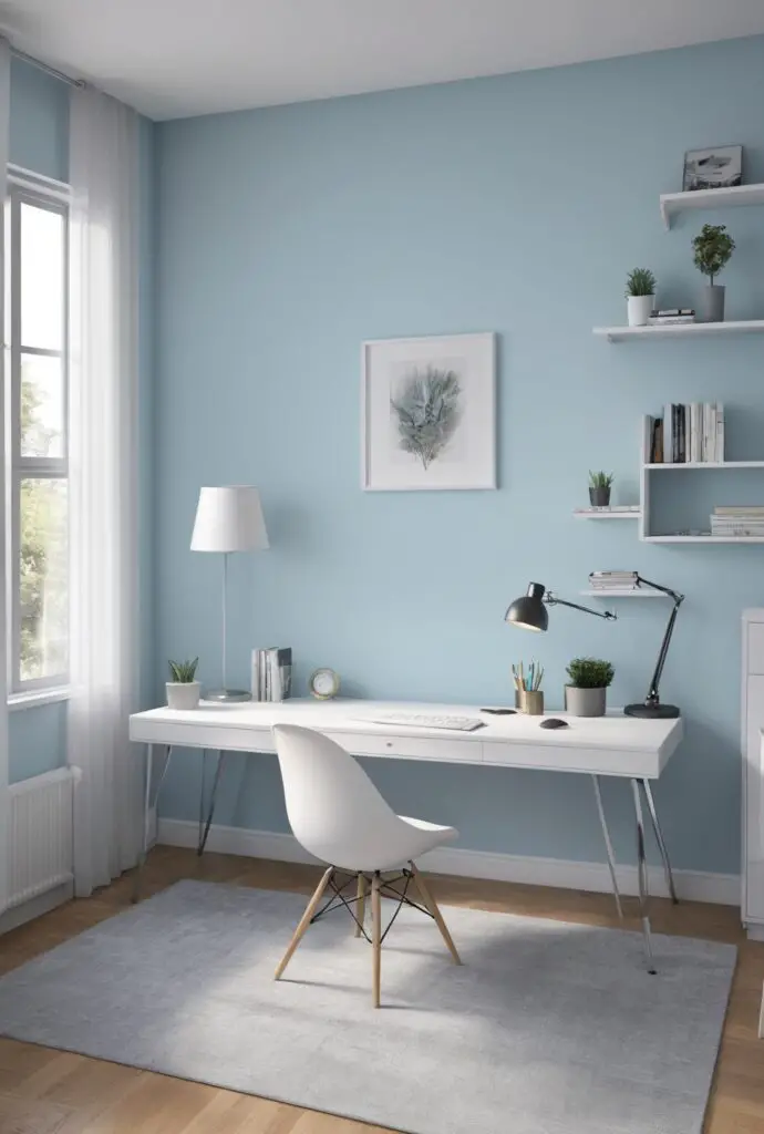
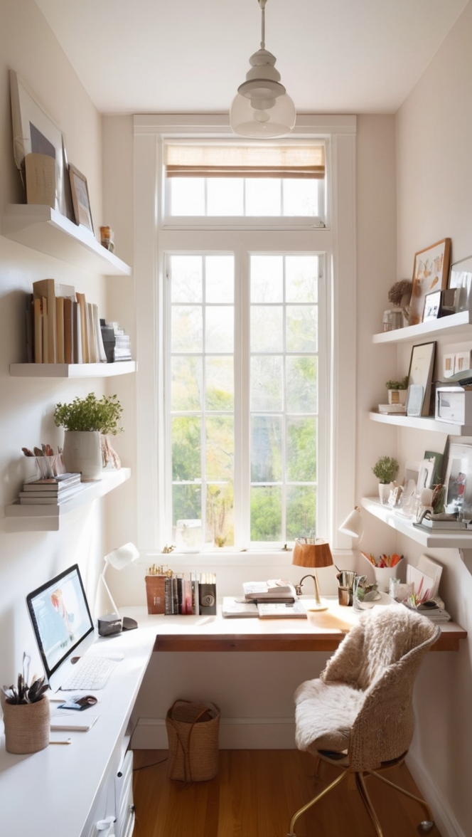
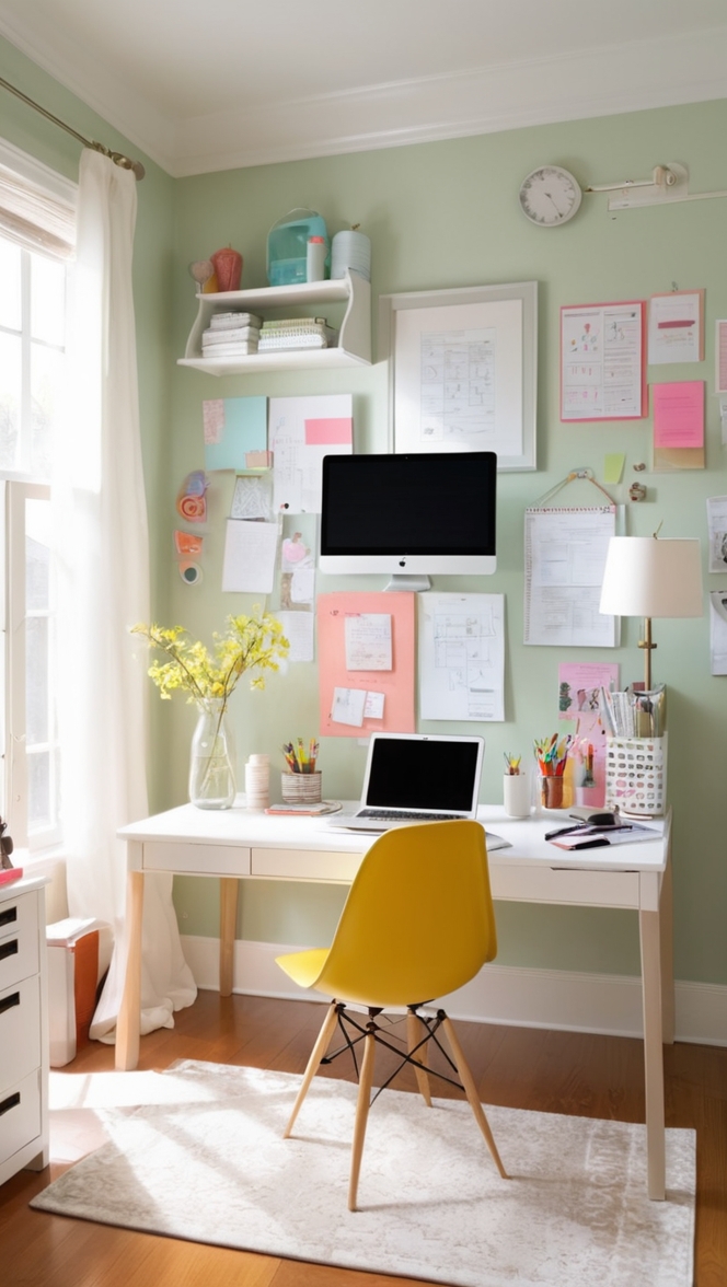
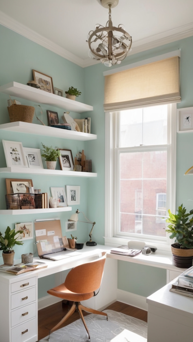
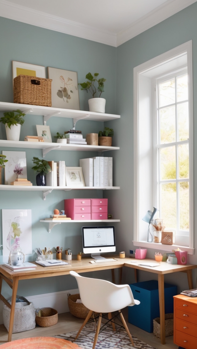
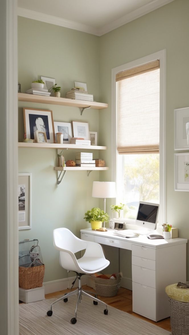
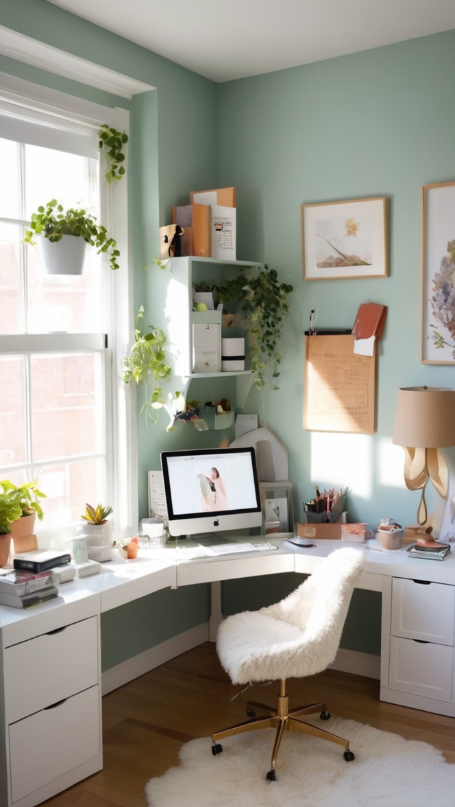
In the fast-paced world of modern office design, staying ahead of the curve is crucial. As we navigate through the year 2024, the demand for contemporary aesthetics and functional workspaces continues to soar. Enter Icicle Paint—a versatile color choice that embodies sophistication and innovation, making it the perfect solution for transforming dull office environments into dynamic, inspiring hubs of productivity and creativity.
Why Choose Icicle Paint?
Icicle Paint exudes a timeless elegance that effortlessly complements the sleek, minimalist designs prevalent in today’s offices. Its crisp, clean tones evoke a sense of tranquility while adding a touch of modernity to any space. Here’s why you should consider incorporating Icicle Paint into your office palette:
- Versatility: Icicle Paint’s neutral hue serves as an excellent backdrop for a variety of design elements, allowing you to seamlessly integrate it into any office theme or style.
- Light Reflective Properties: The subtle undertones of Icicle Paint help to reflect natural and artificial light, brightening up the workspace and creating an inviting atmosphere conducive to productivity.
- Enhanced Focus and Concentration: The calming effect of Icicle Paint promotes a sense of serenity, aiding in concentration and mental clarity—a must-have for busy office environments.
- Professional Aesthetic: Icicle Paint exudes sophistication and professionalism, making it an ideal choice for corporate settings where making a lasting impression is paramount.
- Timelessness: Unlike trendy colors that may quickly become outdated, Icicle Paint’s timeless appeal ensures longevity, providing a solid foundation for your office’s aesthetic evolution.
Tips for Matching Colors with Icicle Paint:
- Accentuate with Warm Neutrals: Pair Icicle Paint with warm neutral tones such as beige or taupe to create a balanced and inviting ambiance in your office space.
- Add Pops of Color: Introduce vibrant accents like teal or mustard to inject personality and energy into the workspace without overwhelming the calming effect of Icicle Paint.
- Embrace Contrasts: Experiment with contrasting colors such as deep navy or charcoal gray to create visual interest and depth against the backdrop of Icicle Paint.
- Consider Texture: Incorporate different textures like natural wood or metallic finishes to add dimension and richness to the overall design scheme while complementing the cool tones of Icicle Paint.
- Opt for Monochrome Elegance: For a sophisticated look, stick to a monochromatic color palette by layering varying shades of gray alongside Icicle Paint for a chic and cohesive aesthetic.
Hue Matching with Icicle Paint:
- Subtle Blues: Pair Icicle Paint with subtle blue hues like pale aqua or soft sky blue to evoke a sense of tranquility reminiscent of clear skies and open horizons.
- Soft Greens: Incorporate soft green tones such as sage or mint to infuse a refreshing and rejuvenating energy into the workspace, promoting a connection to nature and fostering creativity.
- Neutral Greys: Combine Icicle Paint with neutral gray shades like dove gray or slate for a harmonious and understated palette that exudes sophistication and modernity.
- Cool Whites: Pairing Icicle Paint with cool white hues creates a fresh and airy atmosphere, perfect for promoting focus and productivity in the office environment.
- Earthy Browns: Introduce earthy brown tones such as taupe or cocoa to add warmth and depth to the cool tones of Icicle Paint, creating a balanced and inviting space.
Alternative Colors from Sherwin Williams and
Benjamin Moore:
- Sherwin Williams – Repose Gray: A versatile gray with warm undertones that complements Icicle Paint beautifully, creating a cohesive and sophisticated color scheme.
- Benjamin Moore – Edgecomb Gray: This timeless greige hue strikes the perfect balance between gray and beige, offering a soft and inviting backdrop that pairs effortlessly with Icicle Paint.
- Sherwin Williams – Alabaster: A warm white with subtle undertones that harmonizes with Icicle Paint, creating a clean and elegant look ideal for modern office settings.
- Benjamin Moore – Hale Navy: For a bold contrast, consider pairing Icicle Paint with Hale Navy—a deep, rich blue that adds drama and sophistication to any workspace.
- Sherwin Williams – Sea Salt: This soft, muted green-blue hue complements the cool tones of Icicle Paint, infusing the office space with a sense of tranquility and serenity.
Other Rooms to Use Icicle Paint:
Conference Rooms: Icicle Paint sets a serene backdrop for productive meetings, fostering focus and collaboration among team members.
Reception Areas: Create a welcoming first impression with Icicle Paint in reception areas, exuding professionalism and sophistication to visiting clients and guests.
Break Rooms: Foster relaxation and rejuvenation in break rooms by incorporating Icicle Paint, providing employees with a serene oasis to unwind and recharge.
Executive Offices: Elevate executive offices with the understated elegance of Icicle Paint, exuding professionalism and sophistication befitting of leadership roles.
Conclusion:
In the ever-evolving landscape of office design, Icicle Paint stands out as a timeless and versatile choice that effortlessly elevates any workspace. Its crisp, clean tones and calming properties make it the perfect canvas for creating contemporary and functional office environments that inspire productivity and creativity. By following the tips for color matching and exploring alternative hues from Sherwin Williams and Benjamin Moore, you can create a cohesive and sophisticated palette that sets your office apart in 2024 and beyond.

